Please help me with feedback on this soccer themed logotype
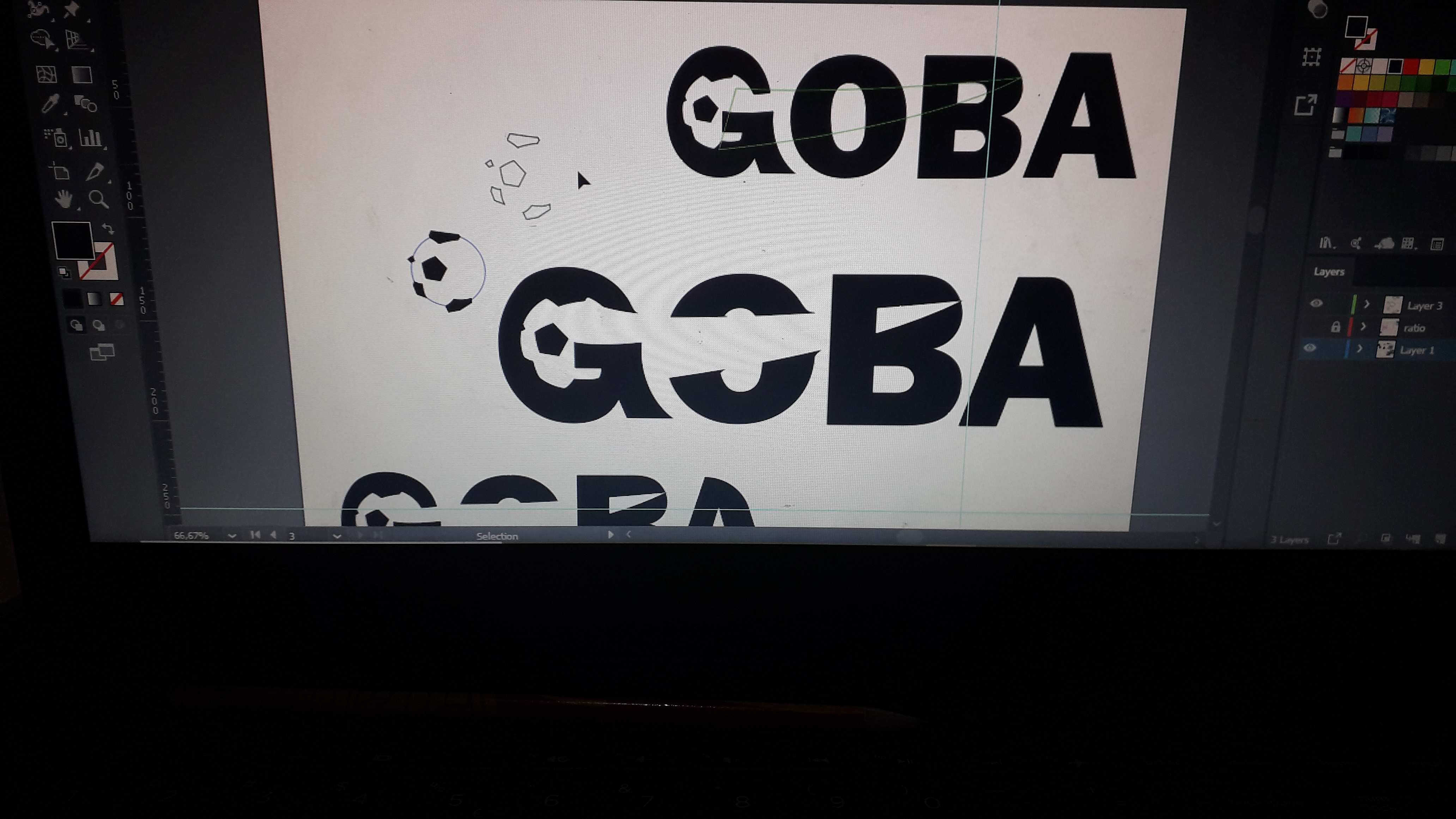
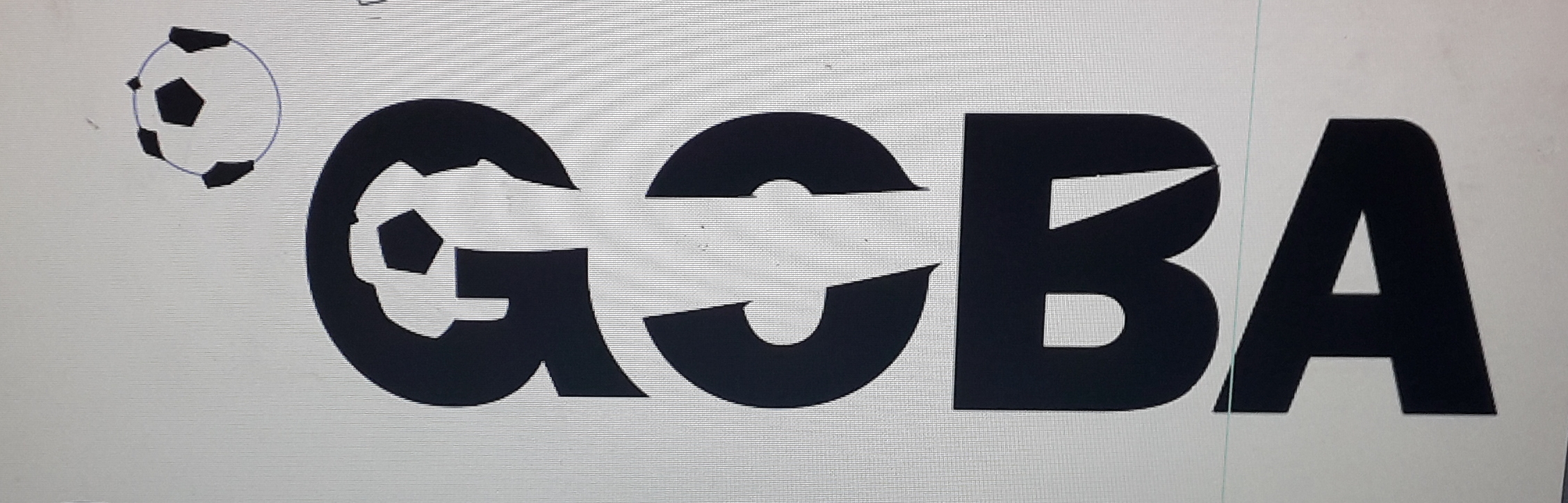
I like the dynamism, but I don’t like the distortion of the G.
2 Likes
Thank you for feedback. Do you mean the distortion at the arch of the G or the arrow-like thingy at the bottom right of the G
Potentially a nice idea and I can see what you are trying to do with it. However, in its current incarnation, it looks a little too cumbersome and over-bloated. You have over-egged it a bit, I think.
Ideas like this, you need to get across as simply as possible. For example, the B doesn’t need the top counter to be pointed. It makes the character ugly and there is real tension where the point almost touches the outside edge of the glyph. I think it would be better to do this by taking the original counter, making the right hand curve slightly parabolic and skewing it up to the angle to follow the ball. Think about it as if using the shape you have now, imagine it in illustrator and you drag the little round-corner adjustment dot in quite a lot.
Also it is overplayed on the O, so as to make the O less legible. The drag lines on this are going the wrong way too.
The G is over distorted.
I think I’d give the whole thing a lighter touch. That way you’ll get the idea across and maintain legibility. You want people to almost smile wryly and indulge in the cleverness of the solution. That way this emotion will reflect on the product or service it represents. Think Lubalin’s Mother & Child. I am not saying your solution needs to have the same feel, of course it doesn’t; entirely different area, but the perfect, elegant, crafted subtlety of this makes to timeless. Even now, I’d wager there isn’t a single typographer doesn’t wish they’d come up with it.
I think yours could be a really, really nice solution, but I think it just needs a few more hours of OCD fiddling – goes with the territory when it comes to anything at all to do with typography.
If you do make adjustments, please repost. I’d love to see it. As I say, I think it could be a really lovely piece of lettering. Just needs refining.
2 Likes
First time I ever heard that! Funny! ![]()
1 Like
I agree with sprout, the concepts not terrible, but the execution is lacking. Keep working at.
I really like the idea, but the logo looks broken. The tiny details throw me off. These little edges that stick out and the left most spot of the ball. I’d either get rid of them or make them more defined. Basically, refine, refine and refine
What if you switched the angle of the ball to be flying towards the top of the B and forms the top? You could simplify and thicken up the G and have the arrow with a solid consistent direction.