I have a crude sketch of a logo my client likes and I want to run a quick test as to what people see in it without any given context. Ideally, I should ask the targeted audience this…but other designers will do.
Concept : Business logo
Purpose or Goal : I don’t want to say, just looking for what you see without giving context.
Format : Digital
Audience : Again, don’t want to give clues.
Your Experience Level : Professional
Nature of Job: Paid client work
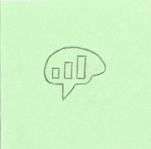
A speech or thought bubble with a bar graph inside. My first thought is some kind of statistics analysis, but a moment of thinking about it, it could also be a signal bar graph for some kind of cellular reception - if that was the case, I’d recommend changing it, because it definitely says stats first.
I do like the fusion of the brain shape with the speech bubble, I think it’s a good way to say both thought and communication together.
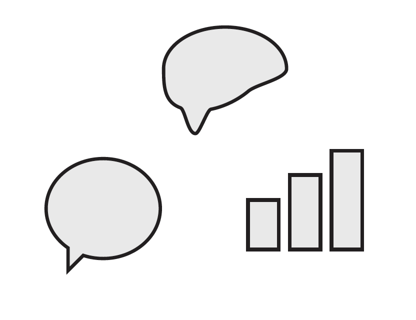
Thank you everyone for your responses and sorry about the second thread. These are the three symbols I’m working with for an exclusive stock trading community moderated by expert advisors. I’ve had my doubts that all three of these symbols could be communicated clearly—but to my surprise, many of you have clearly identified all three.
This is the concept I am advising for my client as I think it more clearly communicates its two symbols (speech bubble and rising bars) than the other communicates all three. This logo’s message is meant to be, “we talk about stocks”. I believe the added element of a brain as a way of communicating expertise makes this message unclear. Any feedback as always is appreciated!
The client likes both and I wanted to test my hypothesis for each one separately.
Spot on! It is an exclusive stock trading community moderated by expert advisors. Thank you for your feedback Craig—I agree that it does need some work!
With that in mind, If I could make one suggestion? though it may be harder to work with (I’ve not got any bright ideas for visualizing it) a line graph says stock/business to me more than a bar graph, since the sloped nature conveys the upward motion/growth over time.
I do really like your last sketch, though - that’s very solid!
I also think the bar charts symbolize statistics more than stocks, but I’m not sure a line chart would work either because it might look like a brain stroke. Maybe another monetary symbol could work better. That said I think the bars look fine.
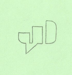
On another note, I don’t like the fragmented version at all. While your first version manages to bring the three symbols together in simplicity, the fragmented version looks like joining together two things that don’t fit.
I agree. I’m seeing a combination of ideas that could work if somehow combined into a singular, unified logo, but honestly, I can’t see how that might be done. If it were me, I’d probably move on to a different idea at this point.