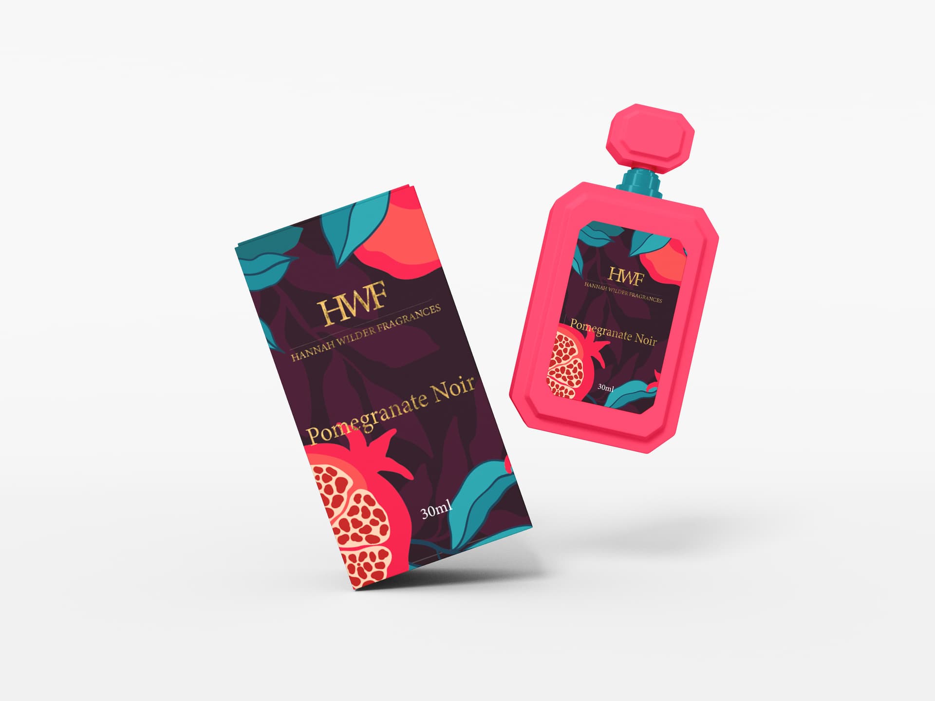

It’s mostly fine. I like the colors and the illustration is cute, but the text on the back on the back of the packaging is going to be difficult to read. You need to make the background more opaque so it can be read more easily.
The bottle in the top image looks strange to me. Is it meant to be made of plastic?
1 Like
The illustrated fruit is blobby looking. Perhaps that’s intentional and a matter of style, but personally I find it unappealing. I’m not the target audience, presumably, so my “taste” may be irrelevant.
The type and copy need work everywhere.
- Where the ‘m’ crosses the fruit on the front panel, it ruins the readability. Any reason that type can’t be moved up to the open space above?
- The brand has a weak place in the visual hierarchy; elegant in a way perhaps, but if it was mine, I’d want it more prominent.
- On the back panel, all the copy is over-written to the point that it comes off contrived and hyperbolic. Fashionable for this type of product maybe, but that doesn’t make it good.
- The center-justification and line breaks need refinement; it was just typed, not typeset.
- There is a superfluous period leading the last line of each paragraph. Is that intentional?
- Subheadings 1 & 2: [space] en dash [space] isn’t really a thing.
- Subheading 3: [space] hyphen [space] is inconsistent with the previous subheadings.
- The second paragraph is repeated below the third heading.
- The brand name should be set in Title Case.
2 Likes
Thanks for your feedback!
About the body text I agree with you it’s need to more opaque I will fix it.
In fact, it is not the actual bottle of the product, it is only an approximation.
Well, the packaging it’s tolking about Art Deco movement so that is why I design it like this.
About the space between the the headings and text my teacher said will be more beautiful if I add space between them. ![]()
Well I made no mention of that, but okay.
I like the deep, rich color combinations very much. I like the illustration too, but similar to what @HotButton said, it’s a little jiggly. This isn’t necessarily a criticism, though; just something that possibly clashes a little with the overall personality of the design. On the other hand, it adds some interest, so maybe it’s fine.
The cross-section of the pomegranate looks as though it was sliced horizontally, yet the stem at the top indicates it was sliced vertically. In other words, you’ve rotated the insides of the fruit by 90 degrees from what is actually the case. I might be the oddball who would notice such a thing, but I immediately saw it.
The bottle is way wonky. Whether it’s part of your design or not, it looks weird, and it detracts from everything else that is working.
The weakest part of your design is your typography and how you’ve chosen to use it. There’s no sensitivity or style to it. It’s also difficult to read (as has already been mentioned).
The barcode needs some blank space around it (usually referred to as the quiet zone). This is a practical matter of barcode readers needing that space to read the barcode correctly. A dark bar immediately adjacent to the dark color of the packaging will result in reader errors.
This topic was automatically closed 365 days after the last reply. New replies are no longer allowed.