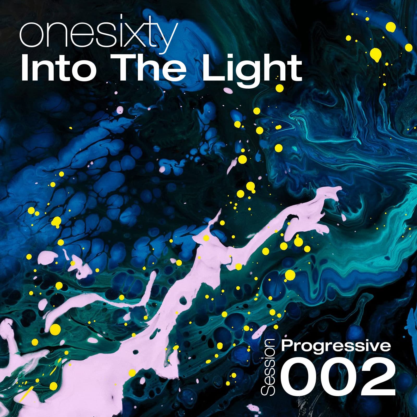
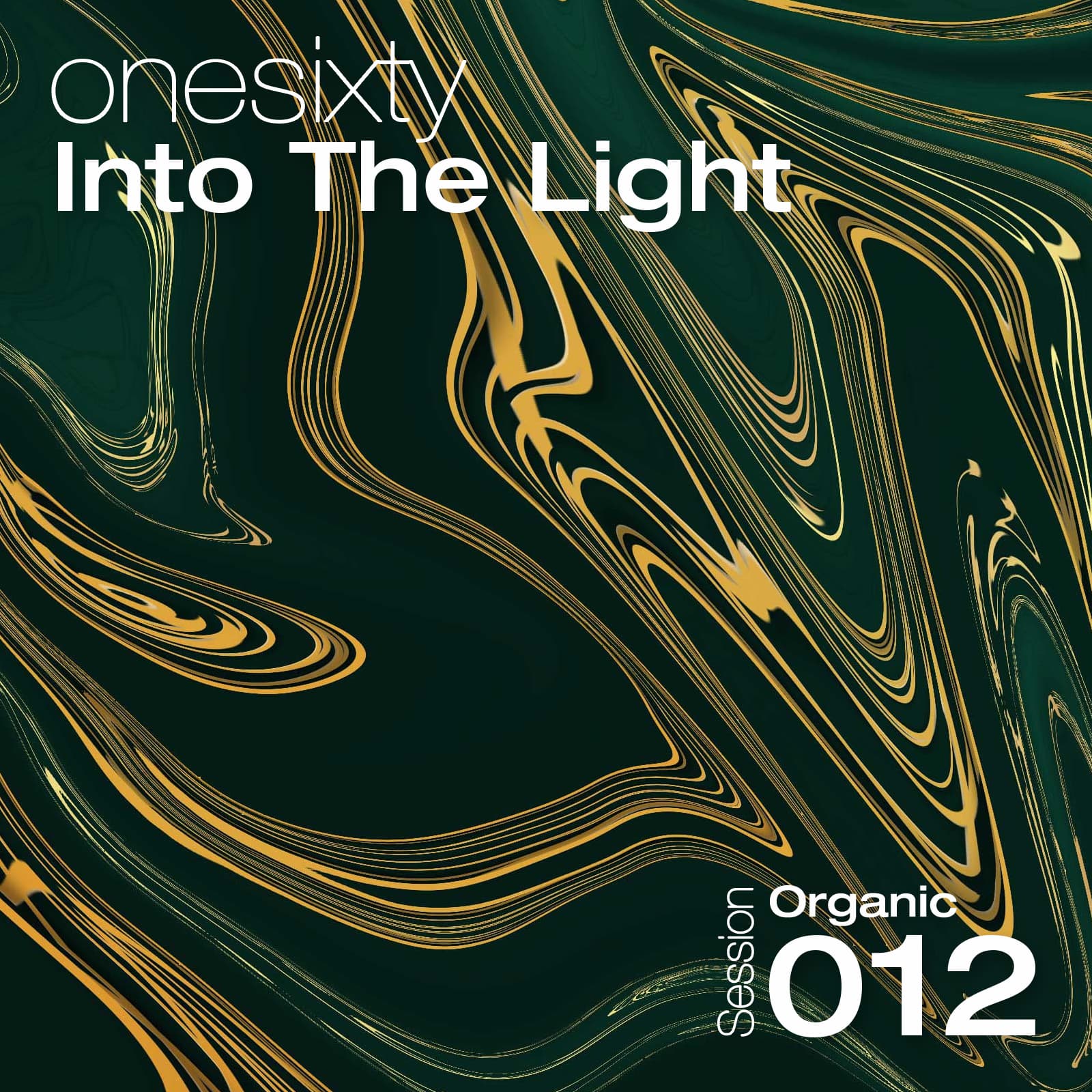
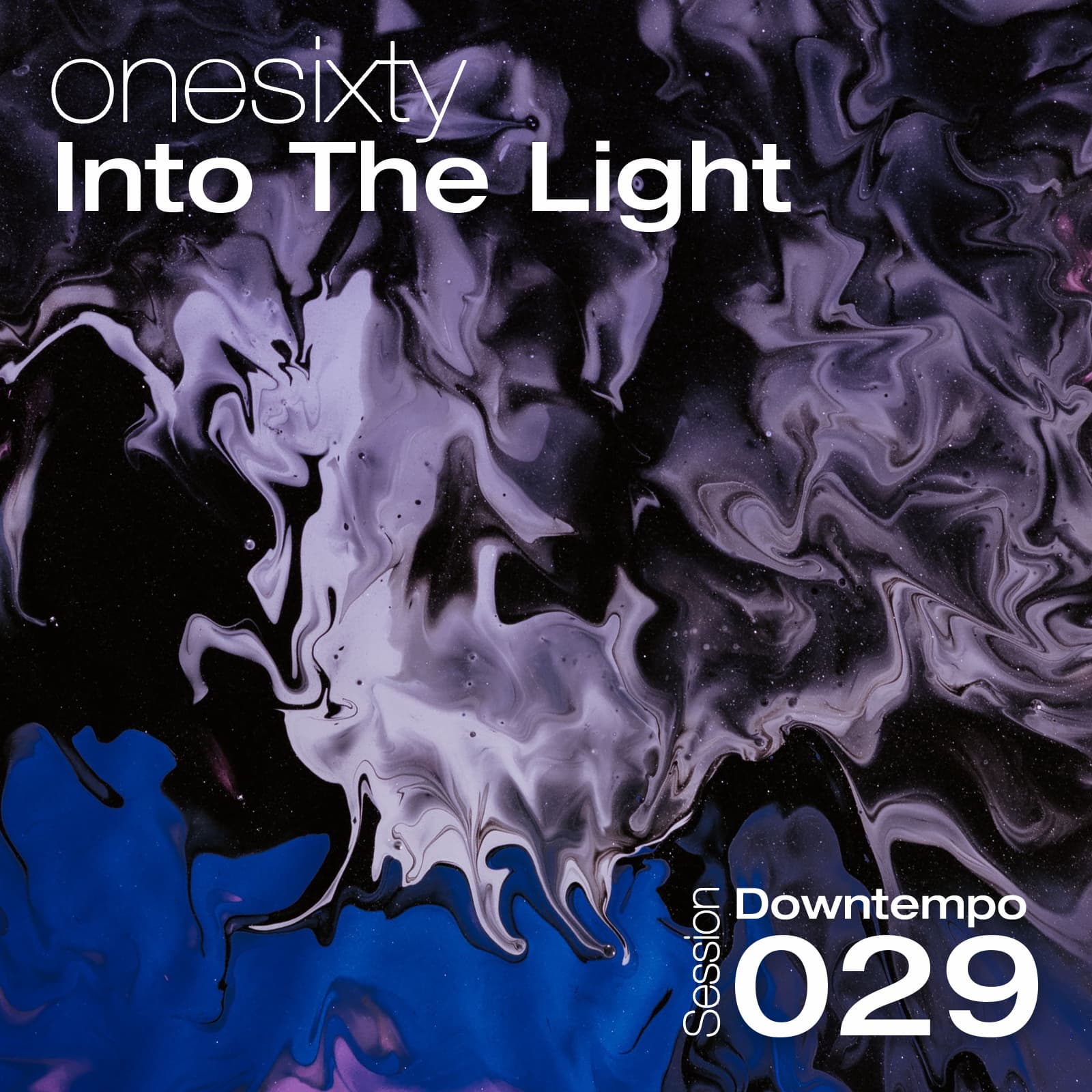
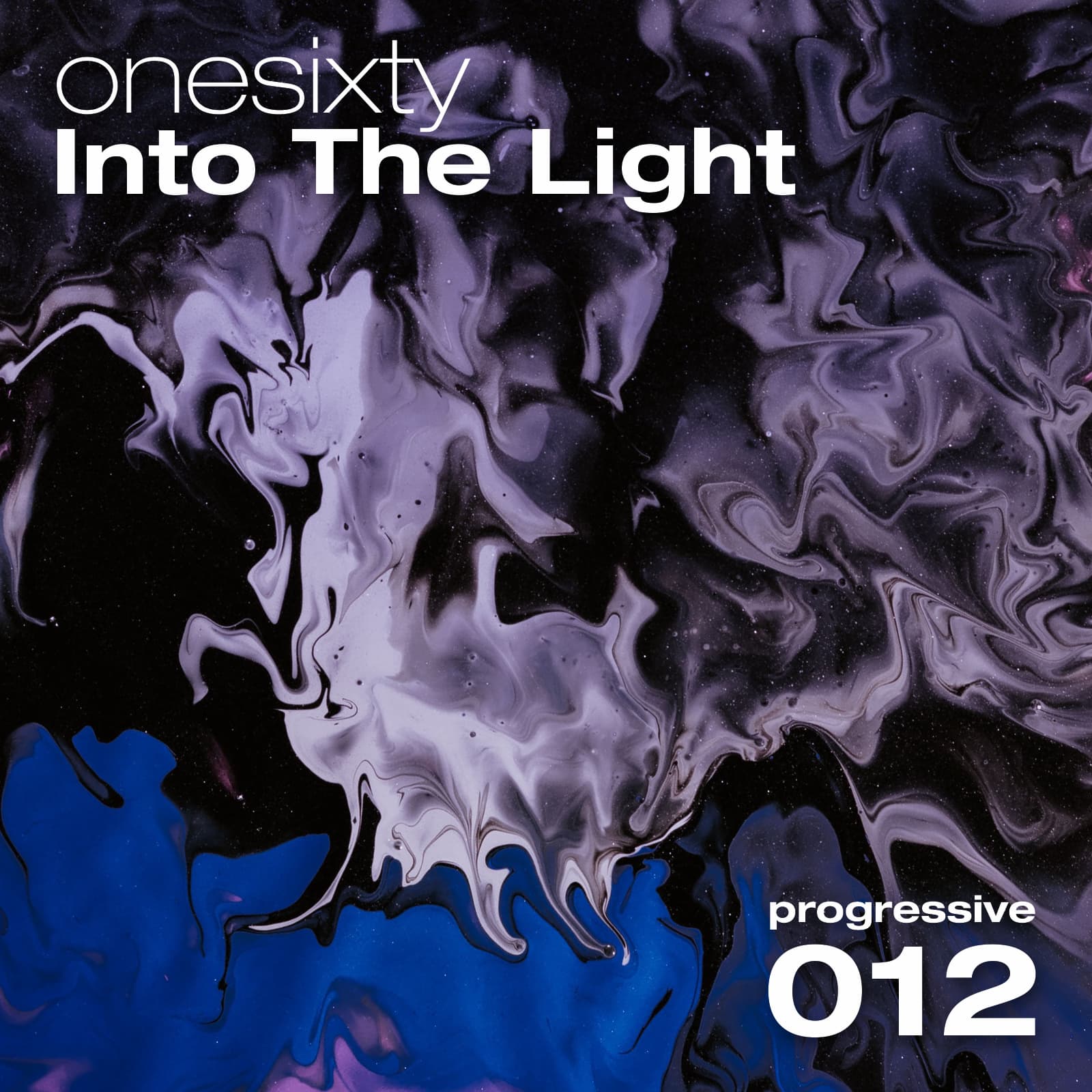
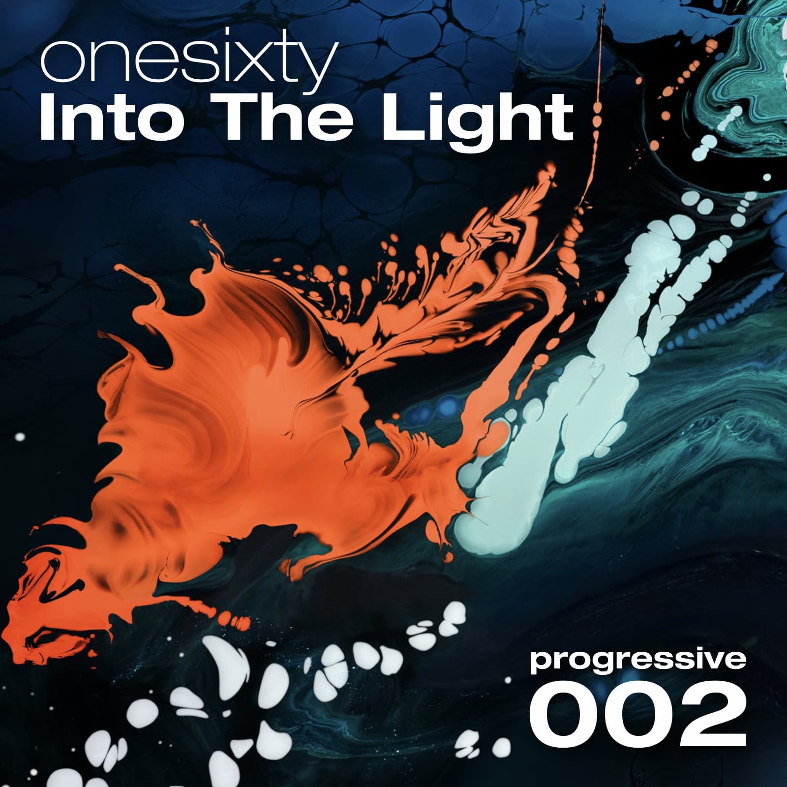
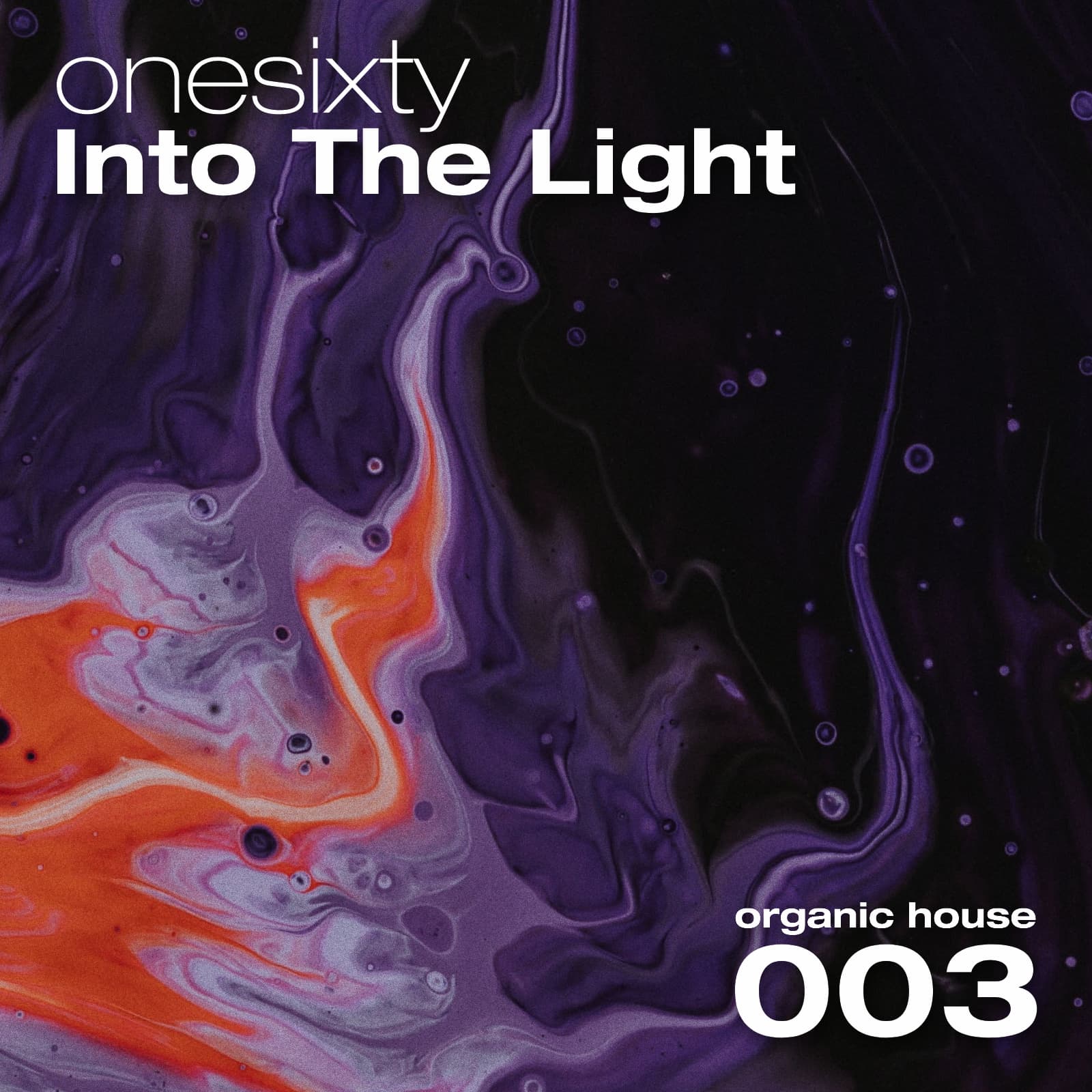
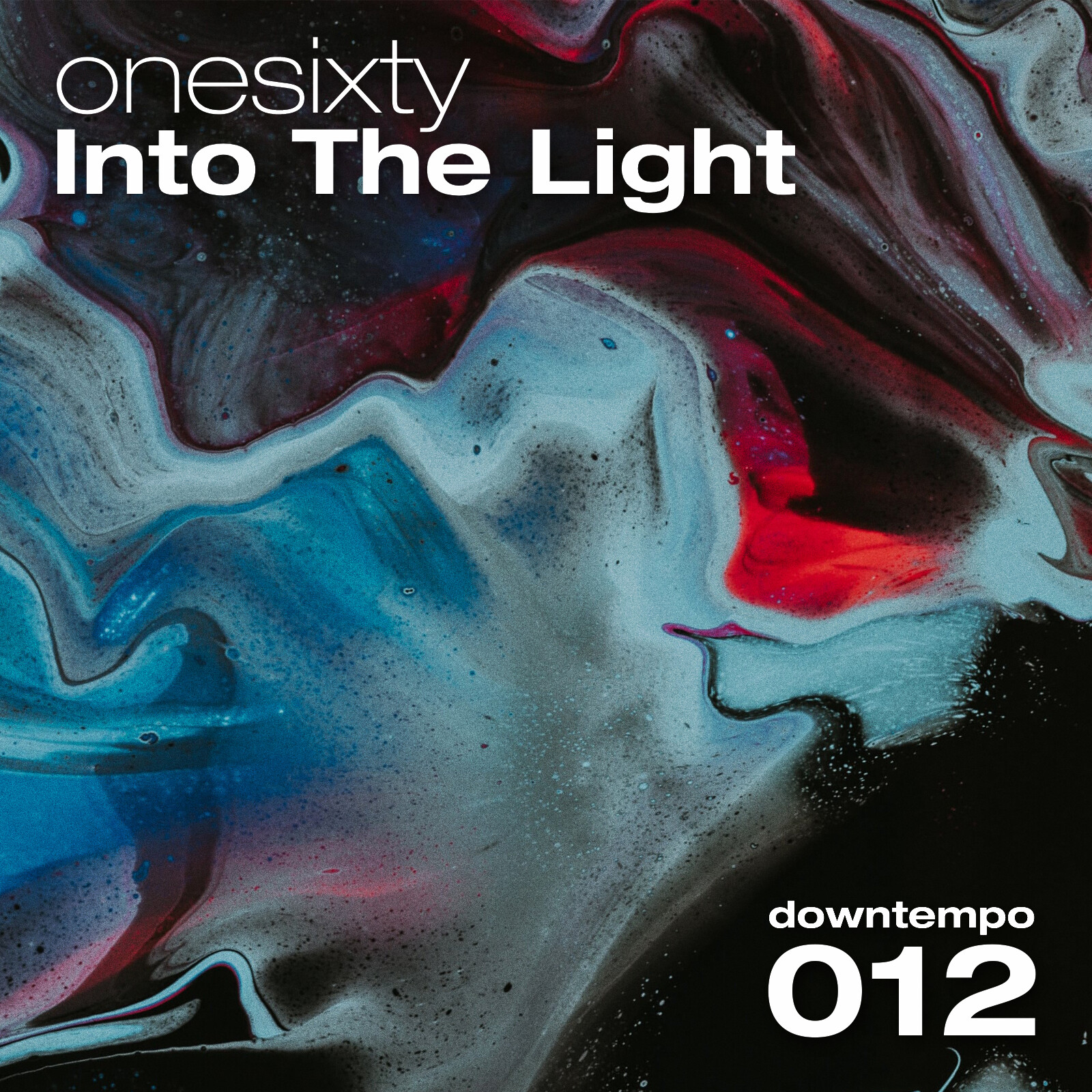
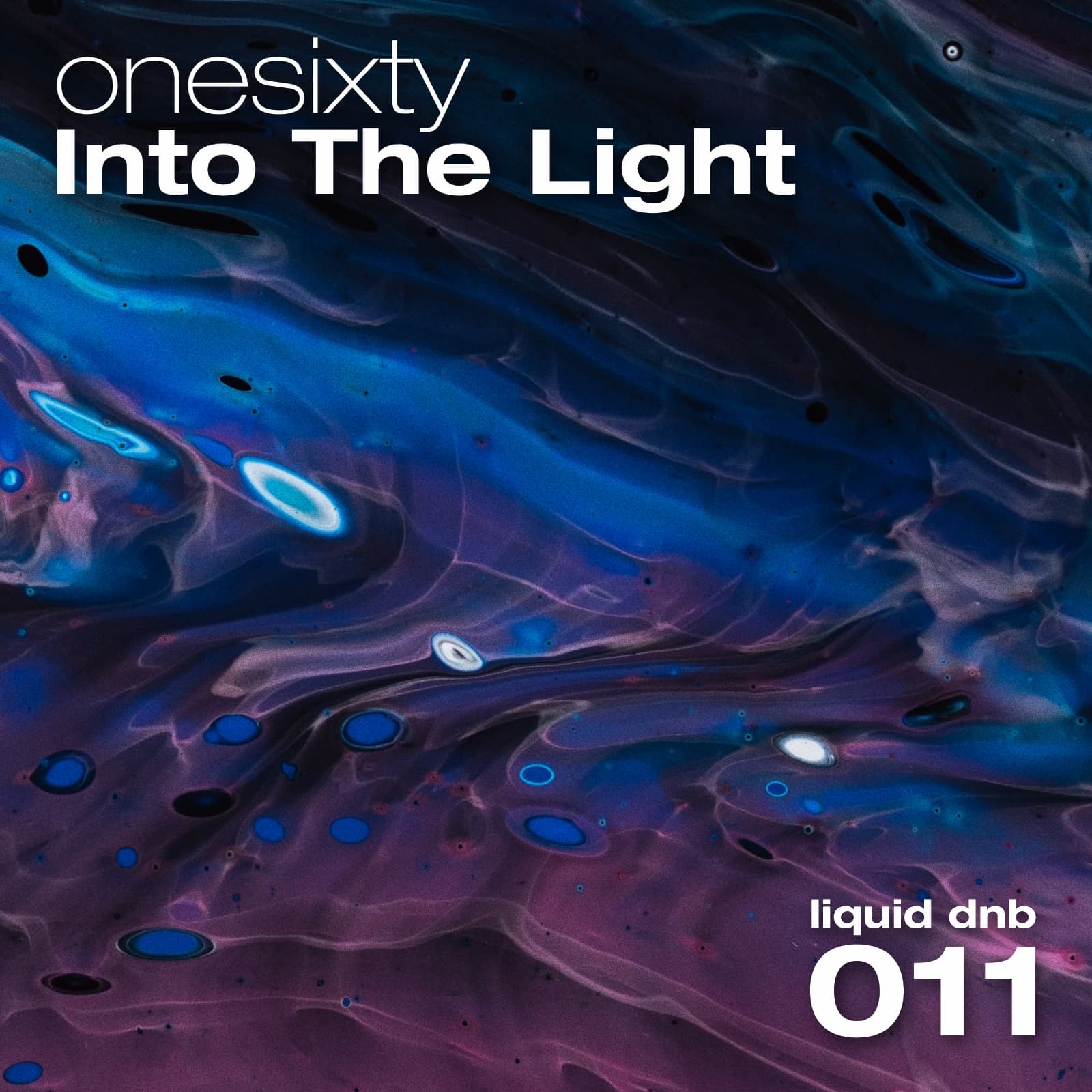
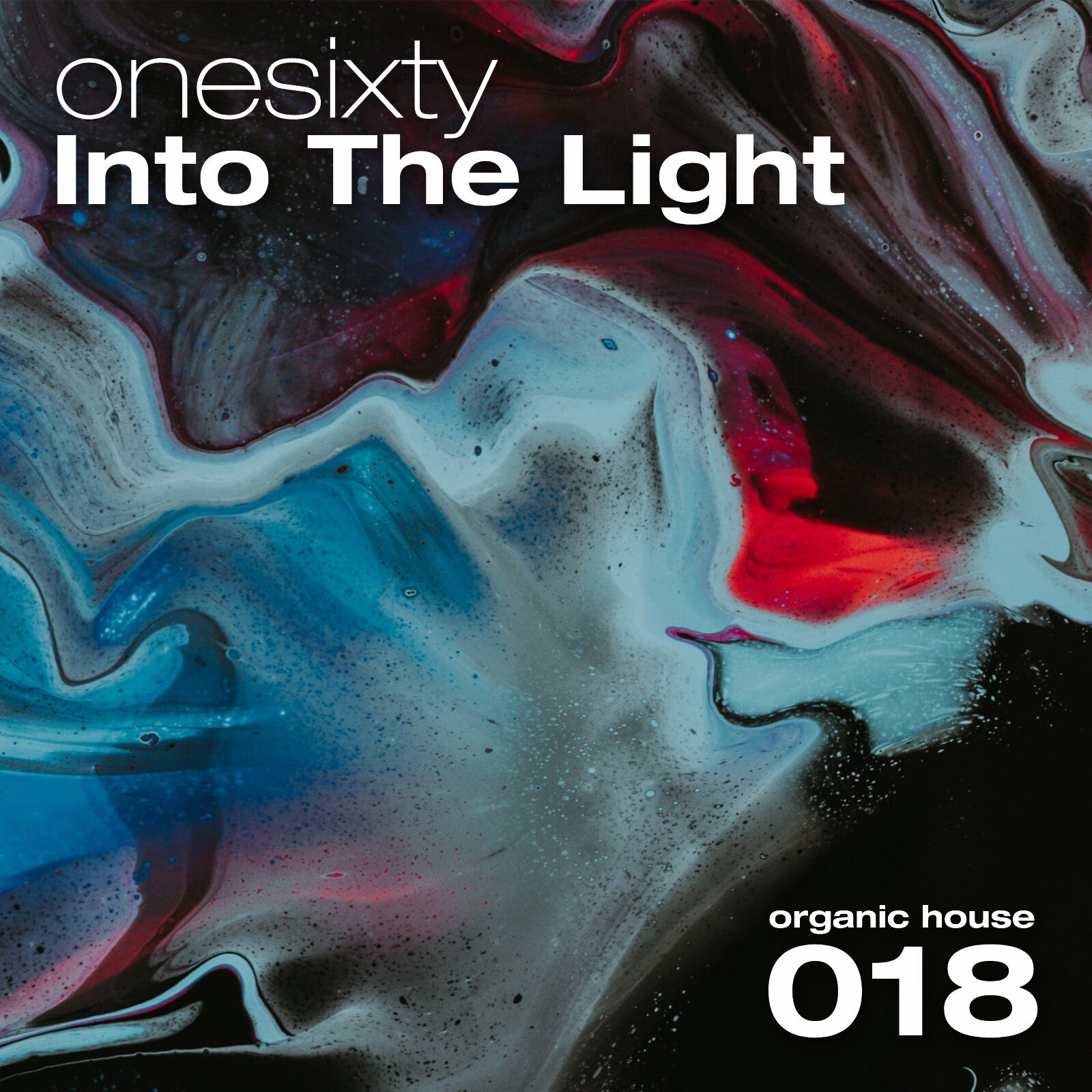
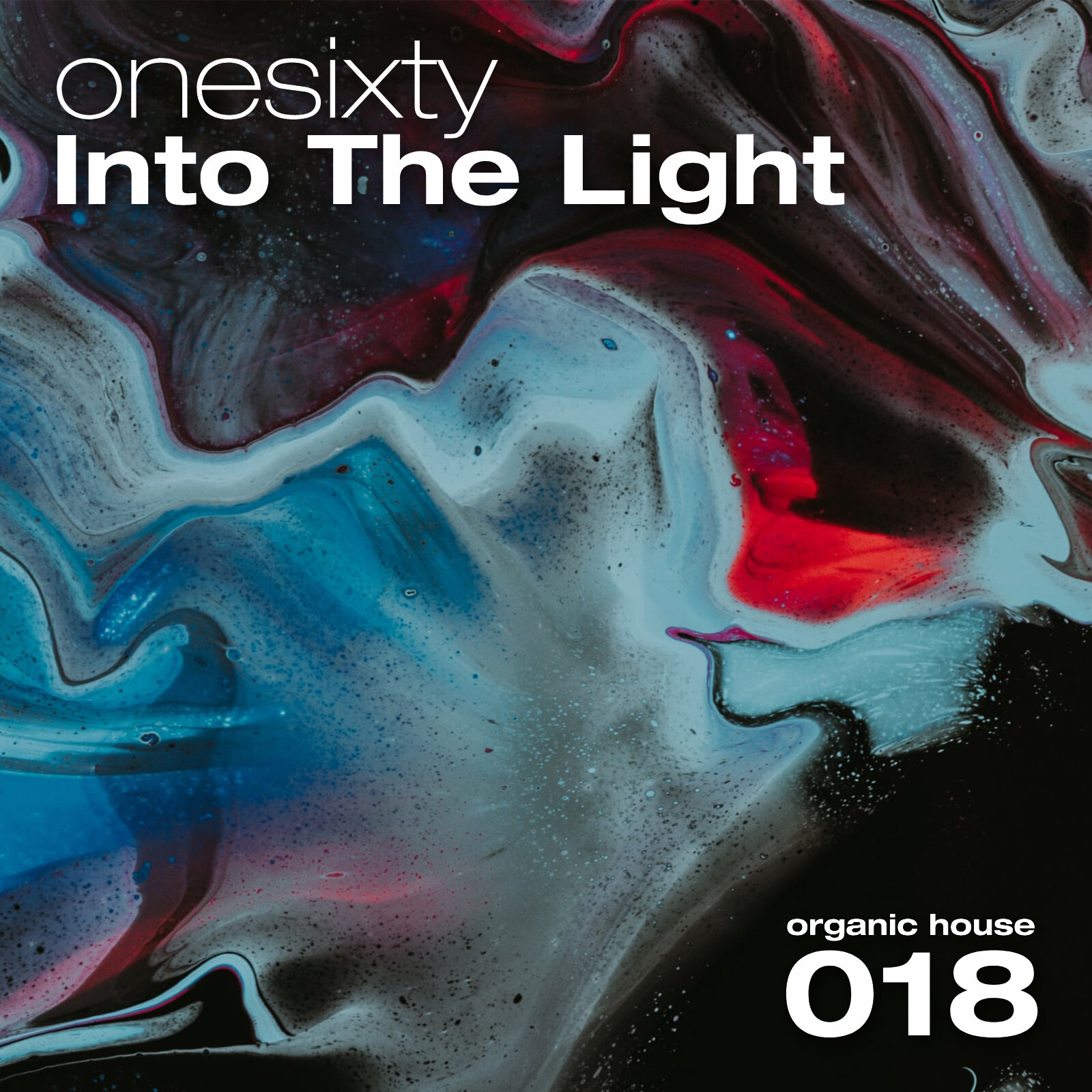
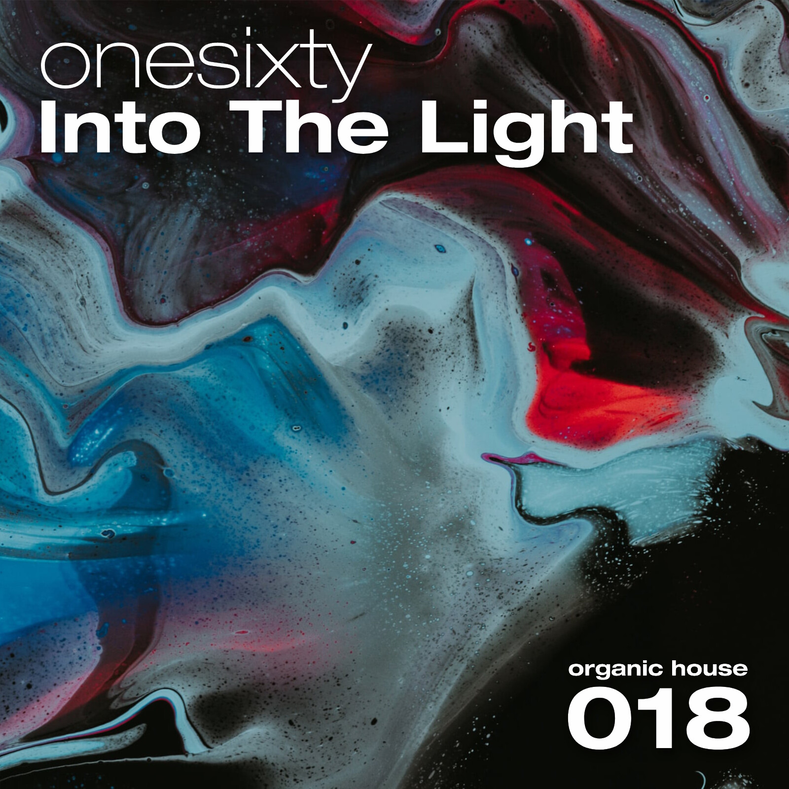
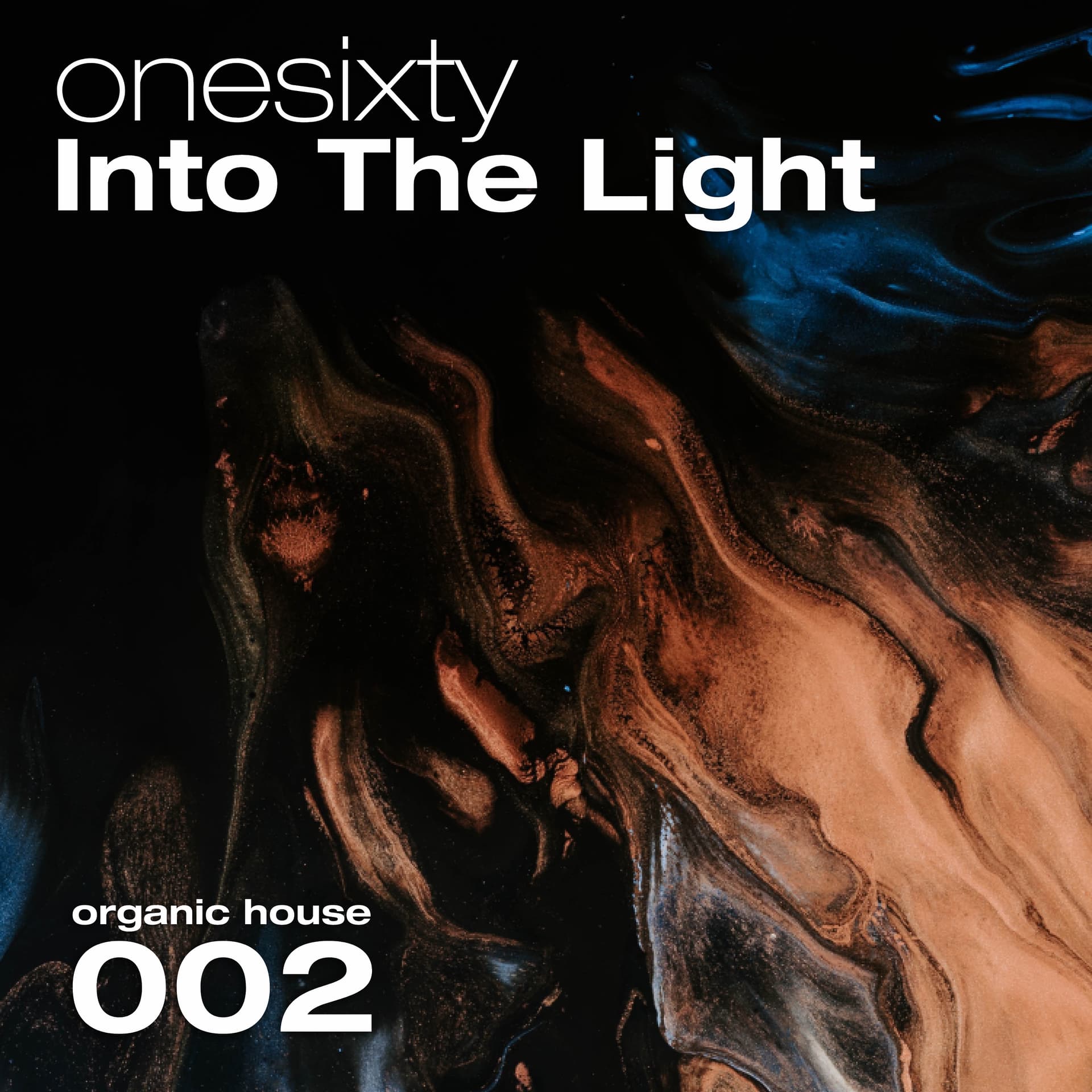
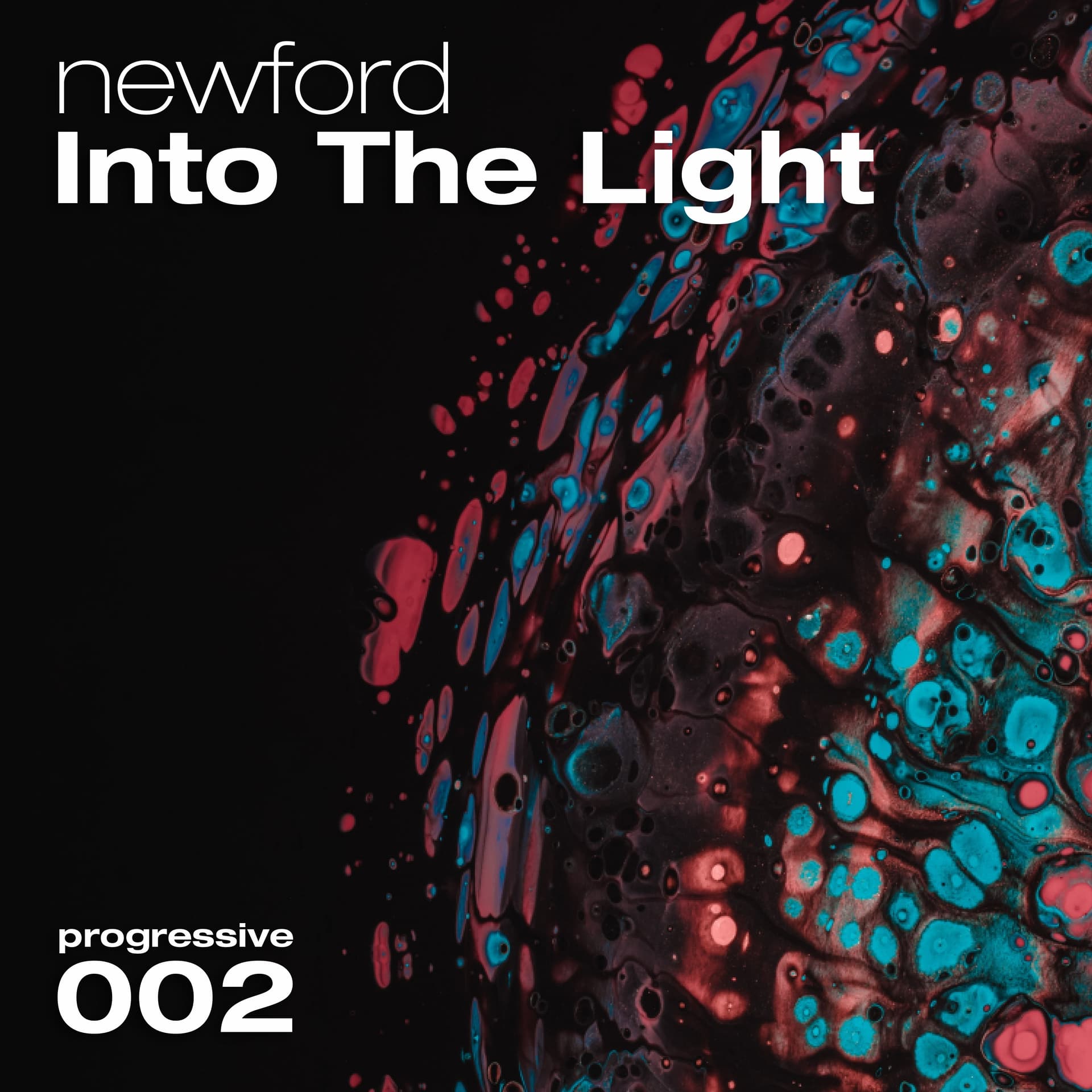
I’m a dj who is planning a new mix series, with my limited graphical skills I’ve taken up the challenge to design the covers. The mixes will be posted to youtube and mixcloud. Each edition will feature a different background, the text will remain the same besides session number and specific genre. The dominant genre across the series will be progressive house.
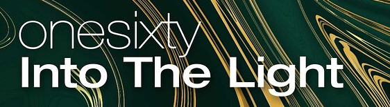
I’m looking for opinions mainly when it comes to the text, does it give a finished appearance? Does something stick out? Top line is the artist name, underneath the name of the series “Into The Light”. There is a 30% opacity dropshadow on all text.
Below is how it was before, smaller text and the thin words thinner. I do appreciate the slick appearance of the original helvetica neue ultralight font however above I applied a 1px stroke to make it slightly less problematic in thumbnails.
Thanks for confirming this. I woke up today and took a fresh look, it doesn’t feel too wrong anymore. Probably still needs something or I need some encouragement to hear it’s fine It’s a simple cover but I want to do it right the first time so it stays consistent across the series.
Trippy!
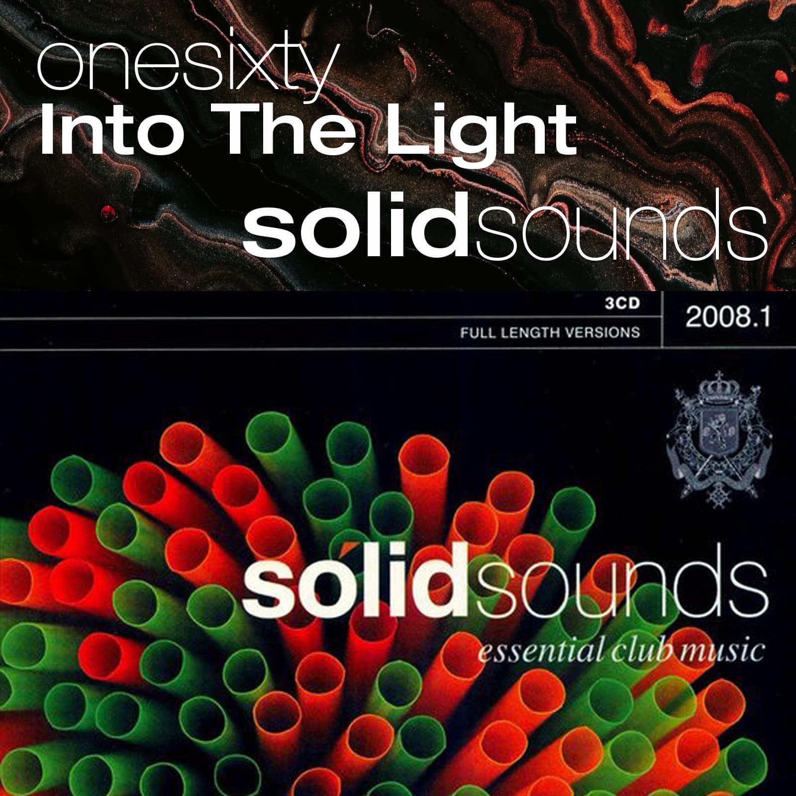
I used to buy these Solid Sounds compilation cd’s, took one out to compare font sizes. Made the fun discovery that it uses the exact same font and it seems like they also did the 1px stroke to make the thin text thicker. I did not copy… I copied this video https://www.youtube.com/watch?v=cvm6U3LkOr0.
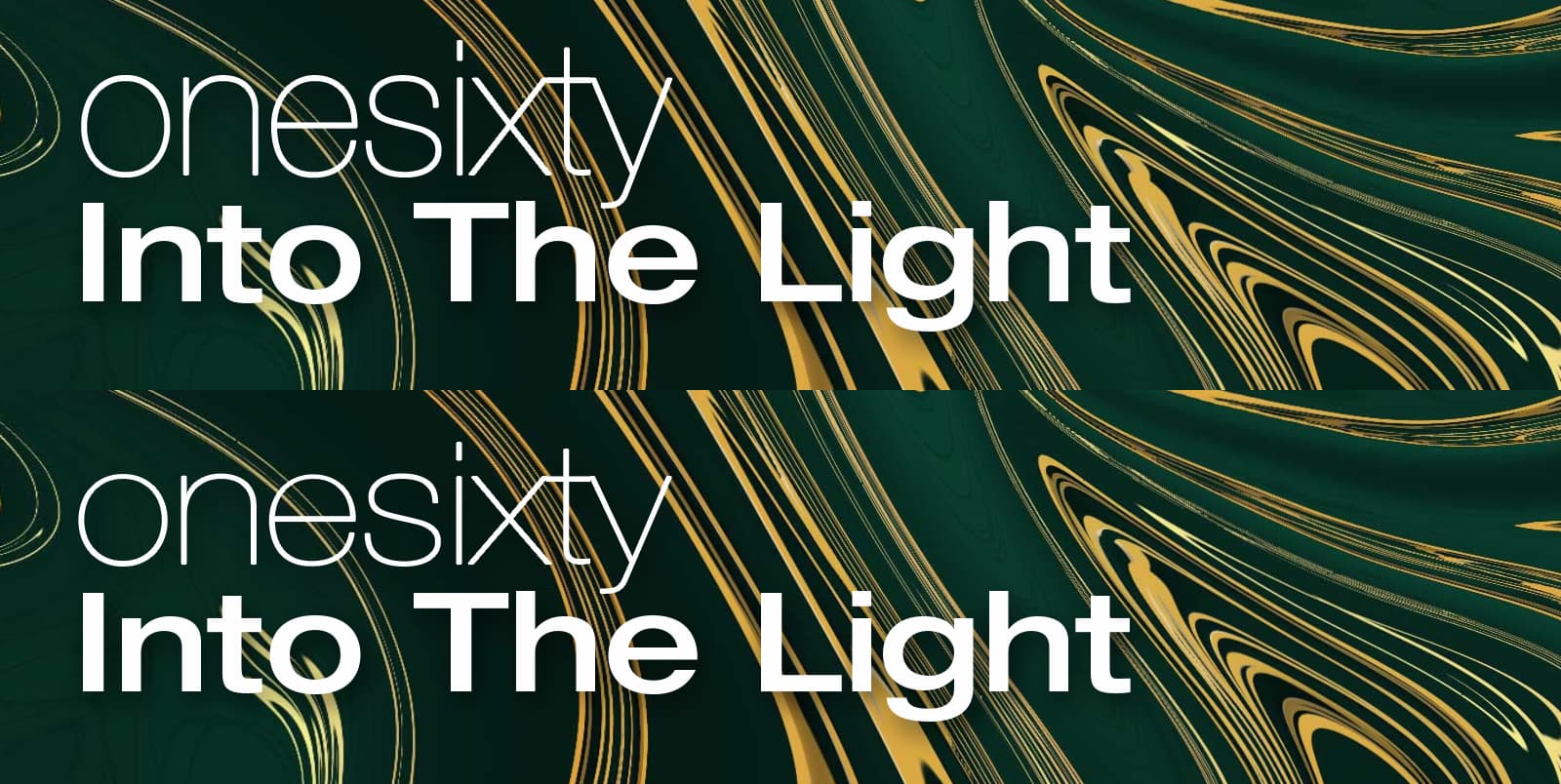
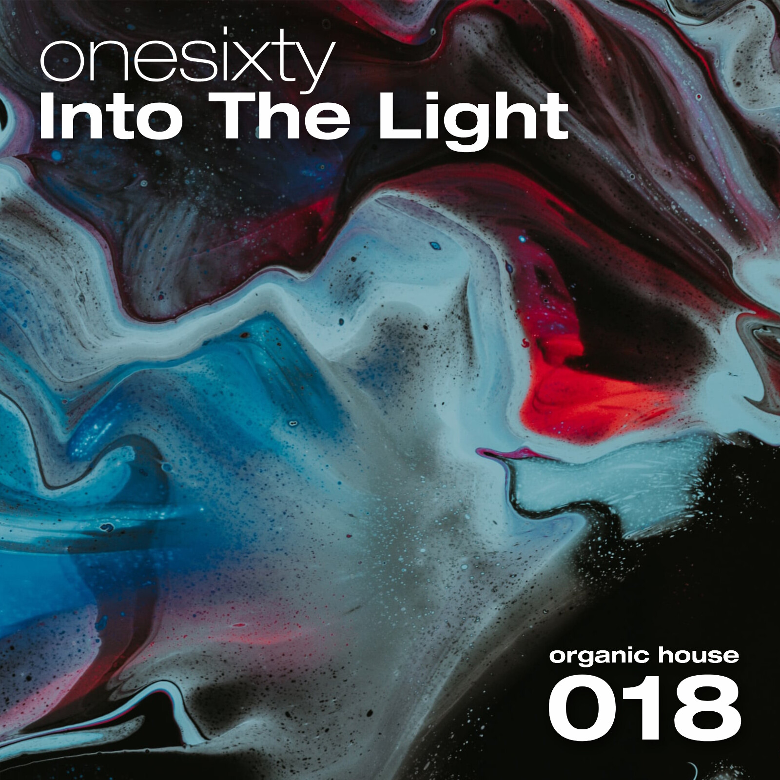
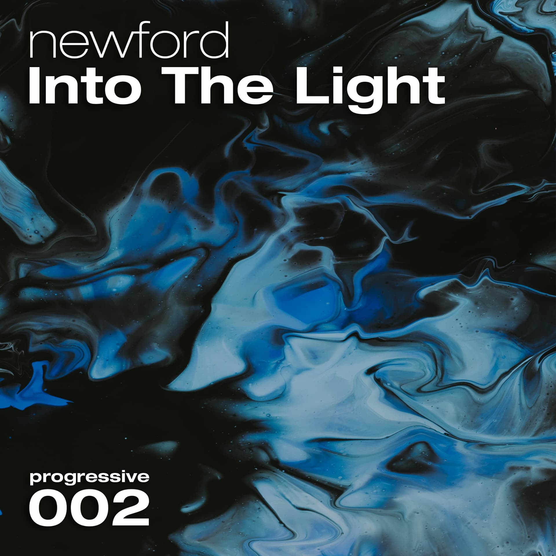
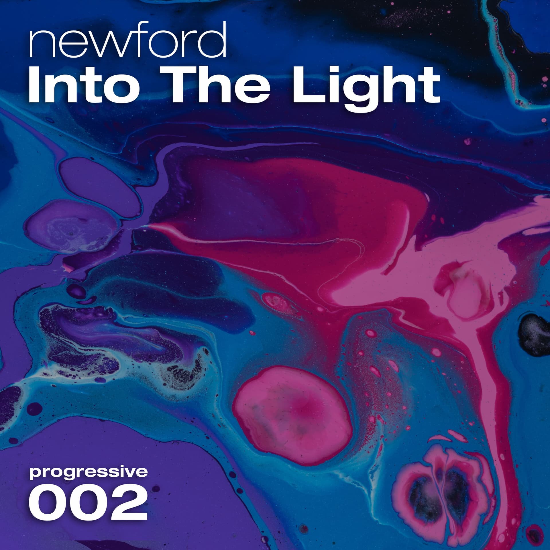
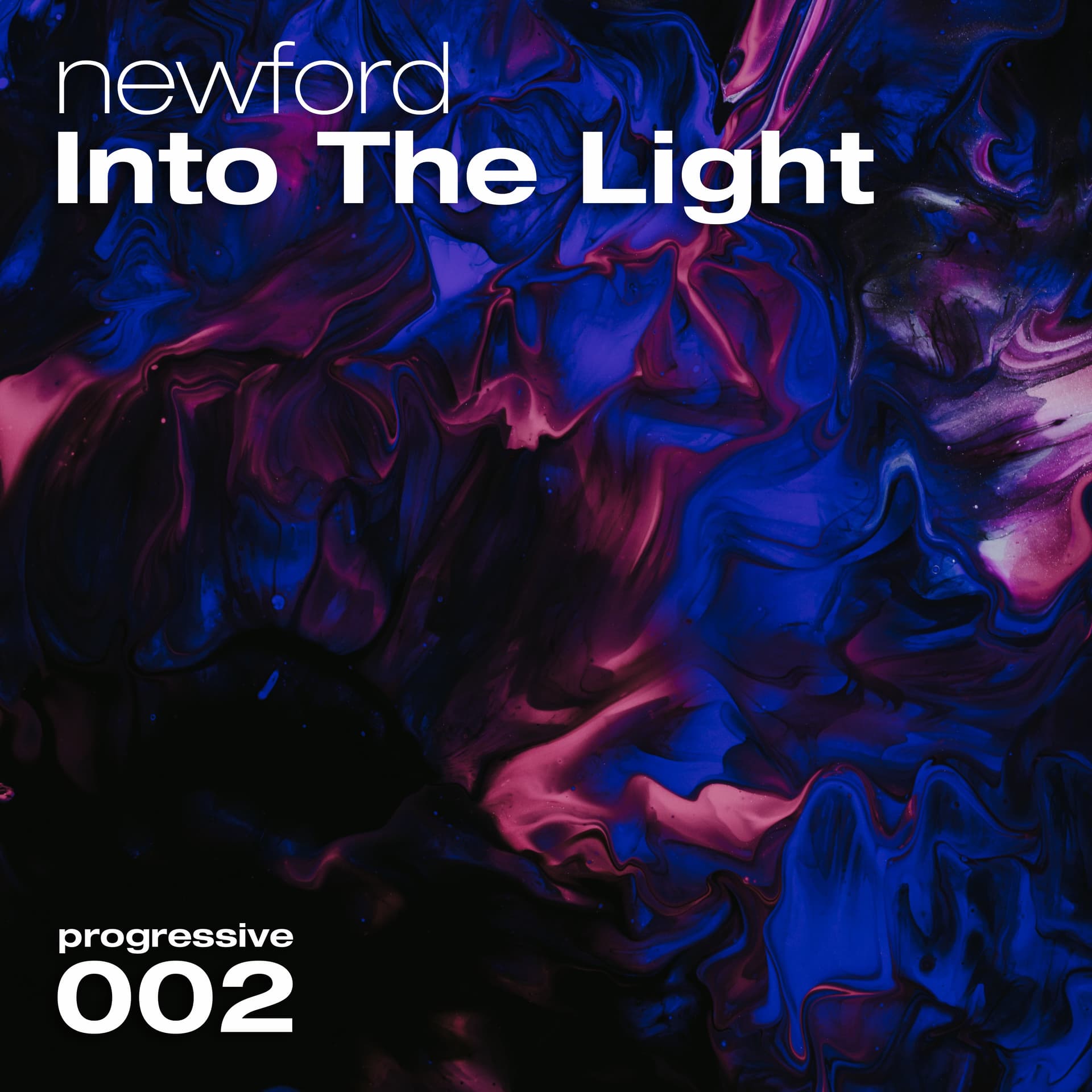
I think you did a good job, am loving the marbled effect, especially in the top one.
The things that feel off to me are:
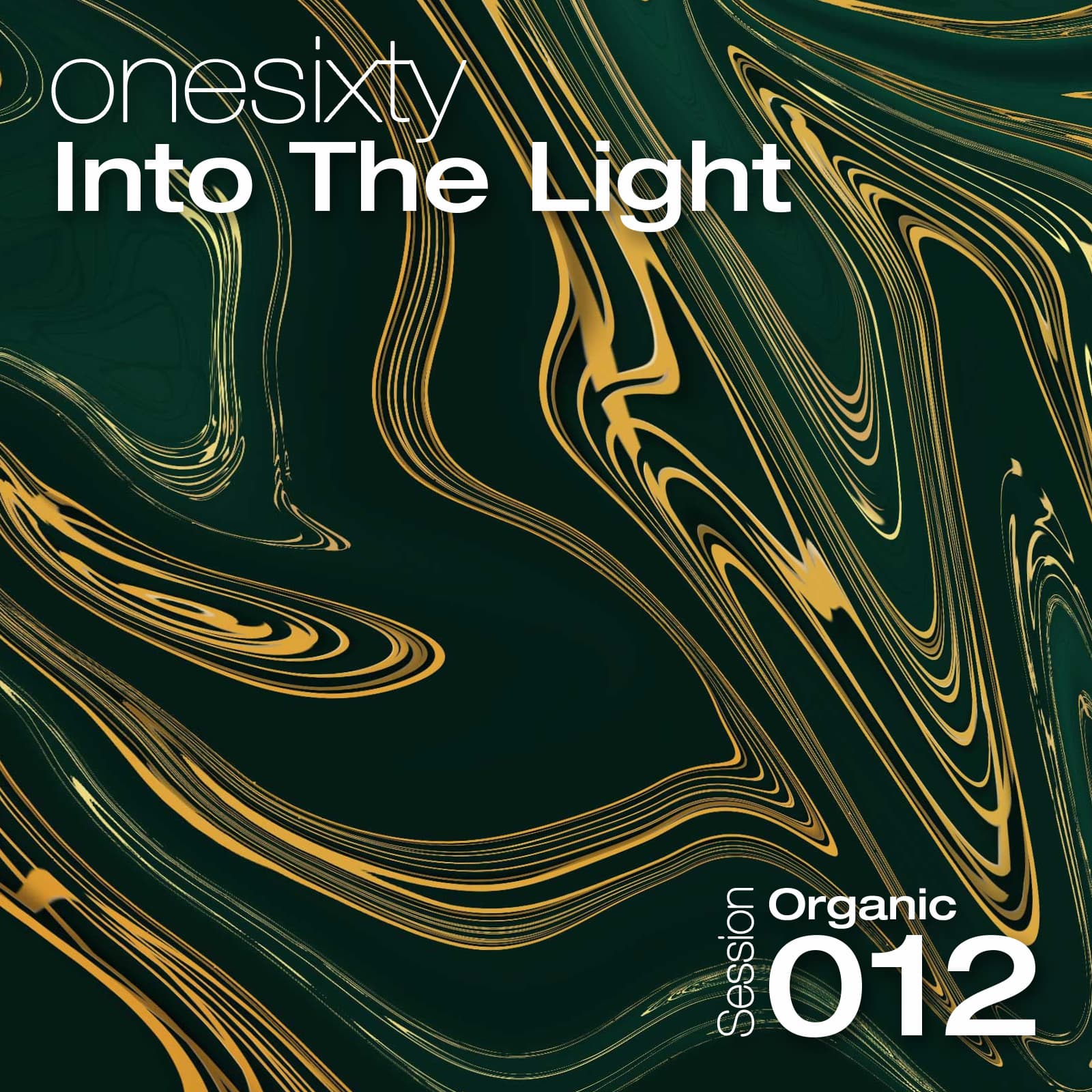
The typeface pairing - I think you should have stuck with one typeface and used contrasting weights (rather than using different weights in different typefaces)
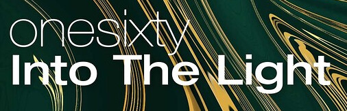
The text disappears into the background here, is a bit difficult to read:
The typeface pairing - I think you should have stuck with one typeface and used contrasting weights (rather than using different weights in different typefaces)
I believe I am using one typeface called “Helvetica Neue”, “Medium Extended Regular” and “Ultralight Regular”. I have downloaded these as one pack with an otf and ttf file for each variation (weight?). I’m not too confident about the wording. The artist name I squeezed down a bit in heigh, does this make you think it’s a different typeface? In the 4th picture of the opening post you can see how it looked before I reduced the height.
The text disappears into the background here, is a bit difficult to read:
Good point, what I did is increase the dropshadow opacity from 30% to 60%, shifted the image a bit to the right and applied a surface warp around the top text to make the lines clash less. Think it looks better. Overall I’m a bit hesitant to apply too much drop shadow. Let me hear your thoughts!
Very much so, I didn’t actually even recognize the extended typeface as Helvetica too. I don’t think they mix well, I’d either go all extended or all standard and have the only difference be the weight, but that’s just me
If I understand correctly you mean change weight only within eg; “Medium Extended Regular”, how should I achieve that? There is no second drop down available when selecting either of these fonts, only a 3rd dropdown with strong, sharp etc. I am using a 2015 version of photoshop so I see from this video that I don’t have access to variable fonts either.
My main laptop is stuck on a black screen, wasn’t able to work on it during the past days. I’m now on my 2nd laptop using photopea.com
Thanks for the link, I see what you mean now with the clashing typefaces. I was doing unnecessary workarounds instead of just using thin extended.
I’m sticking to the extended line. First two combine thin and medium, last two combine thin and bold. Both versions with and without “session”. Not using capital letters anymore besides “Into The Light”.
Please let me know your thoughts/preferences. (click image and use arrow keys to compare)
The 4th example looks most solid to me. Bold gives a better contrast to thin than medium. When switching from bold to medium it feels a bit light. Don’t think “session” adds much value, it seems self explanatory. It probably looks cleaner without, also considering it won’t be readable on thumbnails.
The line height between genre and session number is now reduced.
I’m keeping the genre and session number at the same width by changing genre font size. It’s an option since the genre lengths are similar. The number 1 is causing some extra work since it’s the only digit which is narrower than the rest, depending on the amount of 1’s and their position it leads to 5 possible widths. In the worst cases such as 011 and 111 I’ll pick genres with a shorter name. A bit limiting but not too bad, it just looks nice when both are the same width.
The following examples have a 40% opacity film grain applied, would this be a good idea to add some consistency across the series? I’m mixed on whether it looks good or not. Can always tone it down.
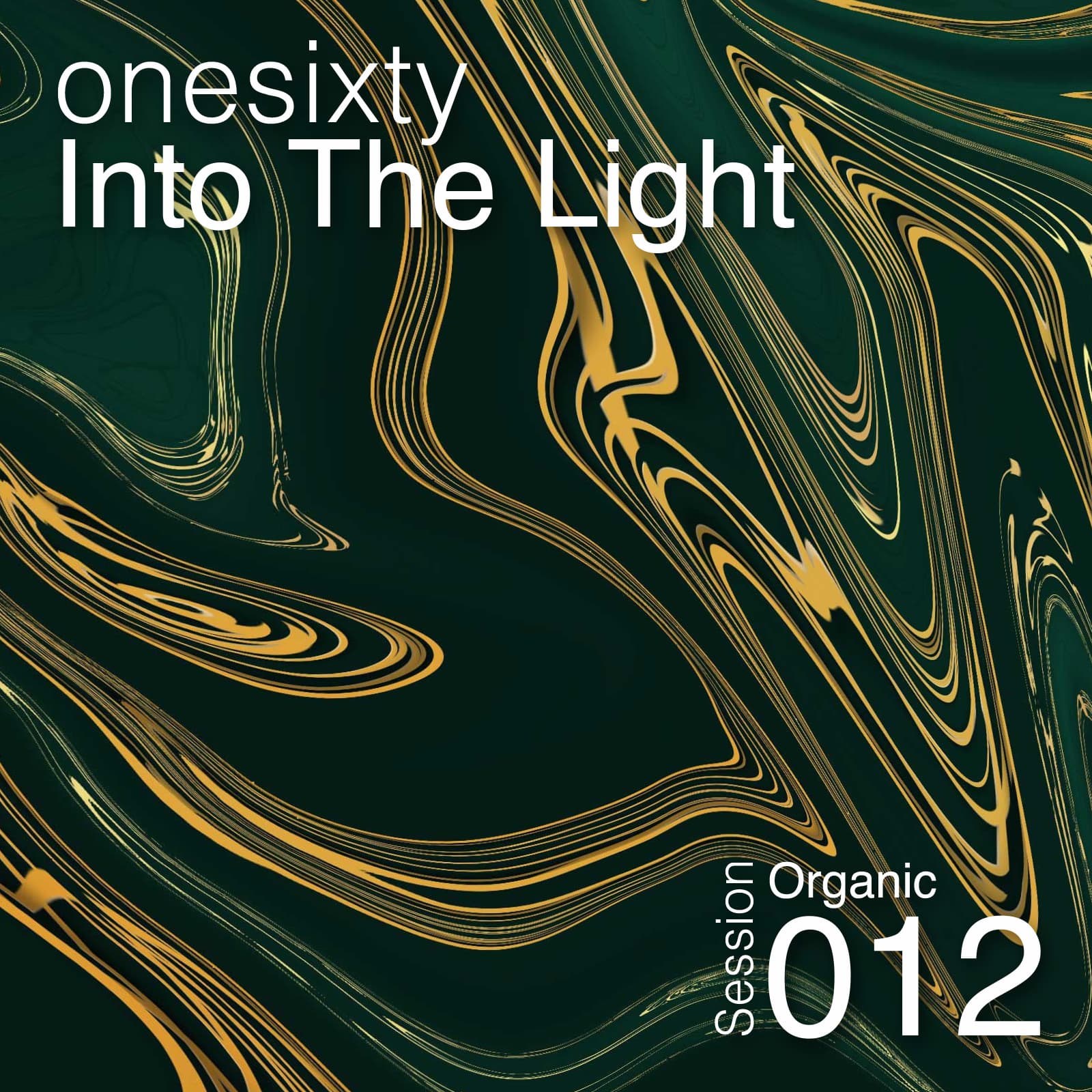
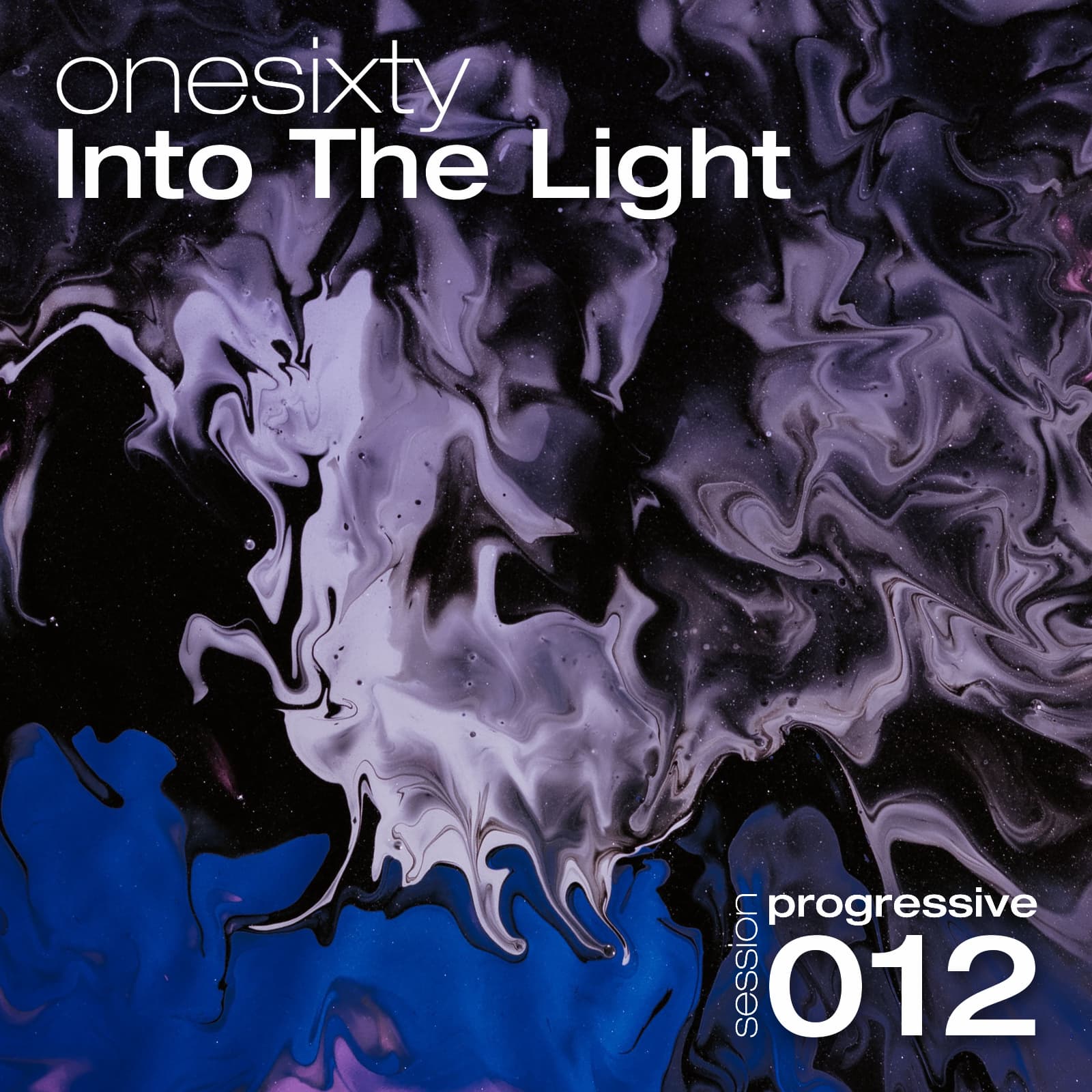
I’m a fan of the color schemes, especially the first one. The typography fits just fine as well, but in the second one the color of the text sometimes blends too much with the yellow marbling.
Thanks for your feedback. I’m quite pleased with the typography, on the other hand I’m aware how up until now every change has made the previous version feel off. By that logic I wonder what improvement I can make which will cause the current version to feel off. Perhaps beyond fixing the clear mistakes I did previously there is only so much which can be achieved within my skillset and 4 pieces of text. It is clear to me from reading around on this forum that my eye isn’t always in line with that of experienced users, some of it is taste but I believe it also requires experience to have a good eye. So I take my time.
I agree and have decided there is no reason to use problematic images such as the green and yellow example unless there are no other options, which there are plenty. So far I have gathered a folder with around 150 of these type of images and only scratched the surface of what can be found. I’m happy I included that one because the feedback made me more critical.
I’m not set on the size yet since I have different preferences at different sizes, the bottom text can feel too dominant on large sizes or unreadable on small sizes. I’ll pick one from the last 3 examples above.
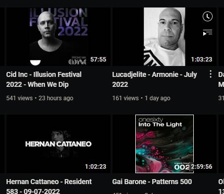
When pasting the covers onto youtube thumbnails it created a dilemma, the YT video length timers are blocking the session number. Not sure yet if it matters enough to change the design, but it’s definitely annoying.
And when trying to upload a test to apple music it was brought to my attention that the dimentions need to be 3000x3000px, I have started over using this larger size.
Do you like this new name? It’s a translation from my dutch name “Nieuwenburg”. I’ve been thinking about changing my artist name for quite some years. This week someone suggested Newford.