Hi there!
This is my first post on the forum. How can I improve my work?
More, I am in a French language country, I hope you understand.
This is my first post on the forum. How can I improve my work?
More, I am in a French language country, I hope you understand.
In general, I like the overall looks.
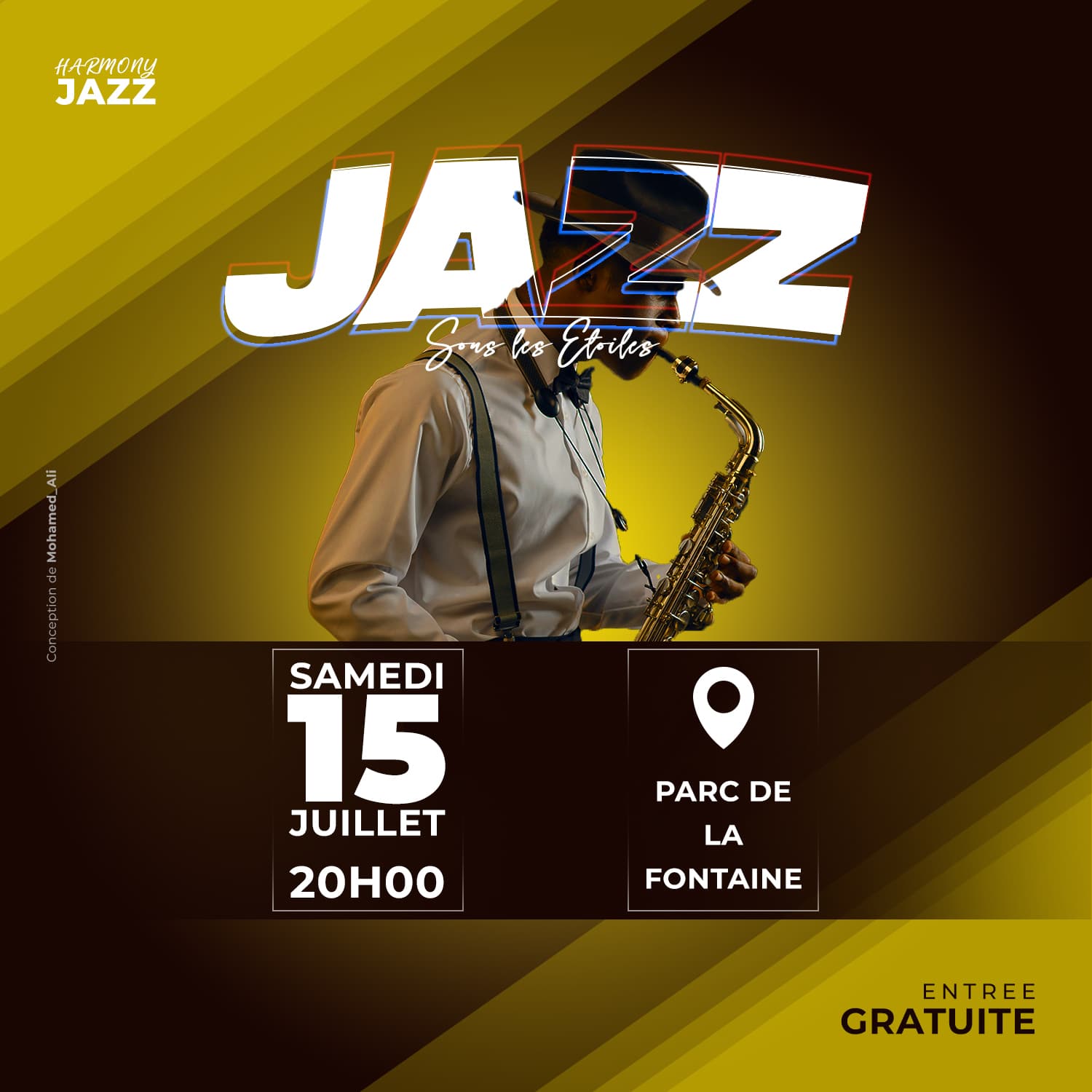
However, I’d be very hesitant to place typography over someone’s head — especially their face. You’ve outlined the first Z to make the saxophonist’s face visible, but if it were me, I would avoid the problem altogether.
How about moving the dark horizontal bar, its contents, and the musician down a little? Then, raising the word JAZZ and the line of type beneath it up above the musician’s head. You could run that line of script over his hair, but I would avoid covering his face. Faces are important, and when they’re covered, it sends the wrong signal unless it’s purposefully done as a design element to intentionally convey a message of some kind.
Thanks for the feedback. By looking again, it clearly appears that covering his face is wrong. Thanks again.
Also, the sax person’s photo needs to be lighter.
Not being a French speaker and with no background information, it is hard to give a relevant critique. So I will make two comments—one you can take with a grain of salt, the other you can not.
First comment, the diagonal stripes don’t feel “jazz” to me. I’m not sure what music genre they telegraph, but it doesn’t feel jazz. I think you should draw inspiration from old Blue Note album covers, That’s the comment you can take with a grain of salt as I am not sure of the style of jazz, your target market, the venue, etc.
Second comment, if you have a script or handwriting style font that isn’t specifically designed as an all caps font, don’t set it in all caps. I’m lookin’ at you “HARMONY.”
Okay, thanks for the suggestion.
When I was working on it, I didn’t even notice the fact that I wrote HARMONY instead of Harmony. Thank you for the remark. Maybe using another typeface could work too.
For the lines, my intention wasn’t to make the design feel jazz, but to give a sense of energy, movement and fun altogether. That’s also why I used yellow as the main color.
Your composition is solid but my biggest complaint would be the subtitle covering the face. The relationship between the musician and the saxaphone is pretty well realized with just JAZZ, but the subtitle is getting in the way a bit. Maybe it’s possible to place the subtitle above JAZZ instead? Also, I’d give some room for the borders of the date/time. Looks a little too tight at the moment. Overall, relatively impressive!