Please tell if I am executing the design principles here.
Here is some of the brief:
Who are you known as?
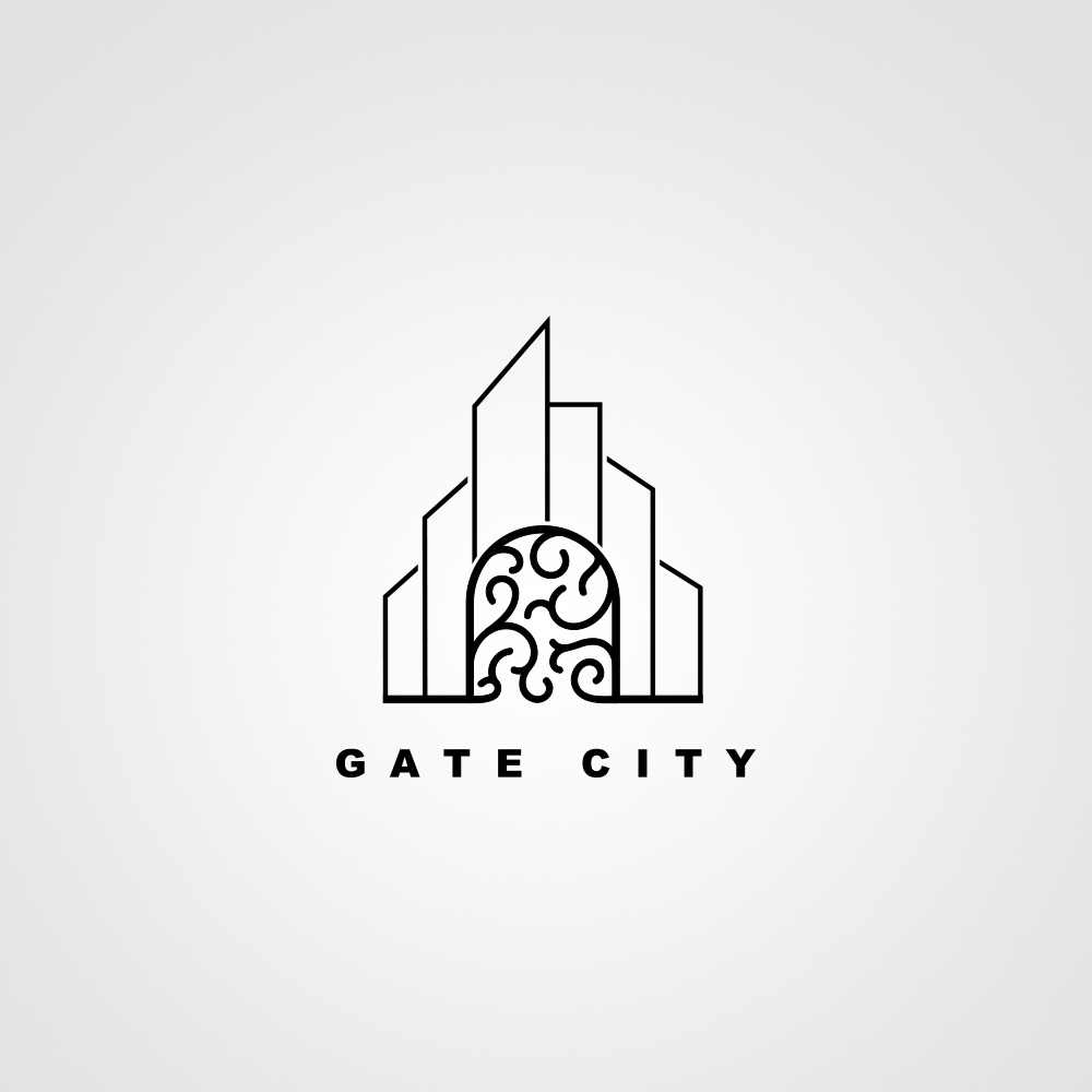
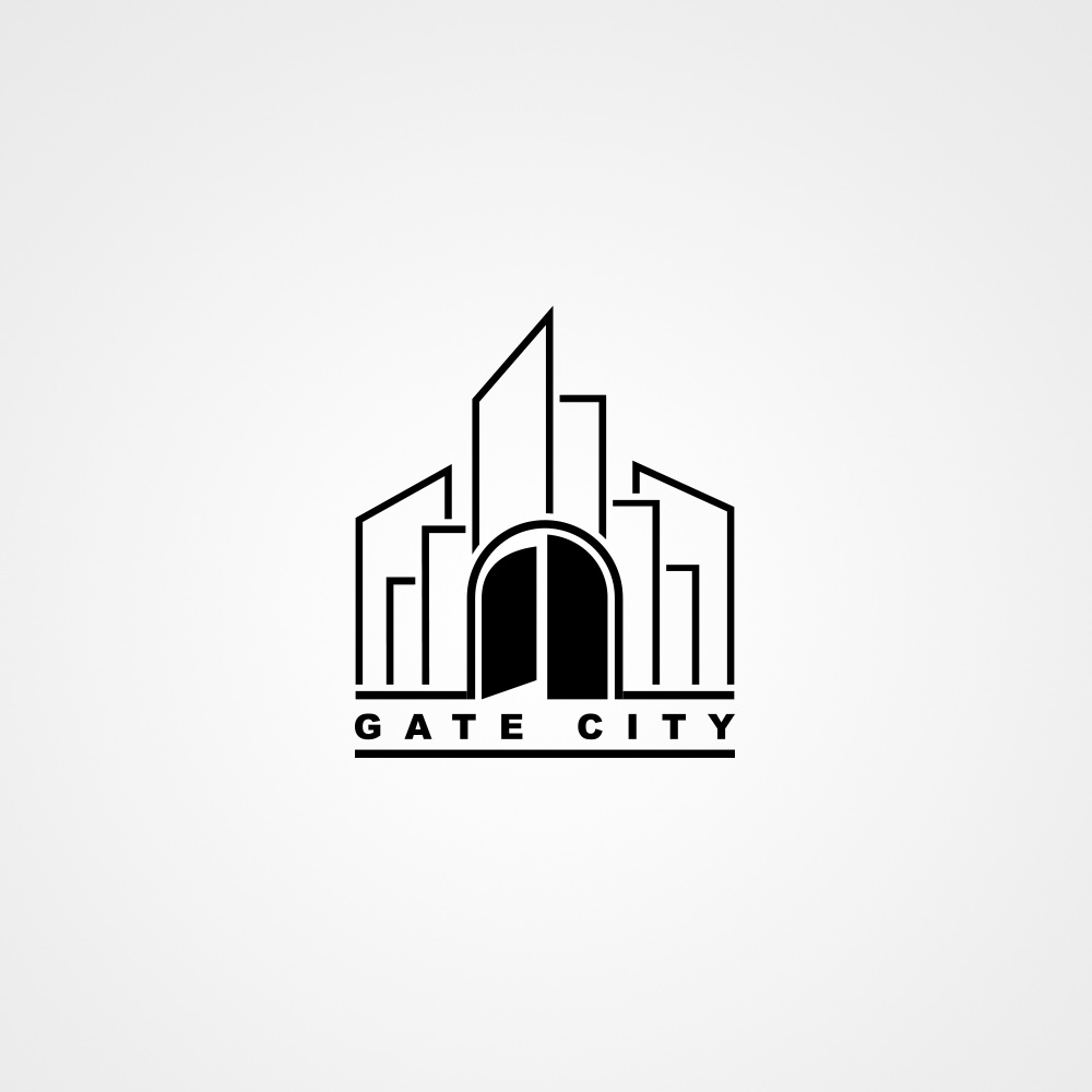
Gate City
Tell us a bit about who you are and the people you reach?
We are sports agents that manage and guide the careers and lifestyles of professional athletes
The line widths of the gate and the typography are the same, yet the weight of the lines in the structure surrounding the gate are lighter. I’d be inclined to make the line weights the same or experiment around with those weights a little more. They just don’t seem to complement each other.
The small breaks or gaps between the lines are uncomfortably small and are on the verge of disappearing. I’d either make those gaps larger or remove them altogether.
Architectural themes in logos typically mimic the actual architecture associated with what the logo represents. I don’t know what gate city is, but is it a city? Does it have a gate? Does it resemble what you’ve drawn?
I’m wondering how your gate would open if it were real. Is it a two-door gate that somehow opens in the middle or is it a single gate that opens from the side? It just seems a bit structurally unsound and unusual for either. So why is this important? I’m not sure that it is, but since it was one of the first things that crossed my mind, I’m wondering if others will wonder similar things about the gate. If so, the structure of the gate and how it works is likely an unwanted distraction.
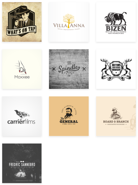
Despite these things, I do like the concept, its simplicity and what you’ve done with it. I think it’s just a matter of refining what you have. I’m having a little trouble interpreting the brief, but if the examples are things the client likes, and if the slider bars represent qualities the logo should have, I think you’re likely hitting the essentials.
Yes you are right about the examples and the slider bars, They are what the client likes. I got what you mean about the city, The logo is not related to a specific city, But it’s just a name for a sport agency (As the client’s brief). I will try to make changes around the lines and the gate as you mentioned, I will submit the changes for you to see them. Thanks!
I’m not sure you intended to do so, but the lighter line weights for the “city” give it a bit of atmospheric perspective. Rather than make all the line weights the same, I’d experiment more along that line of thought. Just don’t make the city lines so ethereal that they vanish.
But.
This logo you’ve created is a literal translation of the two words Gate City. Your logo has absolutely nothing to relate to an agency that manages professional athletes, ie provides them a a gateway to enter the pro world.
I’m not saying add more elements. Perhaps this whole thing needs a re-think.
Yes for one of them, I am trying to improve myself, I know they are not effective but I am working on getting clients outside of them. I intended to make the lines lighter so the city seems far from the gate but I am improving them. I know that this has nothing to do with sports (although management is far from sports) but that’s what the brief said. I think it’s a good think to different sometimes. I will submit the refined version to see.
Here’s another observation.
Your concept looks nothing like the logo examples given. Most of those are woodcut illustrative and involve a badge or shield motif.