Hi guys I hope you are having an amazing day.
I am working on a logo for a client who is a beat maker and music producer. He wanted me to make the word ‘ELITE’ as a diamond and the word ‘eliteonthebeat’ underneath it. I made him this logo but he told me he liked it but there’s something could be better. He wants me to play more with the inner part ‘LIT’ and make it little bit different from the outer diamond ‘EE’. I told him this is good for you a music producer. The more simple the better. What do you think? and What should I tell him or consult him about what he needs rather that what he wants? What would you do? Thanks!
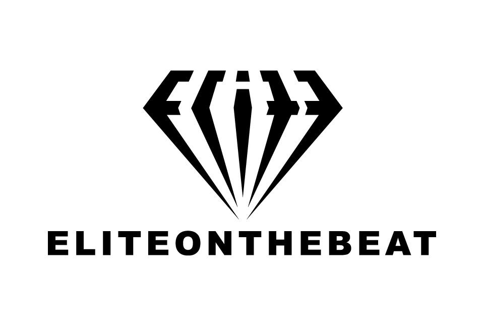
I suppose he has a reason for wanting LIT set apart? Anyway, I don’t think it makes much difference since ELITE is pretty much unreadable and basically just an abstract diamond shape. I like the abstract diamond shape though and would hate to see it degraded.
Also, kind of a boring font and type treatment for a beat maker and music producer.
2 Likes
I don’t know what he might mean by making the LIT different from the two E’s on the ends. If you make them different, you run the risk of compromising the diamond shape. Then again, like I said, I’m unsure what he’s seeing or suggesting.
Is the name supposed to be run together like that? If that’s the name, you don’t have much control over it, but it’s awkward. Like Praxis, I’m thinking the typography might be off. It’s a nice typeface, but considering the company, it might benefit from looking more cool than corporate.
1 Like
What do you suggest for a font?
What should I tell him about the font?
That’s up to you, but if he’s already approved it and is focusing, instead, on making modifications to the diamond, I’d probably be inclined to just let it go as is.
1 Like
thank you so much