Preferably with pictures and a reason.
Not something I ever think about really.
I don’t think I’ve ever looked at any design piece and go “WOW” - I just don’t do it.
I appreciate nice design, but couldn’t care enough about it to start categorising best logos etc.
Sounds like a homework question.
Just a note to LAFS students, we ain’t doing yer homework.
1 Like
Ugh. There is no “best” . . . well, anything . . . but a logo that may have the desired effect on a particular type of person in a particular setting on a given day might be nearly invisible to another person on a different day under dissimilar conditions. You might hear your inner voice say “that’s the best one I’ve ever seen” about a logo or anything, but it’s only a moment of personal reflex, entirely meaningless outside your own sphere of consciousness, and even inside that sphere, its significance is woefully fragile.
The heavy lifting and transport company Mammoet has one of my favorite logos:
https://upload.wikimedia.org/wikipedia/de/thumb/5/58/Mammoet_logo.svg/2000px-Mammoet_logo.svg.png
I love it because it is a rare example of a global industrial brand that has a logo with a double meaning (an “M” and a mammoth), and also because the brand name and logo just really fit the application - a powerful giant beast that can lift up anything in its way.
Here are some pictures of the Mammoets in action:


https://www.mammoet.com/siteassets/sir-refinery/referral-sir-refinery.jpg
1 Like
There is no “best” logo. There are favourite logos, though.
I can’t say I have a favorite logo. And I’m so jaded there are no Best logos.
There is a great variety of logos. Some are simple, some are too complex but all are fulfilling their function at their own site. Every firm designs a logo for a particular purpose, that is, the logo is a symbol that can reflect your themes and functions.
If a logo is accomplishing the purpose for which it was designed, I would consider it a best logo.
Cheers
Of course there’s no objectively best-logo-ever, but we can narrow down some of our favourites. So show us what ya got! ![]()
Out of those, I can see why you’d possibly include Coca-Cola, Apple, Nike and Chanel in the conversation about the best logo ever - but the rest, naaah!!!
Your opinion.
Of course it’s just that - an opinion - as the whole topic is subjective. But on all of the above I can make my case, why I’d think so.
Coca-Cola: The script design is just lovely and timeless. And kudos goes to them for keeping this mark throughout the ages, while others like Pepsi reworked their brands to follow trends. Granted, Coca-Cola gets a big “fame bump” in my rating, and there are other script logos I find more appealing.
Apple: Derived from the apple that struck Isaac Newton, it works as a symbol of breakthrough ideas turned to life. The fruit is refreshingly different from other technology brands. And the way they refined the design of the apple over time also reflects the design language of the products they sell.
Nike: The swoosh is a remarkably simple and striking symbol of speed and power. It work especially well on the sneakers, but also on their other products. Other sports apparel brands got pretty good branding too, like Adidas with their three stripes, but their logos are not as nice.
Chanel: My wife has probably brainwashed me on this, but I find the Chanel logo the best luxury brand logo around. It makes it look like black-and-white are the only colours you ever need and the ambigram CC looks gorgeous from every angle.
Again, your opinion. Stripe is actually the name given to the logo on a shoe. But I doubt it has connotations in the origins, other than other shoe makers refer to it as three stripes.
again, your opinion.
Again, your opinion. And you refer to brand here, not logo. The logo is shite.
And Nike logo. It is a wing of Godess Nike. Also known as swoosh.
And sick to death of talking about this logo. It is boring.
I would also argue that the Coca Cola logo is not that great, as an example of well-executed lettering. For starters, the swashes are somewhat unbalanced, to say the least. It is just imbued with all the homespun, apple pie associations coke have been pinning to it for years. This is its brilliance, rather than any direct aesthetic elegance.
That’s the point of branding, after all. In this regard, it is extremely successful. The company effectively peddles an – allegedly – super-unhealthy, sugar-laden beverage and as a company, its track record of denuding villages of their water supplies around the world is not exactly glowing.
Yet as soon as we see it, we all see Norman Rockwell paintings and endless, warm, sunny days spent with old friends, family and loyal dogs.
A great exercise in branding? For sure. A good piece of design? Subjective and dubious. A great example of the power of design? Of course. A fantastic example of how that power Is often abused to sell us ethically-nebulous, resource-hungry stuff we don’t actually need, or is even detrimental to our health on a breath-taking scale for shareholders whilst having us believe that it’s still a wholesome cottage industry. Definitely. Unbeatable.
I have singled out coke here, but similar sentiments are true for quite a few of those logos.
1 Like
Compared to the Art Nouveau logo they used in 1890, the current script is pretty good.
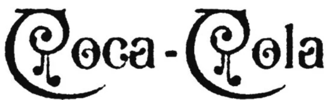
I think the more familiar Coca-Cola script is very nicely drawn and balanced, but I’m unsure if that’s due to its ubiquity and familiarity or because it really is good. It’s one of the most recognizable logos in the world, if not the most recognizable, but I suspect if I saw it for the first time today, I might not like it. It’s certainly a logo that transcends time and passing styles.
Ouch. Suddenly, a couple of off-kilter swashes don’t seem quite so heinous!
https://i.imgur.com/iB5xwIJ.gif
As I said, the whole topic is subjective - I’m just saying that out of the picture you posted, those would be some logos that I can see being included in the conversation about the “best logo ever”. The other logos (LEGO, Subway, Ben & Jerry’s, …), not so much.
Anyway, what are some of your favorites that you feel are better?
1 Like
I don’t think you understand what I’m saying. Just because you don’t think they are the best logos ever, doesn’t mean that someone else thinks they are.
My point is that it’s subjective, and there is no answer.
Whether you think they are not great - makes no odds to the conversation. It’s your opinion. And that’s the point.
That exactly what I’m saying too!
There’s no universal answer, no “objectively” best logo - Yes!
But each of us have some personal favourites, don’t you?