This is for a well established Wiccan School with over 102,000 subscribers. Any thoughts or input would be greatly appreciated. They aren’t sure which cover to use as well.
It depends. What’s the audience? 102k subscribers isn’t gonna cut it.
What’s their age?
What are their expectations from the book?
Why do they need this book?
What may stop them from buying it?
How should they feel when they “interact” with the book?
Are you going to run ads for it?
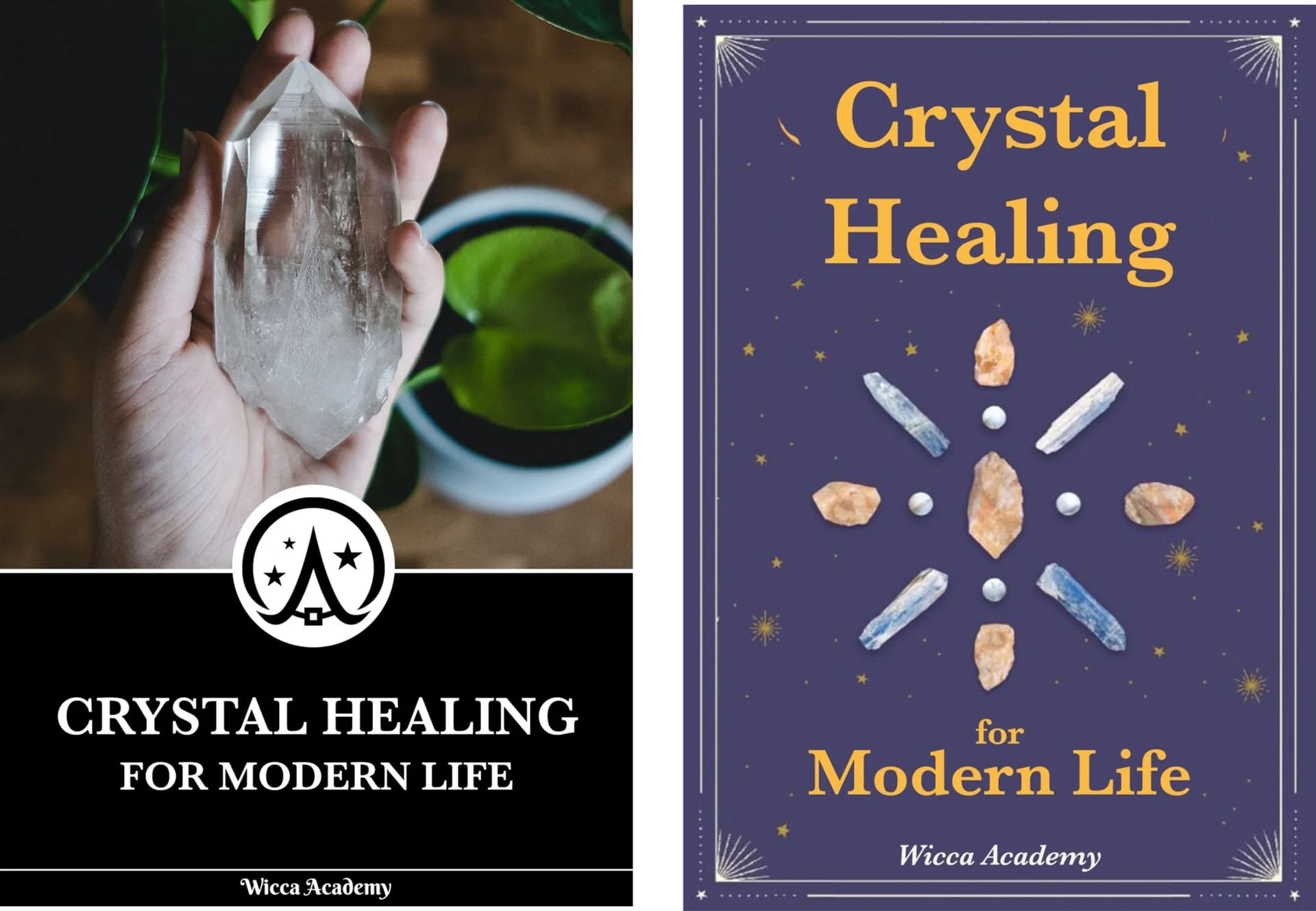
Without any info, 2nd one is good, but the 1st one could be more attractive for some because it’s simpler to understand what’s going on (1st one would work better if you’re running Fb ads)
I agree with @dramaviking that deciding which is best depends on the target audience and the objective.
The first book looks a bit more commercial and mainstream. It might be best if the goal is to appeal more to a general audience that isn’t necessarily already involved with the subject matter.
The second book seems more handmade and what I might more closely associate with Wiccan or occult subject matter. This appearance might make it seem more authentic and appealing to a Wiccan-familiar audience. I’m not sure how that audience differs from those interested in crystals and alternative medicine. I assume there’s some overlap, but how large it is, I don’t know.
I’m certainly not the audience and have no interest in the subject, so take my analysis with a grain of salt. However, these are the sorts of criteria that you probably need to use to judge the cover — it’s not just about aesthetics.
From a practical production standpoint, I suggest moving the publisher’s name and the lines near the edges of the books a bit further away from the edges. As they are, they’re butting right up against the safety margins. A trim that’s a little off in one direction or another will be noticeable.
1 Like
Just on visual alone, I prefer the second version.
To me, the first one implies “massage therapy” ![]()
I feel like the first one is for an older-ish audience while the 2nd one is for a younger audience.
I don’t understand the design choices here.
1 has the Wicca Academy logo applied - the other doesn’t.
1 has the Wicca Academy in the correct font according to their logo and the other doesn’t.
The C in Crystal looks like G - ever so slightly.
If it’s going to be for the Wicca Academy then the correct font and logo should be applied.
What makes this book the ‘must have book for Wicca’?
Looking at other Wicca Covers
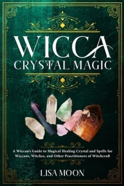
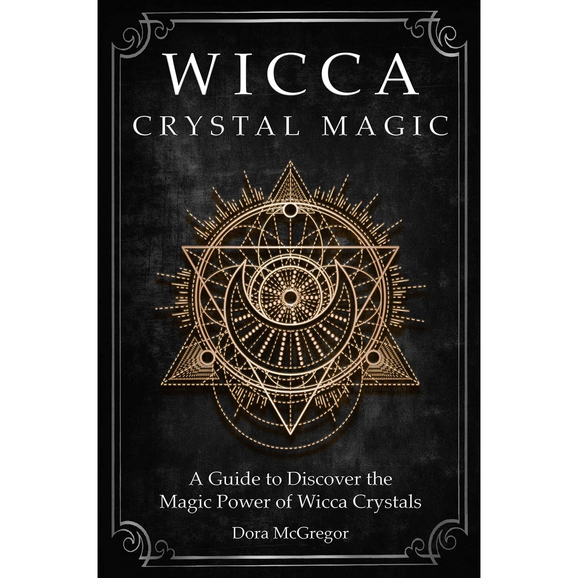
Seems like these have eye catching reasons on the front cover as to why I want these.
And they look far more impressive.
As for how they look compared to each other and which is better?
I have no idea - the one on the left looks like an Cook Book or Recipes or something.
The one on the right looks like it’s aimed at someone starting out.
What is modern life anyway?
Both book covers have issues. Neither are attractive enough.
And sat on a shelf beside other Crystal Books you’d have your work cut out.
I’d be going for the fancier looking intricate covers.
Both covers are good - but have gaping flaws.
If you’re not sure which to use - and neither is standing out - start again.
The difference is too contrasting - clearly there’s no vision on the strategy for selling the book otherwise the cover designs would be similar.
1 Like