Hi, I’ve created a logo for a new classic sailing business starting in Edinburgh. The boat is called Bucephalus, named after Alexander the Greats black stallion horse. I need help in deciding whether to keep the logo entirely black like the horse and also like a knight chess piece or Royal blue or Navy like the Scottish flag and also a traditional nautical colour? I am creating PVC banners for the sides of the boat and a flag for the mast.


Since your boat motif seems to include blue, I’d go with blue. Just be careful when you get it printed that you don’t select something that looks like a nice blue on your monitor, but prints a dark navy.
Blues can be tricky.
If you use a dark blue it will likely look black.
With the mast flag, realize that a double-sided print is made in one of two ways.
If a conventional sign printer does it, it will likely be two pieces of fabric stitched together with a light-blocking liner (three layers of fabric.) This can tend to look sloppy and less flag-like unless the wind is blowing pretty stiff. The one advantage is…your design will be right reading on both sides.
If you get a proper flag, an acid dyed one on a single layer of fabric (highly recommended,) one side will be right-reading, the other reversed. I’d leave the text off and just go with the logo if you go that route. Some sign printers will use a fabric called light flag that appears to print on both sides, but one side will be slightly lighter in color as the inks don’t always go quite all the way through. Again, your design will be reversed on one side.
1 Like
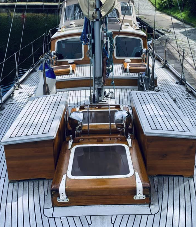
BTW, that’s a
NICE BOAT!!!
1 Like
I like the one with blue color, It’s really amazing!
1 Like
Thanks so much for your advice…really appreciate it! ![]()
Blue is more suited in my opinion as well. ![]()
2 Likes