Wont’ say which one my client likes, but I’m curious what the consensus is here.
All look the same to me.
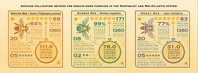
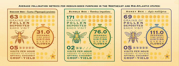
Number 3, I think. It has better contrast in terms of colour and font style. Makes the infographic look less busy.
The one with the right information?
The squash bee and honey bee info is switched up.
Actually, quite a lot of the info is messed up - which is concerning since this is supposed to be an infographic…
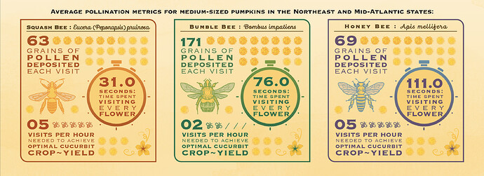
I would go with the bottom one for legibility and layout, mostly cuz insect exhibits display bees in the upright position, not sideways and that’s what I’m used to seeing. But no accounting for the vagaries of clients wanting to “be different.”
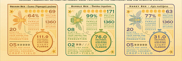
The first two have more information. The bee color is different on #2 and #4.
Haha, oh SHIT, that’s what happens when you work late. Thanks for the noticing the info swap.
FYI – bottom is my preference also.
Aren’t you glad that it was @PrintDriver who spotted that, and not the client?
Plus you don’t need the duplicate information in the first two,
visits in 4 hours vs visits in one hour.
UNLESS, a squash only has a 4-hour window for flower pollination, in which case that is more important.
Wait’ll I send the bill. ![]()
I’m going with 4. I like the toned down insects with the bold, legible typesetting
They’re the exact same, design wise.
I’d probably choose the first one — not because of the aesthetics, but because it contains the most information and doesn’t confuse me with all the pollen grains that don’t add up to the figures cited. I also like the darker bees that stand out a little better.
I’m skeptical of some of the figure in the infographic, but I’m guessing they were given to you. We have fruit trees and lots of flowers in our yard. For fun, I also raise mason bees each spring. I’ve never seen any bee of any species spend 111 seconds on a single flower. In your visitation numbers, why are you using decimal points when all that’s listed are whole numbers — 111.0 seconds as opposed to just 111 seconds? Finally, it says, “time spend visiting every flower.” Shouldn’t it read “visiting each flower”? Visiting every flower would seem impossible unless there are only a handful of flowers to visit.
They’re really cool graphics though, and I love how you’ve justified the lines of type using different sizes and weights of text. I never would have thought to do that since my gut instinct would have told me that it wouldn’t work. You made it work, though, and it looks great.
And as my icon might suggest, I just sort of like bees anyway.
Would say #3 due to contrast and the orientation of the bees - however took me a minute to find the names of each bee, which could suggest a legibility issue.
I suppose too, it’s all about context. Where is this going? In a magazine? Website? On a phenolic graphic panel outdoors in a garden area? Who is the visitor? Is the infographic a hook that leads into a deeper dive? All of those things would affect the brevity and scope of information presented.
I like the last one for it’s brevity and contrast. I like the first one for info and contrast, but it still is clunky in it’s verbiage. You may not have control over that, but it looks like you might if the bottom two are acceptable trims.
Aren’t you glad that it was @PrintDriver who spotted that, and not the client?
To be fair, they’ve seen the digital proof 10,000 times and didn’t catch it.
Thanks for the feedback! I agree about “each” vs “every” and will check with them on that wording. All data was given to me by the client and I did see the source material (scientific study). They were adamant about the pollen grains. I fell in love with bees during this project. It’s awesome you raise them.
We all agreed on #4 in the end. It’s a booklet for the general public (generally…haha). Originally they wanted all of the data in the first set included, but that changed throughout the process and we whittled it down to three facts.
Sorry, didn’t mean to include my reply to someone else there.
Eh, no worries. I have notifications turned off, LOL!
Kinda makes me wonder about some of the information floating around out there. LOL
They didn’t catch that transposed text but were concerned about the pollen grains?
Scary.


