Hi There, please give me your comments on what you think about these 2 examples. I personally think both look good, but just can’t decide which one is better.
I accept every criticism.
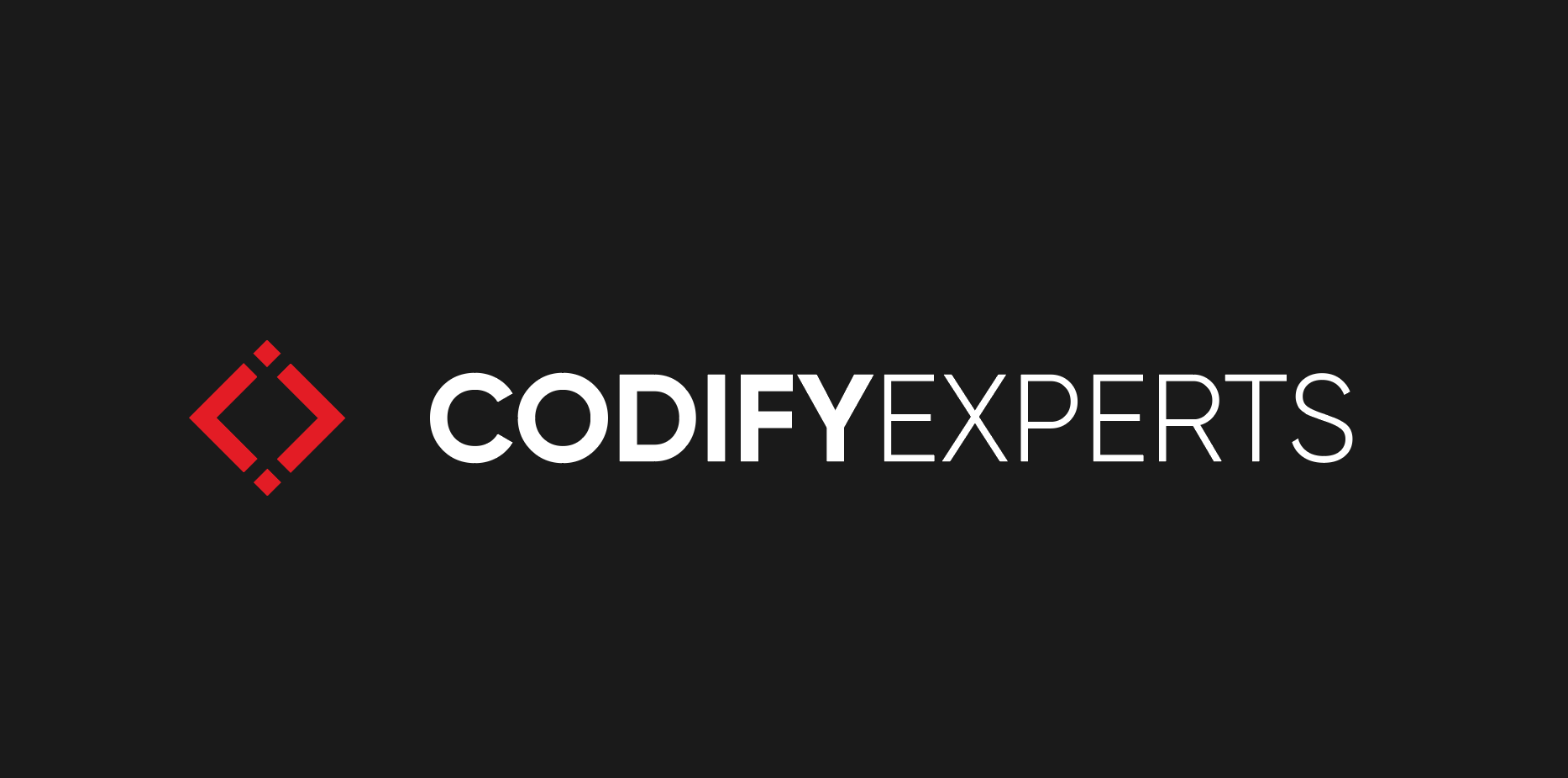
Which logo is better?
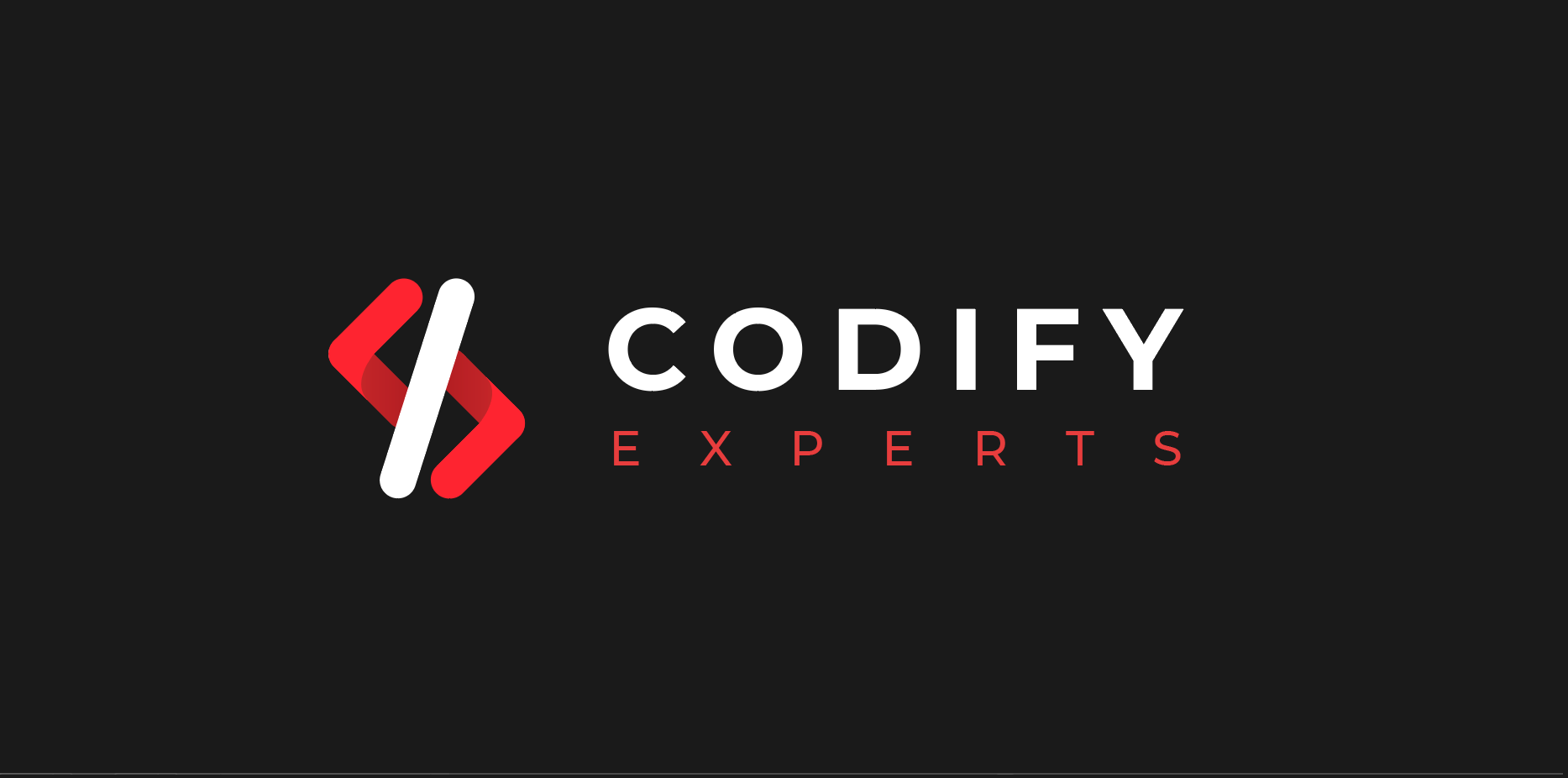
Or, which change should you suggest?
Business Type: Web Development
Business Name: Codify Experts
Thanks for the response! appreciate it. I am a little more for the first one too.
About the brief, not many details are available though.
It’s just a new web development company for custom solutions. Mainly working for Theme customizations and stuff.
As you probably get it, for the first logo, it represents the < > coding characters and : as well( ; is more used in coding but it doesn’t look that good so : looks better)
Going only on aesthetics, the second one is a little awkward. I like the first example a bit better. I’m assuming the logo is independent of the logotype and that you would supply two or three different configuration lockups.
One oddity is the size relationship between the logo and the logotype. The former seems a little small in relationship to the latter. On the other hand, that unusual size differential does supply some tension, which is sort of nice.
With the information given, I like number one better. The sharp edges on the icon better compliment the sharp edges on the text, which goes well with the characteristics often associated with coding and other computer sciences. The rounded edges on the second one come across as soft, and in the context of computer coding this kind of reads as not-sharp, or imprecise.
Other than that, I’d point out that you’d want to manually adjust the kerning and/or tracking on the bottom line if you stack the text like in part two - the Y and S are both objectively aligned together on the right, but the way the whitespace in the Y character plays out, it looks imbalanced.
Well… they joined the site back in 2020 and posted a similar thing for their own logo.
They have a portfolio through their linked in page - links directly to a crowdsourcing site…
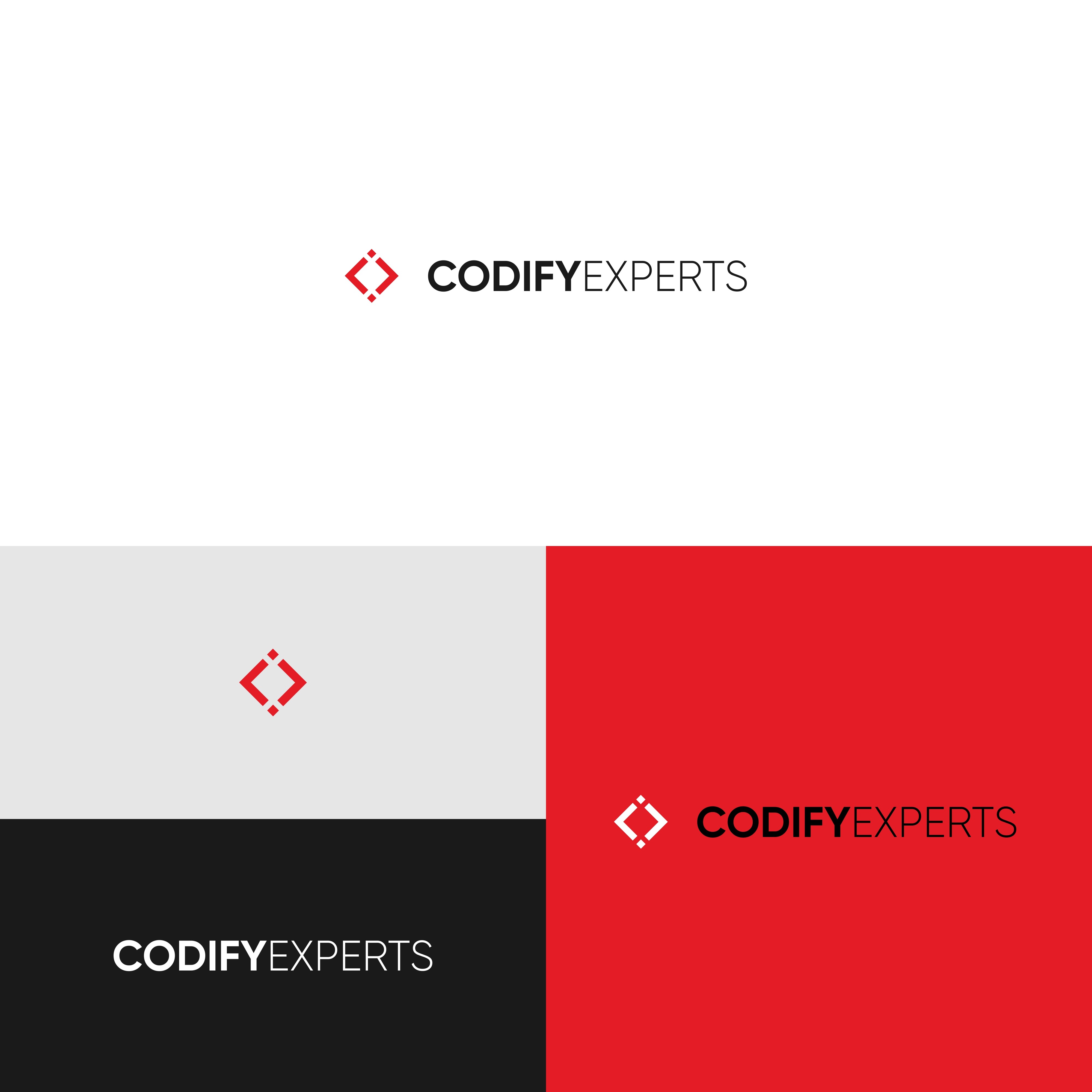
Think the first one is better. It is direct, especially on font arrangement. I feel though that, there is not much representation, or maybe, let me call it, a much clear symbological representation of what the business deals in, and, I do appreciate, though, that the name of the company does, to some extent try to represent that.