Hello Im doing market research. Please tell me which logo you like the most out of these 3. These are the logos of autoservice companies from Georgia (country). I would greatly appreciate if you kindly will give me some feedback.


Maybe give us more context? More information about why you’re asking?
1 Like
Did you design these logos?
I ask because we have a policy against critiquing other designers work without their consent or participation. See our forum rules here.
1 Like
Best for what?
There is no “best”.
Surely without a lot more context, one couldn’t even say what is good or bad about any of them.
Best purely based on the aesthetics. aesthetically which one is the best.
I don’t like any of them, but if I was forced to choose, the second is the cleanest.
1 Like
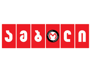
first one !! spot on!! reason?? its has a bright catchy color!! no too much colours which will create chaos! it fills every criteria for a modern wordmark! though it does not have an english translation its regional language shapes themselves are iconic and clean like a logo!!
As Pan asked earlier - did you design these logos? We do not allow crit of logos done by anyone but the person posting them.
Hello, first off, I will say that I am a student, not a professional. But, here are my thoughts based off of what I’ve learned about logos:
I would have to say that I like the 1st logo because I like the concept the most.
The second logo, to me, doesn’t seem to have much of a concept and is a little too bland for me.
I don’t quite understand the concept for the 3rd logo, I don’t see how it ties in with autoservice, but maybe part of that is because it is in a different language.
Lastly, although I do like the 1st logo the most, I have to say that all of the logos appear to be a little too busy. The 1st one has really tiny type in addition to the main word in the logo (which I presume is the name of the company). The 2nd one just has a lot of words in general, and the 3rd has quite a few graphic elements in them that seem to crowd each other out. This presents a problem because it makes it difficult for the logo to be used in multiple settings, such as on a business card, or in letterhead. Good logos are designed so that they can be used on something as small as postage stamp but can also be seen quickly and easily on a billboard. I don’t see any of these logos fitting well on a postage stamp, and they are too busy to be quickly seen/read by a driver glancing at a billboard.
I would pull a few items out of the first logo to simplify it, and then you’re good to go.