Which of these Stylescapes would you choose?

Our agency is going through a rebranding process, and following several strategy sessions we’ve produced two stylescapes.


For context, here’s a brief overview of our strategy:

  • Our brand (Snap) is a blend of Hero(70%) and Everyman(30%) archetypes, positioning itself as bold strategic and results-driven creative partner.

  • We target entrepreneurs that value high efficiency, high standards, and clear ROI, while balancing professional growth with personal time. Snap’s tone is direct, engaging, and impactful, cutting through complexity without being intimidating.

  • The agency prioritises clarity, simplicity, and strategic boldness, ensuring clients feel both empowered and supported.

  • Our fears include overcomplicating things or failing to meet expectations, so the messaging needs to be sharp, result-focused, and approachable - balancing professionalism with warmth.


Stylescapes are below, It would be great to hear feedback from you all!

Stylescape 1

Stylescape 2

1 Like

Hey @maximus1987, I think stylescape 2 is a better balance of professionalism and warmth and better meets the factors in the brief and brand strategy.

With stylescape 1, the color choices feel quite loud and dynamic, which feels less warm and approachable. Although the font choices and bold use of type feel professional and sharp, they feel more cold than warm. Also, it’s more graphic based, which makes it feel less personal and approachable.

With stylescape 2, the serif supporting font lends a professional feel while providing a soft contrast to the bold, sharp logo and sans-serif heading fonts, which provides a sense of warmth alongside the professional feel. Being more image focused gives off a more approachable, personal feel and the clean, clear style of the images provides a sense of professionalism, clarity, and being results-focused. The limited use of colors, as well as them being lighter tones, and the rounded, less rigid and grid-like nature of the graphics adds to the simplicity, warmth, and approachability factors.

Hope this feedback helps!

The first is very chaotic and basically incoherent.
The second is channeling every magazine ad from the 1960s or maybe early 70s.
Not sure either is your intent.

Perhaps you haven’t given us enough context about what these layouts are, what they’re intended to accomplish, where they will appear, or who your potential clients are. You mentioned an agency, but there’s little in the work to suggest that to someone who did’t already know.

@Just-B I believe that they are essentially what we might call mood boards. I don’t believe they are meant to be an actual layout for an actual deliverable.

I was on my smartphone earlier today and couldn’t type fast enough to fully explain myself.

I’ve always had reservations about stylescapes and moodboards, but they’re sometimes useful to gauge clients’ gut feelings when clients aren’t articulate enough to explain visual likes, dislikes, and the reasons for them.

However, when I see a moldboard, it’s a bit like judging the desirability of an automobile by seeing only what it looks like or judging how a cake might taste by only seeing a photo.

The majority of qualities that provide a full picture are the things that I previously mentioned, which are missing.

Although I like the 2nd stylescape better because it’s less cluttered, I have no idea how either might be developed, who will see them, why the desired brand goals were chosen, who the desired target audience might be, or the type of clientele the agency currently services.

As for the “Hero(70%) and Everyman(30%) archetypes,” I don’t see this ratio in the work. Instead, I read ad agency jargon that’s supposed to give substance to something but fails to follow through because the terms are too vague.

Ask a group of designers on a design forum which is best without supplying other relevant information, and it will likely result in a lopsided vote for which is best looking rather than which will work best if a more complete set of the relevant variables had been known.

Well said, that man.

The minute I see any sort of mood board – unless it is for interior design, et al – I have a strong compunction to yawn. For me, they are pretty meaningless marketing spiel, bordering on self-aggrandisement. It’s never going to replace thorough, in-depth and clear communication with your client – after all, clarity of communication is supposed to be what we do best.

To the OP, option 2 is prettier – though I’m never a fan of jaunty type at random angles, unless in kids’ books – but more than that, I cannot say.

I’m not having a pop at you personally, but, for me, terms like ‘hero’ and ‘everyman’ evoke the same slightly, bile-inducing reaction as mood boards. They feel more like obfuscating business jargon than actual clarity. Blue-sky thinking, team-player, etc – or perhaps, I’ve just been doing this long enough that I’ve become incredibly jaded.

@sprout , @Just-B , @efmgdesign Thanks for the feedback—really appreciate your insights!

Designing for clients is one thing, but designing for ourselves as an agency is a whole different challenge. It’s always tricky to step back and see things objectively when we’re both the creators and the client.

On the brand archetypes, I totally get that they might not be everyone’s cup of tea. As a designer myself, they’re not necessarily my primary framework either, but the strategy was developed by our team of marketers and brand strategists. Our role was to translate that into a visual direction as faithfully as possible. So while some of the terminology might feel like “marketing speak,” the intent was to build a brand identity that aligns with the positioning they’ve defined.

A few have mentioned that more context would help—which is a fair point, but I imagine you may not want to read the full strategy document. These stylescapes are meant to act as a visual foundation/creative direction for how we present ourselves across various touch points, from web and social to client presentations. The goal is to balance bold, strategic confidence “Hero” with an approachable, results-driven feel “Everyman” to resonate with entrepreneurs looking for a creative partner who can deliver impact without too much heavy complicated jargon.

As a relatively young agency, we feel our current brand isn’t perceived as particularly professional by larger corporate companies. Being based on an offshore island, where the predominant industry is offshore finance, we’re aiming to attract clients in this sector as well as high net-worth business owners. These businesses typically have in-house marketing teams searching for agencies that speak their language, which is why our strategy has been developed to reflect this. But we also don’t want to lose our current clientele, or alienate ourselves from from the more creative projects.

Again, really appreciate the time and feedback! Open to any further thoughts

Given the extra information about financial services sector, sorry, but I’d say neither have the right feel.

I cut my teeth in design for the financial sector, designing Annual Report and Accounts, bid documents, etc, etc. Granted it was a two or three decades ago now, but the financial sector, I can’t image, is all that changed. I worked, at the time, for a well-known agency based in the City of London and we dealt with many of large City banks and institutions. Largely speaking, their idea of bohemian was a purple silk lining in a pin-stripe suit.

Their entire sector is based on market confidence, so they need to be seen as trustworthy. They liked to think they wanted their designers to be creative and innovative, but there was only so far you could take ‘left field’. They were, in turn, dealing with people investing vast sums of money and these people need to know their money is safe.

Sorry, if I am over-egging this particular point, but if it is these people you are wanting to get business from, you need to appeal to that mentality. They need to see you as an ever so slightly outré version of themselves. Anything too whacky will have them running for the hills. You need to be the safe option who can talk to their clients. They liked the idea of going to offices and studio spaces that were nothing like theirs and were exciting and different, but the public face of their designer’s brand needed to be far more conservative – again this is just my experience and it is ‘back in the day’. The Thatcher years, when the City was about as conspicuously bullish as it gets. Pin-stripes, Porsches and Bolly.

The retail financial market can be a little more free with ‘bright and colourful’, but the financial markets themselves don’t really do whacky – and by whacky, I mean, not pin-striped.

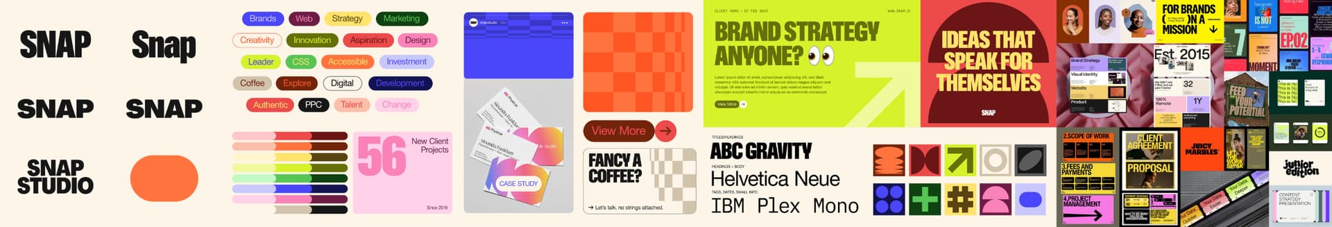
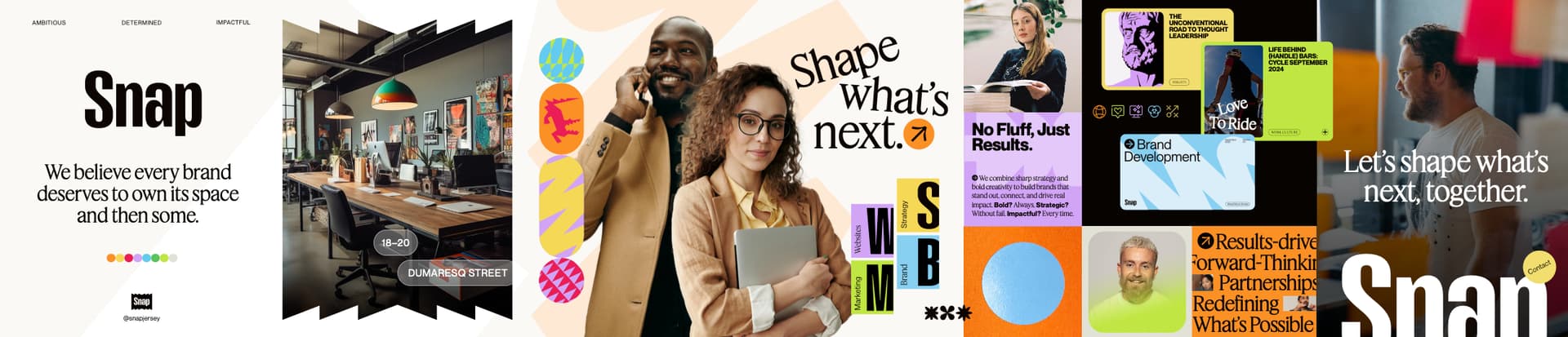
I had a quick look at your existing site. Honestly, with some refinement and sleek polish, I’d say where you are now is closer to where I’d position myself to speak to financial boardrooms. Your mood boards feel all too consumer, retail, customer-facing. A bit too chummy ‘everyman’. Shiny, happy people. In my experience, tradition, heritage and security (with red shoelaces), would carry more weight.

Remember, these are only my observations from working with the sort of people I imagine you are looking to attract. Hope it helps – for what it’s worth.

By the way, I can empathise, designing for yourself is a nightmare, which is why I still don’t have a website. Thankfully I have been lucky enough that work has come via word of mouth, but I really should have my own site. It’s been my New Year’s resolution for the last 15 to get one done. This year…!!

Like @Sprout, I looked up your agency. You’ve done some nice work.

I didn’t see any financial work, but perhaps it’s confidential, or you’re hoping to break into that market segment.

Whatever the case might be, I don’t get a financial vibe from either of the stylescapes. Those interested in offshore banking are typically high-income individuals and businesses that are looking for stability, fiduciary responsibility, tax benefits, etc. They’re not really the “everyman” or woman type of people. Their banks, motives, and concerns aren’t likely to be reassured by an agency that leans toward bright colors, trendy people, and cool-looking design.

I’m obviously not privy to your marketing people’s concerns and logic, so they might have good data to support the direction. However, as nice as the stylescapes might be, they don’t suggest high-income, high-net-worth banking, finance, or long-term stability to me — it’s an awfully conservative market segment.