Which one ? (esport mascot)

Sorry troep, but that font isn’t going to work well no matter what you do to it. None of the above.

3 Likes

do you think i need to search a orther font?

If I had to pick, I’d say the top one – only in comparison to the other two.

Your outline type treatment is questionable. No matter what you do, the font must maintain its body shape. Right now I have no idea what font it is, so create the outline to the outside of of the font.

Do fangs look this way? They seem to stand alone without outline, and therefore look like an oversight … and what of the body, with the odd shape and, once again, without outline?

Your have two shades on the face, but not the grey part. Get rid of the darker brown.

The illustration is interesting and nicely done. It’s not my kind of thing, but setting that aside, you’ve done a good job with it. A criticism I have is that it’s perfectly symmetrical, which in and of itself isn’t bad, but you might want to change a few minor things on one side to make it look like you didn’t simply flop one side to the other.

Sorry, but I have nothing good to say about the typography. As Eriskay mentioned, When type is outlined, the outline needs to be on the outside of the type and not intrude upon the type itself. I don’t know what typeface this might have originally been, but what’s there now isn’t working, and I sort of doubt that it was the right typeface to begin with.

1 Like

Did you do the illustration yourself or is it from a stock site or other source? Just curious,

Steve, this likely answers your question? The difference between what’s working and what isn’t in this illustration is so stark that it just didn’t seem to all be done by the same person. The part that works appears to be a registered Canadian trademark in Quebec.
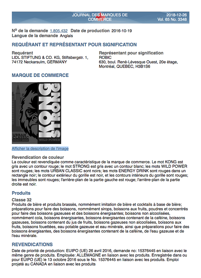
Thank you for your help full advices guys.

And yes i made the illustration but its inspirited by that energy drink but its belongs to me. first of al its drawed by me on paper and thank illustrated in illustrator

No, this illustration does not belong to you. Plain and simple, you stole the illustration. If you use this illustration, you will have committed a trademark infringement that likely exists in multiple countries. This kind of practice is unethical, illegal and could potentially lead to significant problems for yourself.

hqdefault

download

Thank you for the information so inspired things are like stolen things?

I don’t know what your esport mascot will be used for. I’m assuming it’s just a personal thing you’ll be using online for games. If it’s just that, their lawyers likely won’t come after you since it wouldn’t be worth their time. There’s no guarantee of that, though.

Even so, what you’re proposing to do is still illegal. It’s also ethically wrong. It’s definitely not something that can be categorized as inspiration. It’s plagiarism, which is stealing someone else’s work and passing it off as your own.

It doesn’t matter if you redrew it, recolored it, added things to it or removed things from it, the essence of what you’re doing is tracing, copying and stealing from someone else.

“A Whiter Shade of Pale” was inspired by Bach’s Suite No. 3. Your primate is definitely not AWSOP.

The Procol Harum song? I didn’t know that. I’m familiar with both, but never drew the connection. Interesting.

Yeah, Procol Harum is one of my life’s few obsessions. There, I gave my age away.

1 Like

So i have putted so much effort in to make this mascot and now i am thief??

Cripes, you sure did. (Brushing decomposed matter off your shoulder.)

2 Likes

As did I. :wink:

I don’t know why it isn’t obvious to you that you shouldn’t take other people’s work and copy it. The additional work you might have put into it is yours, but the gorilla illustration belongs to someone else.

Inspiration is different from what you’ve done. Inspiration is when you see something you like that sparks a new idea that is yours.

For example, even the illustration that you copied was inspired by King Kong, but it’s not King Kong — it’s a separate idea, a new illustration and a new name that contains nothing but an essence of the original. Even then, it’s likely bordering on a copyright / trademark issue. I suspect they had their lawyers look into it very carefully and, possibly, even make arrangements with the owners of the King Kong franchise before launching their product.

Now if you had seen the Kong illustration and said to yourself, “I like that.” Maybe you could have used a similar style to draw a wolf, a lion or a buffalo while incorporating some of your own ideas. That would have been something drawn from inspiration. However, simply tracing something and adding a few things of your own around the edges, is not inspiration, it’s stealing.

I dunno, but it’s awfully similar, and the fact that the original is just one half, while yours is so clearly one half -mirrored (after some odd narrowing) is a rather strong coincidence. Doesn’t look good either way.

image

Is this project for an actual client?

OMG! It is, that’s awesome.

Well, to be fair, it’s only the organ intro.

You heard of Proco Harum??!