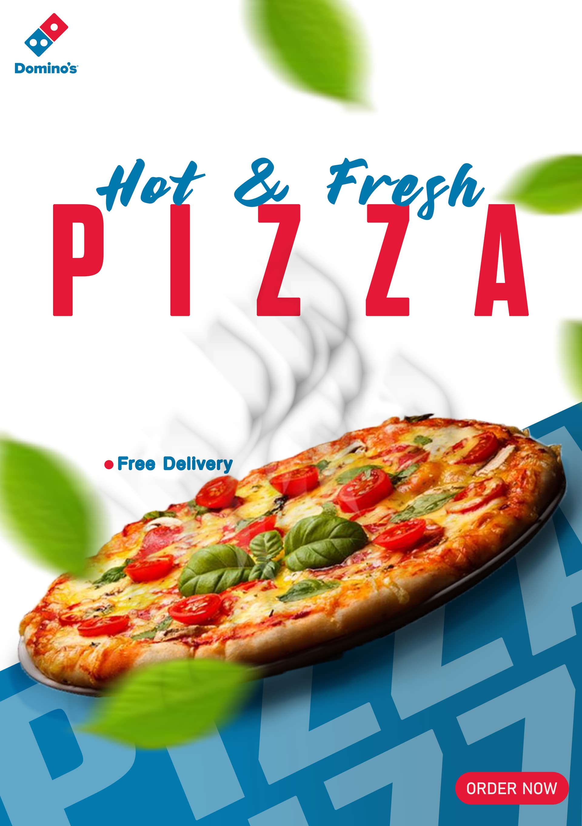
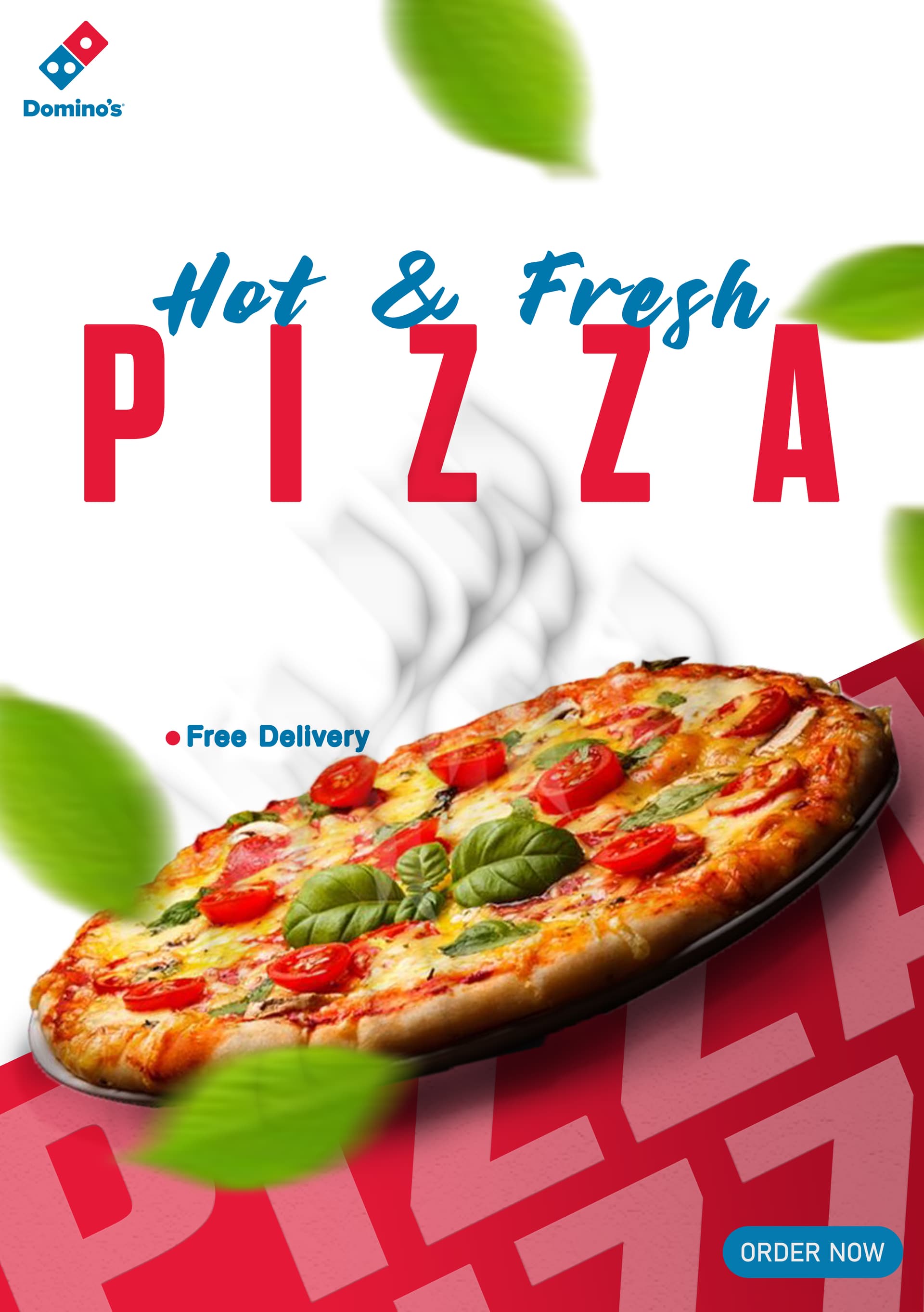
To me, the top one looks best, but are looks all you’re concerned with? Good design involves more than looks. Besides, they’re the same, except for the color change at the bottom.
I doubt Domino’s would approve this ad since it doesn’t show one of their pizzas or incorporate their branding (other than a tiny, little logo). I don’t think they offer fresh basil leaves as a topping — at least where I live. The steam isn’t very convincing.
What is this: a poster, flyer, social media image, print ad, or something else? I’m assuming it’s student work, correct? If so, I don’t know what the assignment was, so how can I possibly judge it?
Despite all that, your ad made me wish I had a tasty pizza sitting in front of me right now.
1 Like
What is “Hot & Fregh”?
2 Likes
The leaves in the lower left part of the poster draw attention to themselves and away from the pizza. Remove them altogether.
“Free Delivery” is barely visible. Make it much bigger and place it further away from the pizza.
Neither is better, they’re the same.
-
The font pairing doesn’t work, and PIZZA loses all its potential impact with such anemic tracking.
-
The blurred basil leaves are distracting, detracting, and superfluous decoration.
-
The shadow/white blobbiness in the background is unappetizing…wait, that’s steam? No it’s not.
-
Free Delivery is poorly placed, and a bullet list can’t be a single item.
-
The pie is not a Domino’s product. They offer nothing of the kind.
I assume the image of the pizza is AI generated. The tomatoes and basil look completely unreal and thus wholly unappetising.
I agree with Just-B. Without a brief, we cannot really comment on how successful It is.
Aesthetically, as it stands, I would probably pass it over or not even see it. It is not saying anything – apart from the two things delivery pizza usually isn’t. Hot, or fresh. It certainly doesn’t make me want to buy one.
I spent too long in Italy to be fooled by what the pizza chains elect to call pizza.
Isn’t it pretty bad when AI generates an image that looks better than the thing that comes in the box?
My grandpa would make real Eyetalian pizza (his pronunciation, LOL!) I sure do miss that. Weelllll, maybe not so much the mushrooms from the back woods, but mine still pales in comparison.
Since you appear to be a student, I want to give you credit for a good effort. That being said, you really do need teaching on the importance of type, fonts, and kerning. After all, graphic design is all about communication in such a way as to grab the attention and if possible, the emotions of the viewer, and your fonts, kerning, etc. detract rather than enhance communication.
Your image does this (although the steam rising from the pizza appears as dirty smoke instead of tasty steam) but your fonts, type size, placement, and kerning do not fit the image.
This topic was automatically closed 365 days after the last reply. New replies are no longer allowed.