Of the two, I think the first one is a much quicker read.
I don’t know enough about whatever Gym Devil might be to have much of an opinion on anything other than the aesthetics. My first reaction, though, is that it’s a bit forced and unfocused with all the ideas and styles competing for attention rather than complementing each other. The way the tail bulges out from the I seems especially problematic. I might be inclined to choose a more neutral typeface.
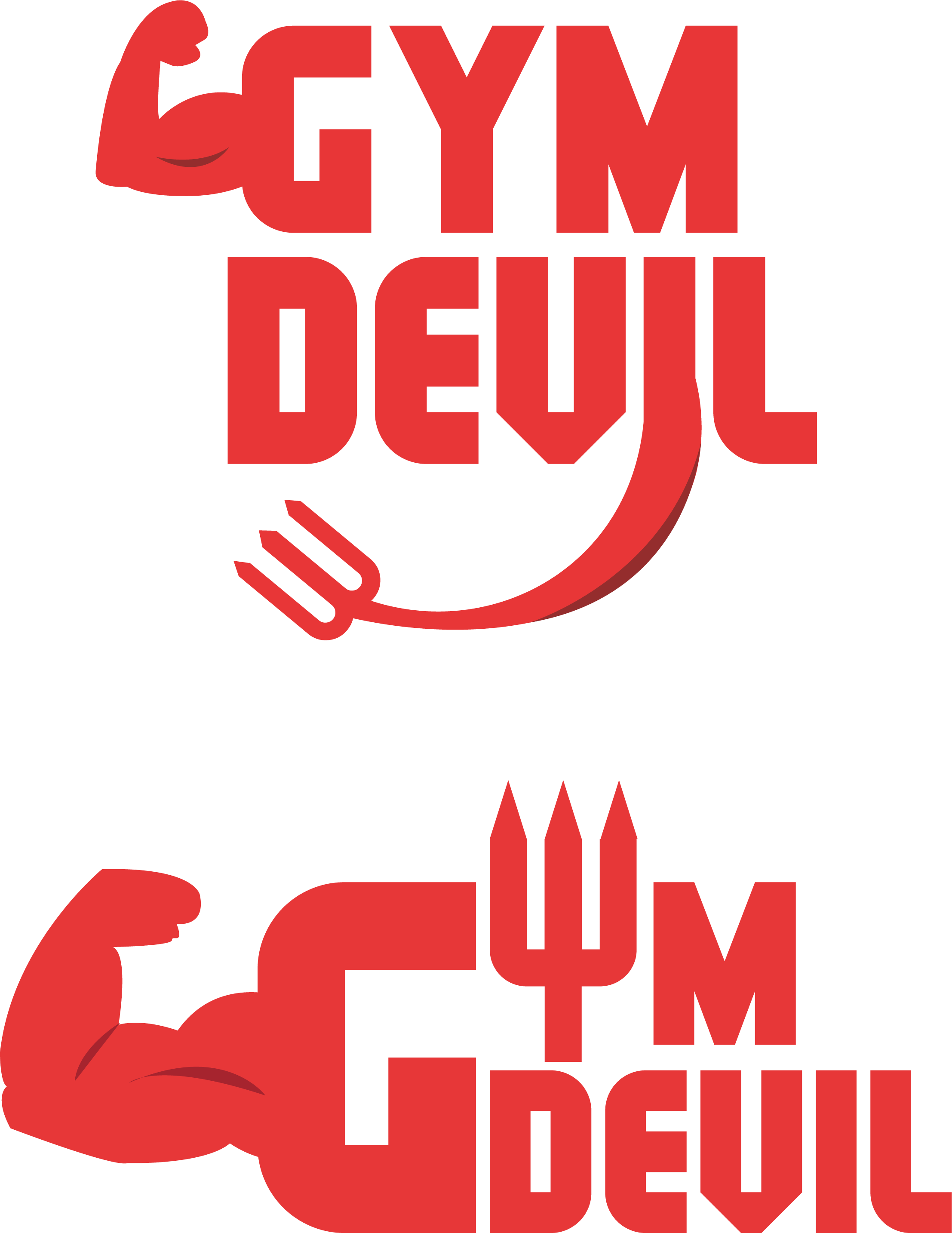
Not a fan of either myself. Must we have the arm? I think a simple devil tail would suffice in this.
Perhaps extending slightly right from the upper case ‘L’ in “devil”
The arm I find a bit redundant. It’s a gym. No need for it.
Focus on the Devil branding, and be subtle.
And I’m with Just-B on the typeface. It’s a bit too novelty for me.
Some characters sport broad curves while others have a chiseled look.
The “L” has both a right angle bend on one side and a broad curve as its counterpart.
It irritates me.
I agree with Biggs about the arm, and here’s one more thought about it. Some gyms are frequented by and cater to body builders. The clientele of most gyms, however, are just regular people trying to stay fit.
Whether true or not, placing an illustration into the logo of a big, beefy arm sends a strong signal to potential customers that this is a place focused on body building. Many people who are a bit out of shape and wanting to lose weight or do some aerobic exercises do not want to do so at a place full of muscle-bound weight lifters.
It depends on the gym, of course. In either case, you really need to clearly identify the target audience and design the logo in a way that resonates with them in a way that is consistent with the focus of the business.
Edit: I originally assumed the logo was for a gym. Now that I think about it, it’s more likely for a piece of gym equipment. Whatever it’s for, it’s just not possible to give good feedback on a logo when almost nothing is known about the entity for which the logo is intended.
Well as I often say in response to these wordless logo critique posts, I’d need a lot more information before I could opine as to whether there is a viable branding solution for Gym Devil here.
All one can do is comment on the mechanical aspects of the graphical concepts put forth, and there I can only generalize. A logo that pulls a visual stunt—one visual stunt—can sometimes come off as charmingly clever, or more often, obvious, literal, and novel in an unsophisticated way, just for a fleeting moment. That’s one stunt. The moment a designer attempts to add a second such stunt, the result is always lame, no matter how clever the stunts themselves may actually be.
The word Gym doesn’t need a cliché bicep, and the word Devil doesn’t need a cliché pitchfork; both are easier to digest and visualize without being mangled into readability-compromised caricatures. I’m sorry but a two-word brand in which each word has been decorated with its own literal picto-metaphor is simply not good logo design.
YES. That.
ALL the context matters, not just common associations with the individual words.
If the question is which one; my answer has to be neither.
I was thinking the same thing about the arm representing a strength training facility and not a “everyone welcome” type establishment. It’s a good way to scare away beginner clientele and athletic types that might to run on the treadmill for a couple hours.