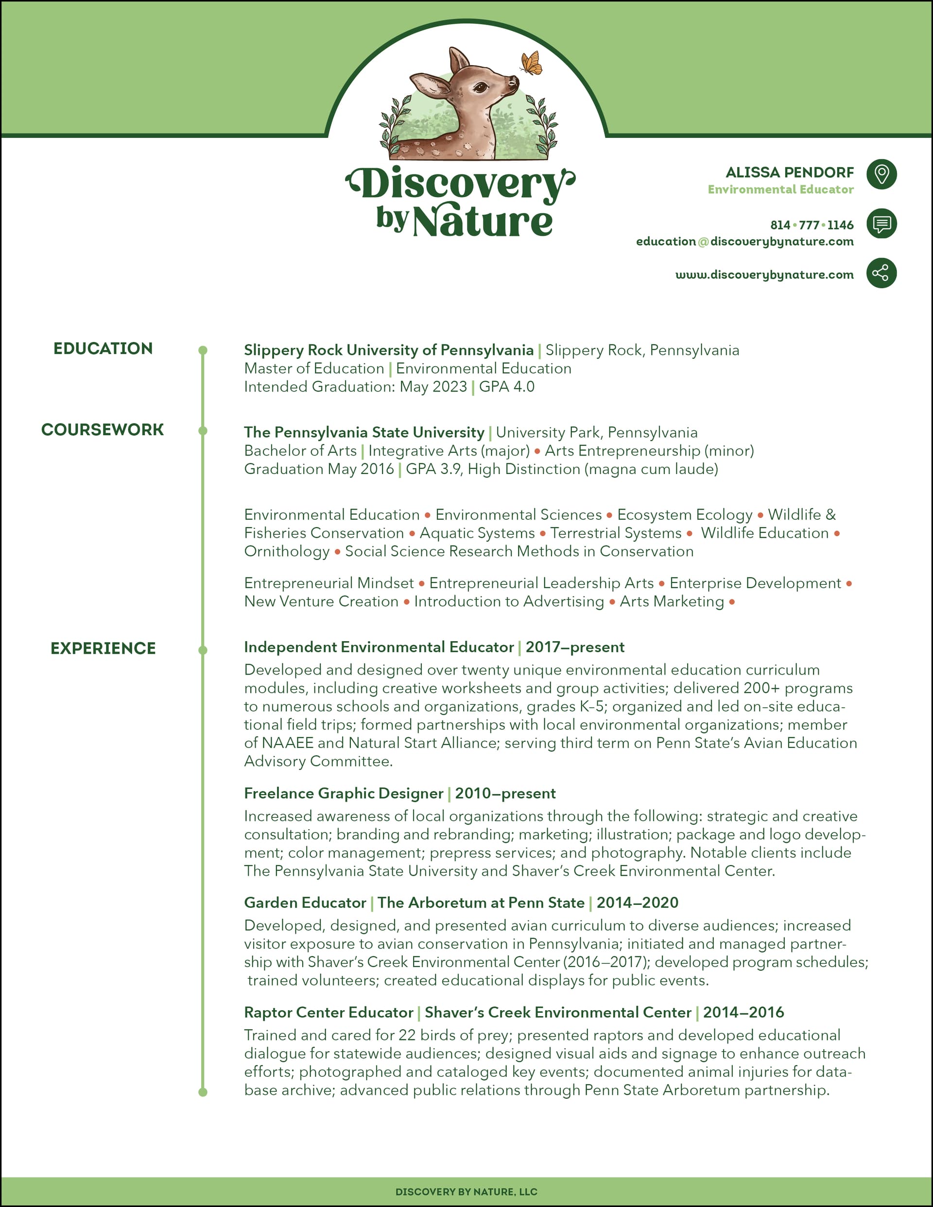
Option 1:
Option 2:
I’d like to mirror the design in other documents, as seen below, but I feel I could go with either design effectively.
Positive feedback and suggestions are both welcome.
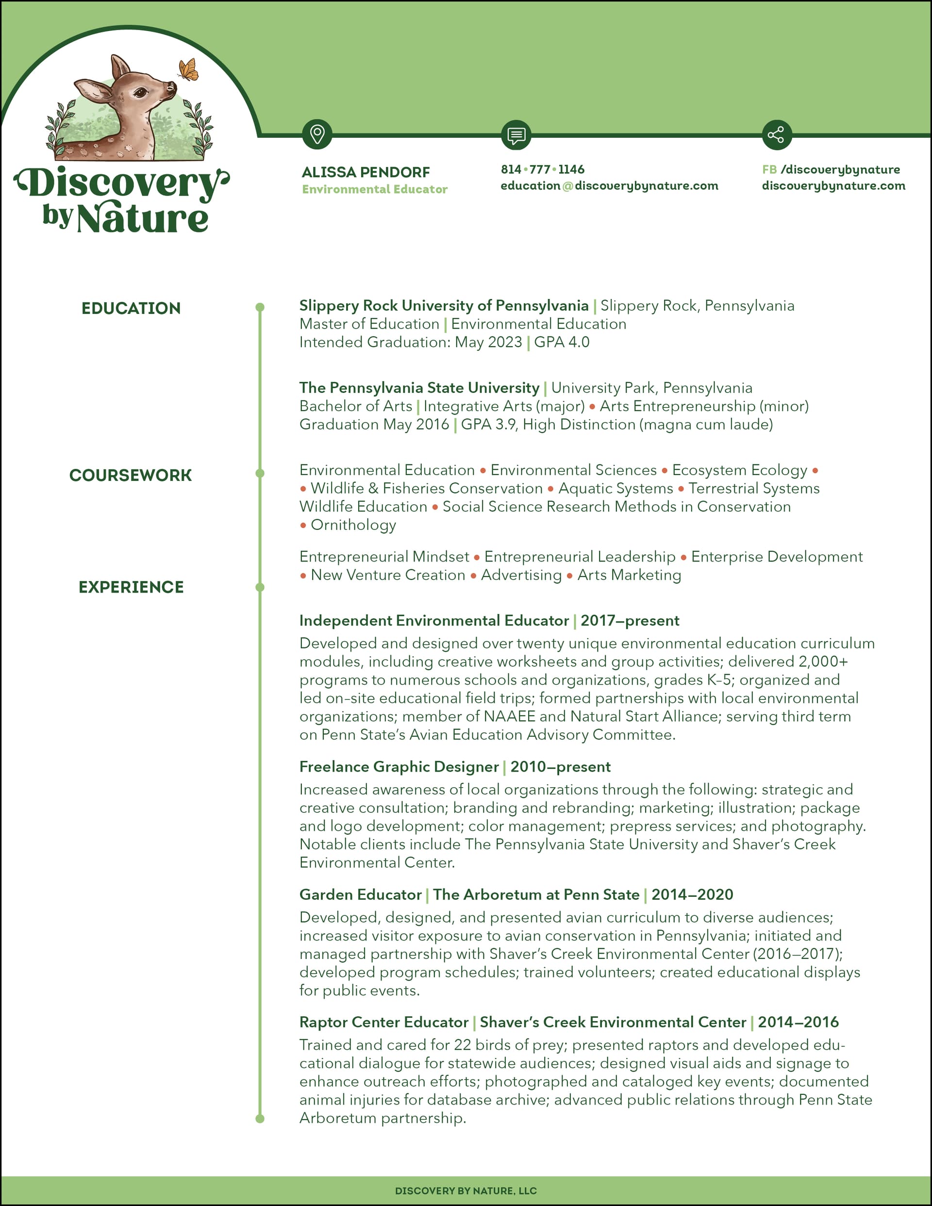
Option 1:
Option 2:
I’d like to mirror the design in other documents, as seen below, but I feel I could go with either design effectively.
Positive feedback and suggestions are both welcome.
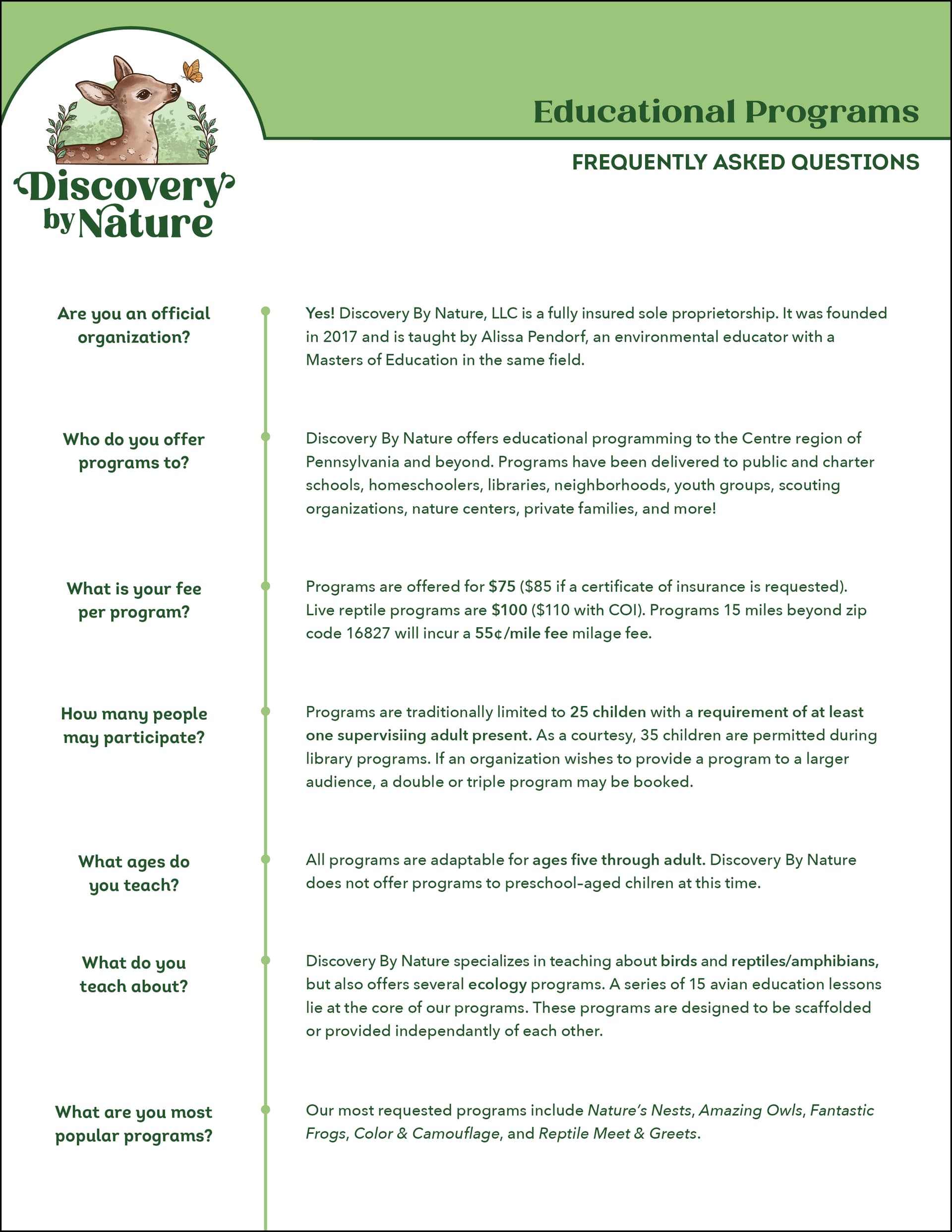
Personally, I like Option 2. Looks cleaner and less forced to fit at the top, like option 1 does. My only pointer would be to change the top color, as that green reminds me more of a 70’s “puke” green, probably not what you intend. I did notice a typo, you have mile fee mileage fee, I’d take out that last part, but those are easy fixes.
I prefer the second one. The first one alternates between flush left, centered, and flush right, which seems a little chaotic. The second is more consistent in that respect.
Oh there are several typos, haha. Thanks for the insight!
Agreed. I should have gone flush right on the top categories but I was leaning towards #2 anyway.