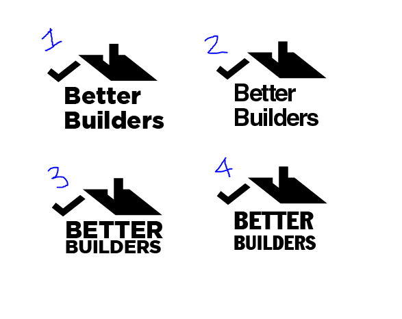
Concept: Icon resembling a house while incorporating a ‘tick’ Purpose or Goal: Logo for small building company My Experience Level: Hobbiest Nature of Job: Practice
Am keen to go for a typeface which is very simple and basic because there’s a lot going on in the house icon, however really want to use the type to reinforce the house icon.
Which do you prefer, both from a functional and aesthetic perspective?
Please be brutally honest and don’t hold back, am super keen to improve!
Ok brutal here: I think I don’t like any of them. If I had to pick from the four then 3 is the closest but 2 I would play with.
I like that for 3 both words are the full width of the house. You could try to do this with font 2.
I like that font 2 has the same size capital B for both words. This reminds me of having a big weight barring column in a house.
I can’t tell yet if I prefer all caps or not… or if drop caps could work here.
I’m terms of specific font choice I think try to look for another font as thin as 2 but with better readability when packed together like ‘Building’.
Also do you want any feedback on the house and check mark icon?
Of the batch here, I think 3 is the best option since the words are square to the right edge of the roof. If I am having someone build a home for me, it better be square and line up.
Consider the letter spacing too cause the letters are too close to each other, like the 2 T. It’s not good looking. But I like the icon tho, I think I’ve seen it somewhere…
I’ve seen variations of a silhouetted roof dozens of times. It’s become something of a cliche for both builders and realtors. But that’s not what you asked about.
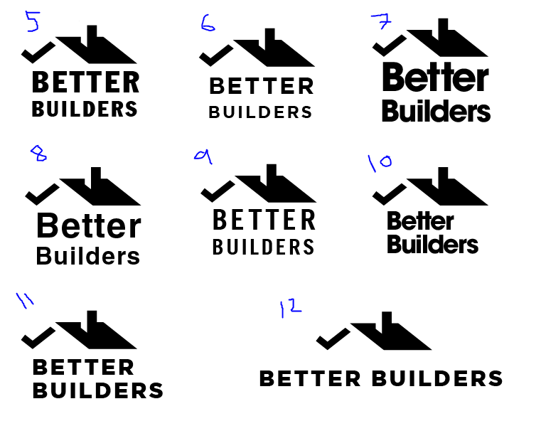
As to which type choices work best, I’d go with the lowercase, mainly because lowercase looks a bit friendlier and avoids the awkward spacing of placing two uppercase T’s next to each other.
Like @Naby mentioned, your letter spacing seems too tight. On version 2, for example, the letters are crashing into each other. Reduce the logo to a smaller size and they’ll begin bleeding into each other and causing legibility issues.
@IzChik I know what you mean about not liking any of them, I really liked the legibility of the lowecase type, however it doesn’t do much to reinforce the house icon. Do you have any specific recomendations on the thinner font to use? Totally keen to hear any feedback on the house icon too!!
@Just-B I wonder how it would look if I reduced the font size on the word “Builders,” so that it lines up with the text above?
Thanks so much for the feedback everyone - will have a tinker and post up some revised versions soon!!
I am with Just-B, as soon as I saw it, I‘m afraid, I rolled my eyes a bit. I have seen very similar things a thousand times before. It’s not just the roof element and the over-used tick, the name is also incredibly hackneyed. Overall, the choice of font, to my mind, is the least of your (or rather your client’s) worries. I just don’t think it will work all that well for them in its current incarnation.
What you want to instil is a sense of quality, reliability, craftsmanship, etc.
You don’t need people to come away with the idea that this is yet another in the line of builders that conform to a cliché stereotype, because the stereotype for builders is not exactly flattering. You could just as easily use a Stetson, lasso and a six-shooter (not sure if the term, cowboy builder is used in the US. If not, that last sentence will make zero sense).
There are some industries where brands need to work very hard to overcome existing negative perceptions. The building trade, is definitely one of them.
One other issue with the name, is that it is not original. I know of a toy company with the same name and a quick search revealed a few more.
Sorry, this is probably not what you want to hear, but I hope it helps all the same.
Sorry but I’m not so good at knowing fonts by heart. However I do know there are thousands of fonts and for better or worse this means there’s almost certainly one that will work. A boxy font I recently worked with is called Orbitron. It’s free too. I think it won’t work for your purpose but figured I’d share.
I think the font you currently have is somewhat close. I would try to find a san serif that has ‘t’ w/o tail on base, ‘e’ that is not as closed into a circle but still has a level horizontal line, and ‘r’ with a less pronounced upper right handle. Sorry if this doesn’t make sense. I’m sure there’s proper terminology for parts of letters.
I don’t disagree with previous comments that the house is an overused graphic but I usually will give the client a warning about this but do what the client wants.
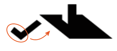
Anyway, if you stick with this graphic I would not touch the side of the house with the chimney. I would play around with the check mark. Try it smaller or thinner or both. Try moving it more in underneath the house. This might make more sense with the house graphics current shadows (esp if the check is made smaller too). Lastly, my eyes might be off but, make absolutely sure that the house and check mark bottom edges/points are on the same horizontally level. Or I would do the opposite and make it very clear that they are not on the same line/level.
@sprout Do you mind if I ask what exactly concerns you about the choice of font - my thinking was to go for something bold, clean and san-serif, what do you think would be more suitable? As for the name, it’s just an arbitrary name for an imaginary company from the daily logo challenge (this isn’t a real job).
As for the mark, what do you think about making the front of the roof using a set square? or do you think I should just do away with the whole roof concept maybe something different, like a tool or maybe some handlettering?
@IzChik That’s ridiculous that you spotted the check mark not being aligned with the other side of the roof - I hadn’t noticed! Regarding alternative configurations involving the the tick, do you think I should still leave something in place to suggest the second half of the roof, because I think the mark might fall apart without it?
Sorry, I think you’ve missed my point. Some of those fonts are OK. Your instincts are spot on that it needs to be bold, sturdy, strong, etc, etc. My issue is with the whole approach. The use of roof – gable end on or otherwise – And the tick mark is the issue. It is so over-used that it has become a visual cliché (think jigsaws, light bulbs, etc), that it is never going to say what is individually unique about that company. It will always look like yet another identikit Acme building co. The same as the million logos you’ve seen for decorators with a cartoon of a smiley man in overalls with a paintbrush held aloft.
You need to dig deeper. What is unique about this company? What would make someone want to use them over and above the competition. See what I mean? Why are they better? Your job is to find this out, then communicate this to their intended audience in a way that audience expects to be spoken to.
I 100% agree with using this question to push the logo to stand apart from its competitors but this is not for a real client right?
@pluto Hahaha I think that’s a mix of skill and skepticism but usually if something feels off it means it is and then I throw lines all over it to find the problem.
Anyway, for the tick, if you change it’s size and/or width and keep the tick in the same general area then it should still be able to suggest a second half of the roof.
I actually really like 11. I used to want lower case letters or drop caps but def not anymore. I’m not sure I ever would have thought of having ‘Builders’ push out away from the house but it’s great. The font and layout feel solid (like a house) but clean and straight forward. If anything I might try to stretch the letters to be taller just a little so the space is more even for the inside of the Es. It might just be easier to find a new font though.
@sprout Ahhh… so the originality of the mark is the primary issue - that’s a fair comment. I might struggle a bit to come up with something unique about the company as it’s obviously not a real business, but I totally see your point. Do you have any asthetic preferences about any of the designs to date (the originality of the mark aside)?
@IzChik Yea you’re totally right, it’s not a real client! Will have a tinker with the tick and see what I can come up with! I quite like No. 11, it was actually a happy accident that the word ‘builders’ should form such a solid foundation (no pun intended!), but I also think 10 looks fairly solid too (good call on droping the curls on the 't’s BTW)!
If I had to choose a font, something like 7, but less humanist. Still bold. I’m not a fan of the open spaced ones, but 7 is too tight. Perhaps try something like Akzindenz-Grotesk, or similar. A good, solid, turn-of-the-century, Industrial Revolution, kind of font. Also watch the visual length of the Builders against Better. It over-shoots. That said. I still think you need to get the fundamentals right before worrying about detailing it.
In terms of it being a fictitious company. I get that, but why not try fictitiously building it as a company, not just a name (and if it is made up, think about making up another name – often as part of a branding project, I have been tasked with coming up with a name. It is massively important to the identity of a business to speak to its audience). Think about the kind of company it is. Make a list of its skills. Domestic renovations / commercial building / civil engineering construction? Think about its ideal customer. Who are they? What business are they in? Why would they hire this company? That way, you can be more targeted with branding it.
The way you are doing it is not problem-solving. You are just making a logo that just about the aesthetics of it. I’d suggest going back to the drawing board and start with a problem to be solved, rather than just making pretty on a logo for a company without purpose. If it is all made up, you can make up everything. Give the chairman a name. Give yourself a sense of who you are working for (even if all made up). That way, you will end up with a far more successful solution and moreover, you will have a project that will be much more effective in your portfolio, as you will be able to give some background to the company it is for.
Also think about the whole, not just the logo. Corporate typeface. Image style, etc etc. Think about it as a brand, rather than just a stand-alone logo, which, in reality means very little.
If I’m not mistaken, the check mark is supposed to double as a continuation of the roofline, which would be fine if the illusion created by the high-contrast shadows carried over to the entire check mark. The right stroke of the check mark doubles as the shadowed soffit of the roof, which looks just right. But the left stroke of the check mark breaks the illusion. If it’s meant to double as the upturned continuation of the roof, the left stroke would represent the fascia board, which would be in sunlight, like the other fascia board (see arrow).
Not being a real client is the reason you mentioned impeding you from addressing @sprout’s concern about the mark being generic as opposed to reflecting the uniqueness of a real company. Why can’t you more tightly define the fictitious company in more specific terms? For example, the builder might have been in business for decades and specialize in one aspect of residential construction that caters to a particular segment of the market. Instead of a general contractor, this builder might just do framing or siding or remodeling as a subcontractor or, maybe, the other way around — a general contractor who arranges, coordinates and subs out everything to specialists.
I previously mentioned your letter spacing being a problem. In your last set of examples, that problem has become more apparent. You did loosen up the spacing some, but from one example to the next, it’s still all over the place for no readily apparent reason. For example, the spacing in number 8 is very loose, but very tight in number 10. In number 6, there’s far more space between the two T’s than between, say, the E and the R. In number 8, the spacing between the two lowercase t’s is tighter than the spacing between, for example, the B and the lowercase e.
Logos are especially difficult, which is why it puzzles me that so many new designers start with them. Maybe it’s because when they’re done right, they look so effortless. However, logos are also so minimal, that the level of care given to the smallest details becomes critical in ways that might not be all that important in other kinds of design work.
@sprout thanks for the feedback. I have to be totally honest: I don’t have any experience going through this process with a client to understand their business and values and translating that into a mark which represents them. I know that is an area which I need to work on. What I’m trying to do here is understand the gaps in my asthetic design game. You mentioned my lacking in the fundamentals, is there anywhere in particular you think I need to focus on?
@Just-B I actually never intended the check mark to be percieved as the eave of the roof, but that’s a clever idea. Regarding your comments about the spacing I was just exploring a few ideas and different fonts. I fully appreciate that a good mark is not easy to make and there’s a lot which goes it into it. What do you think new designers should focus on, if not logos?
It is all about learning what a logo is for, what it is part of, how it works, etc, etc. In short, I am guessing you are self-taught? If so and it’s something you want to pursue as a career, then I’d suggest strongly that you get an education.
Alternatively, if this is not possible, get an entry level job in the industry and learn. I have no idea how old you are, so if you are not at this stage yet, then read as many books by the great designers as you can. Learn about all aspects of design, not just logos. History, application, aesthetics, psychology. Learn about architecture, fashion, product design. Immerse yourself. Find your passion. Learn all you can about typography. It will be invaluable.
If this is not your passion and logos are just kinda cool to do, find another career, because you will definitely need passion.
In your post that started out this topic, you listed yourself as being a “hobbiest.” So I’ll answer your question assuming that’s the case and that you’ve had minimal formal training.
Most formal university design programs (at least here in the U.S.) don’t start out with projects that try to imitate real-life, professional projects. Those kinds of projects, like logo designs, typically aren’t assigned until the 3rd and 4th years.
The reason for this is because there are lots of prerequisite basics that need to be learned before diving headfirst into realistic projects. Most of these basics have to do with a loose collection of principles typically known as the elements of design. These elements or principles involve learning about and working with color, shapes, negative spaces, texture, balance, contrast, rhythm, harmony, hierarchy, etc. If you look up these things, you might also want to look up Gestalt psychology since it helps put into context why these elements are important.
Concurrent with a focus on these principles is a strong emphasis on typography. The reason for this is because, first, typography is a huge part of graphic design and, second, typographical forms are a microcosm of all the elements of design boiled down to their bare essence into letters, numerals, various marks and, in combination with each other, words.
So to answer your question directly, I think a beginning designer should concentrate on the elements of design and typography. Outside of a formal program, though, most designers typically want to skip over the prerequisites and jump directly into those things that piqued their interest in the subject to begin with. This is unfortunate since it leave huge gaps of understanding and ability that are difficult to overcome.