Hi all,
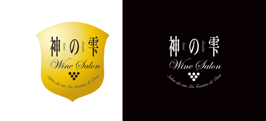
I was recently tasked with creating an English version of an existing Asian wine brand logo. The logo is for an online and brick and mortar wine shop centered around the popular wine manga The Drops of God. The top version is the existing logo and the bottom is my redesign, catered to a more refined US audience aged 25-45. The tight set Futura “Drops of God” text is the current title format for the manga, but the publisher might change that. The keywords were “relaxed sophistication”. I changed the emblem/shield into a more ambiguous wine glass shape and added a little visual interest to the grape bunch to incorporate the Drops of God theme. I also created a suite of logos for differing uses and sizes. From left to right- full horizontal, full vertical, monogram/icon, and small sizes. I’m interested to gauge how effective a redesign this is, keeping in mind the new demographic. Thanks!


