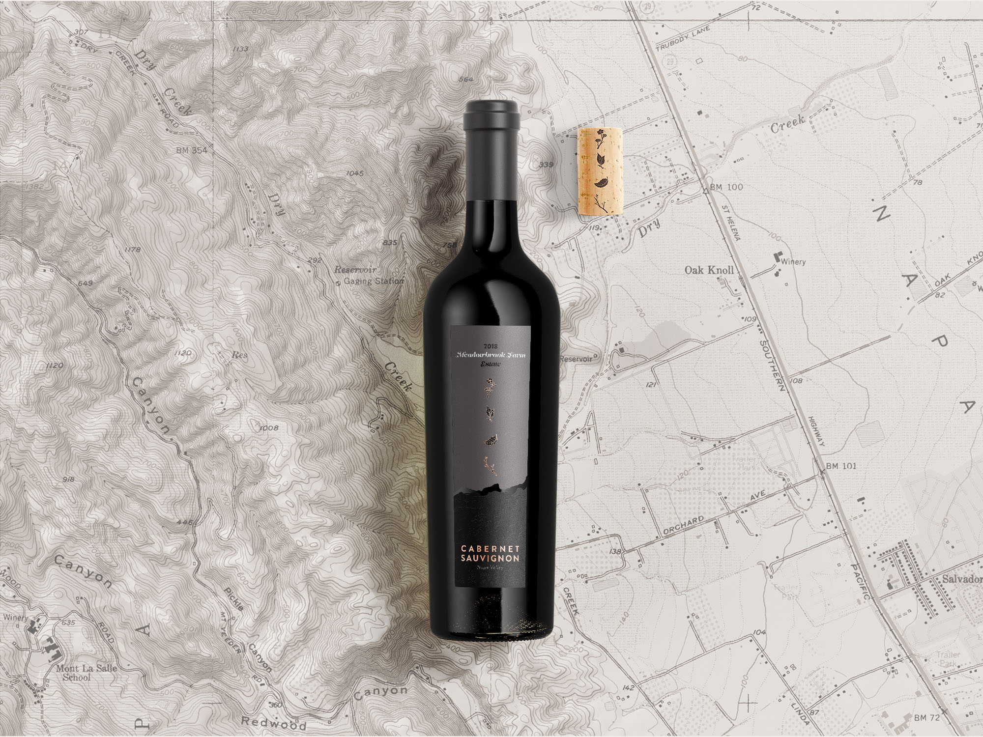
Hi all, I’m looking for feedback on a wine label project. It’s for a Napa Valley estate cabernet sauvignon, priced roughly $60. It’s going to be included in wine club shipments and in the online store, but not offered in brick and mortar retail shops. I got a very lukewarm reception from the client (and that’s putting it nicely) and I’m looking for feedback on the concept and execution. Please excuse the limitations of the Photoshop mockup. The two halves of the label are separated by a die-cut and the bottom portion features a high-build spot gloss.
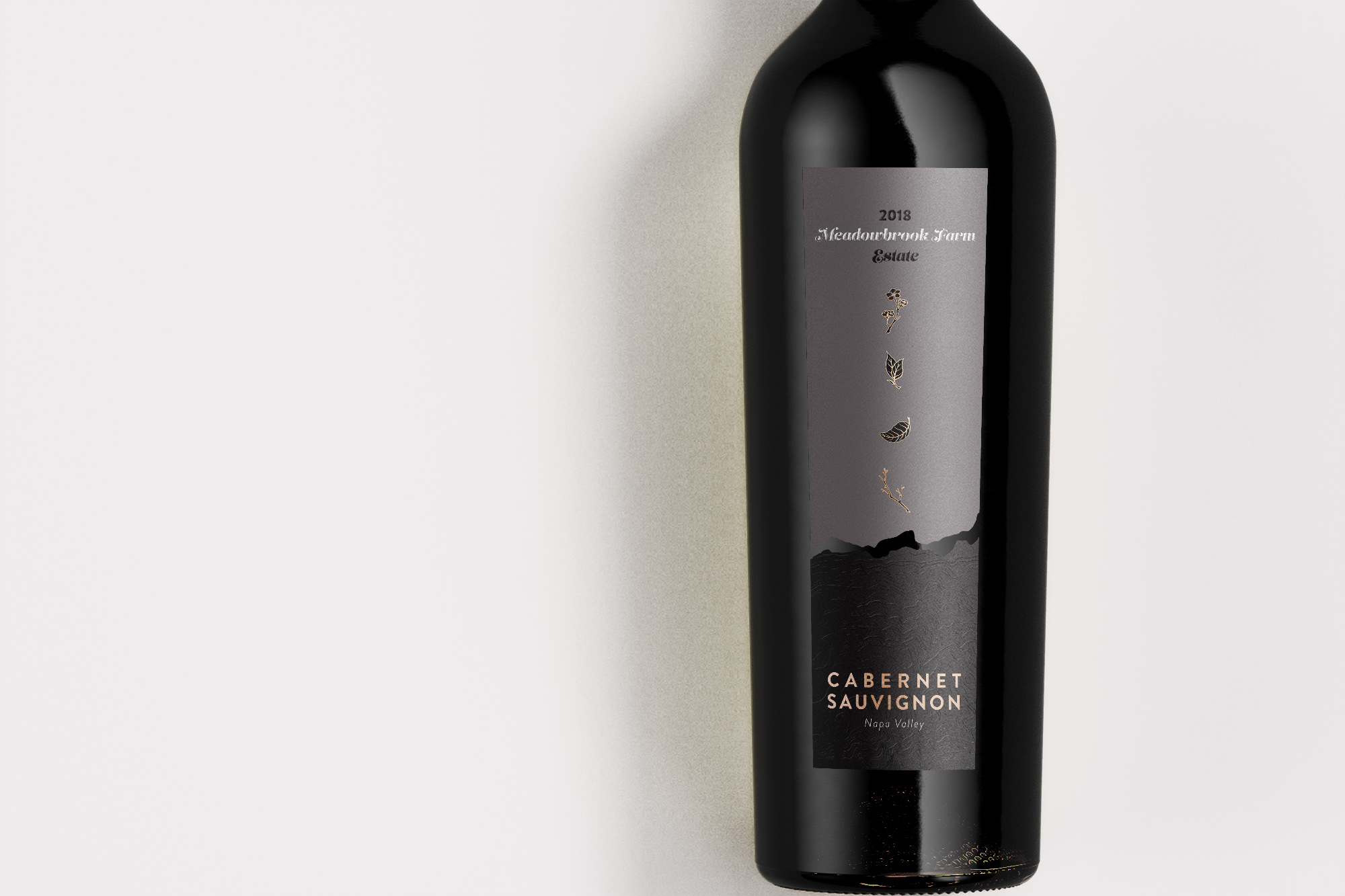
what is the significance of the plant illustrations? It feels a bit out of place in my opinion. I’m also not a huge fan of your font selection at the top of the label. Gives off a cheap feel, considering this is a premium product. I do however like the bottom half of the label.
I definitely need to integrate the botanicals more with the rest of the design. Pear trees are the defining feature of Meadowbrook Farm, so the pear blossoms throughout the seasons are the focus. I’ll change the type as well. Thanks!
I do agree, however, that the botanical elements appear somewhat gratuitous without knowing more about the history of Meadowbrook Farm. Repeating them on the cork is a nice touch, though. I also agree that the typeface at the top isn’t quite right. I wonder if part of the client’s lukewarm reaction was due to the brand name lacking prominence and readability. I’m not too sure about the italic Napa Valley type at the bottom either — I’d be inclined to make it upright. However, I don’t feel strongly about any of things things — they’re details in an otherwise very strong, nice-looking label.
All that said, I love the premium, understated look. The dark, rich, subtle colors and surface textures seem just about right for the type of wine. Breaking the label into two separate pieces with the bottle showing through to form another shape is really nice. What’s the tear’s significance, though? Are the shapes it creates intended to be reminiscent of the hills surrounding Napa Valley? The gold foil sets off everything off and provides the necessary life. Like I said, I like it. I’d never buy a $60 bottle of wine, but that’s an entirely separate issue.
I like it also but agree with the others about font choices-- a few additional comments.. I’m not really getting what is unique about the winery. You said Pear trees are a defining feature of the winery.. do they use the pear in this wine? I do like the botanicals and initially thought it lead to the wine making process of these “ingredients” falling from the vine and turning into the wine (the bottom spot gloss). The label is a huge driver for me with wine and it’s usually the thing that I remember most about the ones I like (not always the winery name). I think you have a good handle on the elegant style, but it’s lacking something stand-out or unique to make it memorable. I know it’s only online for now, but at some point it may be among all the others on the shelf.