I am attempting to branch out and see if I can do Graphic Design. I was recently laid off from my simulation job and I noticed that there are a lot more Graphic Design opportunities than 3D artist position near where I relocated to. I have not done Graphic Design in a long time, so I am trying to put a portfolio together.
Alex, since you are admitting that you’re not a graphic designer and you’re wanting to see if you can do graphic design, I’ll go easy on you.
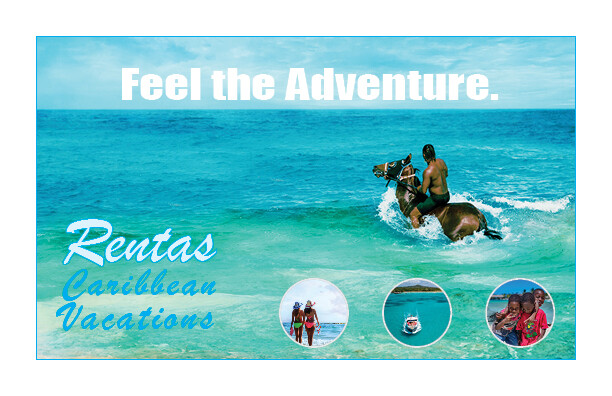
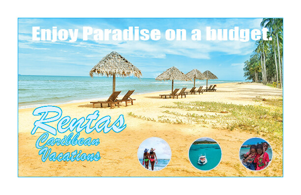
Sorry about this, but this is not very good. The balance is off. The type selection and combination is poor. You didn’t do a very good job setting the type. There is visual tension going on. The blue “Caribbean Vacations” is essentially lost on the aqua background.
Furthermore, I have no idea what I’m looking at. There is no CTA, so I’m assuming it’s not a display ad. A postcard or online ad, perhaps? Either way, it’s just not evocative or engaging enough to make me want to turn it over or click on it.
And that’s your real problem. This type of marketing material should elicit a response . . . a mouse click, a website visit, a phone call, etc. This does nothing to connect with me or make me want to use Rentas for a Caribbean vacation.
Headlines, don’t usually have a full stop or punctuation at the end.
Feel the Adventure doesn’t have any adventurous feeling about it, it’s blocky and uninviting.
I don’t know how I feel about horse riding in the sea, I’d be dodge enough on the sand! Seems more advanced. And those advanced, would they see it as cruel to horses, as I’d imagine they’d care for horses?
The text on the bottom left, cannot read it at all. I don’t know what Rentas is, as an English speaker I might assume it means rent, so what am I renting, a horse, a beach, a boat, a party?
The 3 images in the bottom right corner are good ideas, but they don’t tell the story, they are spread too far apart, and they are too small.
You need a GRAB, you need a SELL! You need Call to Action (CTA) as noted already.
Do research into adverts for tourism - best and easiest place to draw inspiration is a google search.
Thanks for the feedback. I was reading the feedback given in other posts and started to iterate on the design. Rentas is a common Hispanic last name. Like Oscar de la Renta.
Here are some changes. Let me know what you think.
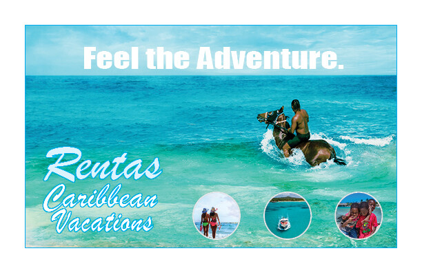
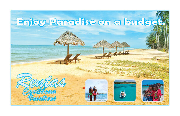
The first members to comment gave you some really good feedback.
You went out and applied it the best you could.
Unfortunately, there are still issues with the typography having a stroke around it.
There’s still no CTA and the contrast issues are still prevalent in your designs.
The still composition looks static and blocky.
You’re trying to walk before you know how to crawl. Read up on the graphic design basics. Learn about typography, composition, color theory, and so on.
Anyone can use the software but it takes research, discipline, and goals to create an effective design. Design being mostly communicative requires an understanding of these basic principles that you havent grasped yet.
Keep trying. Go back to the drawing board. Sketch out some layouts and ideas. Prepare yourself a board of effective and good-looking design postcards. Determine the goals the business has and who they want to attract and apply your knowledge to get those people on the beach.
On a design that is intended for print for example, wouldn’t the CTA be the background? I’m looking at videos about CTAs and so far they are websites. In my case, the CTA would be the background and the images showing the potential activities that can be done on the retreat. Thanks for the feedback.
Outlines around type doesn’t usually work. There are exceptions, but this isn’t one of them.
No.
The call to action is what you’d like the person reading the ad to do next. It needs to be absolutely obvious to the target audience what the ad is about and there needs to be an obvious next step (a call to action) for them to take in following through on what the ad is wanting them to do. This might be a phone number, a visit to a website, an invitation to a webinar, a form to fill out or something that is the logical next step for them to take.
The photos and the background are devices to engage the target audience and get them interested. But once you’ve gotten their attention and interest, the call to action is what you’d like them to do next.
They are all the same. Spend time studying composition. Step away from computer. Grab pencil and paper. Sketch out thumbnails. Pick 10 and draw them out larger scale. Then pick 3 and complete on screen.
Dont worry about images, or fonts. A square with an X going through for an image. And loosely draw a style of font like your own hand writung for script etc.
Explore with thumbnails, blank and white, no images, etc how all the elements come together.