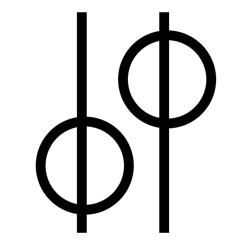
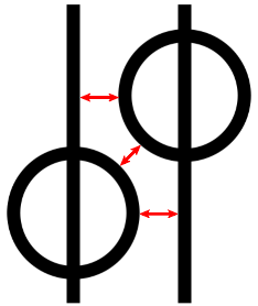
Thank You everyone for your feedback. You all confirmed all the things I don’t like about the design. As I mentioned, it did bother me that the lines and circles were not centered. Also, the letter spacing was off, and I intended to work on that more.
@PrintDriver Yes, I intentionally did not center the lines and circles. I wanted to, but I thought they would be indistinguishable as letters in the logo. I totally agree with you on it being too subtle. I am more in favor of them being centered because it seems more balanced, yet also more abstract.
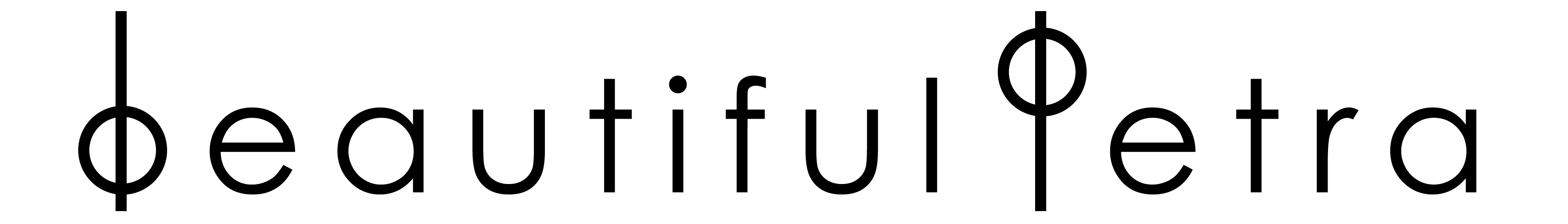
@Smurf2 you are right, it says, “beautiful petra”.
I was trying to stay away from a distinct “b” and “p” in the logo, but I do want the wordmark to be legible. That was a conflict I was trying to resolve.
@Steve_O I agree with you on the letterspacing, and I tweaked it a little, but I still don’t think it’s 100%. I will take your suggestion and create a mood board with other luxury brands logos to compare.
@pluto I came up with the circle and line mark as I was doodling and drawing different ideas. I liked the idea of an abstract logo that had a broader meaning than just circles and lines. I gravitate toward symmetry and simplicity, so I thought it was an idea worth developing. I also wanted the wordmark to be more distinct and recognizable from all the other brands that “clutter” the industry. In my research, I found that a lot of jewelry companies use a serif font in all caps (or scrip). I considered doing the same for the wordmark and using the circles and lines (centered) for the logo. I decided on the Century Gothic font because it is very circular like the mark.
As far as it feeling high-end or luxurious, that seems to be an interpretation based on past experiences. I feel the same way as you all about it because it doesn’t look like other luxury brand’s logos. The lower case “b” in beautiful and the upper case “P” in Petra actually bother me. The letterspacing and centering the lines can be adjusted, but the “b” is still lower case, so if I can’t reconcile that or accept it I may have to scrap the idea of using the logo in the wordmark. What do you all think? Do you all think I should try to keep some continuity in the wordmark and logo? If you do think I should separate the logo and the wordmark, do you have any font suggestions?
@PrintDriver It’s interesting that you associated the mark to hobo hieroglyphs. I don’t think the average 20-30 year old would make that connection unless they are really interested in history.
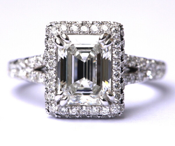
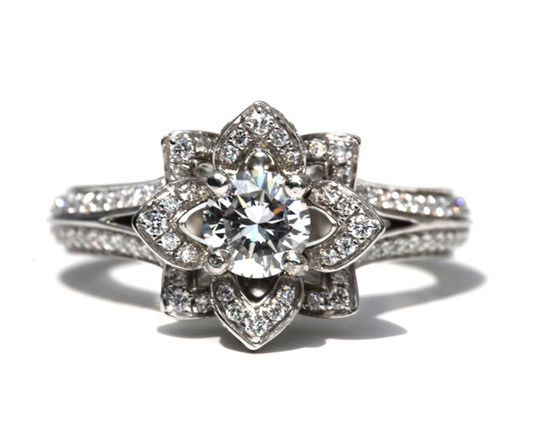
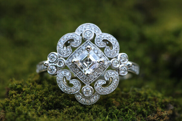
So, I said I was aiming for a high-end luxury feel, because that is the type of product the company makes. They are focused on quality and unique designs, so I thought that’s how the brand should be presented. In comparison to automobiles, the company could be comparable to Tesla, not Bugatti or Lamborghini.