Personal project. Creating an online learning resource & comminity, mostly for women, ages 16+ who PC game, who want to learn how to build computers. Logo will mostly be for digital formats.
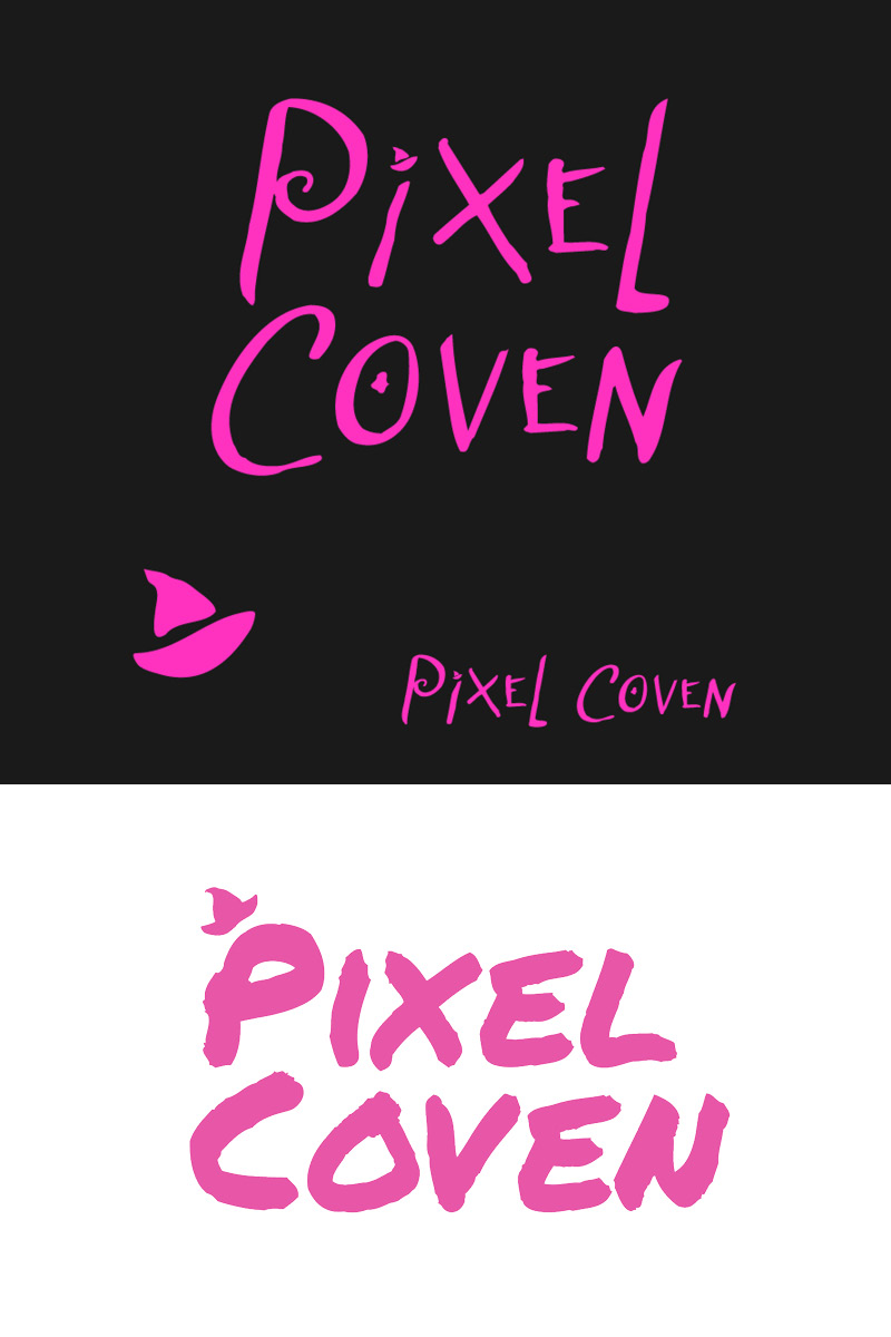
I originally created the logo with a witches hat, but just didn’t like the overall tone of it, and that could just be my own design style wasn’t going for it - and my logo design skills are novice. I’m worried I went too clean with the current design.
Would love any criticism and suggestions to help improve the overall design, and tone. No need to be gentle, I am not a novice to critique.
I truly feel that the cleanliness, simplistic design are solid. Potentially a more pink/magenta color on the contrast piece that you are using, but that is just a personal opinion. I would love to see the one with the witches’ hat on here for comparison. I believe it’s a fabulous design regardless.
Meant to comment on this yesterday, I was looking at it on my phone.
I couldn’t read the bottom one cleanly - the dot over the eye was completely lost, and somehow it actually was very difficult to look at almost like it was hurting my eyes, like physically straining my eye to read the logo.
This probably comes down to small detail elements issues that are just going to be hard to control depending on usage.
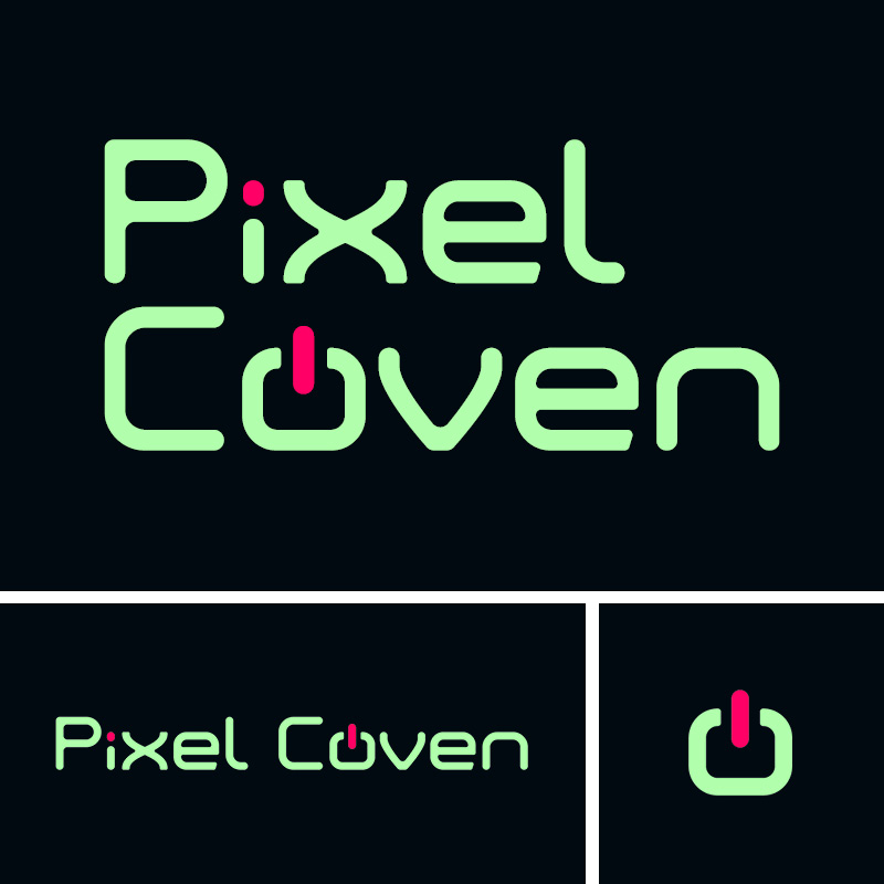
Even though it’s a very simple logo it’s still overly complex using 2 elements as a graphic.
Sadly, it needs to be simpler, cleaner, and easily readable at all sizes.
I get that you were going for probably a power button with the 0 but I don’t feel like it’s hit the mark.
And the pixel element over the letter ‘i’ while ok - it’s going against the legibility of the logo.
Overall you have 4/5 things struggling against you, the colours are too harsh in contrast especially at smaller sizes, the font is a graphic element in itself, trying to pick a font with pixel/digital like feel to it - then you have the graphical elements, dot at small size and an easy enough to detect power button that doesn’t really look like a power button but your mind goes there but it’s not very very very clear.
All the contrasting elements make it hard on the eye.
It feels to me you’re trying to communicate that it’s a community for female computer-building enthusiasts in the logo so litterally with the typography, when the name already says it.
I would suggest instead think more about the feeling you want to evoke in people that see it and use your knowledge of typography and colour to create that feeling.
In any case, personal projects are the best, ultimately there is no right or wrong, just whatever you like the most and feels right to you.
here are some of the past concepts with the hats. I was going for a more “punk & art” vibe, but I didn’t think it communicated quite right. Fun, sure; tells the user what the site is about on first glance not so much.
You ask 10 designers, you’re likely to get 10 different opinions. Here’s mine.
The last two options use a brush-type font and a hand-lettered-looking font. The font choice combined with the fact that you have “pixel” in the name (which makes me think of displays or digital painting) makes me think this would be more applicable to digital art than hardware.
To my eye, the font in the first option you posted is more applicable.
All of that said, I think you need to really drill down on your customer avatar. Saying “women, ages16+ who PC game” seems a bit vague. Whatever solution you come up with needs to resonate with your target market.