Would you love to give me feedback on this project

I just put a new case study on behance that I have been working on over 2 months. If you know the tech branding and have proven experience in this industry please give me a critique on this project.

Thanks in advance

https://www.behance.net/gallery/248189697/Sora-brand-identity

Couldn’t make out the r in SORA.

and what’s the story with every portfolio only including web colours. It’s kinda useless like that.

And complex gradients on business cards is generally a no no. So given that it will be printed makes it even more important that print colours are represented in the brand.

1 Like

Please excuse the bluntness of my earlier comment I was replying quickly on my phone. I’ve been seeing a lot of portfolios recently that follow a very specific visual style. They look good on screen, but often miss the technical fundamentals that hiring managers are actually looking for.

In a competitive market, those details tend to be the make-or-break factor, so I wanted to give a bit more context behind my points.

On the logo, the “R” in SORA is quite abstract. If a brand name isn’t immediately legible, it becomes a difficult sell especially for clients who prioritise clarity and usability.

From a production perspective, only showing Hex values alongside complex gradients is a concern. That suggests the identity has been designed primarily for screen. In practice, clients need colours that translate reliably into print, CMYK, Pantone, sometimes even LAB. Without that, inconsistencies start to appear, and fixing them later costs time and money. Demonstrating that awareness is often what makes work feel more “senior.”

There’s also a small but important detail on the colour board the blue hex code is written as 0430#A0. It’s minor, but this is exactly the level of detail recruiters tend to notice.

The gradients are another point. They can work, but on items like business cards they’re difficult to reproduce consistently. You can run into banding, colour shifts, and variation between print methods even between different items like letterheads and compliment slips. It’s not that they shouldn’t be used, but they need a considered system or fallback.

More broadly, this comes down to showing how the brand works beyond a perfect mockup. When you hand off a real identity, you’re usually providing full colour specs so the client can maintain consistency across suppliers and materials. Without that, the brand starts to drift.

A simple way to think about it if every Coca-Cola label on a shelf was a slightly different red, it would feel off. You’d still recognise it, but it loses that immediate visual consistency that makes it strong in the first place. That consistency is what good production thinking protects.

I’m being direct because these are the kinds of things that portfolios do get filtered out on. The visual side is solid strengthening the real-world application side would make this much more convincing.

1 Like

I really appricite the way you spot these little mistakes. For colors are you talking about the individual R, G, BB values. And the minor 0430#A0 mistake was because there was not an option to bring the hash symbol at the begining. Would you like to give some refrences of good case studies that you admire and have the answers to my questions.

I really appricite that you put some time to review the work. What would you rate my other skills like design fundamentals, overall system thinking etc. I am preparing work to get freelance work instead of applying for a job. I am not experienced enough so what advice would you give like getting a job or working as a freeancer?

No problem and fair play for engaging with the feedback.

I’m not referring to RGB values. I mean a full production-ready colour system. That typically includes CMYK breakdowns for print, Pantone equivalents where consistency matters, and sometimes LAB values depending on the workflow. Right now the palette is defined in a way that works on screen, but not in a way a printer or manufacturer can reliably reproduce.

Alongside that, I’d expect to see things like tint percentages, usage rules, and clear guidance on how the palette behaves across different applications. That’s what turns a set of colours into an actual system.

The same applies to some of the visual elements. For example, very thin white icons can work in mockups, but at small sizes or in print they’ll start to break down or disappear depending on the background and production method. These are the kinds of constraints that need to be considered early, not after the fact.

On the bigger picture, one project, especially a self-initiated one, isn’t enough yet to demonstrate readiness for either freelance or a role. Not because the work is bad, but because it doesn’t show range or problem-solving across different scenarios. Clients and hiring managers are looking for evidence that you can take a brief, deal with constraints, and deliver something that works in the real world not just something that looks good.

Freelancing in particular requires that level of understanding, because you’re the one responsible for the entire outcome. If the brand breaks in production, that comes back to you.

If your goal is to move forward, I’d focus on:

  • Building out more projects (ideally with different types of briefs and constraints)

  • Showing process, not just outcomes

  • Including real-world considerations, print, scale, legibility, reproduction

  • Turning each project into a complete system, not just a visual direction

On references look at case studies that show the “why” and the “how,” not just the final visuals. The strongest ones explain decisions, constraints, and how the identity holds up across different uses.

You’ve got a solid visual starting point. The next step is proving that it works outside of a perfect mockup that’s what will move this from student-level presentation to professional-level thinking.

1 Like

Don’t forget the other things I mentioned, your client will be sorely disappointed with a gradient on the front of the card that doesn’t match what they see on screen, or across different print processes, it just doesn’t work in the real world, on screen it looks great. Same with a solid colour on the back of a business card - absolutely can work, but some digital processes in production struggle to hold a solid colour like that in digital printing might work or not. Plus it needs to be a spot colour for litho print (longer print runs different process) (spot colours are 1 ink print usually a Pantone reference). 1 colour printing is more common for large print runs of business cards.

Especially where it’s a solid blue like that - print companies would tend to print a ‘shell’ set of cards, where they print a large batch of the back in 1 go and store them. Then the next time you want cards you only have to get the front printed, which is cheaper. So you could get shells made up of the pantone colour on the back, and then digitally print the fronts for shorter runs of individual cards, usually people get 500 business cards each to hand out.

This is why it’s so important to get the colour right.

Same with the envelope - can you get custom colour envelopes, absolutely, but it costs a whopping lot or at least it can. Perhaps the print company has an envelope of similar shape and colour or a lighter similar colour already in stock. Actually where you placed the logo is unusual, but it’s technically on the front of the envelope not the back as it folds over, so there’s no extra cost for printing there - which either makes you knowledgable, or in this case - lucky.

So not only what I’ve said in my immdediate reply. But overall.

And I’m not going to rate your skills, it’s impossible and there’s no scale. All I can do is tell you where it’s going wrong.

Your excuse for the typo is a bit bizarre not really sure why you can’t type the hashtag at the start, or what option is stopping you.

Anyway, clients won’t care what excuse you have, they expect results, not excuses.

If you don’t deliver results, it costs them, which then costs you.

Excuses don’t matter, results do.


*many edits and updates - sorry - may need to read again

2 Likes

I see some of your other work

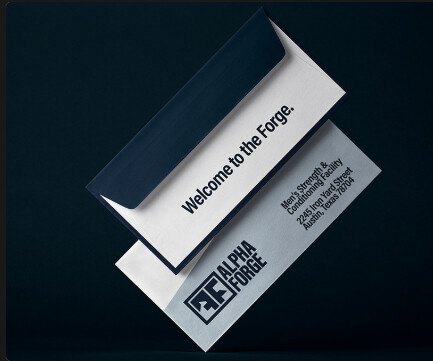
This costs extra to get printed, printing both sides of envelope is expensive. You could print the Welcome to the Forge. on the flap which works out cheaper. I believe, it’s a long time since I printed envelopes but in the old cobwebs up there it’s ringing a bell.

I think you posted that brand here before so won’t rehash much here - but I believe the feebdback before was that the AF looks like FF


Again, legibility issues with your marks - which is concerning that you’re making the same mistakes.

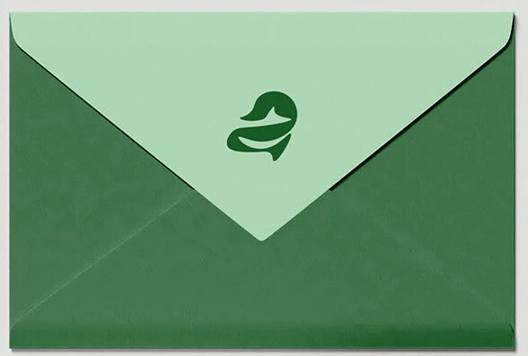
Not really sure what the mark on the left is - is it supposed be a stylised ‘a’ with a fish tail or somthing?

It’s completely not in line with the plain text of AuraOrg in a font like ‘Extended Medium’ or something. It doesn’t balance well.

I’m not saying it can’t work - look a the Gyro di Italia logo - stylised cyclist with opposing text.

There’s a fine balance.

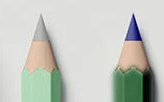
The green pencil has a blue tip

The envelope again printed with multiple colours front and back

1 Like

I am impressed by the small mistakes you spot. I have never learned these things without your honest opinions. God bless you.

Small mistakes add up, and then so does the cost.

1 Like

I might add that a full-bleed would likely require converting the envelopes (printing them first, then folding and gluing them from scratch). Although I’ve read that some digital printers claim they can print full-bleed on pre-converted envelopes, I’d hesitate to promise good results to a client without seeing comparable samples from the printer.

Flap adhesive, triple paper overlap thicknesses where glued, and triangular flaps seem like problems waiting to happen.

2 Likes

Yeh typically we’d source various colours of envelopes from printers to closely match the brand, that or just go with white with the branding on it. But it gets expensive printing on both sides.

I guess it’s not something many are aware of. Promising to clients with cool mockups then a massive print fee could be misleading and the vision shown ends up being watered down to save costs, most just tear open an envelope and discard it in the bin - so for mailers, minimum branding and cost for envelopes, and the content inside can be bespoke design or whatever you want to call it.

1 Like

Yes, this is something not discussed enough. Design proposals that don’t consider budgets, time, practicality, printing limitations, and other real-world constraints end up being disasters.

Long ago, when I was just starting out, I had a project that involved designing a postcard. To make a long story short, the postcard didn’t meet the postal service’s bulk mail requirements and ended up costing the client several thousand extra dollars to send the cards first-class instead of the reduced bulk mail rate. Of course, the client didn’t pay that extra fee — my employer did.

These are the kind of things new designers don’t know about. A design solution might seem like a good idea, look great, the client loves it, but it turns out not to be doable for one reason or another.

1 Like

Gotta watch those machine reader rules on envelopes too. One of my early jobs as a design intern way back in the dark ages when mailings mattered, an entire mailing arrived back at our client’s address because their return address was in the reader region, got read first and didn’t go to the intended recipient. (Thankfully I learned this lesson from another’s mistake. :slight_smile: )

1 Like

Direct mail actually seems like a good option these days. There is a whole lot less noise in your physical mailbox than any online space.

Oh yeh, the address position
 in a previous employment I had a direct email to the head of the postal service cause all we did was mailers, so anything we got went straight to him for clarification if it would work or not, he usually came back swiftly to let us know what to change and why.

It was nice the employer had that relationship with him made the job so much easier.