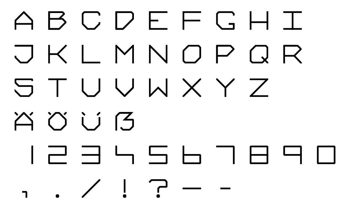
Honestly, it looks like an extreme and less refined version of Fontsmith’s Alvar, with little or no allowance in line weight for the vertical vs. horizontal optical difference. It feels a bit like a first font. It’s not hideous, but I feel you need to learn a bit more. Stick with it and perhaps scale back the obvious similarities to other fonts.
@sprout Thank you for your Feedback! As you noticed correctly, this is my first font and I am eager to play around with it some more. I didn’t put a lot of work in it yet, but will go on when I have some hours to spare.
I didn’t use any fonts for inspiration but the Alvar is a really good font to look at and see how it’s done right. Thanks for the advice!
Do you have any recommendations for literature about font design?
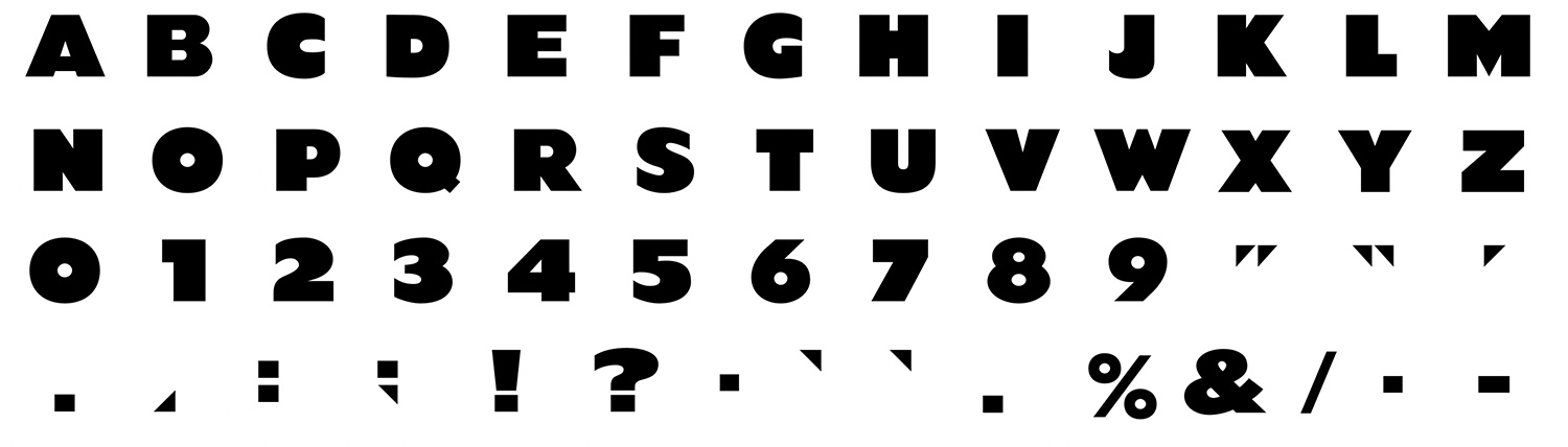
I’ve spent quite a bit of time designing typefaces and building fonts over the past, um, 30 years. Geech, time just scoots right on by. Some are commercially available and some have been commissioned for various projects. I’m just finishing up a 42-font family that should be out soon (I’ve been telling myself that for months).
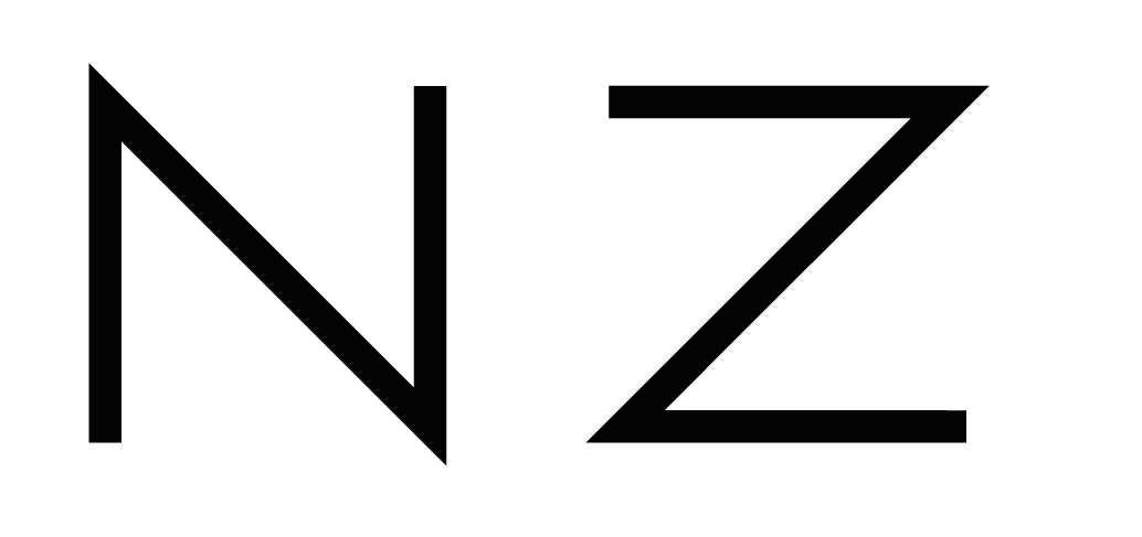
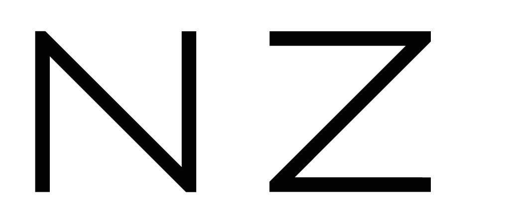
Your question on the pointiness of the N & Z is telling in that you’re already questioning what degree of personality and quirkiness you’re after. There’s no right or wrong answer, but the more unusual the design, the less usable it becomes for broad ranges of projects.
Anyway, I agree with Sprout. Yours is an interesting first font with some personality, but it could use a bit of refinement to get all the glyphs working together and deal with the optical illusions that prevent a typeface from being designed from a purely geometric viewpoint. It takes lots of practice. What are you building it in?
For what it’s worth, here’s a screen capture of my very first font designed and built way back in about 1988 or 89. Like yours, it was a cap-only typeface. The type family I mentioned I’m working on now has around 38,000 glyphs. It’s been a beast.
@Just-B wow, the 42 font family with 38000 glyphs sounds fascinating! Is it possible to see a preview or is it still top secret? If so please let me know when it is available and I’m looking forward to check it out.
I messed up my question about the corners of the N and Z. I’ll try it again but it’s a bit hard to describe.
As this typeface is meant to be a monospace/typewriter font and the corners would stand out of the rectangle that usually defines the glyph, would you recommend to leave them standing out or cut them. I would prefer the pointy option but I think it will be better to cut them because of consistency. I don’t want to push them inside the rectangle as it would be impossible to keep the 45° angle I used in all the glyphs.
I’m currently designing them in Illustrator. Guess it wouldn’t be a problem to export or copy/paste them into another program when it is time to do so. But I’m always open to good advice here too.
This is an interesting topic I would love to get more insights in. As I mentioned in my previous post, I would be very happy if you had any recommendations of literature (preferably a good book) about type design. I already own Detailtypografie but there is not much about actually designing a typeface in there. Maybe you have some recommendations?
Well, it’s not the best way to go about it, but I did the same thing on my first fonts. The glyphs in a font are built on a grid and all the anchor and control points need to be centered on the intersection points of those grids. There’s also the issues of sidebearings (although monospaced fonts are easier), hinting, OpenType features and about a million other things that can’t be addressed in Illustrator. It’s gotten to the point where I no longer use Illustrator at all when building fonts and use Glyphs and FontLab.
I’m not sure there are any good books that will walk you through the process, but as for general books about typography, there’s The Elements of Typographic Style, which is something of a classic. There’s also Gerard Unger’s Theory of Type Design that I bought last year when it first came out and have neglected to get around to reading it.
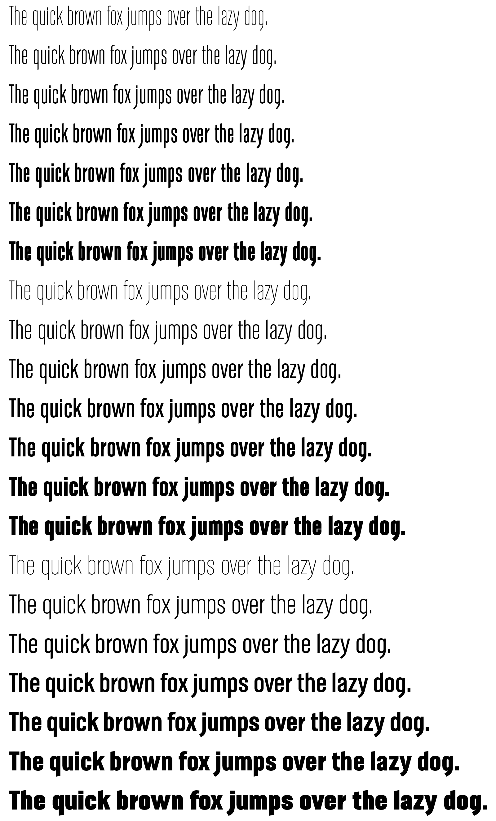
No, it’s not a secret, but I’m sort of embarrassed that it’s taken me so long. I posted some examples of it over a year ago here saying it was about done. Then I decided to expand the character set, do the italics and design three separate widths in addition to the seven weights of each width. And this meant that I could make a variable font with two different axis, which added additional complexity to the projects. Like I said, it’s been a beast. Here are some examples of the upright weights, though, minus the italics and all the other special characters, like numbers, symbols, punctuation, European diacritics, etc. I still need to adjust the hinting on some narrowest, boldest weights to keep the counters sharp and not look like they’re beginning to fill in at smaller point sizes.