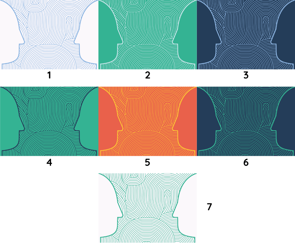
I am entering a competition to create a mural for a building in my University. The theme is ‘Connecting People’ and the design has to look effective up close and from a far. I have created a design with a few colour variants.
I would love to hear your opinions on the design, but more importantly which colours work best!
Your solution to connecting people by connecting their heads creates a shape that is a bit odd and not very head-like. Your idea for a repeating pattern of connections is really quite interesting, but I’d revisit the two-faced head idea.
I also agree with Iraszi about the implementation being just a bit bland. The whole thing seems a bit too repetitive and lacking in the kind of engaging quirks and surprises that can make a large mural interesting. I like the colors in the second row the best precisely because they are more interesting, dynamic and engaging.
Do you have to implement this as well?
Beyond the design there is that to think about.
We had one of these contests in college. I was one of the three finalists and only then did it hit me that I had really no concept on how I was going to paint that mural on a 15’ tall spiral wall going up a staircase. . . I did not win. Thankfully, that time.
I looked at these images a couple of days ago and thought ‘Sherlock Holmes’! Now I know why. The two heads merging together looks kind of like Sherlock’s hat.
I agree with iraszi and Mr-B that a mural can be so much more interesting, and with a theme like ‘Connecting People’ the possibilities are endless.
As for which colours work best, I’d say 4, 5 and 6 work well together. They are more eye-catching than the others and play off well with each other.
Also, thank you all for the great advice! It is very helpful and has helped me to determine which colour I should choose, I am also going to have a look at how I can improve the heads!
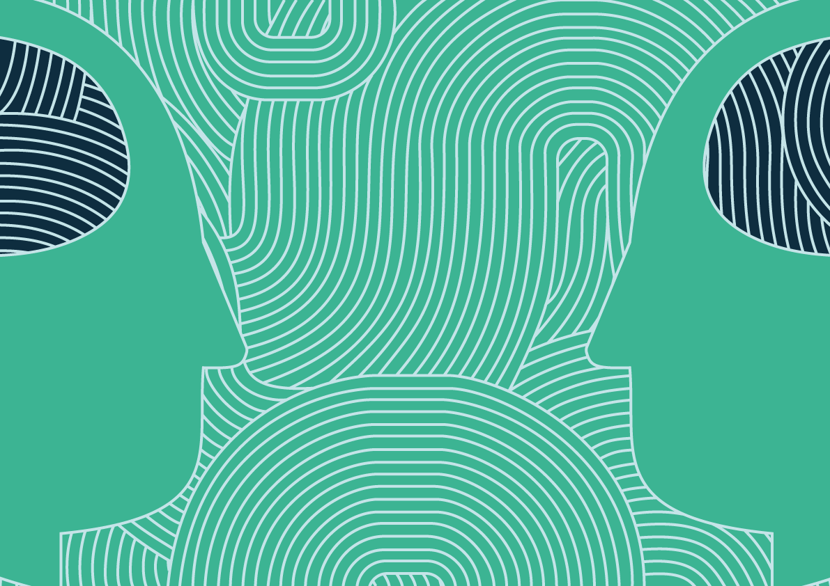
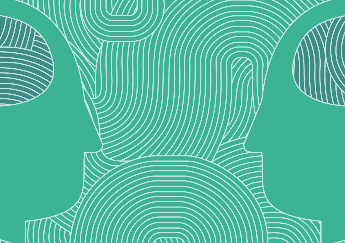
I have added something extra to the heads. What do you think? I am having trouble figuring out how I could improve it, I think I have tunnel vision as I have been working on this for a week or so, it would be great to hear your opinions!
My idea behind it is that as the two colours inside the head are the same, they are in understanding of each other.