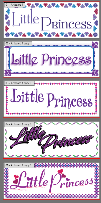
Hey there, this one’s more for fun than anything, but I’m curious to see what people think. At work the other day I got a job in the queue that was to make a sign for a little girls bedroom that had a white background, purple text, and said “Little Princess” - I had the simultaneous instructions to “use my magic” and keep design time to a minimum, so I just grabbed a few fancy fonts, stock borders, and swapped some colors and some basic effects on there.
It’s already gone through revisions and approvals, but I’m curious what you guys have to say or think on these, and if you can guess what the client asked for and ultimately approved. I feel like there’s more I could have done here but the whole “minimum design time” meant I didn’t get to think about it too much.
Nope - they actually asked for the font styling of 4 with the border of #2. Personally I wouldn’t have put those two together, but I suppose I should have seen them going for the Blacksword font. I don’t know if it’s just around here, but using it almost feels like cheating because everyone picks it out of the lineups.
Its just a terrifying sign. I cant believe the client picked 4.
I would actually have gone back to the drawing board myself and work on the type. Its for a little girls bed room…now I don’t know why 4 was specifically chosen but I’m not sure I’d use those color combos.
The borders on all of them are pretty nice. I feel like each one hits a specific decade or house type
As the designer, if you wouldn’t put the type and border together maybe you can figure out how to remedy the situation. If its just not working, you’re the designer offer a better solution.
The typography in #4 is nearly illegible, but they preferred that to the others? Wow! This is one of those projects where you take the money, run and never look back.