Hi. I have a client that likes this logo I have made. I still don’t see it as a logo. It feels like it needs some redefine. Can u help me?
The client insisted that the logo should have people on it. Its a small community of young people who are involve in politics, sports, culture, etc. They are a team.
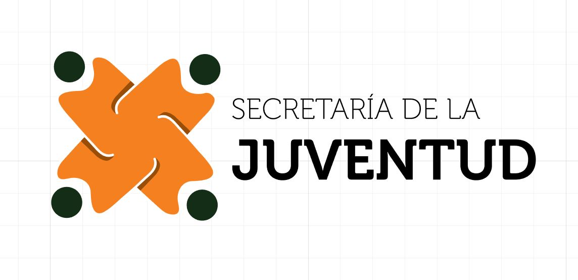
The typeface you’ve chosen is unusual and draws attention to itself. If it were me, I’d use something more neutral that doesn’t clash or compete with the logo.
The logo sort of looks like four people, but they don’t look especially like youth.
The little dark shadows where the arms are don’t really add anything except unnecessary complexity.
The thin white lines making up the arm will tend to disappear when the logo is reproduced small.
Unfortunately, those white lines can’t really be made wider without the logo beginning to look like a swastika. One of the many, but lesser, crimes of the damn Nazis was how they ruined a perfectly good geometric composition by using it as their logo.
I still think there’s something you can do with the basic shape, however, without this unfortunate connotation. For example, you might do a Google image search on 4-leaf clover logo for some similar, but different, treatments of the basic shape that might spur some ideas.
I googled “symbol team.” I’m not suggesting you copy one of these, but as B said, “might spur some ideas.” Especially the hands - there’s a lot you can do with hands.
Yikes! Really???
Transparency in logos = Bad.
But since this is a trend tonight, maybe I should just toss in the towel and start counting the color matches that I get to charge for.
Again? You landed on me before, PD, when I shared part of my creative process. I believe you called my suggestion a “mashup.”
Please, I’m not promoting transparency in logos. I just wanted to share some virtual brainstorming ideas to hopefully spark some inspiration for the OP, specifically graphic examples of people/teams, etc.
'Cause really, I’m just trying to be helpful, like you and most everyone else here.
The symbol is pretty generic looking – like it’s something you’d buy from iStock or Shutterstock as a ready-made logo and the drop your type in. Not a big fan of the font. Sorry. That said, I like Just-B’s suggestion. If the client is happy, bill them and move on.
Seeing a swastika in what is drawn in the top logo is really pushing the limits of credibility.
Everyone is offended by something.
Better just make it a white circle.
(JK, sort of…)
I get what you and frigge are saying… and in this representation it’s definitely leaning that way .. not in the original as far as my eyes see though. Just my 2 cents