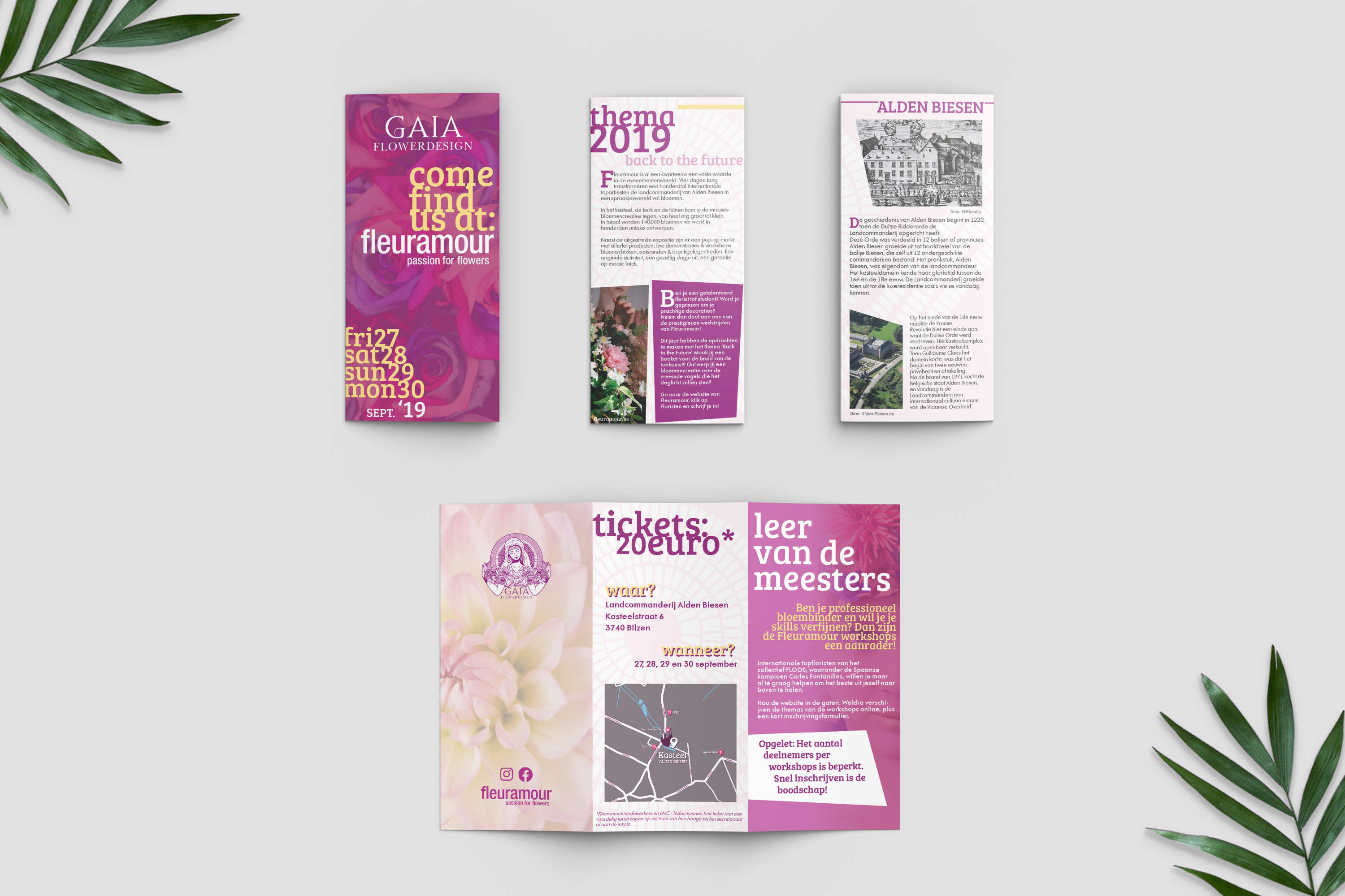
I’ve been working on a flyer design for my portfolio. It’s in dutch though.
The Fleuramour event is a real event where florists are able to show their flower designs in the shape of some sort of art exposition.
The designer itself and logo from Gaia are made up. The idea behind this flyer is to make the customer familiar with the event while announcing that Gaia as a brand will also be participating at the event.
Basically everything except for photos, fleuramour logo and social media icons are not my designs.
Also the mock up is not mine, I just used it to present it.
This is pretty nice work so don’t take my critique as criticism.
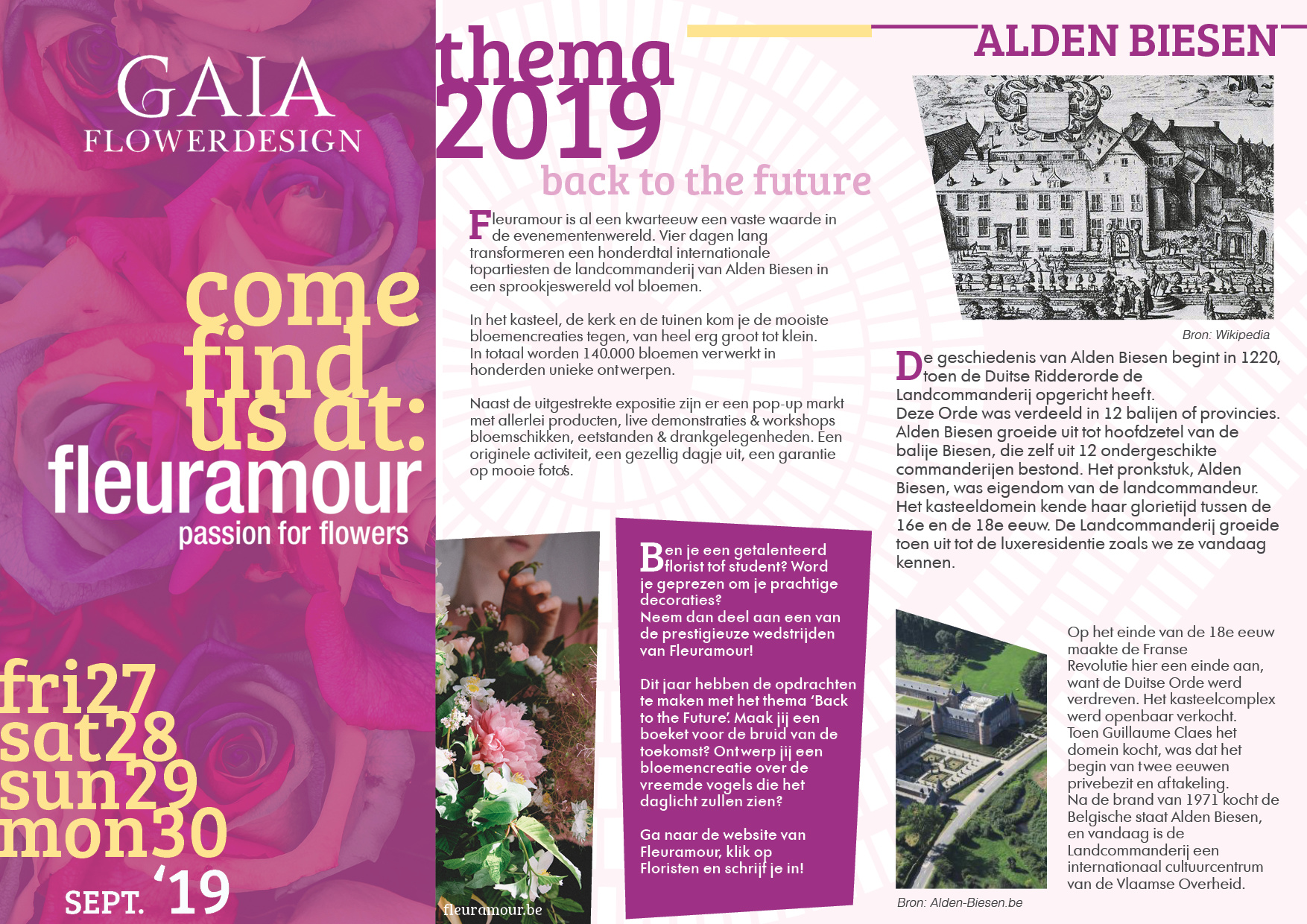
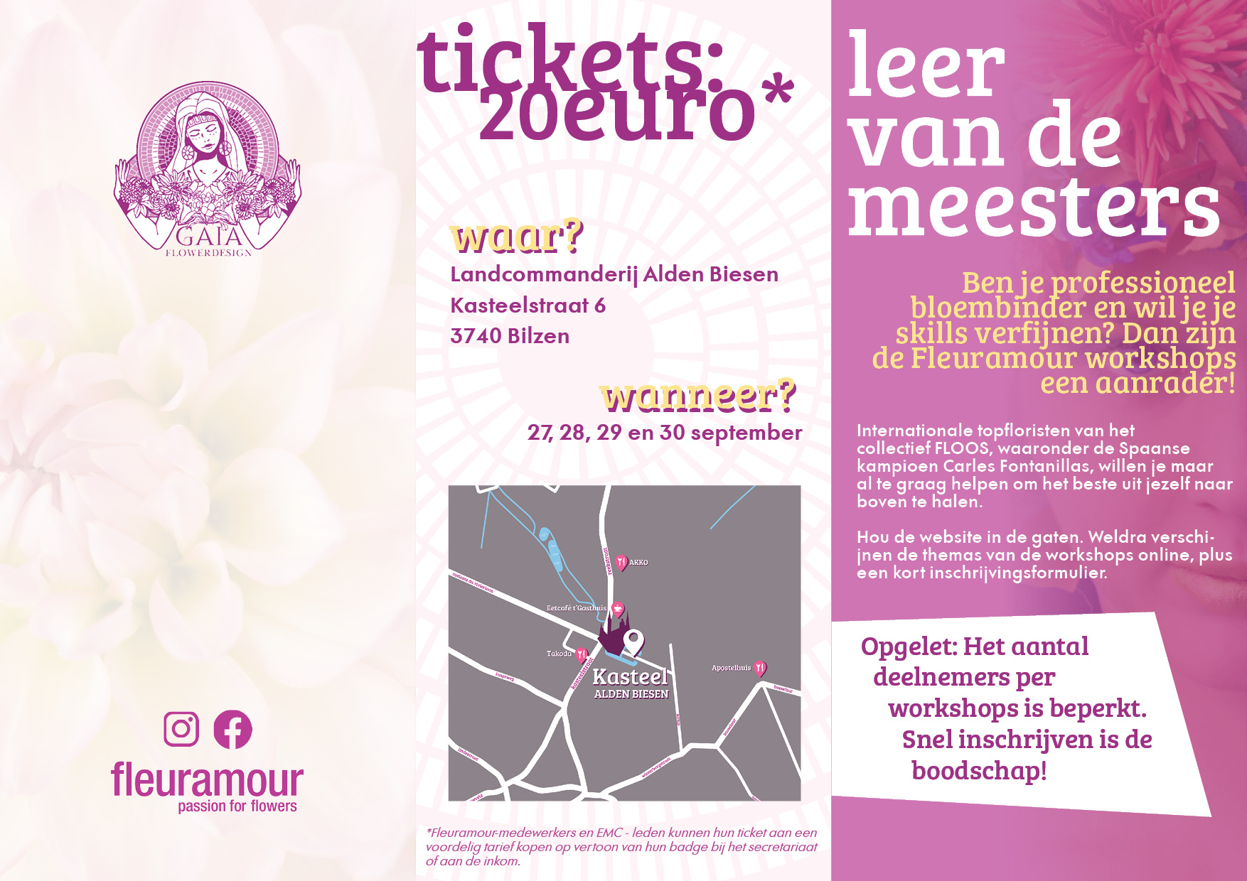
That big grey box needs to be a different color. Everything is beautiful and soft, but then you lay a slab of granite on it when you use a grey that hasn’t been anywhere else in the design. I don’t know what the best choice is, but try sampling some colors from the photos and see what works.
Careful of the text on the fold line. Printers are good at keeping registration, but make notes on your art to the pressman stating that the t aligns with the edge - that way you call it to his attention to keep an eye on as they run through the industrial machines.
Thanks for the heads up on the printing issues. Its a bit difficult to think of them since I haven’t much experience with printing. I’ll need to check up on some information regarding that. Also yes, you’re right, I’ll see if I can change the grey color from the map
Overall, I think this is a nice looking piece. Good job. I’d really only throw out two things for you to consider.
First, compared to all of the other panels, the theme 2019 and ALDEN BIESEN panels seem heavy and text-intensive. Any way to trim the copy or maybe crop the photos down a bit to get those two panels a little more airy in feel?
Second, it appears the Dutch language has some extremely long words which I’m sure make the rag challenging. That said, I think you could insert some manual line breaks in a few spots that would help clean up the rag considerably. Don’t assume your page layout program will always create the best visual line breaks.
Okay, one more thing. The asterisk after 20euro is huge. I think that could come down in size by 50%.
As already mentioned, you’re taking chances with the trim where you’re bleeding type off the edge. You’ve carefully positioned that type to be slightly cut off and give it a bit of tension, but if the trim is even slightly off in one direction or the other, you’ll have something that looks more like a mistake than intentional.
I get the over-tight leading is done for aesthetic purposes and it works on the headlines, but you’ve done so inconsistently by not doing the same with the leer van de meesters panel, then, for some reason overly tightened the leading on the yellow paragraph just below it.
Speaking of yellow type, it works when surround by the darker magenta-colored background, but doesn’t work on white. You already know that, though, since you used a magenta drop shadow to make up for the lack of contrast, which isn’t an especially effective workaround. In this case, it’s also inconsistent with the typography in the rest of the trifold, which makes the workaround even less good.
I’m not too sure I like the sans-serif type you’ve chosen as a secondary face. It just doesn’t complement the friendly serif face you’ve used all that well.
Despite all that, like others have said, I think it’s nice-looking work. Things do bounce around a bit, though, and I might have made things a little more orderly myself, but that’s just me. I think what you’ve done works.
Everyone has already mentioned the edgy text. I’m going to add to that by saying, if you were doing this for real, you might want to run it by the printer. If you use an online gang printer, you will get a template that will show you what the safety line is. The reason you pay the low price of an online gang printer is so they don’t have to care so much about their trim/registration/folding. By giving you a template they can be off by that much. Sometimes up to 1/8". You may have to use someone more specialty-oriented, and it will probably cost a bit more.
I used to do only creative work so I get where you’re coming from.
Basically, whenever there is something that is important, make a note on your proof (I use a separate layer called “Notes DO NOT PRINT”). Most times there are no additional notes. But the pressman always knows where to look for unusual info.
Thanks so much everyone for your time, lots of notes!
I’ll try to fix the most dominant issues as of tonight so I can proceed with my next piece. As for printing, I’m afraid I won’t be able to do that right now at a professional printer. But I might print it at home to check if the folding works and if there’s enough space left.
I also added a couple of words to my vocabulary and will have to work on some InDesign skills.
So this was definately helpful
And oh yes, dutch is a terrible language to work with in text. I learned that aswell.
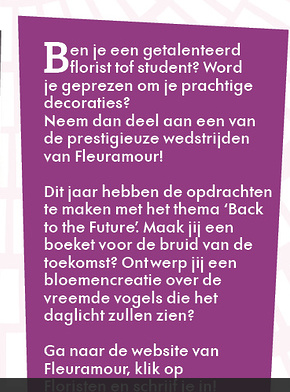
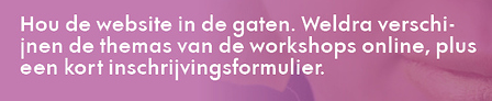
It says ben je een getalenteerd florist TOF student, where it should be “of” i guess? Also, the word “verschijnen” doesn’t break very nicely here. I would suggest breaking it after “verschij”.
For Z-fold flyer, if the OFC is on the left panel of one side, while the OBC is on the left panel of the other side (pretty much the same as a bilingual flyer). Or, if the OFC is on the right panel of one side, then the OBC will be on the right panel of the other side.
Once they’re established, you can proceed to assign the remaining panels.
OFC: Outside front cover, as in the front cover of a magazine.
OBC: Outside back cover.
In the case of a unilingual Z-fold flyer, the OFC, just like a book, is primarily to attract attention of potential readers (the flyer is usually kept in a display case, or laid out on a counter space). The main function of the OBC is to provide a summary of the flyer, contact information, perhaps a call-to-action shout out. Anything in between is up to the client and the designer.
A bilingual flyer, on the other hand, is a totally different animal.
I really like the presentation, the design and the color combination.
my only opinion is the yellow font for when and where.. I find it odd..
lastly, is the map, dark grey is not okay for me. also the fonts in the map is very small
I wonder if the outcome of the printing will get a readable results..