New flyers. Critique Please

Hello here are the recent flyers I’ve created this week in preparation for our services coming up at the end of march (informed of topic this past Sunday…not that any further notice would have made my designs any better, i don’t think).

The picture background used w/mountains in 2 of the flyers is one I took so it isn’t something copyrighted or googled. It was the same Theme we had last year and I needed something, so I started to look at pictures I’ve taken and decided to use it on our flyer.

It hasn’t been stated if any of these will be used or if I need to start over again and start from scratch so everything is still pending as far is if we will go with one.

The flyer w/purple bolded text, i do see that there is a black line near it, that line is from the black sillouette of the people that i noticed didnt appear on the other 2 because that black line is not on the actual flyer.

Of the pic w/the plane, i do have a few variations of that where one has the organization name in a green that matches the visit us w/a black back ground and the rest of the address text in just black with the address text located in the area where the ppl sillouotte is currently on the example below. Then the ppl are at the bottom right of the flyer… essentially a variation or two where the ppl are at the bottom w/the address under the plane wing if that makes it clearer.

Any feedback is appreciated. I have went through and remembered to use the grid and things of that nature so im trying to learn and retain what you guys provide in feedback and use on the next time i attempt flyers, so please dont think the advice goes to waste.

I feel like i do the same ‘thing’ every time on these flyers as far as placement generally of the ppl either at the bottom or sides but I realized this time around w/the color their clothes are in the pics that also plays a game with the colors on the flyer and how all of that flows together!!
That makes it harder.

Not that it matters but just for sharing purposes, I did 11 drafts total, all around these 3 ideas. I only shared 3 because I didn’t submit all 11 to be viewed only the few that i thought would be worth looking at/were the best out of the 11 drafts I did. It took me a while honestly, Sun night, Monday night and Tues night, then I submitted them early Wed am to see what ones they would want to go with or if I have to start from scratch.

First of all, I have to say that I admire your tenacity. You are working hard on these, you put your work out there for critique, and you keep coming back for more. Good job; and I mean that seriously.

For that reason, it gives me no joy to say that these are not ready for prime time — so to speak.

I see the problem as being twofold.

First, I think you have a messaging / marketing problem. What exactly is a prayer summit, why should I care, and why should I want to attend? I don’t know where you are, but, in the U.S., summits can be business-type meetings with presentations, networking, etc. What exactly is a prayer summit? Is it a meeting to talk about prayer? Is it strictly getting together for corporate prayer? Is there a time of preaching or teaching? Is there worship time? If it is people getting together to pray, is there a theme to the prayer? I’m just firing this off the top of my head, but, at least to me, a headline along the lines of “Gather Together with [insert your city here] Christians for a Time of Worship and Prayer for [our city, our country, whatever theme there might be]” is a stronger, more descriptive headline than “Higher Ground Prayer Summit.” Again, that’s just me.

The second is the design. I’m sorry to say this since you seem to be working hard and putting yourself out there, but I just don’t see the sensitivity to hierarchy, contrast, color, and typography that gets this to a professional level. The first option is the strongest of the three, but, even with that, it feels like a bunch of disparate elements slapped together.

Work on the messaging first and see if that won’t drive the design.

Hope that helps. It was meant to.

Hi I greatly appreciate the honest feed back and encouraging words. It really helps me as this is the only spot that I know of to get critiqued. I really don’t want to go on FB and post these in a forum because I don’t want it to get mixed in or seen w/the actual flyer when we do put it up. So this is my one spot to try and get better.

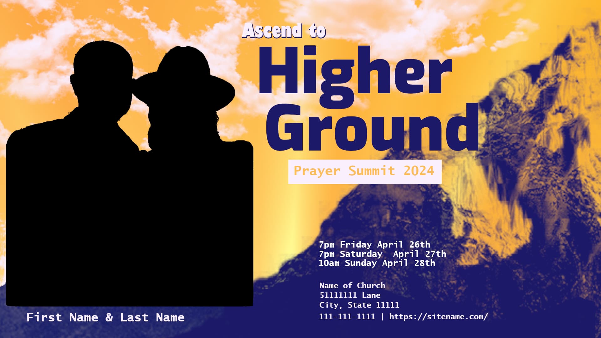
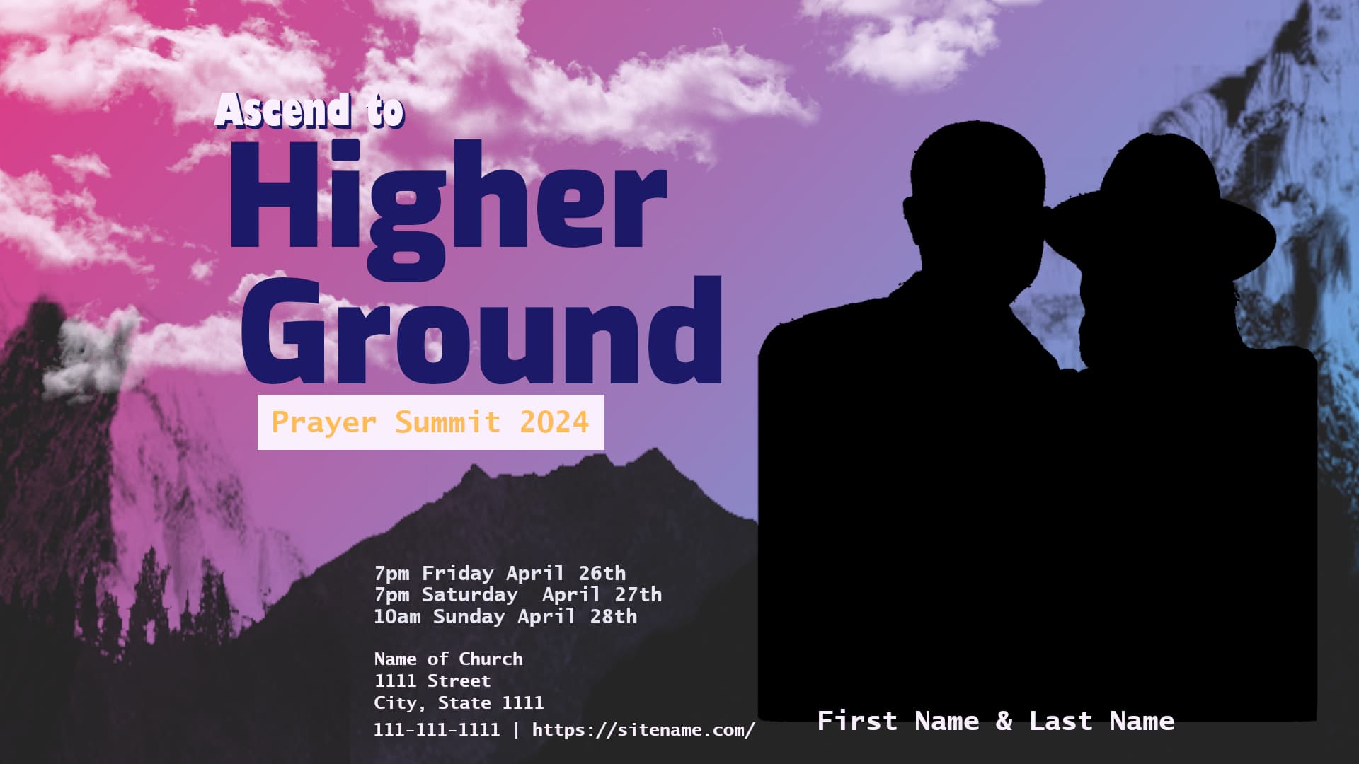
I appreciate you saying that they are not ready for prime time. I understand that. I see that they are flat and I thought the picture in the background would be better because its mountains and in my head im thinking a mountain is higher ground, get to higher ground, go up, mountains. I liked the picture itself, so I didn’t really want to add a gradient or filter to it and take away from it, but I also didn’t want to make it worse and I wasn’t sure how to blend it in with the information, so it doesnt look weird like oh you just threw a gradiant on a picture then dumped the info and people pic on there making it all kinda look out of place.

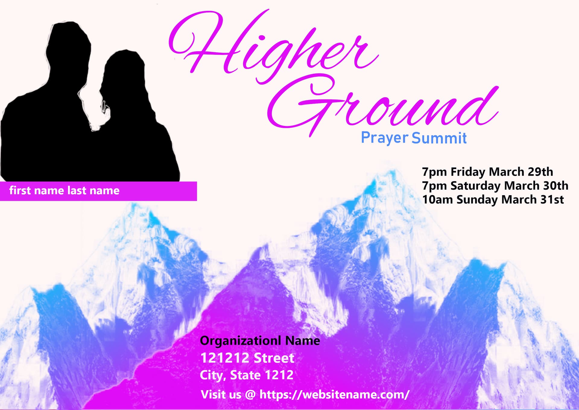
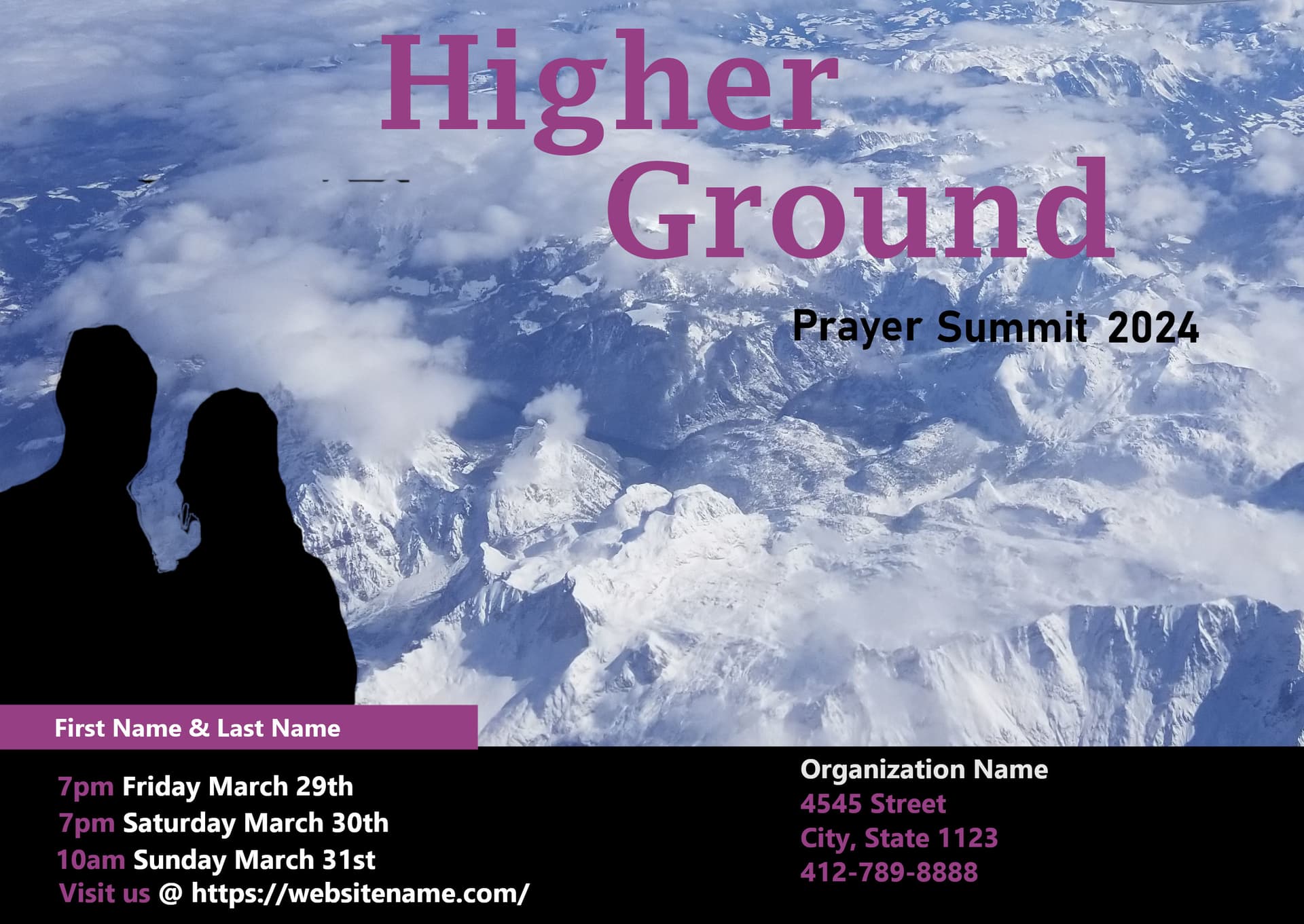
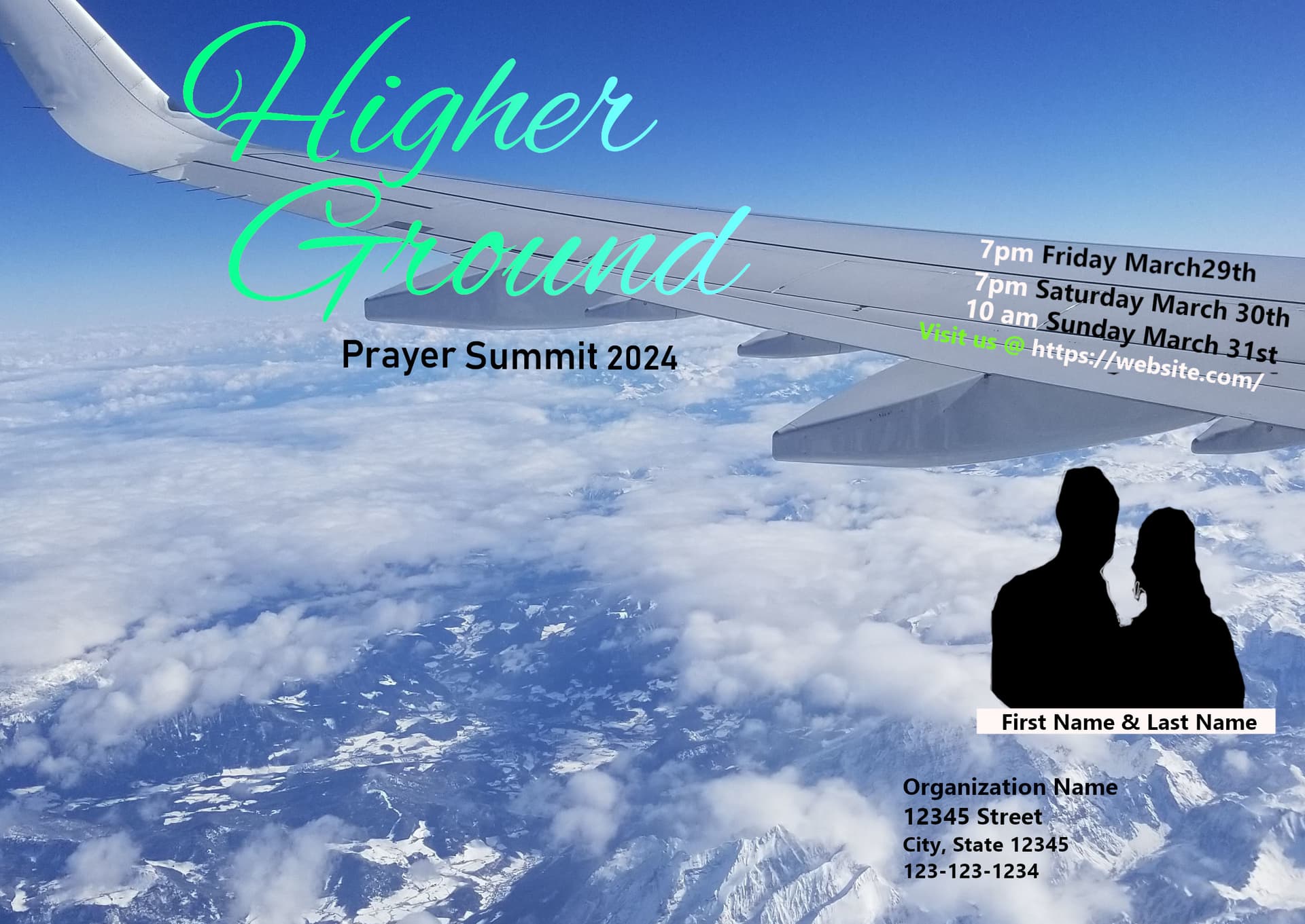
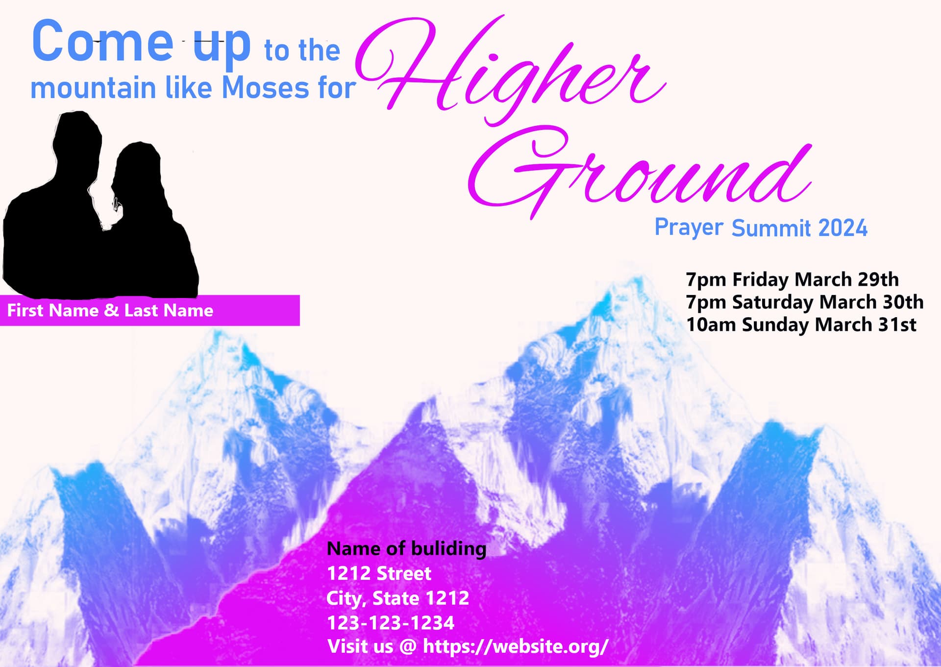
Since it was the same theme last year (higher ground) I had to do something different ( last years flyer w/the same theme can be found here: New Flyer - Please Critique )

So the first marketing problem you describe, I can see that and I understand it is an issue. I just don’t know how to go about it (as I also want to start working on marketing and ways to draw people in w/social media as we only put up things on our fb page if we have an event, usually thats the flyer they approve done by me and a 2 min video of them inviting people out to the event -video isn’t fancy at all literally just recording to come out to the event explaining it. Which is fine but I know we can make it better but that is for another day!)

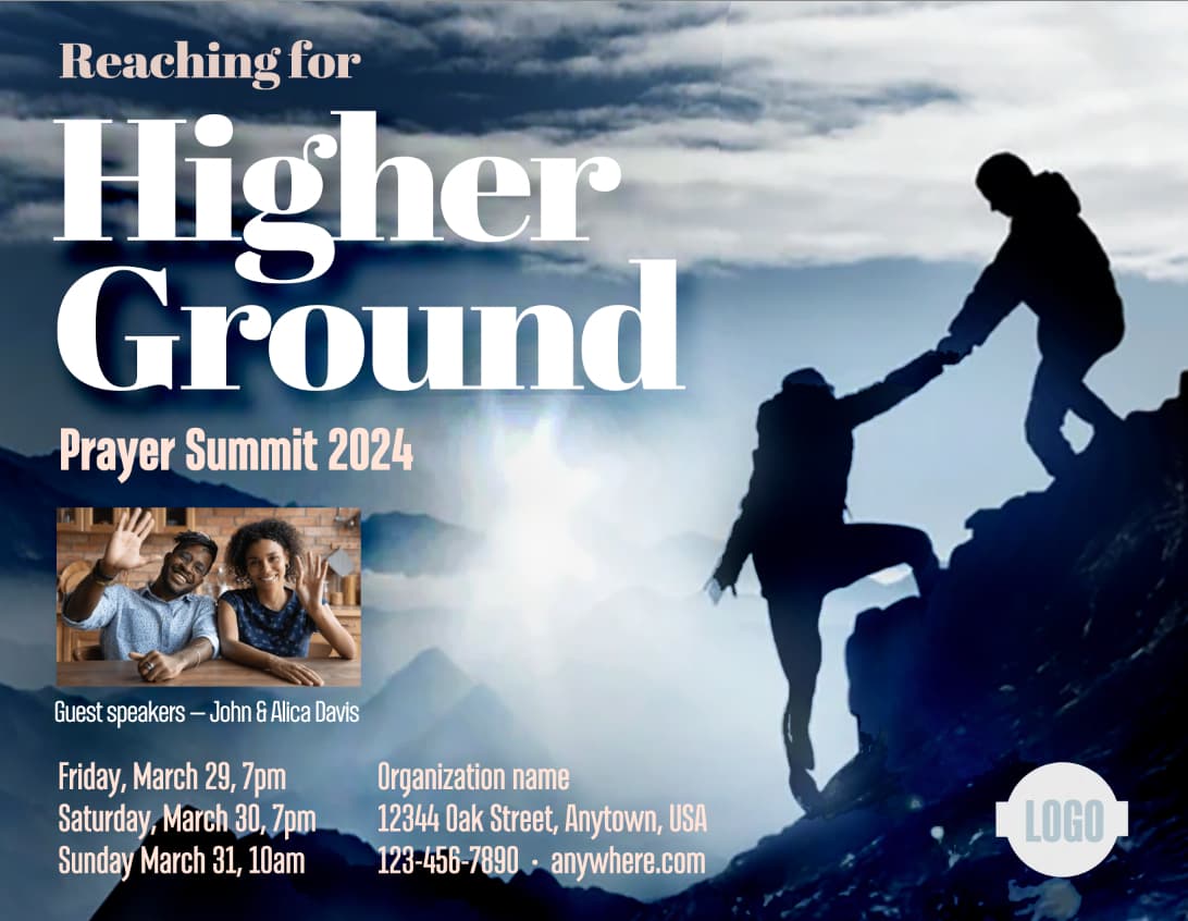
I am given the theme by our pastor and what to put on there so they specifically wanted ‘Higher Ground Prayer Summit 2024’.

Your questions make me think and I like that, I appreciate that. The example you gave even fits, it could be a business-type meeting but in this case it isn’t and there aren’t presentations.

The question you asked “What exactly is a prayer summit, why should I care, and why should I want to attend?” Maybe I am wrong, but I would think, these types of questions are answered by a Call To Action designs or prompts on flyers. Which is where I have no clue how to answer that on a flyer, let alone if someone were to ask me my answer would be to get spiritually fed is why you’d want to show up to an event like this.

This prayer summit (as all of them are for us), its a 3 day gathering, in the evening, where our pastor speaks about what God puts on his heart. It has worship in the beginning then an hour and a half (or 2 hr) message. It is getting together corporately for fellowship/worship/listening to the sermon. We don’t know what he is gonna talk about until that night really. We’ll know it has something to do or that he’ll have the reason for the theme but its not like we know specific topics, such as, Thursday night we’ll be talking about Moses and the Red Sea, Friday we’ll be talking about the burning bush and Saturday we’ll be talking about Jacob fighting an Angel.

Reading your example about Gather Together, made me think, so I went back and added this and also included this in the drafts as a choice (since I didn’t get a response yet figured I’d include it).
Please ignore the black line near come up, thats from the black silhouette.

I know this isn’t the best but I figured i’d add it. My concern is adding to much as well (i hope they don’t come back and say add food and fellowship after every service, and or child care available) because all of that takes up real estate too making it feel cluttered at times and also big enough to be legible but small enough to not take up a ton of space.

Don’t be sorry, the feedback is appreciated, the only way I will get better is by doing this and putting myself out there and making flyers for these events. I though about coming up with random flyers but i feel like its harder to do that but maybe I should just make stuff up just to try and get better then maybe I can eventually use a design for an actual flyer, the hard part of that w/me is, if its not needed for an actual event why am put so much time into it when I could be working on something else that needs to get done. I am not knocking it but that is where i struggle w/that because i know the more you do something the better you’ll get at it.

I went on linked in a while back and marked a handful of videos on graphic design that I have been wanting to watch and I plan on reviewing those and taking notes and then looking at the notes next time i work on a flyer for an event. In reality maybe I need to just make stuff up and practice it.

Good idea on working on the messaging, I think it would help if I sat and asked the questions that you did and tried to think on the messaging as well.

Your feedback is appreciated and it is helpful. Thank you.

We have a forum rule that prohibits redoing people’s work. The exception is when using visuals are the best way to explain something. I’m invoking that exception now because much of what’s been recommended to you as rules of thumb in the past hasn’t seemed to sink in.

I admire your tenacity at this and want you to get better at it and feel more confident.

You know your church and its members. I don’t. You know your congregation and what might resonate with them. I don’t. You understand the preferences of your pastor and church leaders. I don’t. I’m saying this because I’m largely ignorant of what you need, but I know a few things about design, layout, and engagement.

In other words, my example is not the solution, so do not use it. Your work has to be the solution. My example is only a visual aid for the points I’m about to make below.

Using the term “higher ground” metaphorically means working to gain a broader perspective while keeping one’s feet firmly planted on the ground. Your photo from an airplane 35,000 feet above the ground seems a bit inconsistent with this metaphor.

Your work needs to be more visually aggressive and command the available space. Randomly placing things around in whatever space seems to work isn’t commanding the space; it’s letting the space command you. Consequently, it’s scattered and mousy.

The headline should have an authoritative look. Using a weak, timid script face does not convey this.

Your verbs should be active and challenging. For example, instead of writing, “Come up to the mountain,” use a more active set of words, such as “Climb the mountain” or “We will help you reach the top.”

Line things up. An underlying grid can help, but grid or not, line things up and arrange the various parts into a hierarchal and unified block of elements that is simple and easy to see and establishes a straightforward mathematical arrangement between the parts in a way that brings unity to the composition. Instead, your approach has been to simply place things where there’s a space for them in a jumbled set of relationships that meander all over the place.

Pay attention to value contrast (differences between light and dark areas). Squint your eyes to see what stands out. The layouts with the highest value contrasts are the most readable and legible. Use value contrasts to structure your design and focus interest on what’s important. Believe it or not, values are more important than colors.

Don’t draw attention to things that are irrelevant to the message. For example, on one of your layouts, you’ve squeezed typography into the wings to match their shape. You’ve drawn attention to an airplane’s wings that shouldn’t even be in the photo.

There’s zero reason to say, "Visit us at https:whatever.com. People know what a web address is; they don’t need to be invited to visit. Furthermore, inviting them to visit won’t make them more inclined to do so. It’s a bit like inviting people to read a headline.

Finally, quit jamming things against the edges of the page. Typography needs room to breathe.

So. with that and what others have said, let’s see what you can do that’s better than the hurried and naive thing that I cobbled together.

Start wireframing your layout and hierarchy then build on it

image

Generate versions and ideas - and don’t break the hierarchy

Experiment with backgrounds - colours - and keeping the same font throughout - at most 2 fonts.
Use Light, Regular, Bold, etc. in fonts for emphasis or design.

1 Like

I greatly appreciate this. I am a visual person and the visual aid helps alot with points. The exception helps a lot. Your example helps a lot. The input and points you share help as well (visually aggressive, command available space, and authoritative look). In regard to the words, less is more and the examples provided help me know how to think about it differently and approach it.

Even what you put together quickly is amazing but its helpful with everything you shared.

I greatly appreciate the advice you give, I think you have shared input on every post I’ve done and I appreciate the input, and patience as im trying to get better. You are always helpful and it means alot.

1 Like

Thank you for the visual as well. I will start wireframing and work on hierarchy as well.