Some of you might remember me from my last thread, with the not so great design I had. After the rightful backlash on the Cover I got, I just decided to lay it aside and wait for a better idea.
So while browsing Unsplash I found a nice picture of a floor tile, that looks aesthetically pleasing and also has a fitting meaning for the album I want to release. While I don’t want to change that part, the overall layout of the placement on the cover still doesn’t feel great.
Do you think I should keep the white frame and maybe just work on the artist name script? If yes what kind of font would fit in your opinion?
Or do you think I should just use the full picture of the floor tile without any artist name? Maybe even embedd the artist name into the floor tile design?
I’m grateful for any help or opinion.
(And I’ll try to not instantly dismiss any critique like last time )
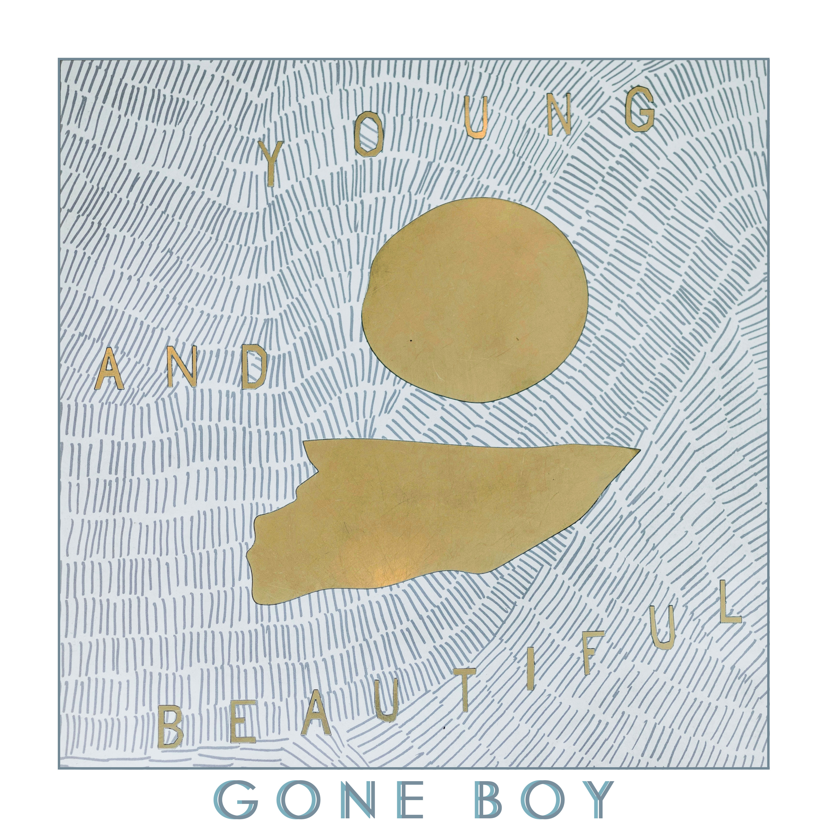
Your last cover had a much younger version of yourself sitting at a piano with a guitar: Album Cover Art
This cover is far different from the last one. You mentioned a picture of floor tile that inspired this, but I’m not picking up on the significance. For example, what are the gold-colored shapes about? They just seem to be random elements.
The typography needs a lot of work. It’s sort of camouflaged into all those lines, which lessens its legibility and tends to make it blend into the background rather than standing out and contrasting with it. I don’t have a strong opinion on the white border (which isn’t really obvious in your image), but I’d likely be inclined to omit it and, instead, work all the typography into the image in a visually strong and aggressive way that unambiguously relegates the busy background to being the background.
I interpret it as a sun rising or setting above a body of water, but I feel like the abstractness of it allows for own interpretation.
Sounds good, but I think there is not much place to fit in the artist name. That’s what I’m struggling with at least
I agree with both of you. I basically just tried to make the font more interesting, because the font itself is kinda boring.
Do you mean the “Young and Beautiful” part? If yes, I take it as an ironic statement to the not so beautiful topics about hardships in the lyrics. But to be fair, that might not be conceived the way I mean it by the listener.
@Just-B@Eriskay
I also thought about taking some of the letters from the Young and Beautiful script and just forming “Gone Boy” with them, while abandoning the Y&B. That would be a lot of work though
No. I meant the illustrative part. I’m of the impression that you spent a lot of time to create it and not said something. I do quite like the drawing though.
I actually like this a lot as fine art, but as illustration or design it is following no design conventions at all. So this is hard to critique. So instead I will tell you a few things that might help the creative process but won’t interfere with whatever spark you’re drawing from.
When I was in Art school the head of the Illustration Department became sort of a mentor to me. He was very big into the idea that if one learns design rules you may actually stunt your growth as an artist - because you start to analyze instead of using feelings to make design decisions.
Since you are a musician you might like this example. There is a short story by Orson Scott Card (of Ender’s Game) about a musician who is kept in isolation in order to produce music never before heard and untainted by what had come before. Someone slips him a recording of Bach (I believe, might have been another classical composer). Once he listens to the recording, people realize he’s been “tainted”.
In art this can be the same thing. Fine art is about feeling - even design based modern art like Kandinsky and Mondrian. They are there to make you think. Design is about delivering a message. Album covers walk a thin line between them both.
So, I’m trying to give you some guidance, but I don’t want to keep you from exploring the fine art aspects of your design. You want that album cover to “feel” like the music on the vinyl makes you feel when you hear it.