Hey,
I’m looking for a critique for a school project where we were tasked with re-branding ikea.
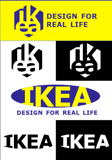
The first logo is a hexagonal allen-key shape that comes with most flat-pack furniture. It also uses the Verdana font that they switched to in 2009. The hexagon represents the innovative idea of their flat-packs.
The second logo is a modern version of their current logo, using the Verdana font. It pays homage to their heritage, just updating it.
am also looking for some professional designers to answer some questions if you have a spare few minutes, I would really appreciate it!
a) What does the logo represent to you?
b) Is it legible? Is it easy to read and understand?
c) What is the core product/service undertaken by the business?
d) What do you think about the company when you see this? (innovative, modern, stylish, international, affordable?)
e) Does it stand out and catch your eye (VS competitors like amart furniture, fantastic furniture, ashley furniture, ect)
f) Does it feel genuine?
g) Are there any technical, legal or budgetary issues that need to be considered?