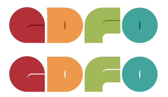
I wanted to create a logo that is like a palette of colors/shapes to represent the tools of a designer. There are two version of the logo. The primary is the square, and secondary is the horizontal. See them below. You can hopefully tell the shapes represents the letters G D F and O. Let me know what you think!
Ditto. I think a little notch in the G and the F make them more recognizable. On a side note, will there be any user ability to change the color scheme for how this forum displays?
I agree with B, even if it’s more subtly defining the shapes. I know that it’s abstract, I get that, but as Hotbutton mentioned, right now it reads more like “adro”
This is what I meant by “ruins the concept.” In fact, I’d say more explicitly turning the shapes into letters disposes of the concept altogether and results in what looks like, IMO, an unsightly font.
Hotbutton, If the concept is four characters all conforming to the size of a circle and geometrically repeating elements of that circle, yeah, the concept is compromised by any alternations that lie outside that concept.
However, a less geometric and humanist interpretation of the concept might allow for some consistently applied tweaks and refinements that provide visual clues and better balance while retaining the overall rhythm of the geometric shapes that it’s based upon.
Trying to achieve a middle ground of keeping as much of the concept while making it more legible is, perhaps, like you mentioned, a recipe for some not-so-good-looking glyphs. Personally, I’d be inclined to abandon a strict adherence to the concept and concentrate, instead, on preserving the colors, flavor and rhythm of the whole thing while paying more attention to designing some glyphs that could stand on their own as aesthetically interesting.
Heading down that road might lead to something like Milton Glaser’s Baby Teeth typeface, below.
Yeah, I’d be sort of inclined to lose the O too. Since the other GDF is going away, there’s some value in maintaining more naming consistency with the predecessor forum. The O is, I’m guessing, just a reference to the .org domain, which doesn’t necessarily have to be part of the name.