The “G” looks a bit like a “C” to me at a glance. I played around with it to see if I could make it look more like a “G.” Here’s what I came up with.
2 Likes
I agree. I’m not happy with the G. But even yours is somehow off, right? Thanks for all! ![]()
Yes. The square part was equal weight to the rest of the shape. I made the square part a little more dominant. I think it looks slightly more “G” like and a bit more unique now.
It’s odd that doing that made it look more like a G, but it does. Perhaps it’s because it looks less like a C now.
Anyway, the D looks just a little wide and taking up a bit too much space, maybe or maybe not. Anyway, I trimmed it back some, below.
(Sorry, Iraszi, you probably want to be done with this. ![]() )
)

2 Likes

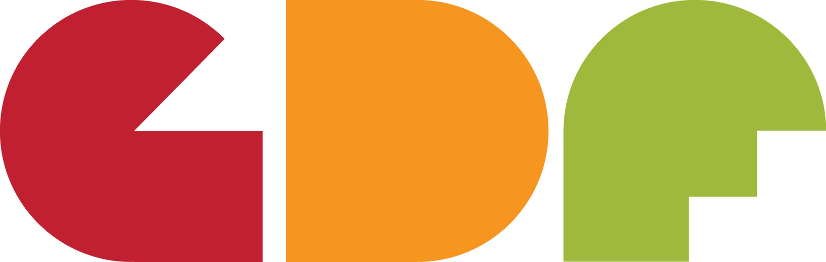
The 90º pac-man still looks too much like a “C” too me, just tilted upward.
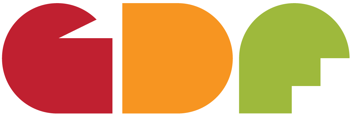
By shortening the width of the square portion of the “G”, StudioMonkey solved the problem I was trying to solve with my 1st attempt. I like it better than my 2nd attempt. I’m also liking the less wide “D” that Mr-B suggested.
I’m starting to see symbolic meaning in the shapes beyond their alphabetical meaning. The “G” makes me think of a mouth talking, fitting for a discussion forum. I see stair steps in the “F”, which makes me think of the potential industry progress that could result from the collaboration on this forum.
1 Like
Still a bit Pac-Man?
The G still looks like a C to me. Maybe look at a Capital G, figure out what part of that form really forms the sount “GEEE.” To me, it is the top art meeting the bottom part that differentiates it from a C. The negative space between the G and D could also be something else, like a flag, or a tree. The solution may be in the negative space?
1 Like
lmao!!! By George it does! ![]()
![]()
Didn’t realize we were doing this here, was trying to respect the ole crit pit rules, anyways, I posted it elsewhere but here’s my go at this. Check out the link if you want a bit of background on the idea.
5 Likes
I like KMs “G” for looking the least like a “C.”
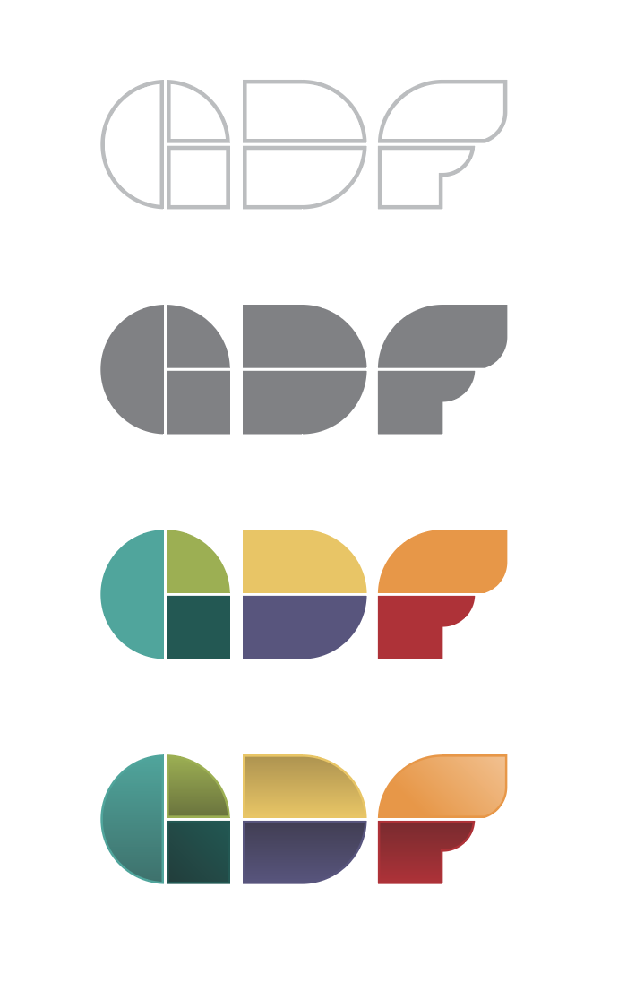
For some reason, the “G” is more obvious in the 1st two monochrome versions then it is in the last 2 color versions. Perhaps a single separate color for each would work best.
1 Like
I think it’s right that the logo be a community effort; a bunch of graphic designers should be able to avoid making a camel of a horse.
Here’s a couple other colour explorations.
3 Likes
This is the one. Good in a number of variations which don’t change the concept. Well Done Kerningmatters ![]()
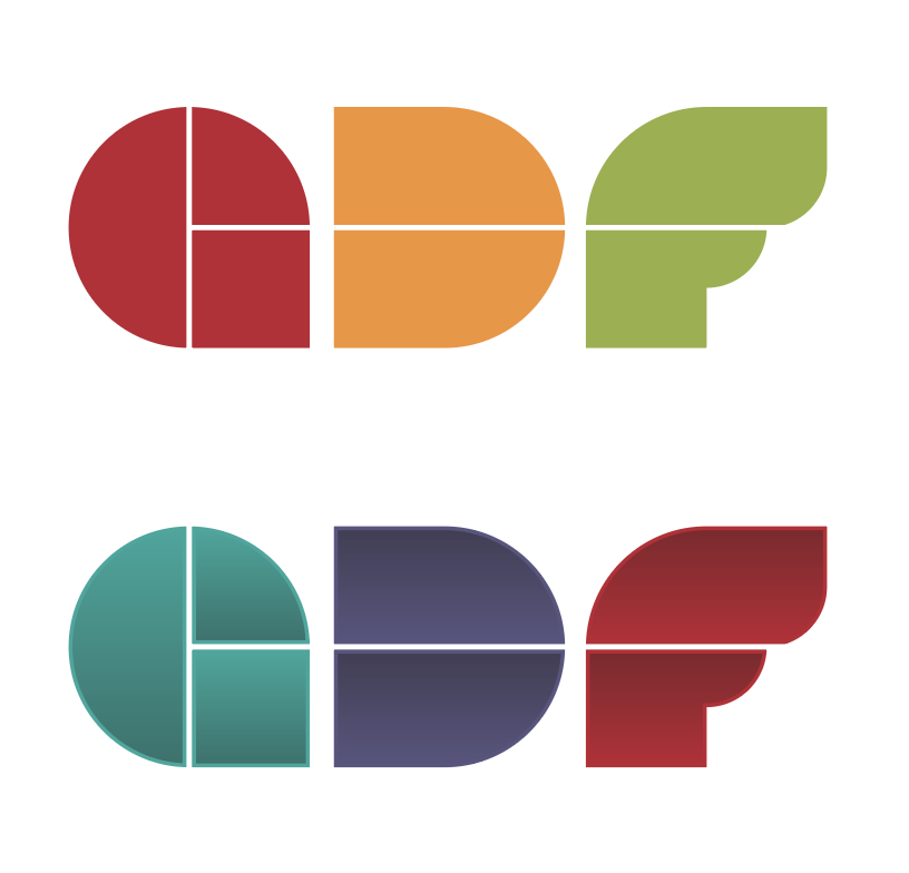
7 (plus?) colors
and gradients?
Okaaay…
@PrintDriver Given the use of this, it’s not really an issue is it? Why restrict this logo to constraints, like printing in spot colors that were never specified, that it will likely never be put against? Besides, it doesn’t rely on the gradients or color to make it work. Consider this a guilded version meant to feel a bit tactile from the other side of the glass.
@StudioMonkey Thank you. Again I look at this as a community effort.
I like what you did with the letterforms. The coloration just reminds me of something you’d get from crowdsourcing sites. If the logo doesn’t rely on gradients, why do it, is sorta where I come from. Whatever you all decide. I don’t particularly care. Just set in my ways, I guess.
[shrug]
I guess we won’t ever make t-shirts.
![]()
(though I think Allen did once, way back when…)
1 Like
Fair enough, I felt it necessary to illustrate that these type of constraints were considered.
There’s no reason why there can’t be both a gradient version and a solid version if they are close enough in appearance.
1 Like