I see nothing wrong with a fancied-up version of a logo for specific usages. As long as there’s a good, simplified version for when the fancier version can’t be used, I see no problem.
1 Like
So, you guys prefer the version with each letter being a single color? Rather than multiple colors? If yes, @kemingMatters please upload a png for both ‘GDF’ and ‘G’. No margins or padding please. Let’s see how it looks like on the site.
I sort of like it the way it is now with Keming’s enhanced treatment. Really, though, I’m totally OK with whatever is decided.
1 Like
Keming’s blinged logo is fine.
1 Like
I like the current one too ![]()
1 Like
Just read through this thread and I really like the one that’s up there now. Nice work everyone, esp @kemingMatters.
1 Like
Looks pretty sharp to me! ![]()
![]()
![]()
![]()
1 Like
Oooh that’s fancy. Looks pretty rad if I do say so myself.
1 Like
![]()
![]()
![]()
Now’s that is fancy!!!
… and Sparkly!!!
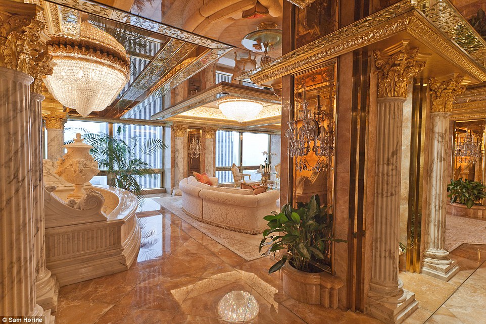
For certain clients like, um, Donald Trump, these would be perfect. The bottom one would look right at home in his Manhattan penthouse below.
2 Likes

1 Like
On January 22, 2019 we can use the fancy logo to celebrate our re-birth. ![]()
2 Likes

Thanks natek.gd ! ![]() I think we are pretty well settled on our look for now
I think we are pretty well settled on our look for now ![]()
Gonna close this up for now ![]()
1 Like