I’m working on designing a brochure advertising a certain kind of dog food. Any picks with the layout? Does this get your attention as a potential dog food purchaser? This needs to go to print in a few days, so any input would be greatly appreciated!
DISCLAIMER: I am not planning to print this with the Getty/iStock images like this. They’re simply placeholders until I get the design finalized. I will then replace these thumbnails with the purchased images. No pirating here!
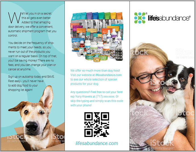
Front Cover – Unless I am specifically familiar with life’s abundance, I have no idea what this brochure is for nor why I should open it up. Even if I am familiar with life’s abundance, you haven’t given me a reason to open the brochure. What I’m trying to say is that you need a hook on the front that will grab my attention and make me want to investigate further.
Flap – This is my opinion, but I’m not crazy about the photo you picked out. The photo on the cover is much stronger. Set the drop cap in a contrasting color. Really pay attention to line breaks. Try not to have one word on a line by itself. Try to eliminate hyphenated words.
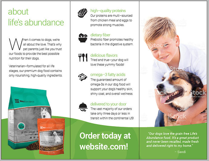
Inside – “about life’s abundance” isn’t a particularly compelling headline. Actually it’s kind of boring. Assuming you fix the cover and you’ve made me want to open the brochure, you now need to give me a reason to read the copy. What’s in it for my dog? What’s in it for me? Set the drop cap in a contrasting color. The content on the middle panel feels tight. I think you need more space above high-quality proteins. Some of the icons could be stronger. For example, the omega 3 icon looks like bacon – pretty much the exact opposite of omega 3.
Back – I’d make the picture smaller to give it little more breathing room. I’d say a good headline would help this panel, too.
Overall, the look is airy and colorful, which I like. The messaging is completely lacking.
The look is nice, but I see a hierarchal gap in the information. What I mean is that it’s not obvious what the brochure is about. Yeah, there are photos of happy people with happy dogs, but that leaves the message to inference on the part of the target audience rather than having it clearly spelled out for them.
Reading the text clears up the gap in information, but beyond the catchy looks and explanatory copy, there needs to be more obvious, easily read, catchy words saying what this is, why it matters and why it’s important to the reader.
As for all the copy, this might be out of your control, but if it were me, I’d try to liven it up a bit. Dogs are fun and they make their owners happy. The copy really ought to reflect that lightheartedness instead of being so matter-of-fact and perfunctory.
I’d also be inclined to make the QR code smaller. It just doesn’t need to be that big.
The dog in a box is fun, but it’s not pulled off all that well. I realize you’re working with stock, though. On that same panel, I’m not too sure about the blue and tan-colored photo combination. The cover is engaging, but opening up the cover and seeing the first flap ends up being a bit of a blue, not-quite-as-fun letdown, which doesn’t set the right emotional tone for engagement.
Really, though, I’ve just pointed out the negatives. There’s are a lot of nice things going on with the brochure too, so I’m speaking more about refinements that could be made to an already pretty good tri-fold.
Edit: Dang! I finished this, read Steve_O’s critique and realized that I could have skipped everything I wrote and just said that I agreed with him. Oh well, at least you have two separate designers seeing much the same thing.
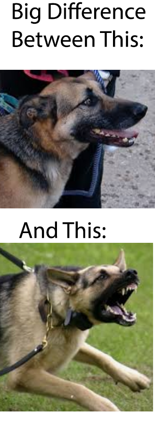
DONT SHOW DOG TEETH!
this makes the animal rabid.
“when it comes to” is when i leave the site or stop caring what is next.
that phrase is just begging, not being informative, and not important.
Excellent point. It definitely needs an "identifier"of some sort for people that aren’t familiar with the product/company. Just remember you are trying to bring them more business, not just describe them for those who already know it.
You can even steal the line from the center panel as a sub-headline.
“So Much More Than Dog Food.”
A post was split to a new topic: Canine Design
![]()
Hello Dear, Good practice. Go ahead
???
It’s another rule of thumb. DOE!
But in general he’s absolutely right. People have a “creep factor” based on our stoopid, caveman, lizard brain. Anything that is normal but just a little… “off” makes us uneasy.
EB’s example is one that you have to think lowest common denominator because MOST people won’t see (feel) the scary teeth, but those that do will have a very negative reaction.
This capitulation to lesser values: the accepting of a bad decision by a client- to me - is what separated design from art - the derivation of your own best and learned opinion will always be secondary to that of the customer.
Given that this is a brochure aimed at dog owners, I suspect a dog with its mouth open, tongue hanging out and teeth showing won’t be mistaken for anything other than what it is—a happy dog.
Seriously? Learn something new every day.
I was gonna say something along the same line as B, the people triggered by dog teeth aren’t gonna be dog owners…
But still…
there are many dog photos free we can use with out teeth showing which i displayed in a graphic that that was reposted to another thread.
the top dog does not look happy, and rabid.
too bad we did not get a reply from the poster. yet
read at your own risk ![]()
Far too many people are “triggered” by far too many things. We are going to end up with a sanitized environment that is already becoming blander by the day.
And that’s all I have to say about that ![]()
Hear, hear! (I mean hear, hear to the blurred section.)
For what it’s worth — from the U.S. Centers for Disease Control
Seems one is more likely to run across a rabid cat than a dog.
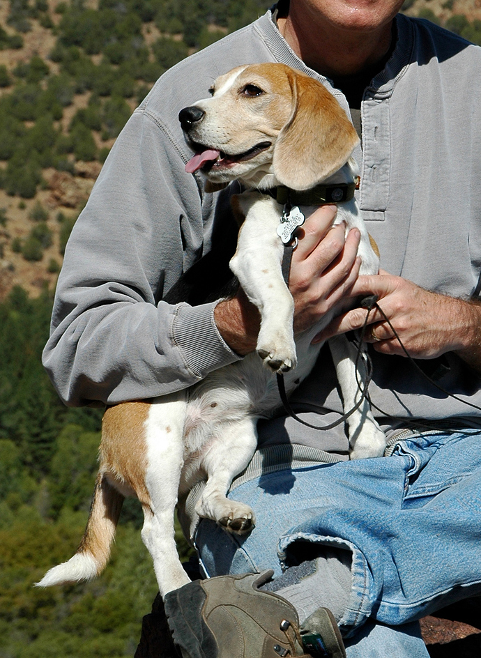
Here’s our beagle, Mable. I can’t tell if that’s a tooth I see in her mouth or a bit of slobber. Anyway, she’s not rabid, doesn’t bite and isn’t very scary. She chased a border collie out of the yard once, but that’s about it.
that happened many years ago, during the 80’s sometime.
Yup.
I wonder if there is a class somewhere teaching kids this crap.
More than likely. When you put into factor what a lot of shit some public schools teach.


