I posted an earlier version of this brochure a few weeks ago here on the Crit Pit. Since then I have made a lot of changes, and a professional copywriter has re-written the text. (thankfully!)
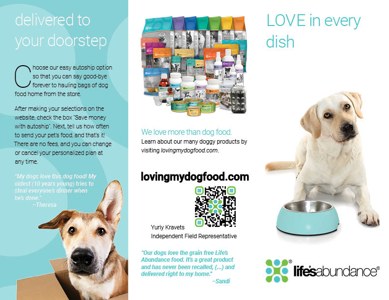
I am having some layout issues with the back panel of the brochure. (Contact info, etc.) It just feels like everything is clamoring for attention, and I’m not sure how to get the hierarchy sorted out. Help!
BOLD!
use bold and all caps in the heading and a darker font
my head exploded so others can add more comments
Sorry but this “angle” that “your dogs will love it” is… well… it’s terrible. Dogs love any food and as a dog owner that would not entice me to buy a particular brand of food. If you must stick with lovingmydogfood.com your angle should be why the owner would love it for their dog. They are the buyer after all.
Ok… as for layout, it’s improved over the previous. But…
- No food in the dogs dish on the cover
- Weak headline
- Is delivering to your doorstep really more important than what makes this such a great dogfood? Is that why you lead with it on inside flap (pg. 2)? Why is the dog in the box? The food should be… no?
- The “never been recalled” is not something I would promote… it actually did the opposite of what it should and made me think about recalled dogfood.
- Product photo is waay too small… this is what your advertising, so show the products!
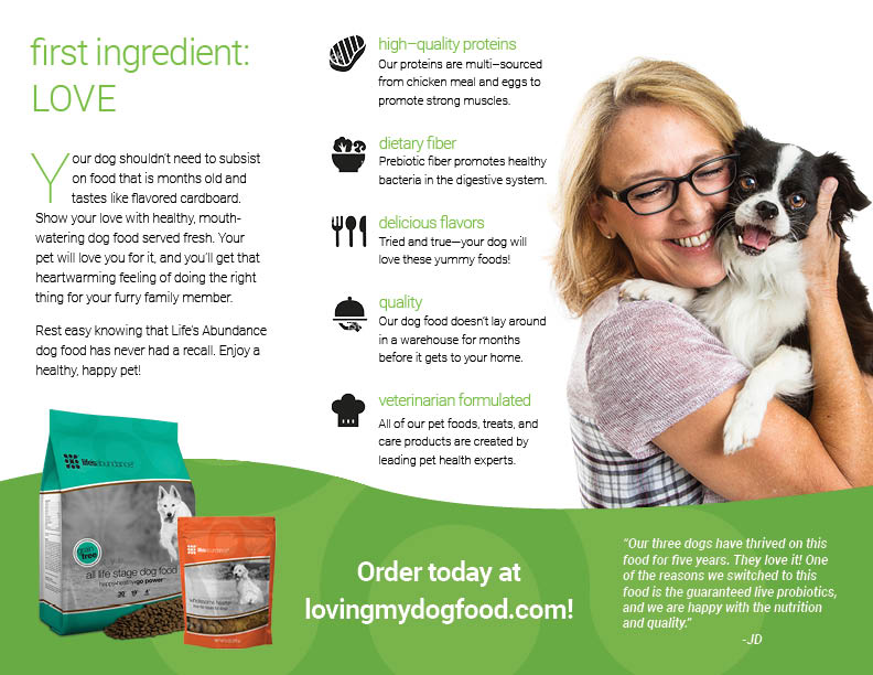
- Is love really the first ingredient?
- “Food that is months old” points fingers at the owner suggesting they are not caring for their dog to give them fresh food.
- middle panel “high quality proteins…” etc. is good-- I do like the icons, but the copy for each needs work. What does “multi-sourced” mean? What flavors? It’s a quality product because it doesn’t “lay around”? “Veterinary formulated” imo is a VERY important feature. Lead with that!
- Quote mentions 3 dogs but photo is only of one. While it is a cute dog, doesn’t exactly show “thriving” or even playful. Photo should compliment the copy.
Thanks to all for their comments; however, I am specifically asking for input on the arranging of the text on the BACK panel. I can understand what you may be referring to as far as the copy, but at this point, I am in no position to be changing that and will not attempt to.
Agreed, since your headline type is a lighter color than your body copy, my eyes naturally skim right over your headlines. Blur your eyes and the focal points start to reveal themselves. Even though “first ingredient: LOVE” and “high-quality proteins” are the same color, “high-quality proteins” will appear lighter because it’s smaller and by nature thinner than the larger type in the same color. You’ll need to adjust the color just slightly on the smaller text if this is going to print CMYK (I assume it will since there are photographs).
Additionally yes, beef up your headlines using bold/thick versions of that typeface. It’s going to be difficult to grab their attention first with the headline being the color that it is because it lays back soooo much compared to the solid black copy.
Looks fine to me.
LOVE in EVERY dog dish!
hmmmn, there is no love or anything in that dog dish…
I think it looks pretty good. I do agree that the headlines could use a little more weight. I liked the photo of the boy with his dog in the first version.
I do see your point about everything clamoring for attention, but that’s mostly because I’m seeing the whole thing laid out in a way that doesn’t reflect the dynamics of picking up the trifold, opening it up and looking at it a panel at a time. The only layout that will be seen in its entirety is the inside, and I think that hangs together nicely.
Wdesign and EB_comix ar right about the dog food bowl — it really could use some dog food in it, but then again, the dog would be eating it instead of anticipating its arrival. I’m not too stuck on the “LOVE” ingredients. With my dog, I supply the love. The dog food supplies nutritious ingredients. But as you said, the copy is done and put to bed.
Pretty good job, I think!
No teeth right? jk
our rabid fido from the original series got the boot!
Thank you for saying this! I literally was covering up pages while viewing to make sure I was seeing the panels properly. Ex. When you first open this trifold the first page you’ll see on the left will be dog food with text and on the right page (before fully opening) will be dog in box with text page.
Actually thinking a little more into this… If the contact info is important to you/your client then you may want to move it to another panel. I could be totally off but I feel like the back most panel is the one I look at last… if at all.
Off-hand I can only picture food brochures (take-out) but they always have contact info right on the front (phone number, address, website). I apologize if you told us the audience info before but if this trifold is expected to go into pet and/or grocery stores then I would add at least the website to the front panel.
In terms of the back panel on its own, it does feel cramped. Here are my quick heartless thoughts (b/c I’ve already gone on too long haha):
- The extra review seems out of place, remove it? Gives you space.
- Why should an audience member care about Yurly? Is the QR code his contact info? Might need a one-liner to add more direction. Generally I think useful idea but most will go to website.
- QR Code - double check physical end/printed size. Can probably shrink. Also not sure colors are needed. (Perspective: logo is smaller than QR)
- Photo feels crowded. Hard to look at. Maybe could show a photo of only ‘not food/treat products’. We’ve already seen food/treat on inside.
- Not sure you need website twice esp on top of each other. Move big bold website up closer to text and delete the small website line. Centered text could look interesting. Play.
- If QR is to bring you to website then maybe center below website with a little more space. Then need more direction for Yurly… or contact info.
This is helpful! thanks for your comments. 

