There’s a whole lot of out-of-gamut color in that.
What is the brief. Can’t give useful feedback without knowing the intended use of the logo.
This has been posted already right? What happened to the hands. It’s one of the few touches that folks liked. The copy still feels uncomfortable under the book, but removing the initial cap is an improvement.
This needs more development.
1 Like
Is the drop shadow part of the logo? It will not be a good idea if it is. Imagine the logo sitting on a dark or busy background.
I’d imagine you’re centring the book to the copy. Visually, however, with the addition of the reader (flower?) it causes the illustration to look leaning to the right.
“GROWS” is too close to the bottom of the book.
1 Like
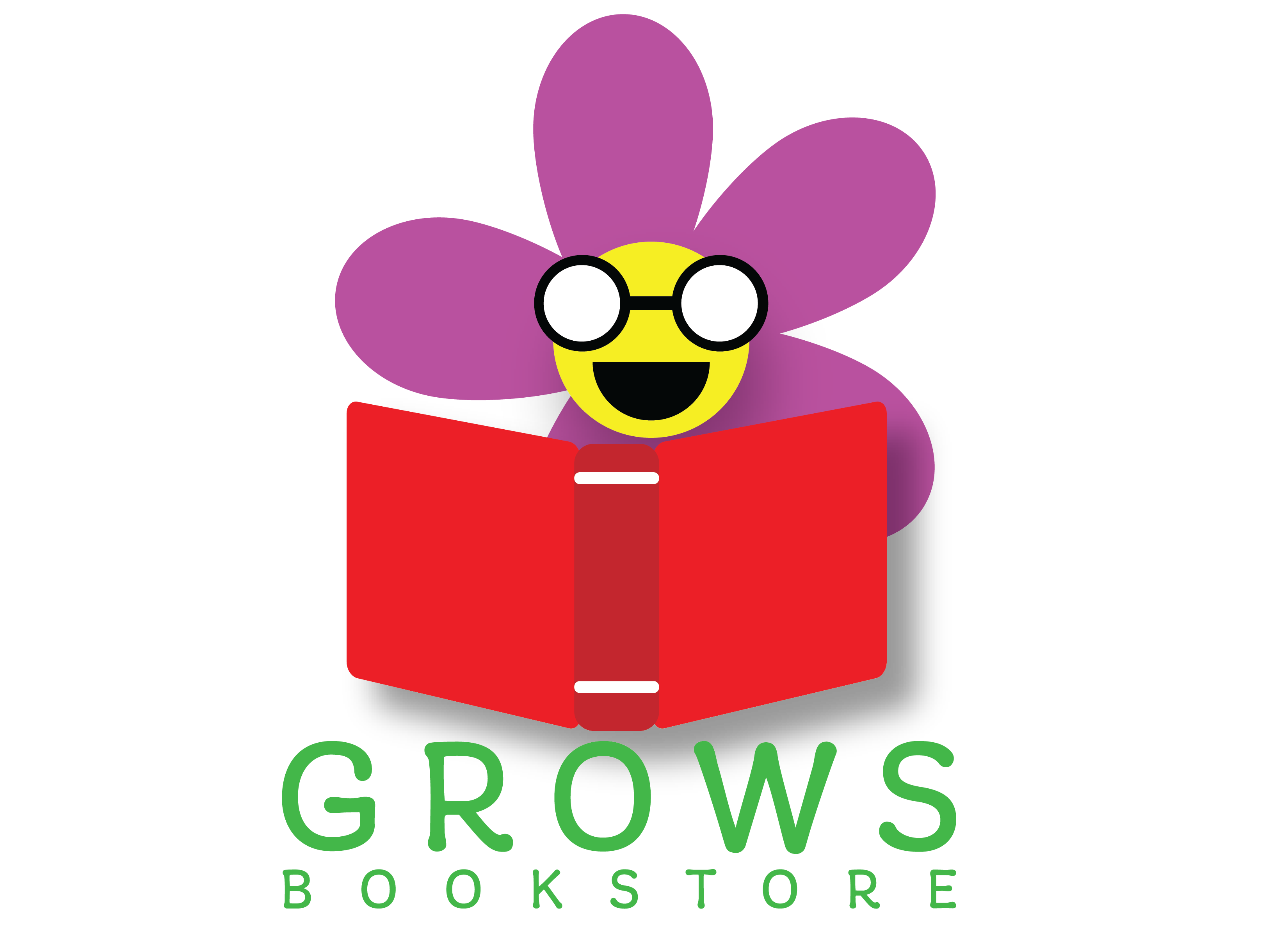
So up at Collage I did a logo for a kids Book Store with a plant theme. For my very first logo. Might be a poor idea at the time, but I figured I stick with it just to see if I can make it work.
This version is an improvement over your first attempt. You’ve made the flower look like a flower instead of someone whose head is on fire, and you’ve improved the typography. However, there’s still much room for improvement.
One of the primary requirements of a good logo is versatility.
Logos need to work and remain legible at every size—for example, on a business card or a billboard. Your logo would turn into a blur if printed on the barrel of a promotional pen.
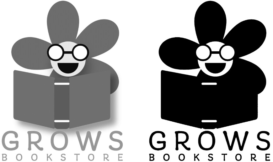
Logos must be adaptable and economical to print—not only in full color but also in instances where grayscale or B&W is the only option. Your logo won’t work well in either (see the image). Logos must lend themselves to multiple uses, such as embroidering onto a hat, screen printing on a T-shirt, making into a rubber stamp, etching into glass, or using on a store sign. Your logo wouldn’t be practical in any of these instances.
Speaking of signs, if this logo is for a physical bookstore, a storefront sign might be in order. Have you considered how this logo might be adapted to a horizontal, lighted, or 3-dimensional sign?
A logo must be more than just a nice-looking illustration, which I suspect has been your primary concern. It needs to be easily and economically adaptable to all anticipated uses. There are good reasons why the best logos are extremely simple and use only a minimal number of colors.
3 Likes
Do people really put logos on the barrel of a pen?
I know our promo pens just have words. No bug. I just looked through my pen collection and not a bug to be found there either.
I’ve ordered oodles of them for clients and employers over the years. They seem like must-have promo giveaways for tradeshows, conferences, or reception desks. Pad-printed, engraved, foil, laser etched — there are all sorts of options.
Your pen collection must be different from mine. Right now, I’m rifling through the pens I’ve picked up over the years, and it looks like about three out of every four of them have tiny logos.
Assuming the logo png had an sRGB profile, only the red seems slightly out of regular CMYK color space to me.
It looks as if it is aimed at children just starting to read or their parents.
1 Like
The yellow is pushing limits too.
1 Like
It’s a great start! The colors do need work though. I’d try more options on that. And Just-B had some great input about the logo needing to transfer to B/W.
1 Like
This is really helpful. Thanks for your feedback.
This topic was automatically closed 365 days after the last reply. New replies are no longer allowed.