This version is an improvement over your first attempt. You’ve made the flower look like a flower instead of someone whose head is on fire, and you’ve improved the typography. However, there’s still much room for improvement.
One of the primary requirements of a good logo is versatility.
Logos need to work and remain legible at every size—for example, on a business card or a billboard. Your logo would turn into a blur if printed on the barrel of a promotional pen.
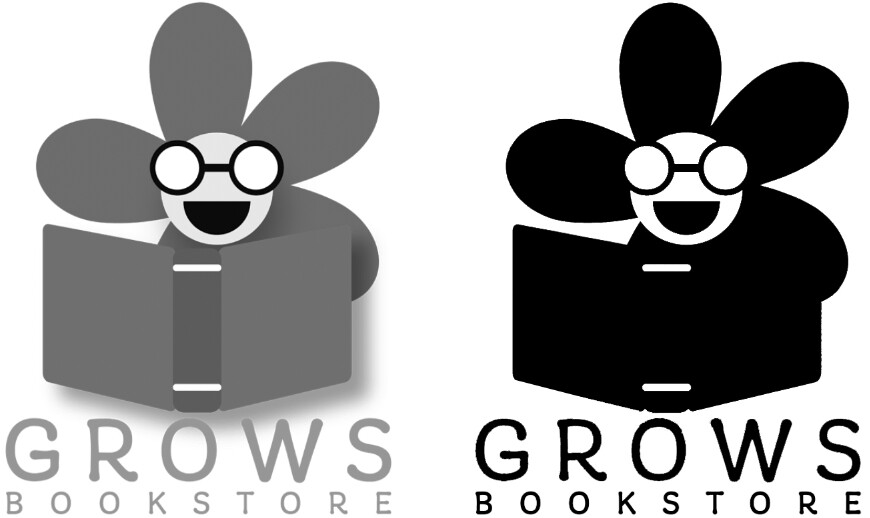
Logos must be adaptable and economical to print—not only in full color but also in instances where grayscale or B&W is the only option. Your logo won’t work well in either (see the image). Logos must lend themselves to multiple uses, such as embroidering onto a hat, screen printing on a T-shirt, making into a rubber stamp, etching into glass, or using on a store sign. Your logo wouldn’t be practical in any of these instances.
Speaking of signs, if this logo is for a physical bookstore, a storefront sign might be in order. Have you considered how this logo might be adapted to a horizontal, lighted, or 3-dimensional sign?
A logo must be more than just a nice-looking illustration, which I suspect has been your primary concern. It needs to be easily and economically adaptable to all anticipated uses. There are good reasons why the best logos are extremely simple and use only a minimal number of colors.