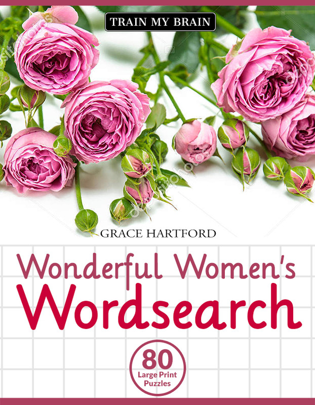
I am making a book cover for my sister’s word search book that will be sold on Amazon.
On Amazon, for some reason, non-word search books tend to show up under the word search category. So it’s important that my cover doesn’t deviate too much from the norm, otherwise, people may not realise it is a word search book and skip over it. At the same time, people browse several tiny thumbnails at one go, so I want my book to stand out.
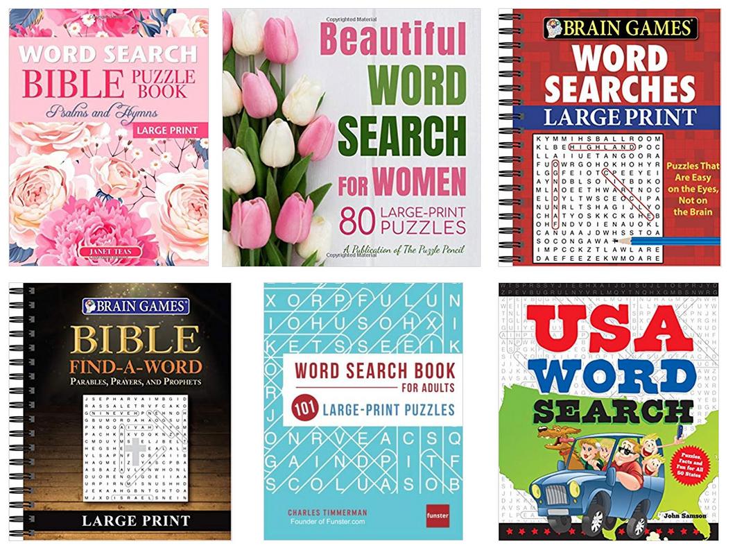
Here are examples of the best selling competition:
My book is aimed at women, and it will often be people buying a book for their elderly mother.
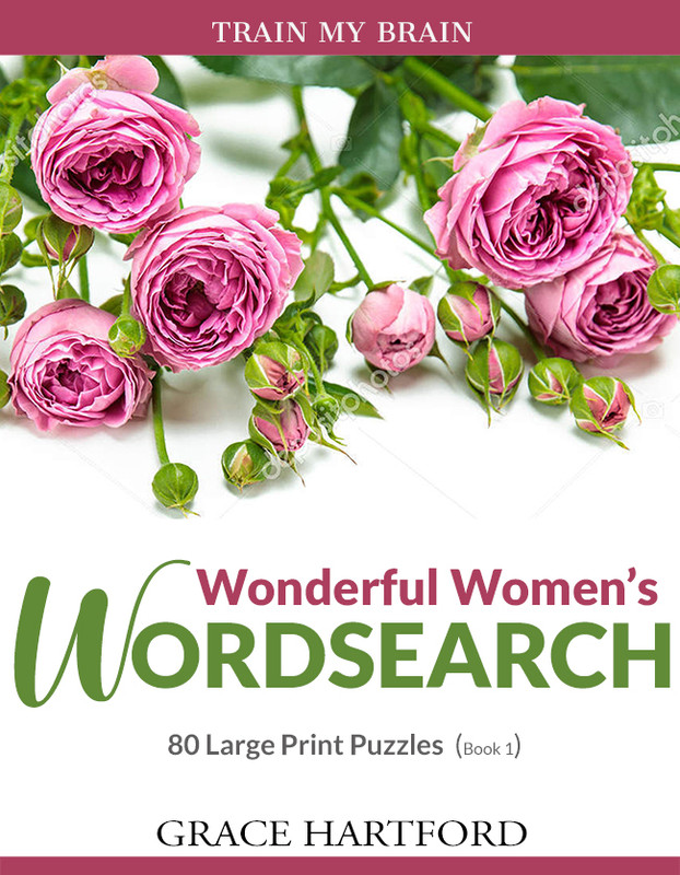
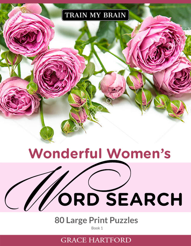
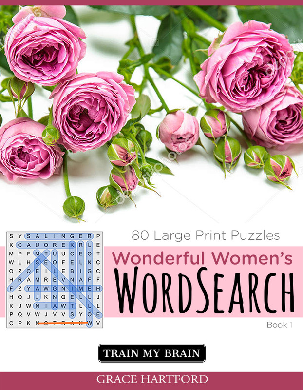
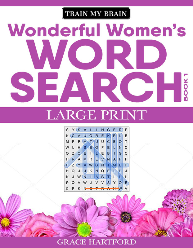
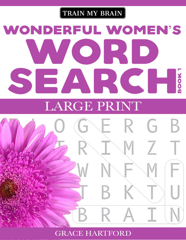
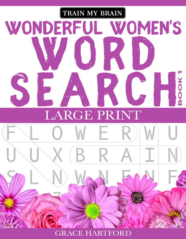
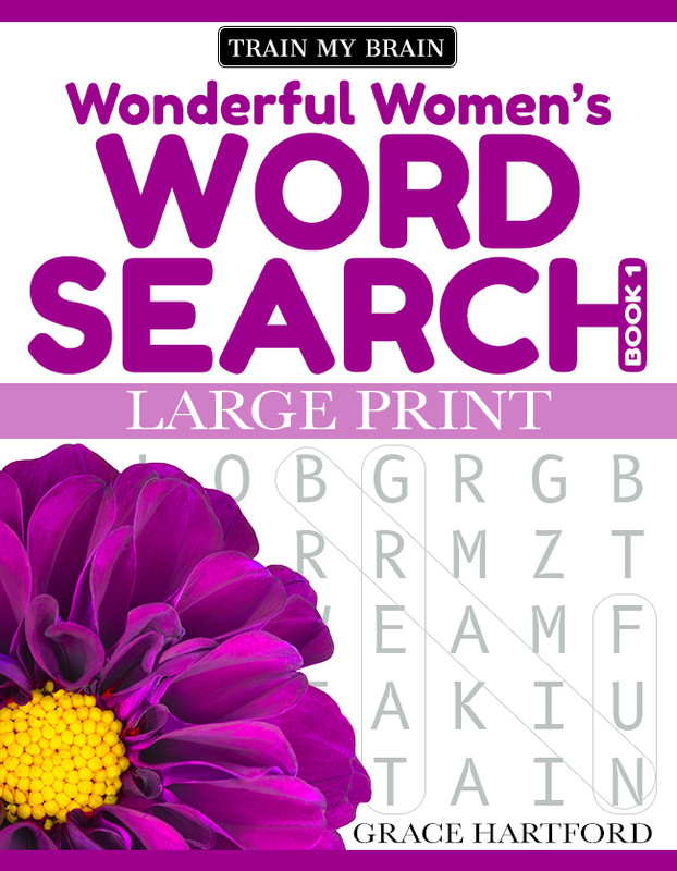
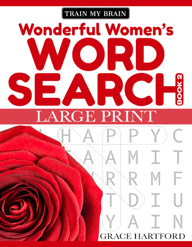
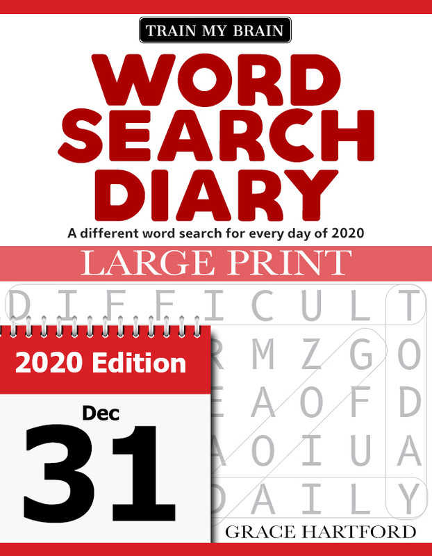
Here is what I have come up with so far:
Idea 1 (Click to make bigger)
Idea 2 (Click to make bigger)
Idea 3 (Click to make bigger)
Idea 4 (Click to make bigger)
I am not necessarily after which design is best (unless you think one is really good), but rather pointers for making something that stands out while still looking similar to the competition.
I making a series of books, so I will change the flowers and colours on each one, but I thought I would just focus on book 1 for now. Thanks in advance!
Thanks for the reply. I should have mentioned: For the text like Large print edition, etc, these don’t need to be too big, as they will be listed on the Amazon product page and also in the title. I would actually prefer not include them on the cover at all, but they have to be somewhere in order to appear on the Product Page/Title.
I will rethink the design. I focused on the flowers, because the best selling books aimed at women had them. But you are right, it does make it less clear what it is, so I need to rethink it.
But I would still appreciate some opinions on the fonts I have used and also if it’s worth keeping the flower concept (like the best selling women’s word search books do) or just going all in on using wordsearch graphics. Thanks!
For what it’s worth, my eye immediately went to the middle top example you posted. It’s different from the others, which drew my attention, and the large, straight-forward typography leaves no ambiguity about what the book is about.
What you designed, although nice-looking, doesn’t seem to adequately address your concerns. They might blend in just a bit too well with the others. In addition, the words Word Search don’t have the prominence you probably need to attraction attention and make clear what the book is about, which is not, for example, growing roses or arranging floral bouquets.
I think they look much better, but it still feels like there is something quite not right. Like they all still need something changing. I’d love a second set of eyes. Thanks!