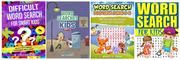
Here are the best selling kids word search books on Amazon: (Click to make bigger)
I think they suffer from being too busy.
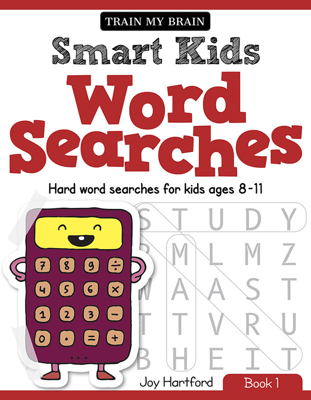
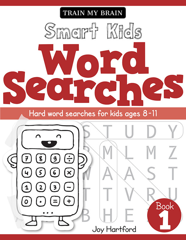
Here are some designs I have come up with. They follow the designs I did here for a Women’s WordSearch book, so they feel like part of the same brand.
Design A (Click to make bigger)
Design B (Click to make bigger)
They look OK, but I feel something is missing, that I can’t put my finger on so I would like a second pair of eyes! In particular, I am not sure if they work better with a color character or a B&W character.
They are going to be a series of 5 books so the character will change on each one. On other books, the character is a book, beaker, globe etc in the same style.
They will be sold on Amazon, where people only see the smaller thumbnails first before they click to see the full image, so I want the thumbnail to stand out. The text in the subtitle doesn’t matter so much because it will be on the product page.
The examples of other books look busy to me too, but you also said they’re top sellers. So busyness with this kind of book might not be a bad thing.
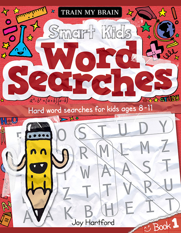
As for your covers, they are supposed to look kid-like, right? I’m not quite sure they do. Yes, the words bounce around some and there’s a smiling cartoon calculator (whose purpose I don’t understand), but the covers aren’t all that playful and fun. They seem a bit serious and unengaging in their lack of color — at least for something aimed at children (or their parents).
@Just-B Thank you so much for your comments. I think I was to stuck on being clean, but you helped me to see that I need to be more fun.
Here are some revisions: Design 2A
Design 2B
Design 2C
Because Amazon shoppers see a lot of book thumbnails at once, I want my design to stand out.
I am not sure if I should go for the Pencil character (who is cuter) or the kids (who probably relate to the topic more). I quite like the idea of having 1 dominant color (because it is a series of books, so I can use a different color for each cover), but I am not sure if having a second color works better. I am also not sure if the background doodles should be in colour.
Would love a second pair of eyes. Thanks in advance for any help!
These are really cute and fun! I prefer the pencil character, but I would consider giving him eyes with eyeballs and no teeth (looks jack-o-lantern-ish). Consider his size.. maybe he could actually circling a found word?
I prefer the doodles in one color. Consider changing for each book in the series and relate to the theme of the book (assuming there is a different theme for each).
I would also make the words in the words search itself darker/bolder and you could have fun with that too.. maybe change the “found words” for each theme..?
I also don’t think the “sticky tape” adds to the image.
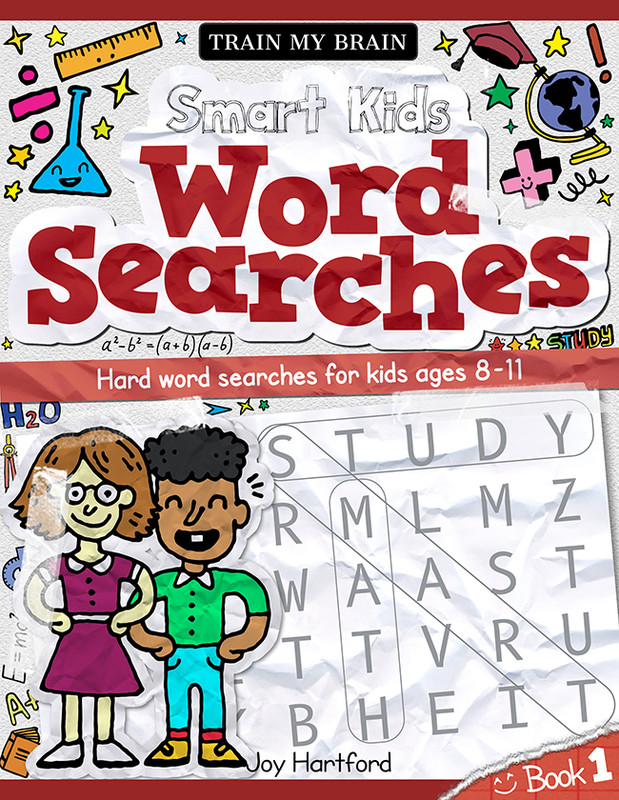
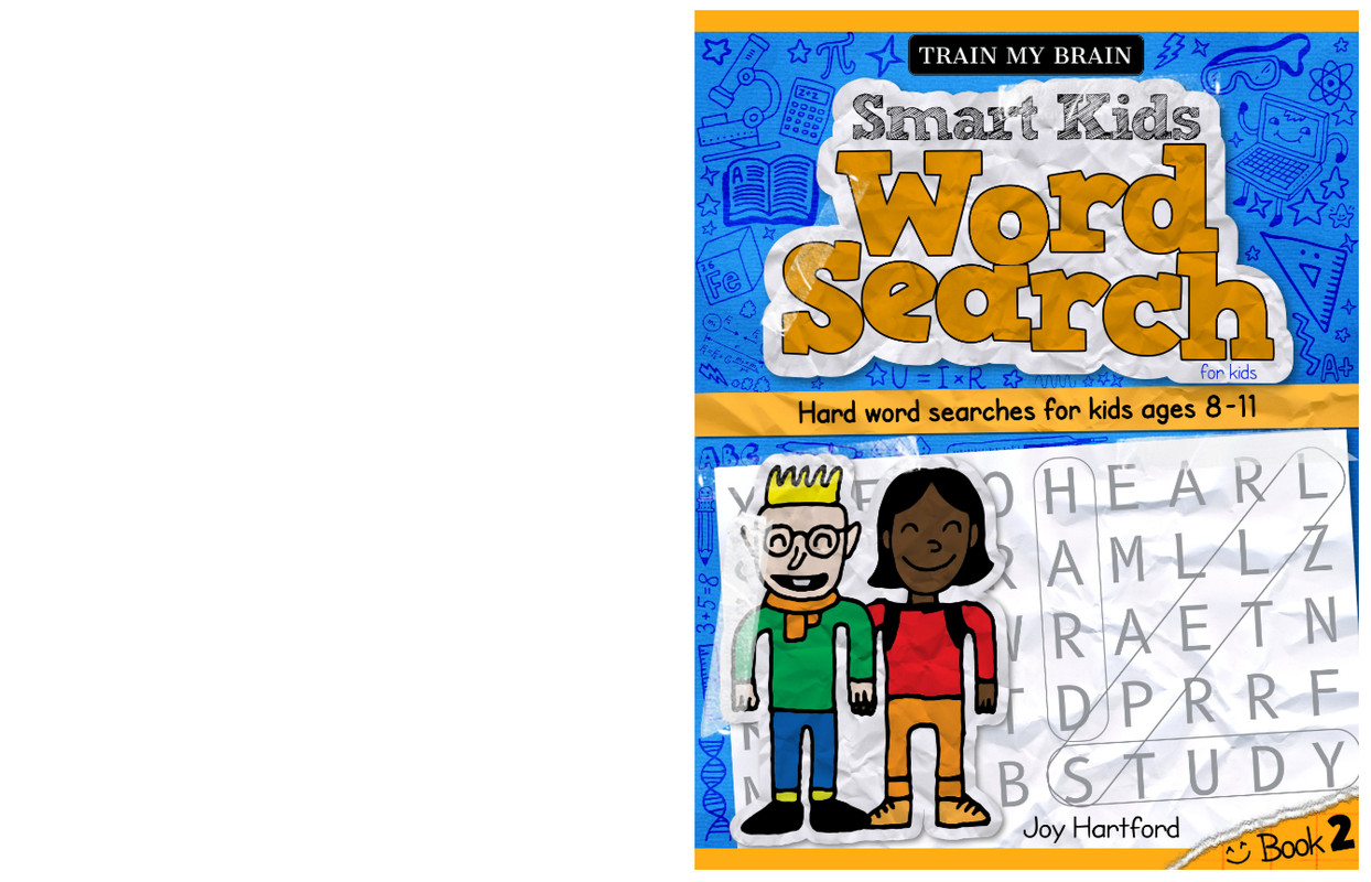
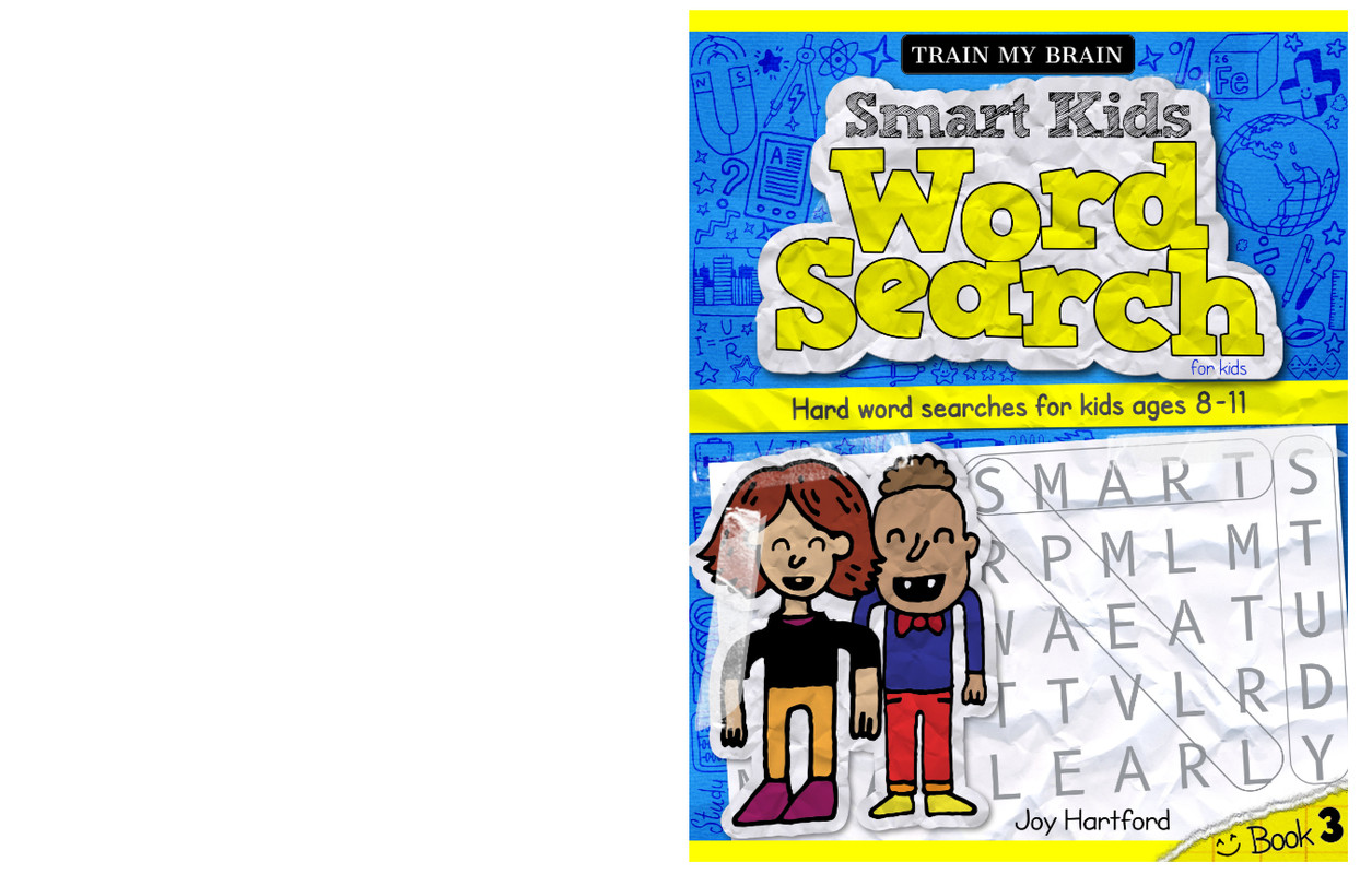
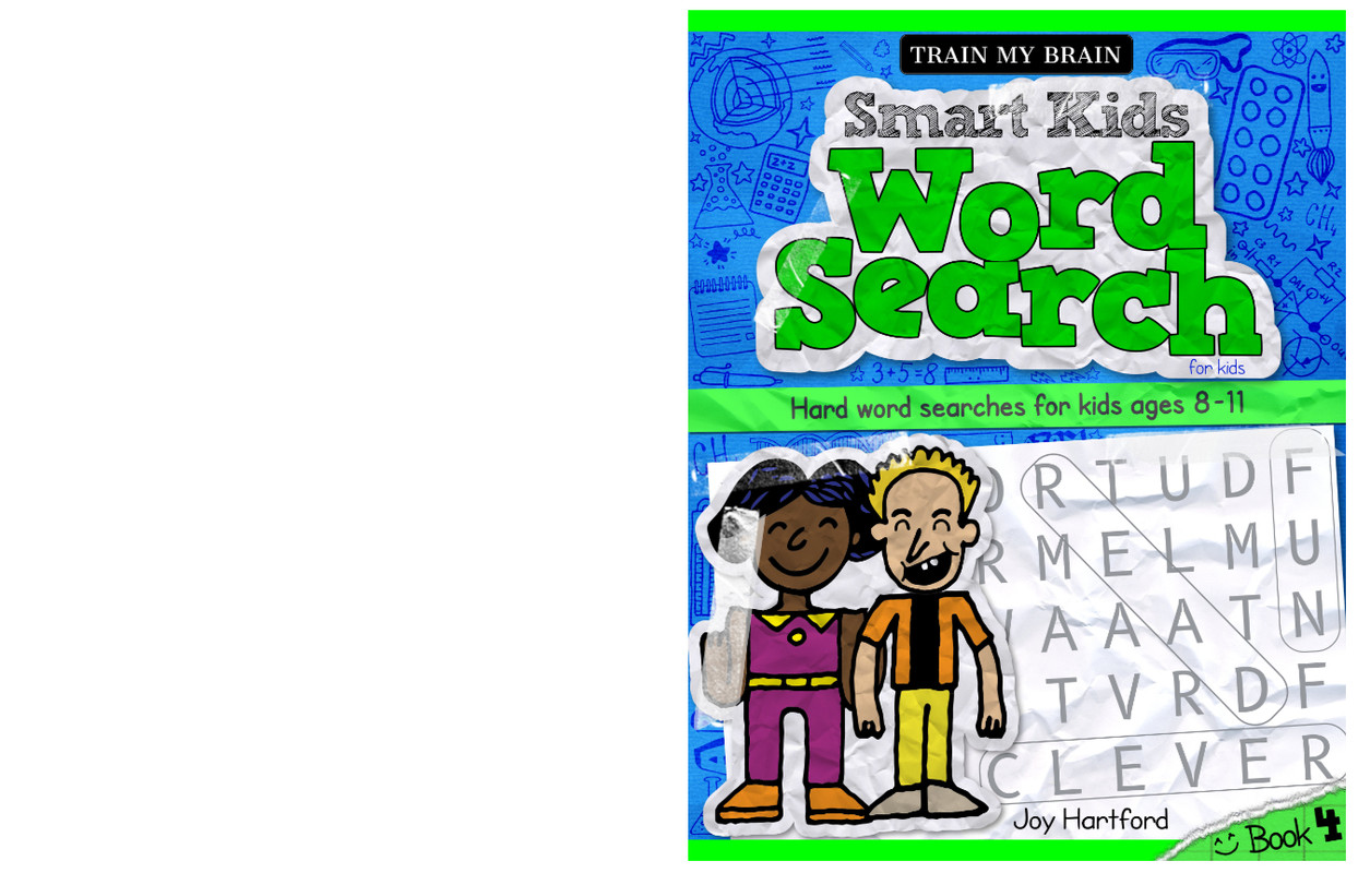
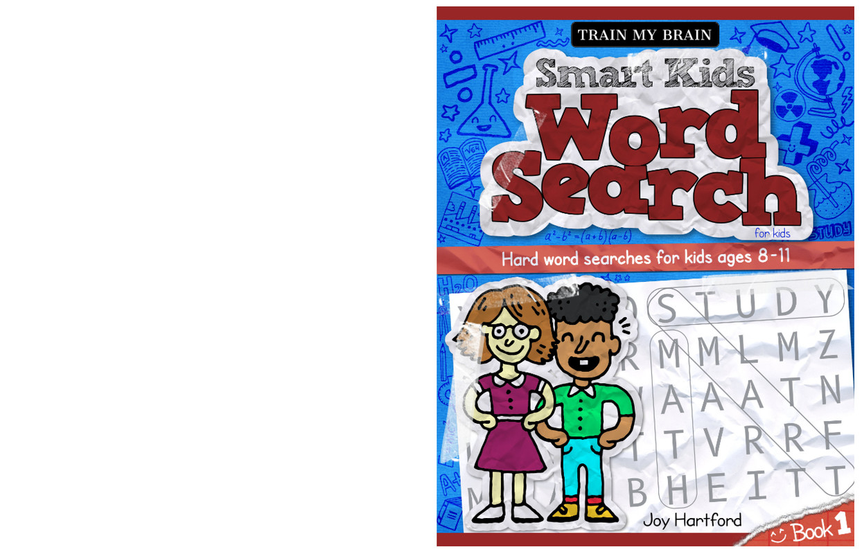
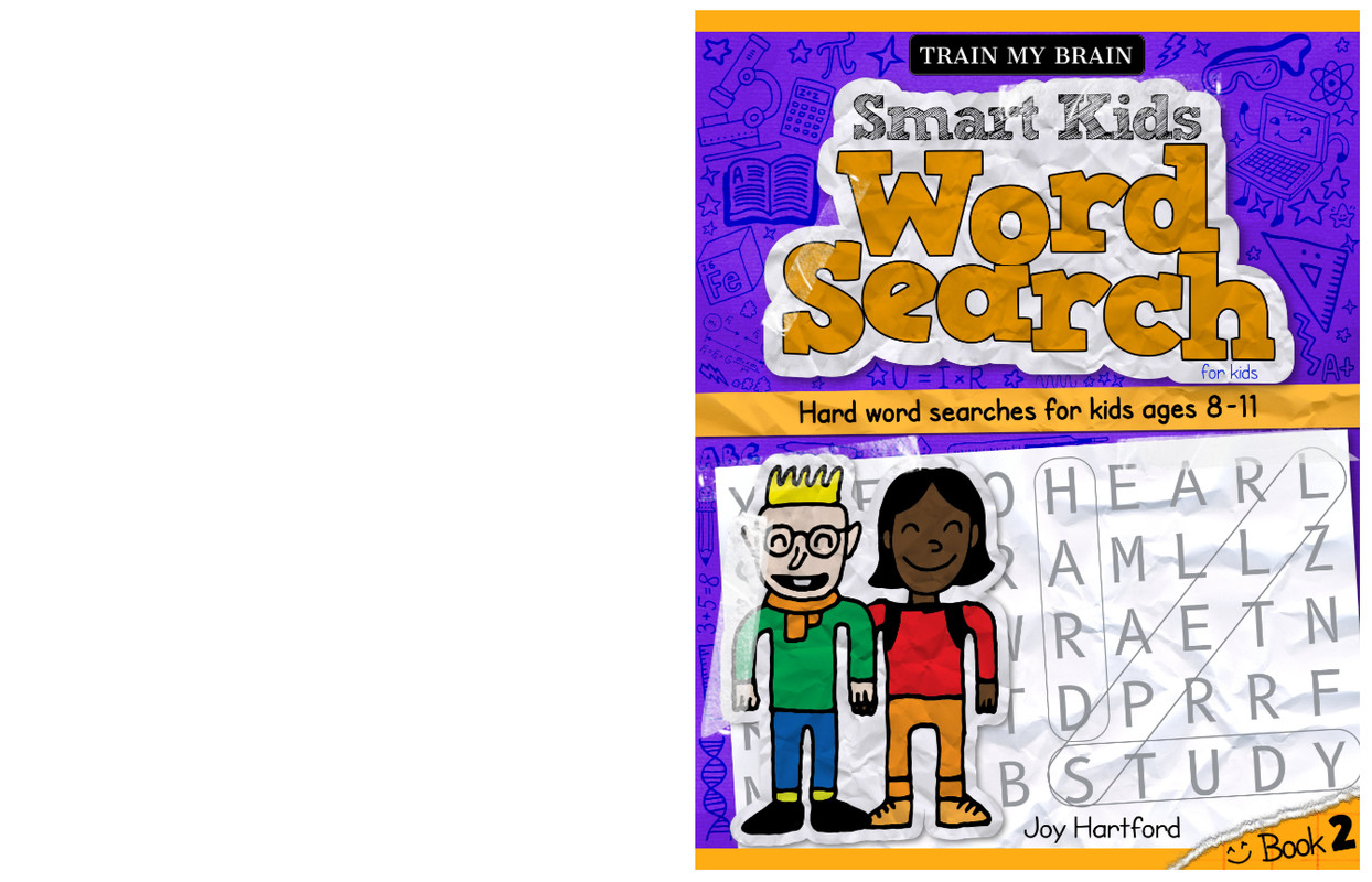
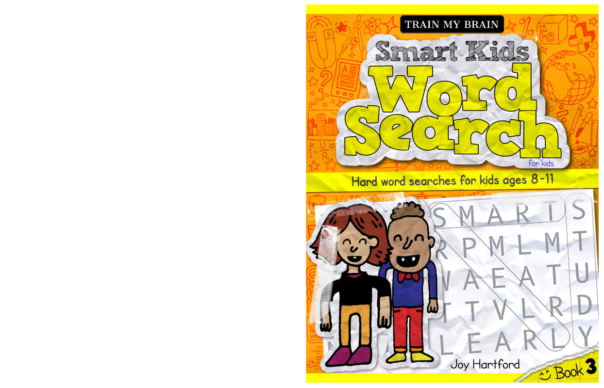
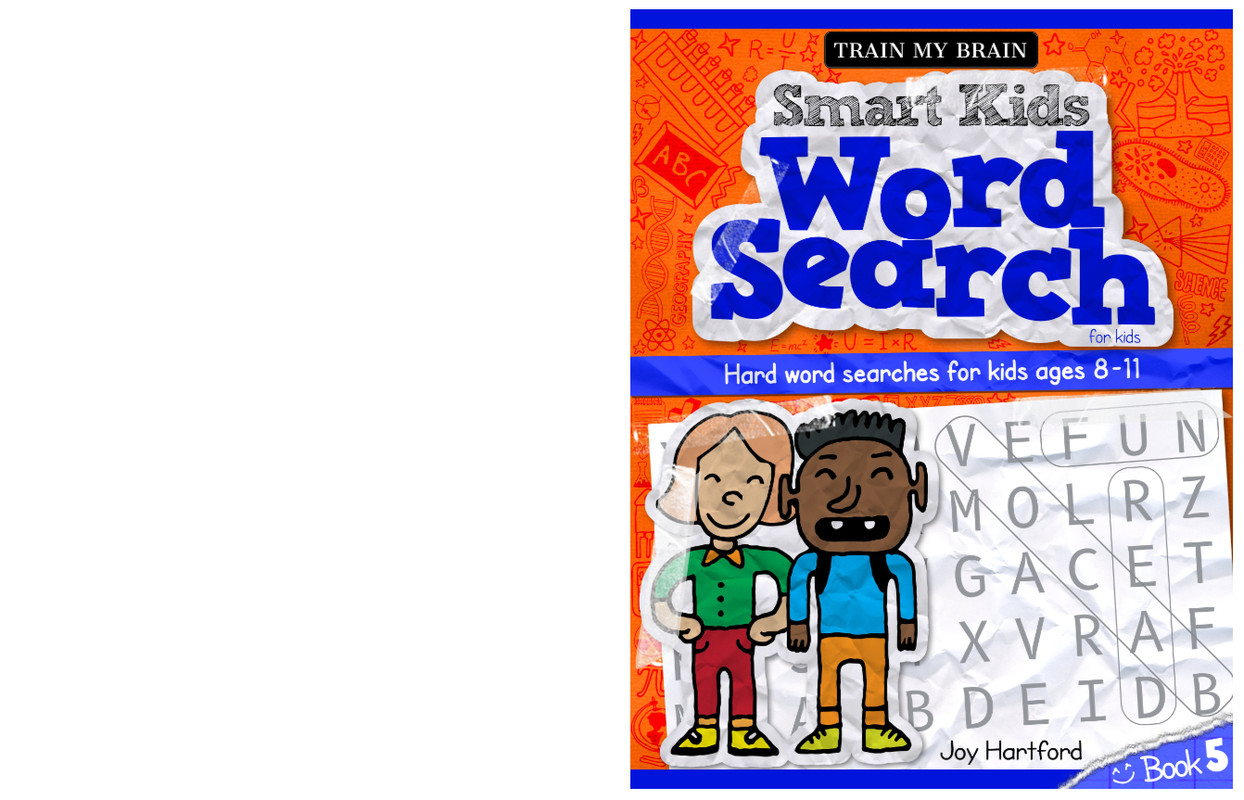
Thanks for the feedback. In the end, I went for the kid characters, as I think when a person glances at the covers, the pencil might be confusing. Plus there is also a separate journal book coming out later, so the pencil would be suited for that.
Here is how the final covers look, I would love any thoughts or feedback:
Click to make bigger
I did consider changing up the background color, but I think it makes it less clear that they are part of a series, so I probably won’t be going for that:
Alternative rejected designs - Click to make bigger
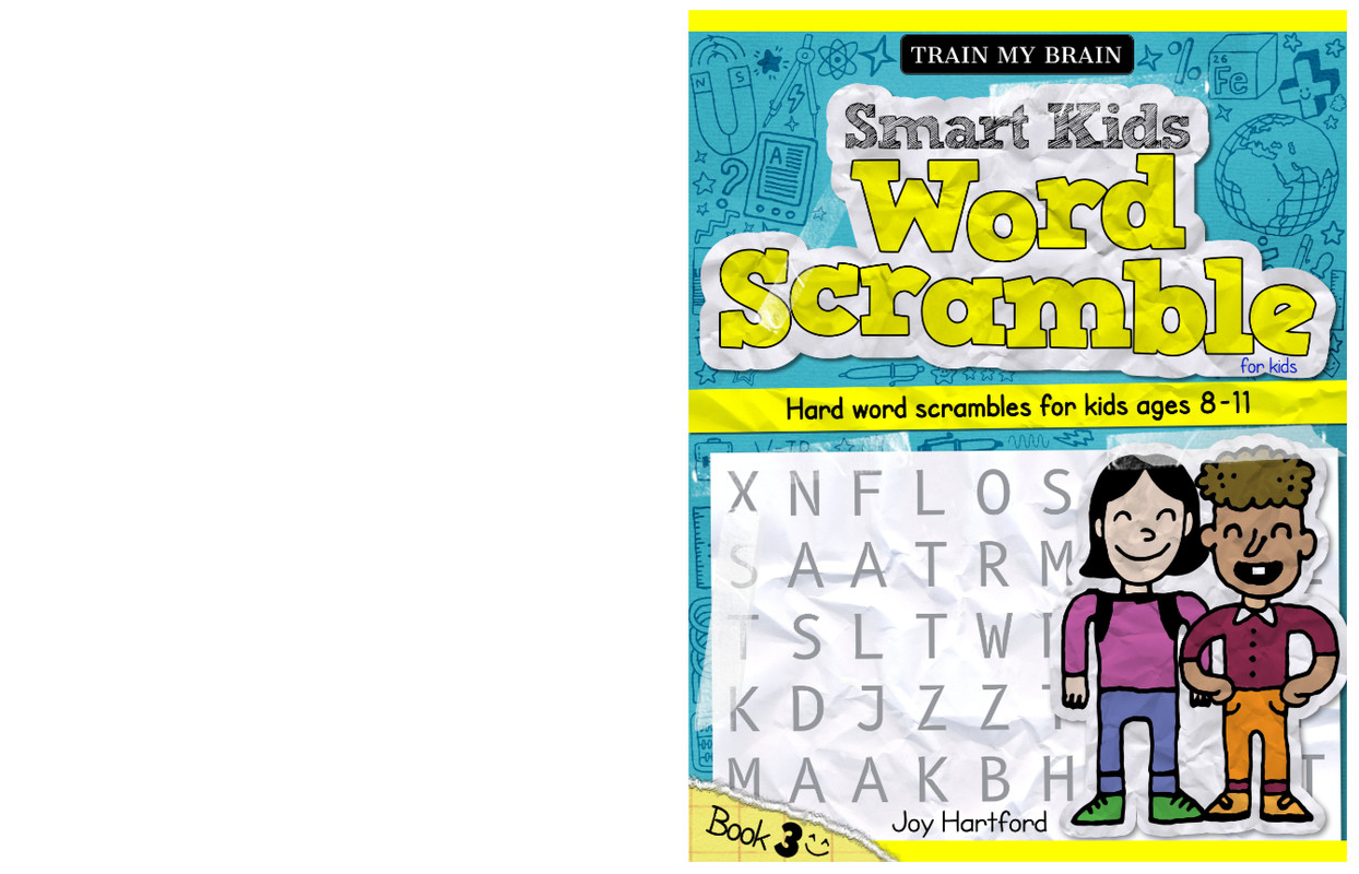
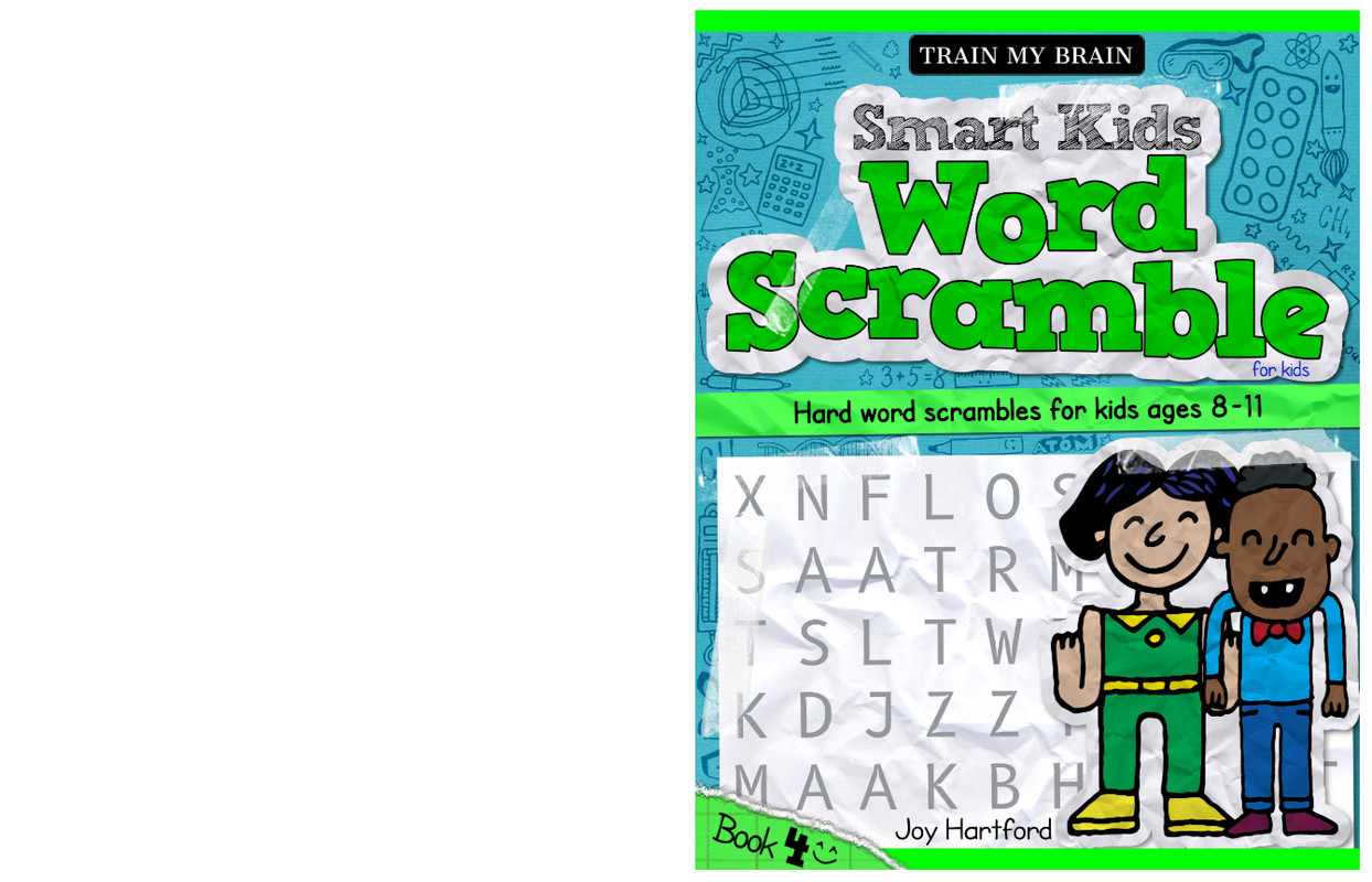
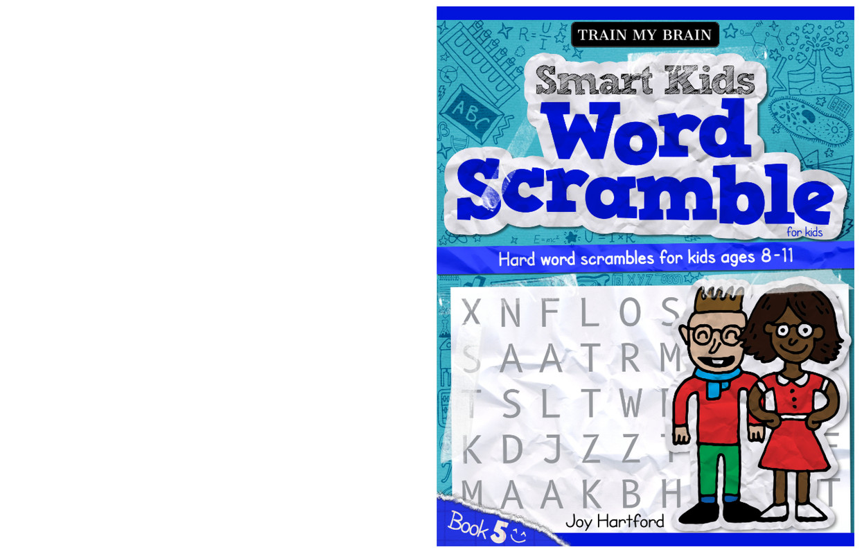
Plus, there’s also a Word Scramble series, so I think it’s better using one background colour for each series to make it easier to tell them apart.
Scramble series - Click to make bigger
Thanks for all the help, and I’d love any further opinions.
Hey Sabrina, can I suggest one thing? I like the first designs with the pencil and the red background but the second book with the two kids on them, I would change the color of the red rectangles together with the background color. Although the text stands out better that way, I think aesthetically you’re taking steps back. The title is already in red, I don’t see a reason why you need to splash color on every corner of the book. I think this way it would be a lot easier on the eyes but still very clear that it’s meant for kids. You have bright colors in the illustration that already screams kids book, aswell as the illustration style.
If you’re going to experiment with colors, maybe give this guide a try Kleurenpaletgenerator – Kleurenwieltool | Adobe Express
that way you can choose your colors and have them fit together too. Even though it’s kiddo stuff, try to restrict yourself to using too many bright and overly saturated colors all at once, it looks unprofessional.
I wouldn’t however do what you did with the last images: the colors don’t fit together as they’re all a different hue (saturated and desaturated color). Especially keep the title the same color as it’s basically your ‘logo’. Try to minimize changes on your logo as a client may not be happy about that. Since you might have created the title yourself, it doesn’t matter as much regarding copyright, but it does in the sense of consistency and if you want your target groups to recognize the product instantly. Try to think of a successful company like CocaCola, their color is red. They won’t ever change it to orange, because their brand won’t be recognizeable anymore and it’s related to another brand: Fanta. I hope this helps!