Fresh Bites - Logo Design

Hi there,
I would like some feedback on this logo I designed please.

It was design practice for a “fake” client as per brief below:

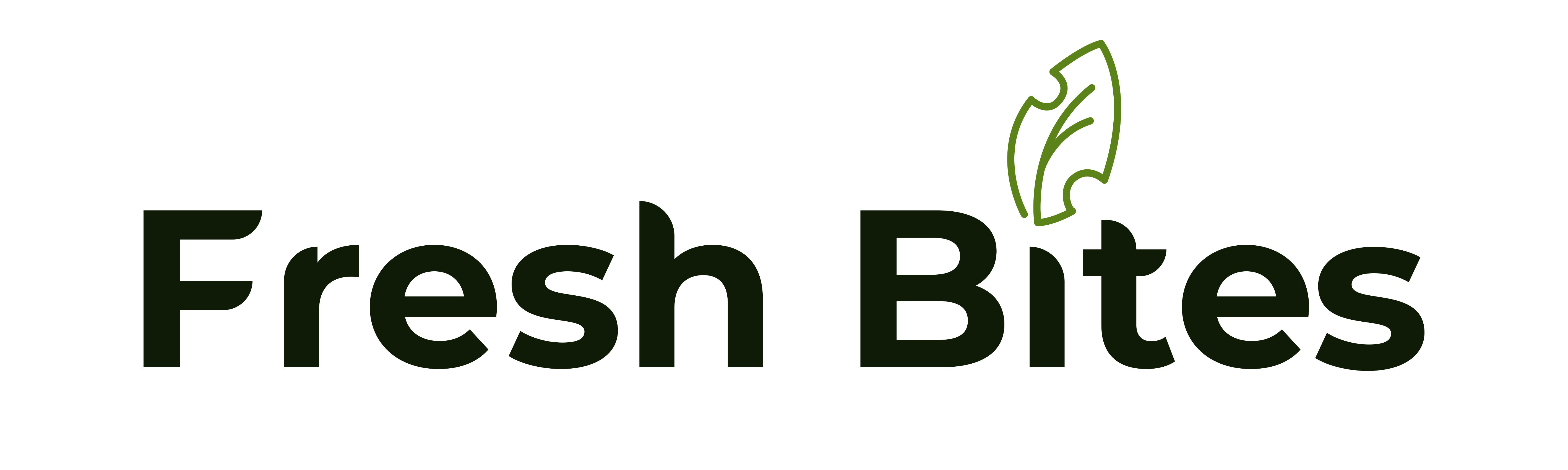
Business Name: Fresh Bites

Business Description: Fresh Bites is a new restaurant that specializes in healthy and organic food. Our menu includes a variety of dishes made with fresh, locally sourced ingredients. We aim to provide our customers with a unique dining experience that is both healthy and delicious.

Target Audience: Health-conscious individuals, families, and young professionals who are looking for a healthy and tasty meal.

Brand Goals: To create a brand that is associated with healthy and organic food. To establish Fresh Bites as a go-to destination for healthy eating.

Logo Design Brief:

  • The logo should be simple, modern, and clean.
  • The color scheme should be green and white to represent the freshness and organic nature of our food.
  • The logo should include an icon that represents healthy eating, such as a leaf or a fork and knife.
  • The font should be easy to read and modern.
  • The logo should be versatile and work well on different mediums, such as menus, signage, and social media.
  • The logo should be memorable and easily recognizable.
  • The logo should convey a sense of freshness, health, and quality.
  • The logo should be unique and not resemble any existing logos in the food industry.
  • The logo should be scalable and work well in different sizes.
  • The logo should be delivered in different file formats, including vector and high-resolution PNG.
    Deadline: The logo design should be completed within 2 weeks of the start of the project.

Thank you

2 Likes

I’d say you can do better. The font choice is okay, but the kerning needs work on just about every pair. The concept is on the bland side, which isn’t good in the food business. Got any other ideas?

1 Like

It says to me “This is a vegetarian restaurant”.

1 Like

I know someone will disagree, but I’d avoid using black (a color associated with death and decay) in a logo that is supposed to represent healthy eating.

2 Likes

Thanks @HotButton for the input :slight_smile: i will work on some more ideas. And work on the kerning. Perhaps do a course in typography too.

Thanks @Steve_O i made the font very dark green, but i can see that it looks black. I will lighten up the colour so it is not so dark :slight_smile:

Repeating what others have said…

The letter spacing is all over the place. The kerning problem between the Fr is especially obvious.

Black isn’t a color I’d typically associate with food and freshness. Almost every logo needs a version that works in B&W, but you haven’t shown us a B&W version; you’ve shown a black and green version.

You’ve tried to incorporate a leaf (as the brief used as an example) and picked up on the bite by placing bite marks on the leaf. However, nobody takes bites out of leaves. Insects, however, do. It’s an organic restaurant, but nobody wants to eat something already chewed on by a caterpillar.

On the plus side, you’re thinking through the problem. I’m just not too sure that your solutions are quite hitting the mark.

On another note, I’m also critical of the brief you’re using. That has nothing to do with you, but it’s the kind of brief that is short on explaining the underlying problem and long on telling the designer what to do.

For example, it says a green and white logo is required. White is typically the background color. It’s seldom specified in the logo, which leaves me wondering if the brief is asking for a one-color logo or a logo that will work on a dark background using white ink (which isn’t a normal requirement for a logo).

It also says the logo should be accompanied by an “icon that represents healthy eating, such as a leaf or a fork and knife.” A leaf is an obvious cliché, which would cause me to avoid it. A fork and knife suggest eating, but it says nothing about healthy.

I’m not a fan of using most online sample briefs. Most seem written by people pretending to know what they’re doing. In addition, even the best brief summarizes a more extensive exploration and discussion about why this is needed and that should be avoided. There might be good reasons why the logo must be green or an icon must accompany the wordmark. However, without knowing the context and reasons for those restrictions, these sorts of mandates place restrictions on designers that box them into certain kinds of solutions that might exclude the best and most original ideas.

2 Likes

+1 on that.

These:

…aren’t really points that belong in a brief.

Yeah, most of them should be obvious to even a mediocre designer.

When I was a CD/AD, and needed to write briefs, I’d always write them specifically for the person assigned to the job and talk over the brief to provide background on every item. A brief written for a junior designer might include things not needing to be mentioned to a senior designer.

I might mark the items the client insisted upon with a red dot and explain the client’s viewpoint.

I’d mark other items with another color dot that required further context or understanding. For example, a trifold that needed to integrate into a legacy campaign, which I’d explain in more detail.

I’d mark in another color those ideas or suggestions that were mine, then always make clear that I wanted the designer, writer, or whomever to challenge those ideas when they thought they had come up with something that worked better (which they often did).

Depending on the person given the assignment, I’d often include things that I wouldn’t include for others. For example, if a designer consistently had a problem with simplicity or kerning, I might include a note to pay attention to those things, whereas, with other designers, that wouldn’t be needed.

For a split moment I thought you used to be in a band.

2 Likes

I’ve done some dirty deeds done dirt cheap, but I’m thunderstruck you’d think I was a musician.

6 Likes

Thank you for your input @Just-B I will work on the points mentioned and do some extra courses and practice. In future I will show the black and white options too. :slight_smile: At the moment I do not have clients or others that can give briefs for practice. So this was an AI generated one. Do you have a suggested site for practice briefs?

@HotButton you sound like a great senior to work under. I am glad I stumbled upon this forum, where I can get feedback and improve.

My apologies @Just-B I saw you actually posted the comment. Thank you

As a professional designer, one should already know that “CD” means Creative Director and “AD” means Art Director. They have nothing to do with music.

Yes, that had to be a mistake.

And, I would absolutely agree that it is true of Just-B; surely a born leader.

1 Like

More than that—he’s a Master Communicator whose humility endears him to all who have had the pleasure of knowing him.

2 Likes

Thanks for the pro tip :wink:

Thank you all for your valuable input. I will take it and refine the logo best I can. Will post an update when I am able :slight_smile:

Whether you intended to refer to @HotButton or not, the statement is entirely accurate as you wrote it. HotButton’s experience and impeccable insight are qualities I have learned from and greatly admire.

2 Likes