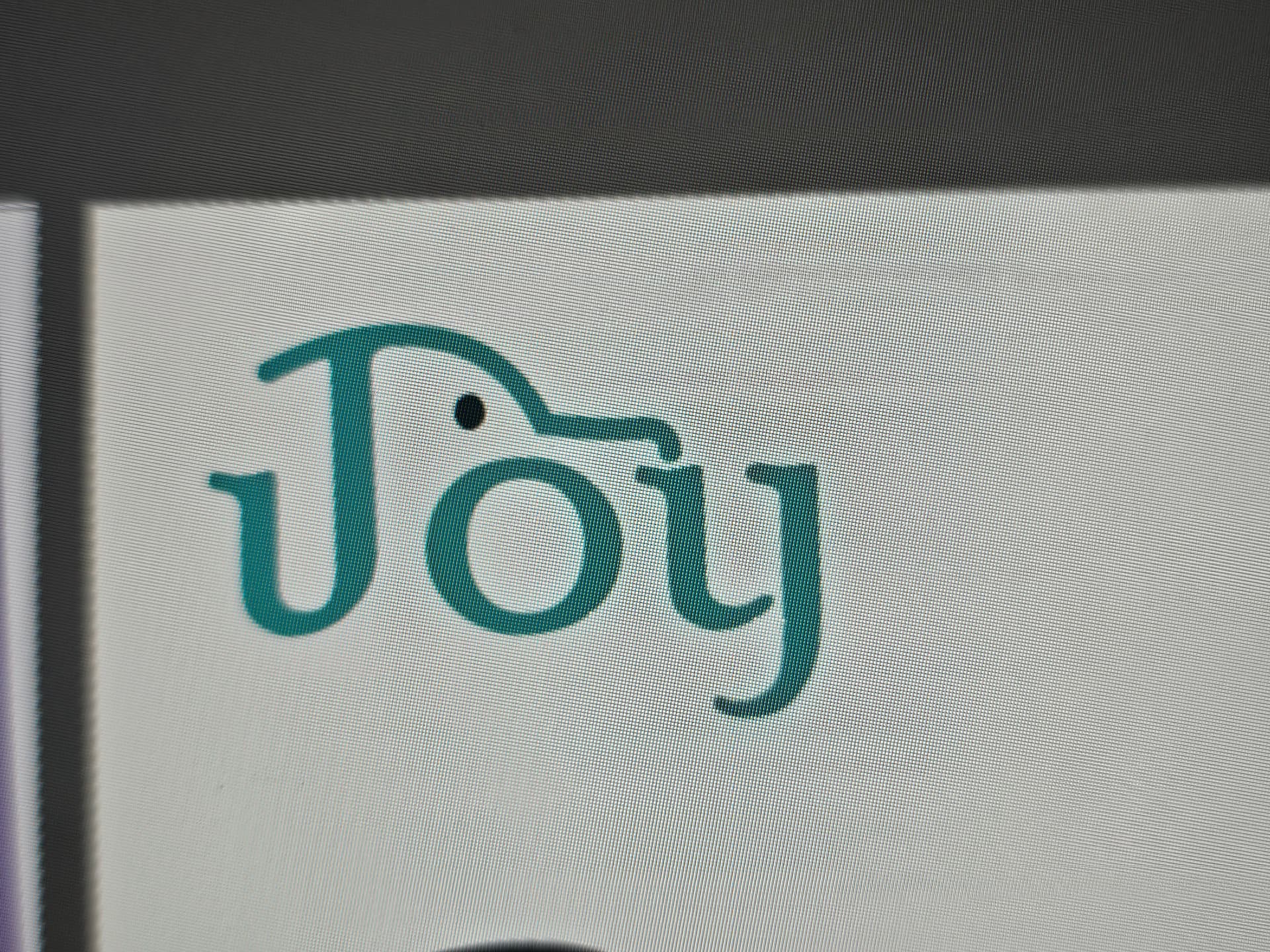
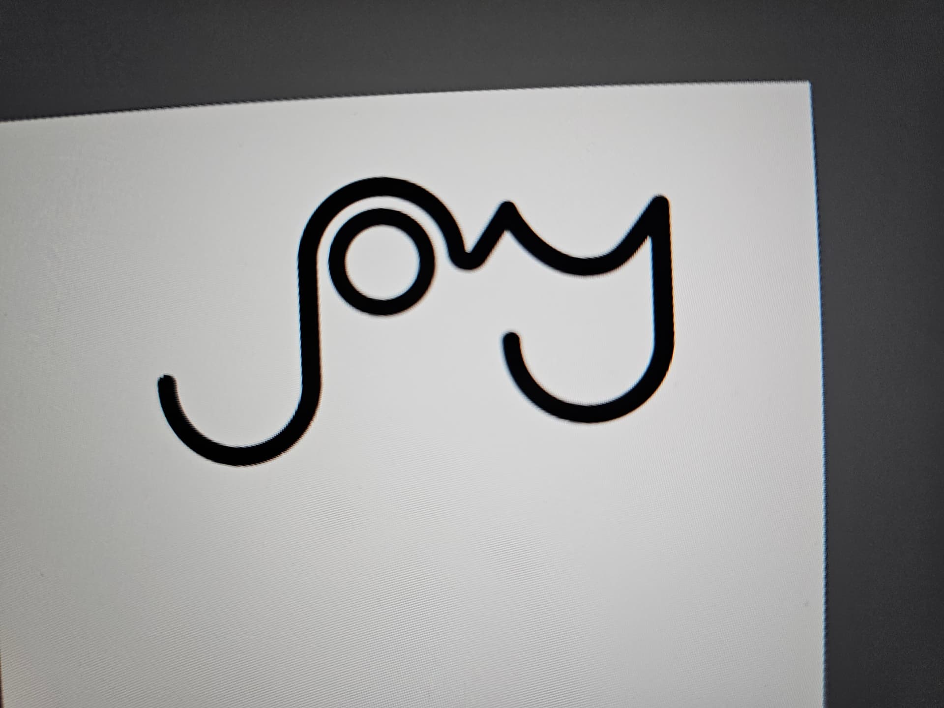
hi, these are logos i made for a pet store called Joy. i want to know your honest opinion on them ![]() (don’t mind the colors)
(don’t mind the colors)
for the first one i used the letter J as a dog’s ear and the line on top of the letter as the side profile.
for the second one i decided to make it a cat, the Y being the face, O being the body and J being the tail.
please tell me which one you prefer, i’m interested in hearing your perspectives and opinions on how i can improve these. thanks!
draw more options. Get past all the bad ideas.
Besides, not all pets are dogs.
My cats have two very nice human pets.
3 Likes
The first looks like a motor vehicle, and the second looks like a bird with a deformed bill.
1 Like
If you use the name of the company as a logotype/wordmark, the name of the company must be easily read — legibility is crucial. A sign on a storefront that people can’t easily decipher would be a major problem for the business.
Your first example is legible, but I don’t see a pet. I see a porpoise. Your second example is almost completely illegible and doesn’t look like a cat at first (or second) glance.
Unfortunately, I think you’re trying to place cleverness ahead of legibility. Remember, form should always follow function.
2 Likes
Indeed.
Good first sketches. You need to do a lot more of these. You shouldn’t have to explain that the J as a dog’s ear or what anything represents. It needs to stand on it’s own merits, since customers won’t want or seek an explanation.
I think what everyone has said thus far is that we care more about your intent than the design. This is a pet store, but some vital questions need to be considered when giving a critique:
- What kind of pet store? Does it cater to a wide variety of animals?
- Practical items or boutique items? Both?
- What’s the vibe? All-natural? Fancy? Family-focused?
No when can give you advice when we don’t know who you’re making this for. Check out this post to help you sort your thoughts.
To be honest, I wouldn’t have guessed that this is a logo for a pet store. Perhaps try not to obscure the animal and show it directly. If you’re concerned that using a silhouette of a dog or cat in the logo might make it seem overly cliché, then try depicting other pets, such as fish, birds, etc.