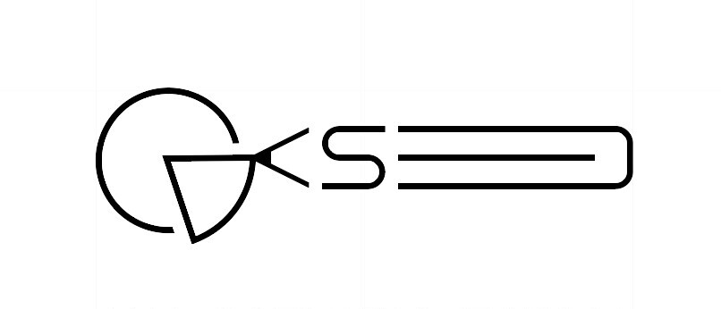
hello, i would like you to criticize my work and see the points where i should improve i made a brand for myself as a graphic designer my name is ana catarina sapage wisch in the pencil are included the initials and also the pencil stands out for design and the graphic of pie stand out for graphic making it graphic design however… i think the long version is simply to long for the logo… idk if i am correct or if i make it shorter but then i have the problem of how i include the long name in a short logo… any sugestions?
Also could you rate?
Hi
It appears to me that you have tried so hard to get the letters to make the image you want, that it has become hugely over-bloated and over-complicated. The end result has lost any elegance it may have had. It looks to me like you’ve lost the big picture trying to get the details to work the way you want and think you need.
I am not a fan of the font either. Too NASA and gimmicky. It doesn’t help that your surname already brings to mind the word, space. Combined with that font, I think you will always run into that problem. It’s a shame because your name is lovely and scans really well.
I think you need to, simplify. I don’t see why the letters have to make a pictograms. All adds to that feel of being a bit gimmicky. Also not helped by the tag line, graphics. Better to say graphic designer. ‘Graphics’ sounds more production than creation.
That said, the lightness and delicacy almost has an elegance to ti that is nice. It is just not holding together at the moment. Hank about losing the whole picture idea and either go with a well-crafted word mark, or devise a monogram.
Hope this helps.
1 Like
Am kinda with @sprout - if I were doing what you’re doing I would simply pick out a beautiful typeface that’s classic and timeless and roll with that and stop trying to over do it.
Have you asked yourself what is it you’re trying to achieve with your logo - who are trying to talk to and what do you want it to say?
Firstly it needs to be legibile. Legibilty is king ![]() .
.
Your current typeface looks like it would be great in a sci-fi movie about spaceships and star wars, but it’s hard to read. This is huge issue when your first and foremost job as a designer is to be a master at visual communication.
Secondly you need to think about the type of work you’re going to be producing and the types of clients you want to attract and I would select your typeface based upon that.
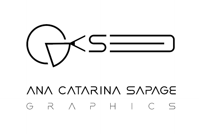
Also your business name is very long, you may want to consider shortening it (like droping your middle name or even the word “graphics”).
Regarding your mark - I would scrap it (sorry!). There is already a lot going on with just your name and you probably don’t need it.
I would have a look on behance or dribble at existing designers that are producing designs in the space that you’d like to work and emulate them.
Clients don’t choose a designer based up on how “original” or “unique” their designs are, they choose the least risky option. And when you present as quirky and off beat, all they see is risk.
Don’t try to be unique, just try to be good. ![]()
Hope this helps, good luck with your business ![]()
The mark is so confusing, it made my eyes want to look elsewhere. I didn’t even study it to see what you might have done and why. I’m sure it means something to you personally, but that isn’t the point here. A logo should be a little more engaging of the audience in question (actually a lot more.) Granted your audience may not be other designers…
Ah, I scrolled back up quickly.
I see you put a pencil in it. Why?
Pie I can understand. I like pie. Or is it a cake?
You’ve gone down a rabbit hole here. It’s possible some small part of the thinking that got you to this point could survive and result in something viable, but you’ll have to let go of most of it. Get out of that hole and start over.
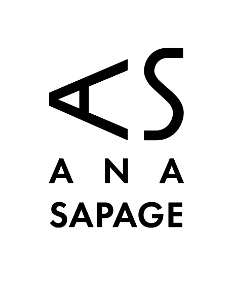
I think you’ve received some good comments. I’ll go ahead and throw my thoughts in. I like the pencil concept. What would the pencil look like on its own? Right now, there is too much going on with the pencil and the pie chart. Also, the pie chart doesn’t particularly say “graphic design” unless you specialize in some sort of data-intense design or infographics. The thing that bothers me is the letters I see in the pencil are ASD, but the company’s initials are ACSG. I agree with others about the type not working. I’d suggest you spend more time exploring the pencil option — work up 4 or 5 different pencil options. Also, spend more time and work up more options on the text.
There are letters in the pencil?
I see an obvious S.
The D is more of a B if I had to make a letter out of it.
There is no A

This, by itself it sort of nice. If it were me, I’d fine-tune this and let it be. The word graphics beneath it just gums it up with complexity. Speaking of complexity, the mish-mash of shapes you’ve come up with for the logo is way too forced, contrived, confusing and just plain not needed.
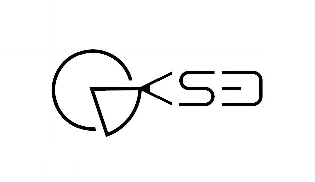
i manage to simplify the confusion a bit more.
the ones in right coner down are the ones.
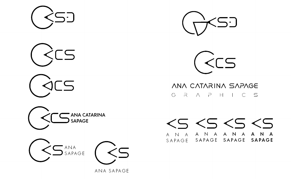
i end up short it out like sugested.
put proxima font timless classic
is it better?
what else can i do to improve?
any more sugestions?
maybe i should take out also that tiny triangle and leave the normal A that gives a pencil tip on its own to keep the whole logo stroke line right?
but they said up there the font looks to much like of a scifi movie .-. is it ok to use only the typography?
All the large C looking ones look like Pac Man
Best is the bottom right, last one.
I did not pick up on that, but it totally jumps out, now.
and the typography the lighter or the more bolder ? i think the secound lighter gives good contrast or am i choosing by wrong reasons? sence the most lighter mind not be seen in reduced sizes so well am i right?
As I said the last one on the right. You are even losing integrity on screen with the lighter versions.
The (nasa-sequel) font you’ve used as a basis for the monogram part looks odd. The stroke weights are all out – vertical vs horizontal. Makes it look very unbalanced. I am talking specifically about the S in AS. There are some real tensions where the curves become straight.
There’s a reason why cheap or free fonts are cheap and free.
i removed that font of before and put futura with some modifications.
is the size of typography ok?
how is it now?
Honestly, it is becoming more disjointed. Very awkward negative spaces. Really not a fan of the massively spaced first name and tightly spaced surname. The AS really doesn’t work at all. Sorry, not what you want to hear, I’m sure.
3 Likes
Start over. That’s all I can say. Sketch until you hand falls off, then pick one or two of your better ideas and maybe flesh those out. This is not your checked solution.
I agree with the others, you’re heading down a dead end with this one. If it were me, I’d rethink the concept. Contorting letters into various shapes and positions rarely works well — sometimes it can work when done just right, but more often than not, it’s one of many go-to approaches for the inexperienced that’s way more difficult to pull off than it might seem.
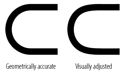
Just to elaborate on a point Sprout made about tension at the points where straight lines become curves. There are lots of little optical illusions in shapes, like letterforms. For example, when a straight line suddenly turns into a curve, even when it’s geometrically correct, it looks wrong. Our minds want to continue both the curve and the straight line along their original paths, which creates the illusion of a little shoulder. To get around this, that point needs to be smoothed out in a way that looks visually correct, even though it’s geometrically inaccurate.
You’re improving ![]()
Proxima is a nice typeface, from an asthetic perspective I think it looks good (a vast improvement on the previous typeface ![]() ). If we’re going by asthetics only, I think this is my favorite thus far:
). If we’re going by asthetics only, I think this is my favorite thus far:
![]()
Although I think you need to start asking yourself some questions to determine whether it’s a good fit:
Who are your ideal clients?
What type of work do you produce?
How do you want to position yourself?
Great design is more than just asthetics, the answers to the aforementioned questions should inform your decission making why you choose that typeface over another?
Why do you think you need a mark?
How are you planning to use your logo?
Saw this yesterday and it made me think of your mark:
https://www.behance.net/gallery/82407477/Draw-HK
You don’t need to try and fit every letter of your name into your mark (that’s if you even need a mark).
The type is much more legible than your original mark ![]() , however the spacing between “ANA” feels way too far apart relative to your surname.
, however the spacing between “ANA” feels way too far apart relative to your surname.
Also I don’t think you need the “S” or to rotate the “A” to infer a pencil…