Ah I didn’t mean say proxima I meant futura. I been frying my brain with this I dont even know wut i am saying anymore.
But I guess I am to stuborn to let go of this idea for my own good.
I don’t believe in dead ends.
I will try sketch also other ideas to just in case my sturnborness ego trying in the way.
I will sketch and show you guys more.
Until Being aproved.
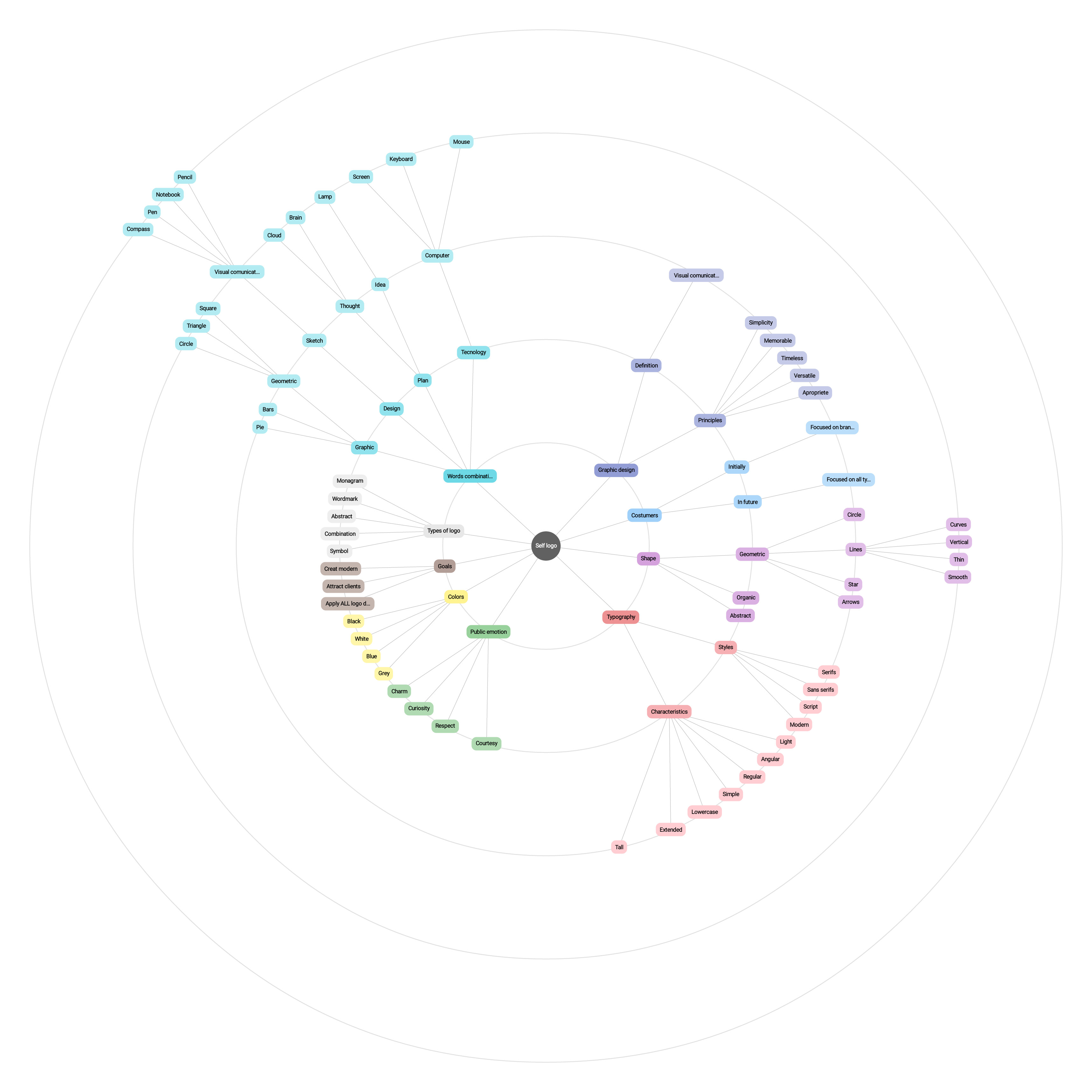
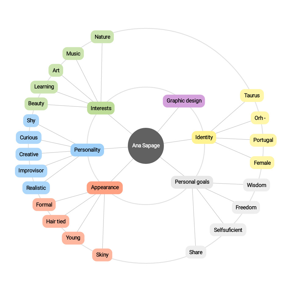
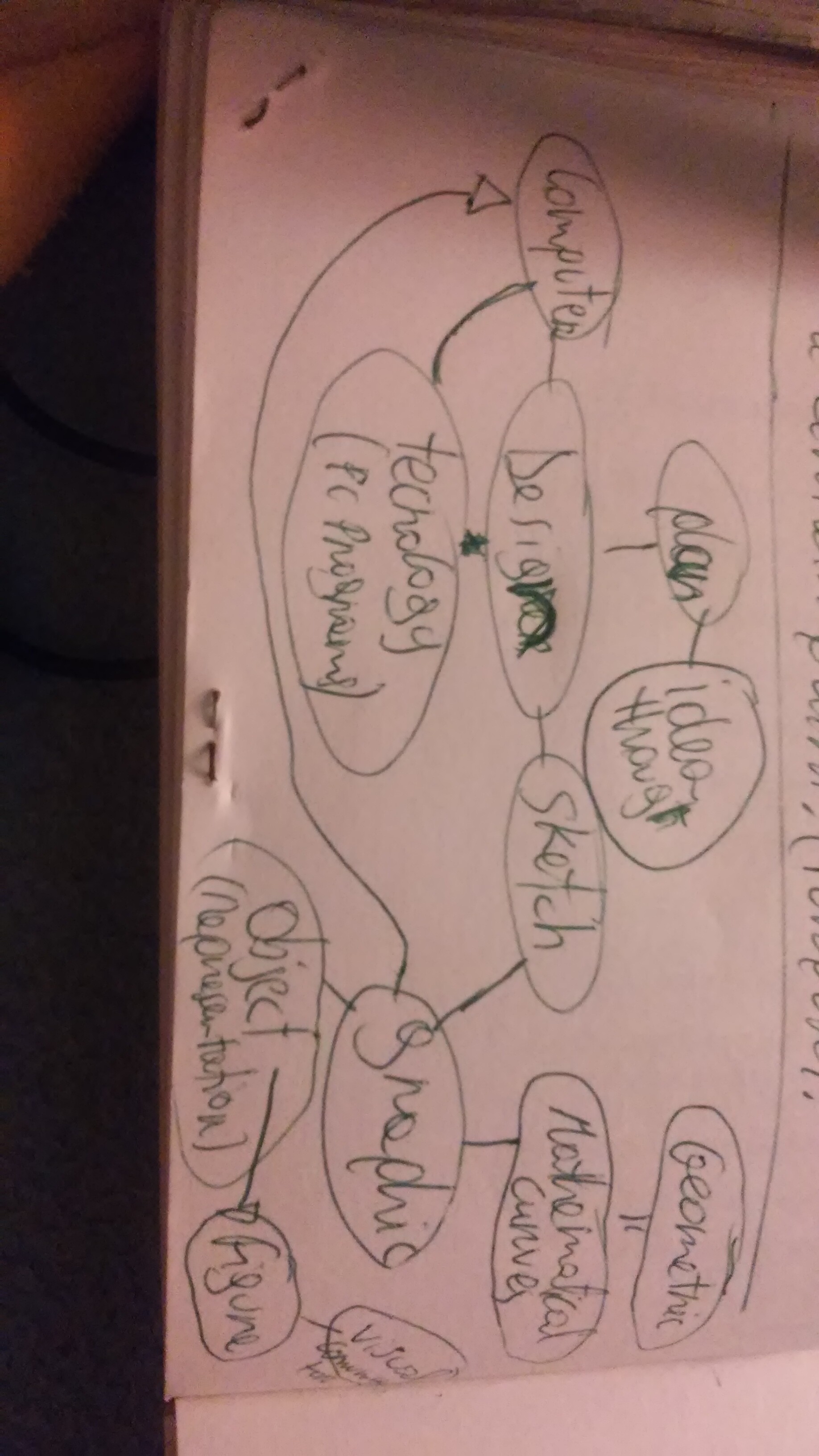
Also btw I did make a mind map of more a less everything I needed.
While reasearching info. For psychology of font and shapes and colors i end up.
I did a mind map for the client, myself.
And also for the logo on its own.
It become quiet big cux I put all fited possibility and not puting the ones that don’t be appropriate.
Even so it become quiet giganting…
I will try show you neither I have to screen shot.
As @pluto wrote, how are you planning to use your logo? As you know, in good design form follows function. So, for instance, if you are planning to use your logo as a signature on your artworks, then you need to ensure it fits right in and does not compete with your work. Hence, take a couple of your artworks and place your logo ideas on them to see which ones work best. Many of the above comments from us can probably also be explained better when your logo is shown alongside it’s intended application.
Well my intention from the start is simply add on portfolio neither in printed or enhance or other website that is ideal for showcase portfolios and put them in mockups sence I read that is good to add my own brand on portfolio to show I can manage self started projects and show autonomy.
But also make it as my own brand and use it on Facebook and instagram profiles pages.
I must admit that I been quiet lost and I am still a bit not so much as before with what to do, is my second logo i do in my life and my first one was college work that pretty much lacked alot of things, so yea I want to perfect this project as much as i can until positive feedbacks.
But I also wanna include a bit personality into it to make it memorable and versatile.
But i do have some problems with making things simple sence I do tend to make things complicated.
I won’t give up and i will keep trying.
Eventually I will get somewhere so,
I really appreciate the patient and effort you guys put on me.
Thank you.
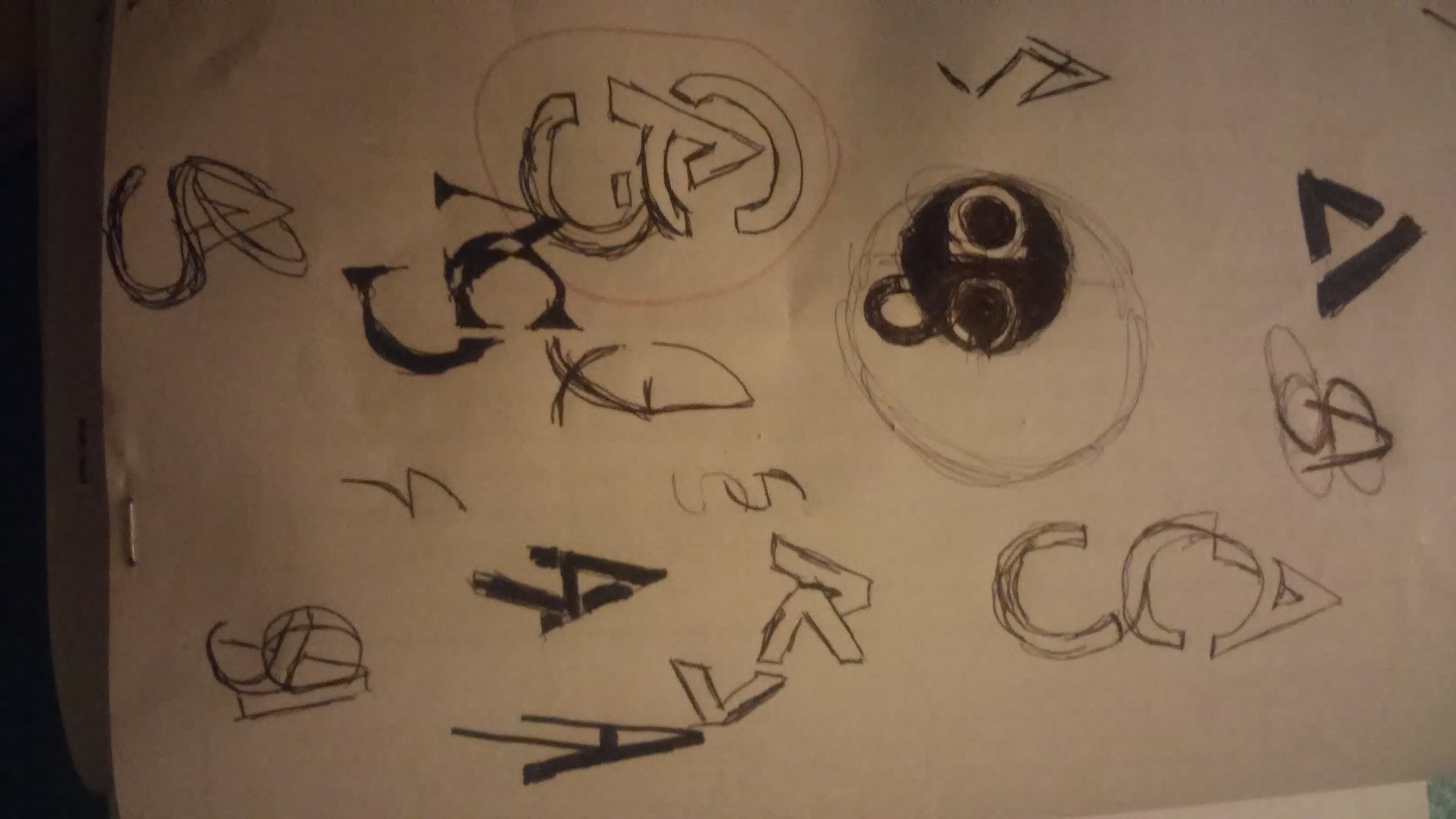
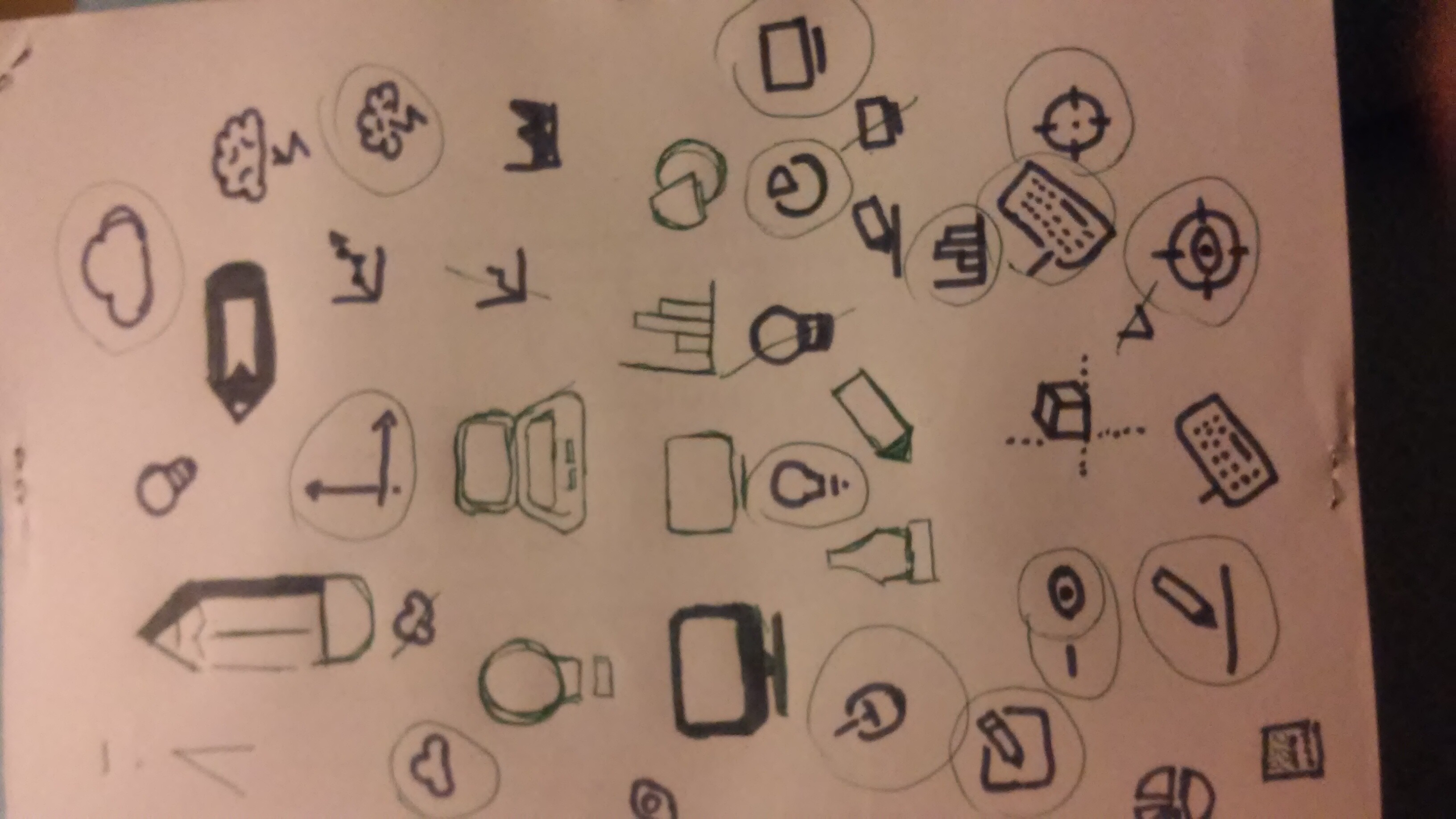
I will draw several things and come again with a Whole bunch.
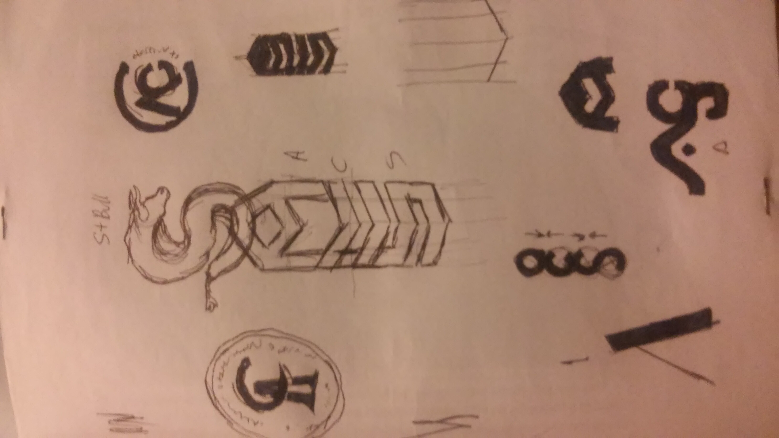
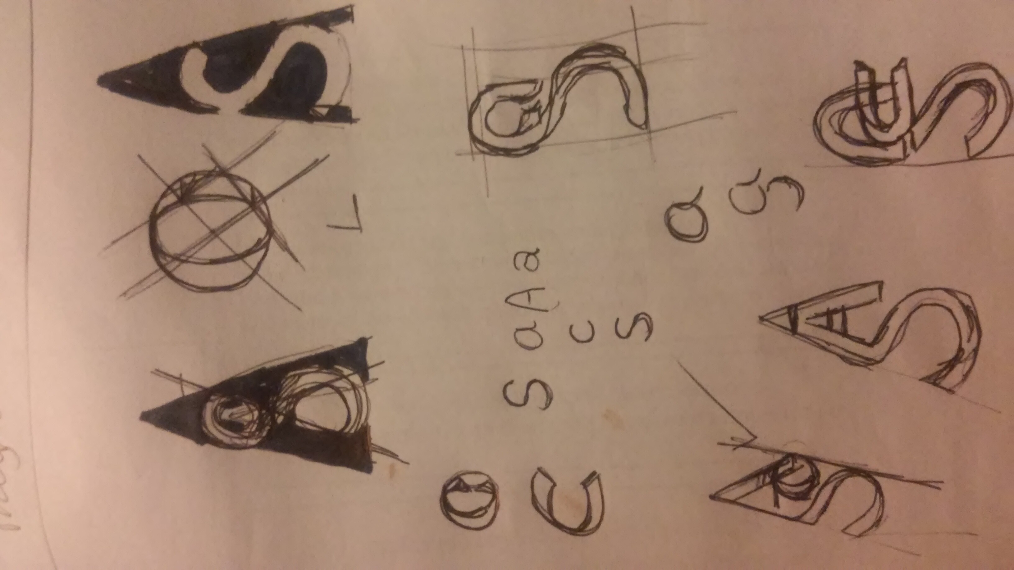
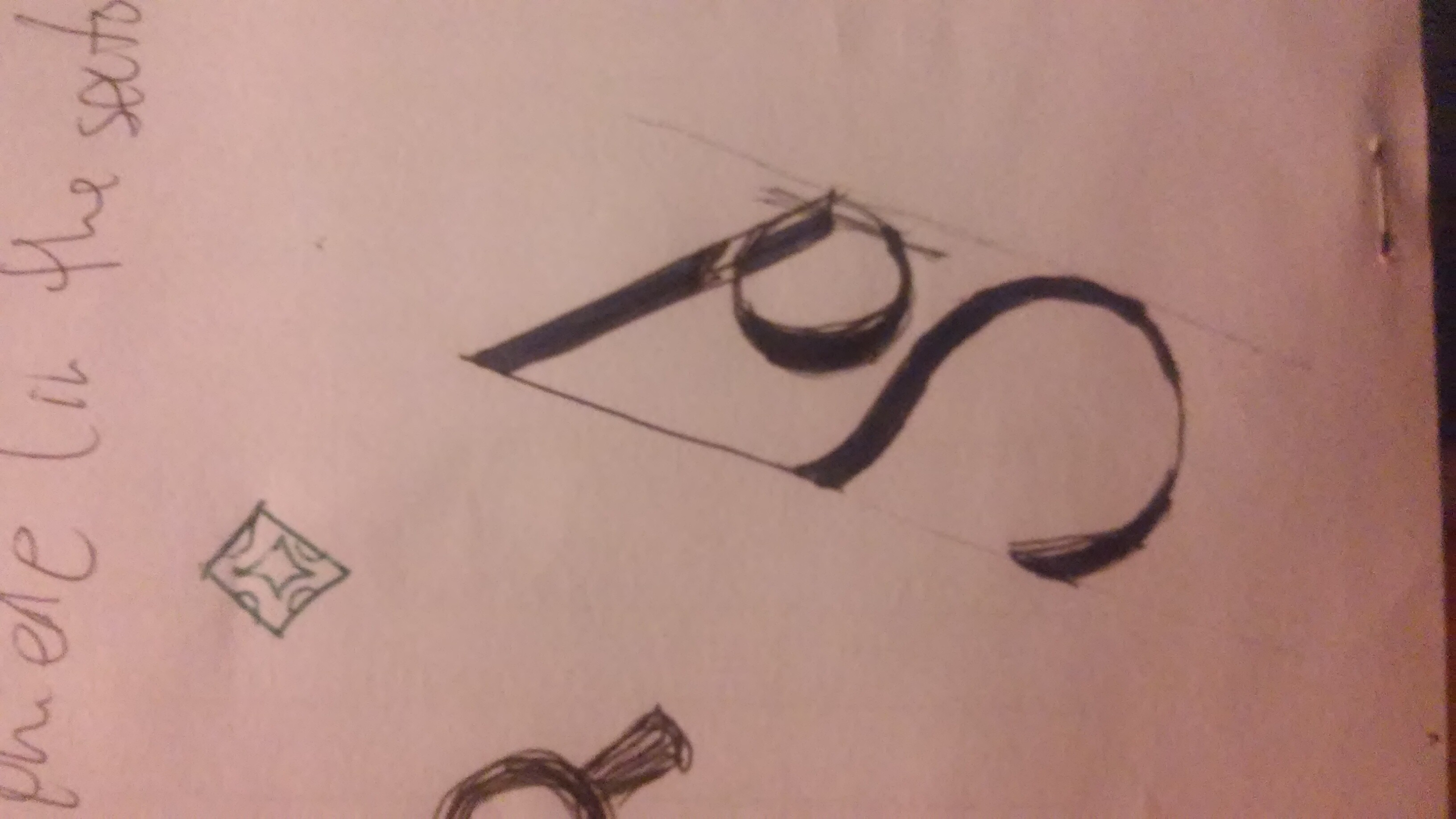
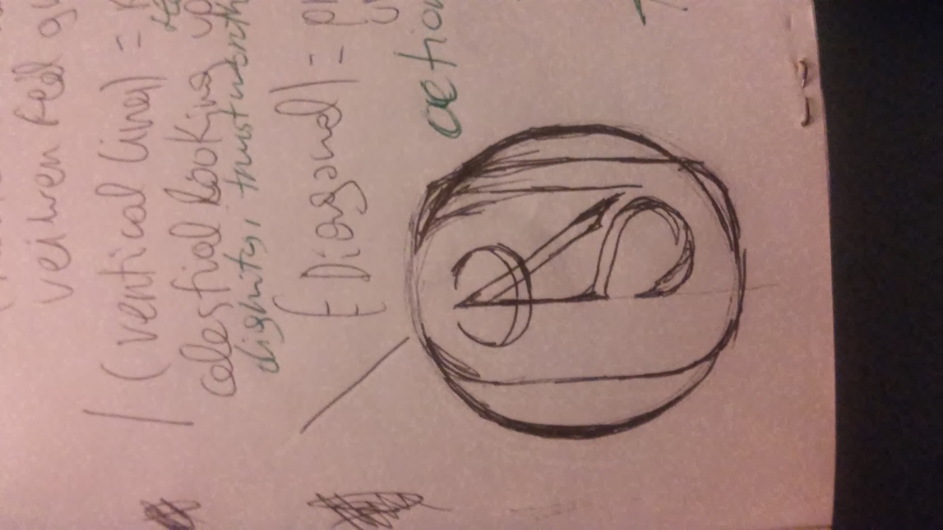
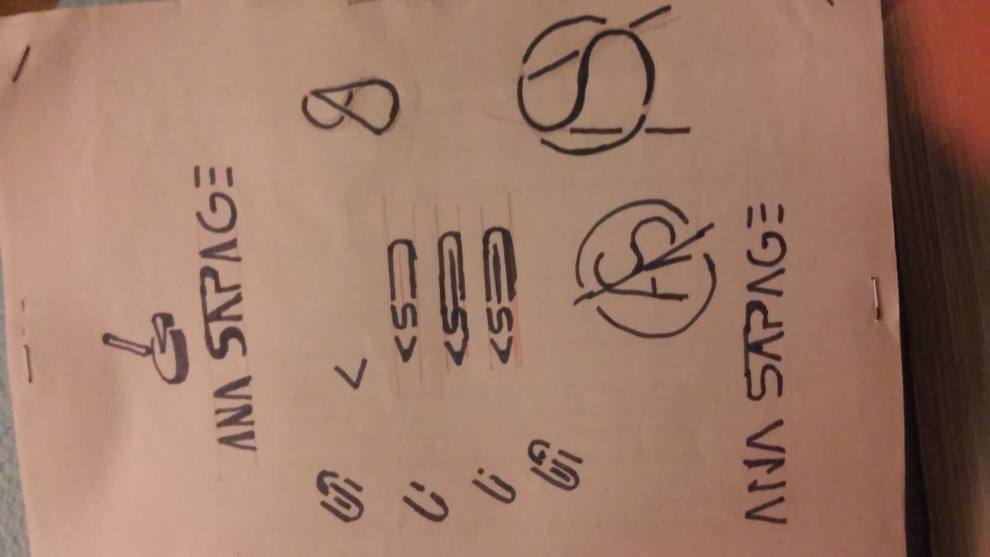
I did draw before as monograms quiet a few.
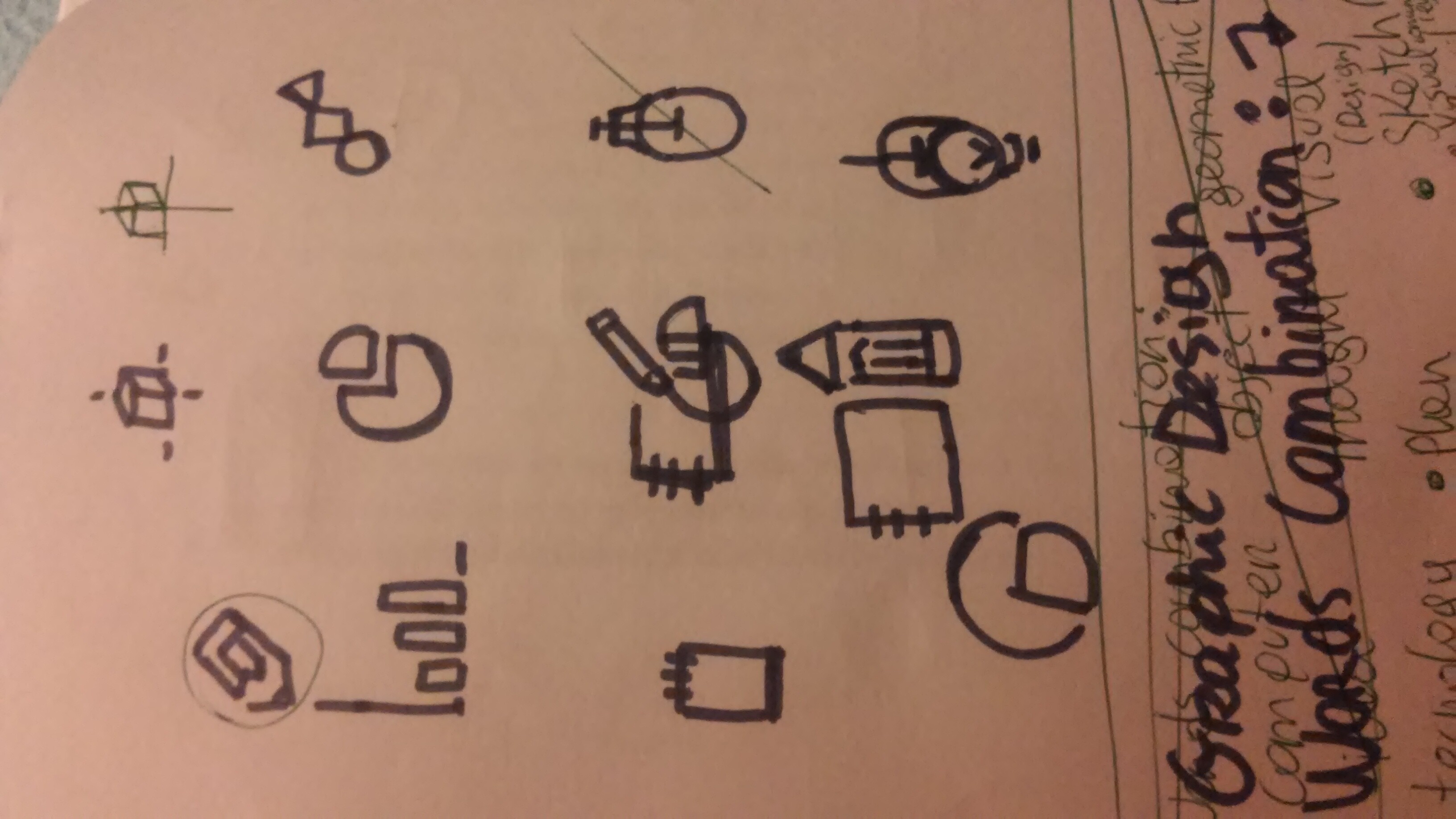
At somepoint started going with sci-fi letters maybe cux it relates best with tecnology like in says in that mind map I draw.
I simply went to a dicionary start find the meaning of graphic and design and started put all related words to it and combinations to find best junction.
Ok so your heart is set on a monogram and we’ve established that you probably need one for your social accounts.
When I’m lost, it’s usually because I’ve lost clairity on the brief. What I think you need to do is revisit your brief to measure how successful your designs are against that.
Your mindmap is awesome, that’s such a clever idea for generating new ideas - what software did you use to generate that?
As @OVOAO said some of these have some seriously awesome potential.
Have picked out my favorites below and some of the attributes from your mindmap that match them.
I think these ones tick the boxes for these attributes:
I notice you want to do branding, I would suggest you consider specializing even further than that to do branding for a specific field of customers. This will give you a competitive advantage over other competition that generalizes, but furthermore this will help you select a monogram that appeals to your audience.
It’s all good , I admire your persistence and determination to get it perfect.
Its pretty usefull and i have trief other mind maps so far this is my preference sence its easy and fast to deal with. And also can be saved in svg for open in adobe illustrator or pdf or image.
I tried other mind maps but they neither lack some functions like save in svg or are having way to many options you waste more time puting options than anything else realy.
In design, subtraction is more apt to improve the work than addition. This is especially true of logo design where simplicity and clarity are needed. Success usually comes from reducing an idea down to its essence rather than decorating it or making it more elaborate.
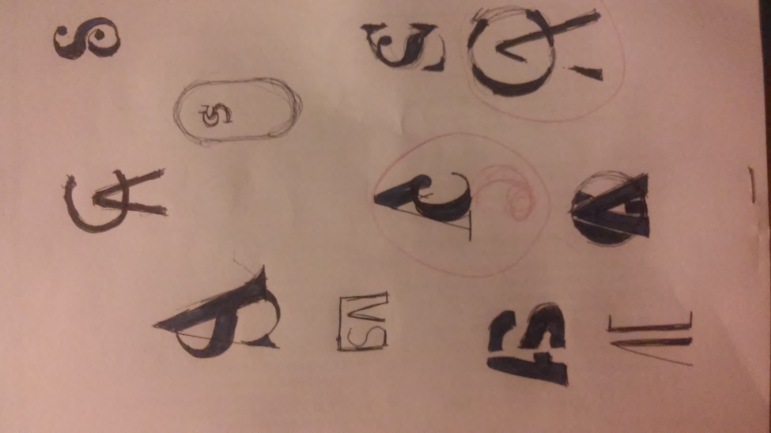
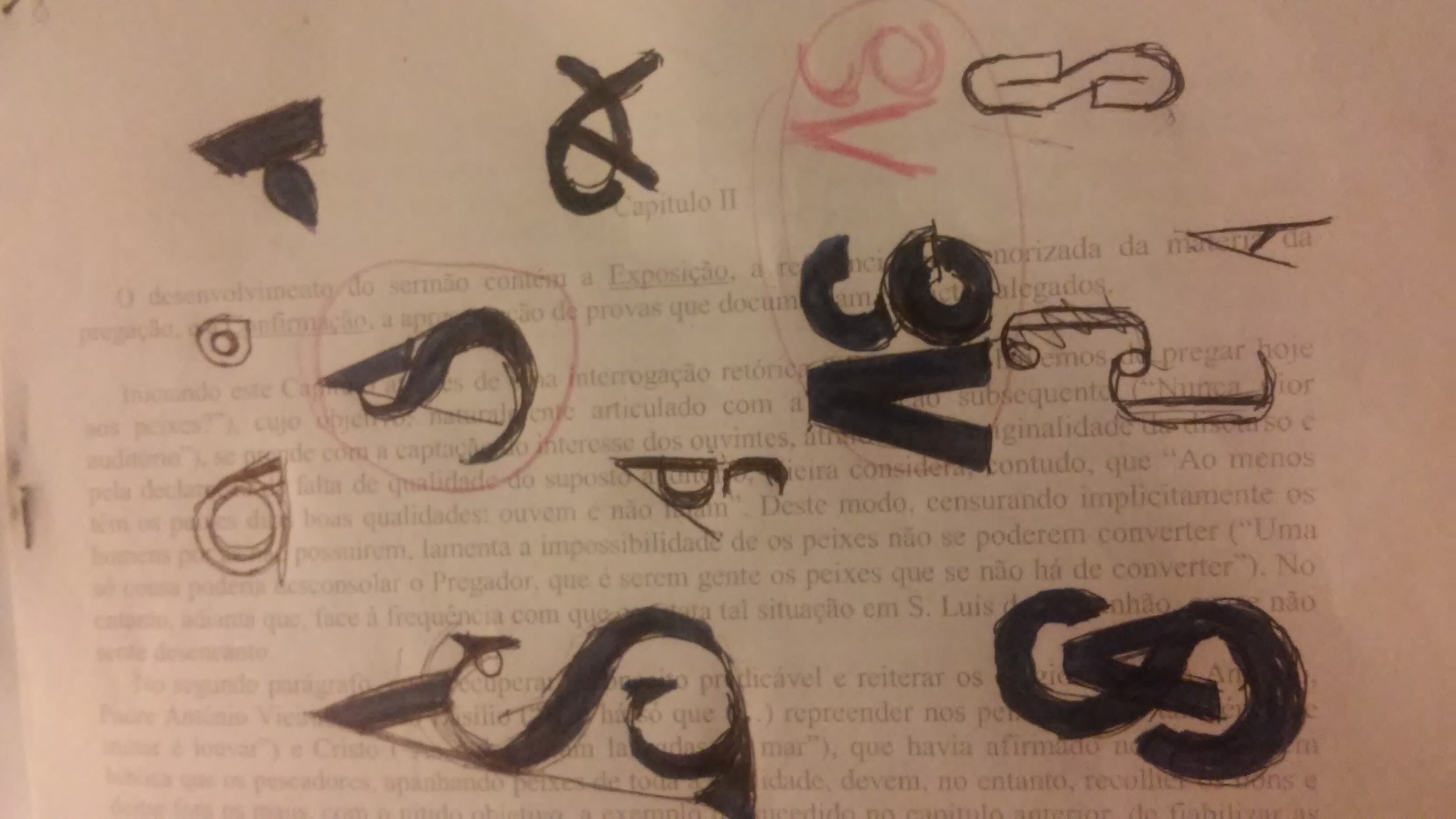
I agree with the others that your quick sketches show lots of promise and show that you’re approaching the development of ideas in the right way. I think where you went wrong was in deciding on something you liked, then elaborating on it by combining multiple ideas and type treatments.
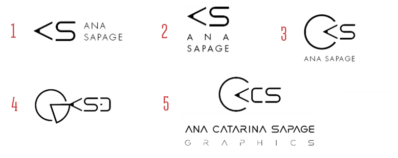
Just for the sake of explaining what I mean, here are five of your ideas where you elaborated on an initial idea that showed promise and compromised the essence of that idea by making it progressively more complicated instead of focusing on that essence of an idea and refining it.
I’m not saying this example works or is the best of your other sketched ideas, but there’s a simple idea here that could be refined into something that might work. Mostly I’m just using it as the starting place for the point I want to make about keeping things simple and focusing on the essence of the good idea rather than elaborating upon it.
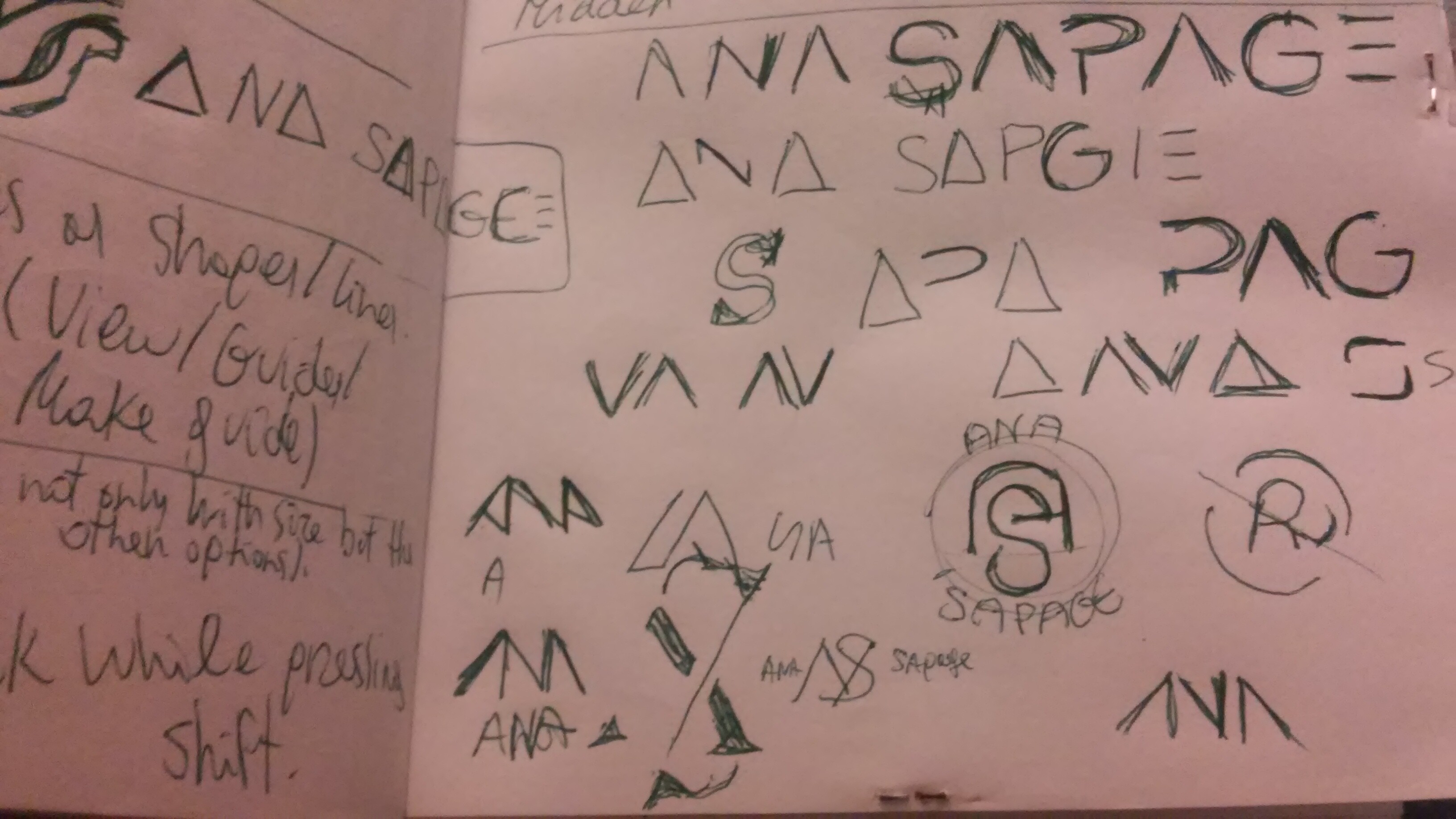
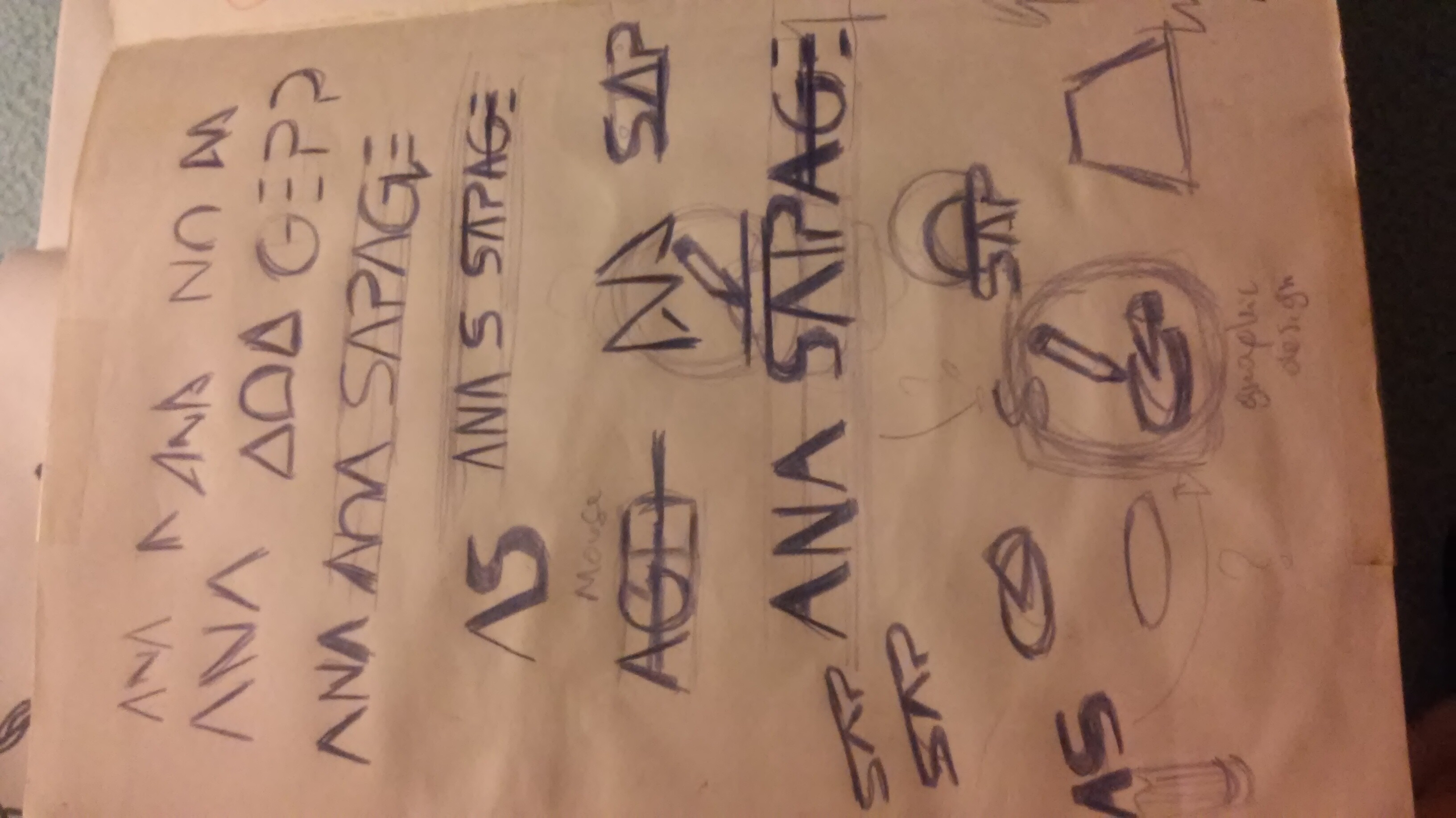
Here, you’ve made it more complicated by introducing odd spacing into your first name. The quirky spacing draws attention to itself and draws attention away from the logo, which makes the general composition less cohesive.
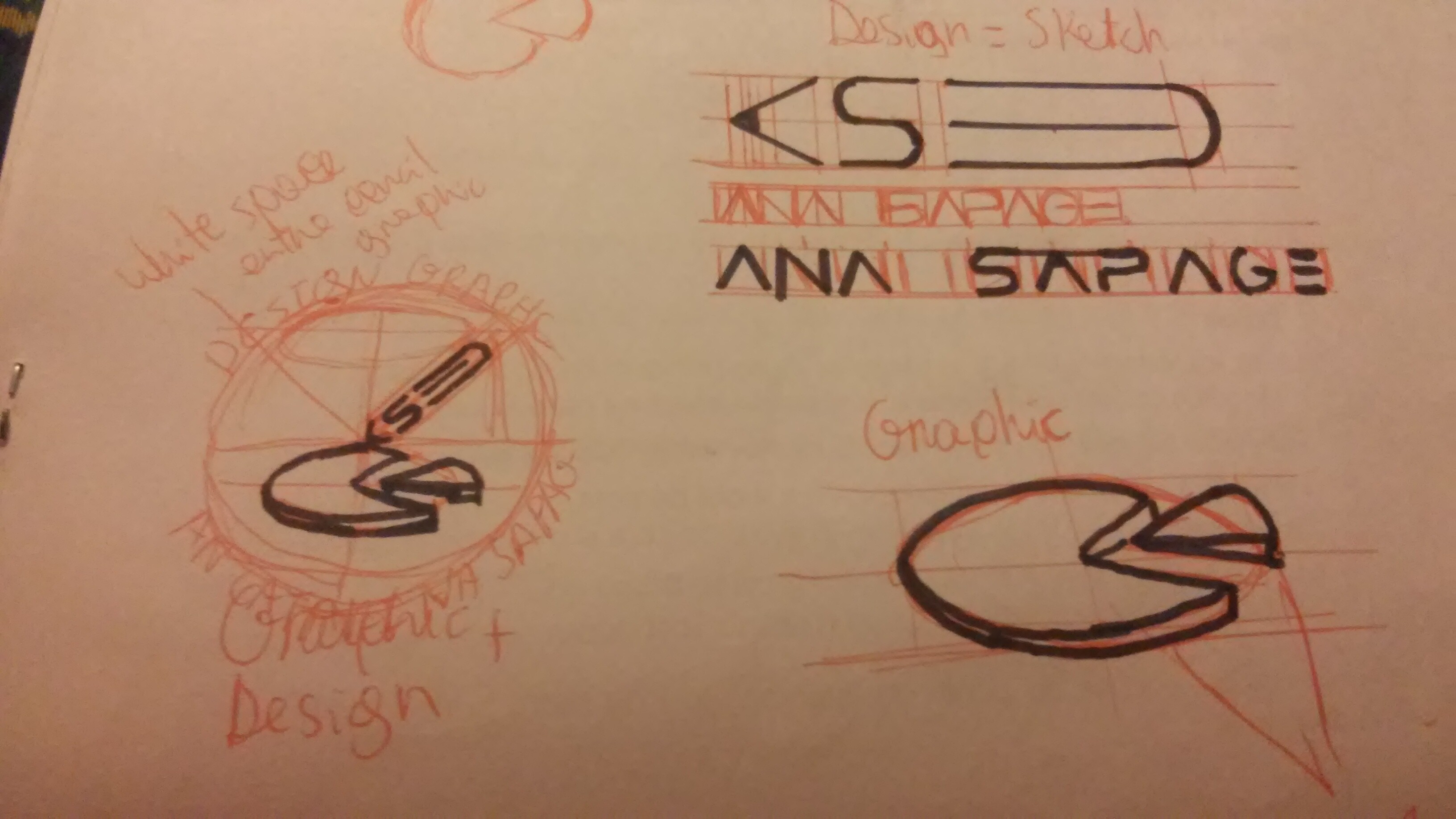
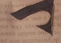
Now, you added a big C, which makes no sense at all since there’s no reference to your middle name. In addition, it emphasizes the C over the other letters and places it first in the hierarchy, even though it’s the least important of the letters. If that weren’t enough, the C and the sideways A form a pie shape that has no meaningful connection to anything and hides the idea you had of the A being the tip of a pencil.
Here’s you’ve seemingly gone way off-track by focusing on the unrelated-to-anything pie, which obliterates and hides your original idea with multiple competing ideas. In an attempt to counter the confusion, you seem to have added an eraser onto the pencil to make it clear that it’s a pencil. Unfortunately, that runs counter to your A and S being letters, which suggests that the eraser must also be a letter — a D — which you don’t intend. In addition, there’s an extreme point of unwanted tension in the logo, where the tip of the A touches the corner of the pie slice.
I won’t say this is worse than number four, but you’ve done something here that rarely works. You’ve added typography with so much of its own quirky personality that it competes for attention with the logo itself. It’s fine to have a stylized logotype, but in those instances, it’s usually best to let that stylized logotype be the logo and not create another logo in addition to it. The name of the business usually needs to accompany the business’s logo, but it typically works best to use type with a neutral personality that compliments rather than competes with the logo.
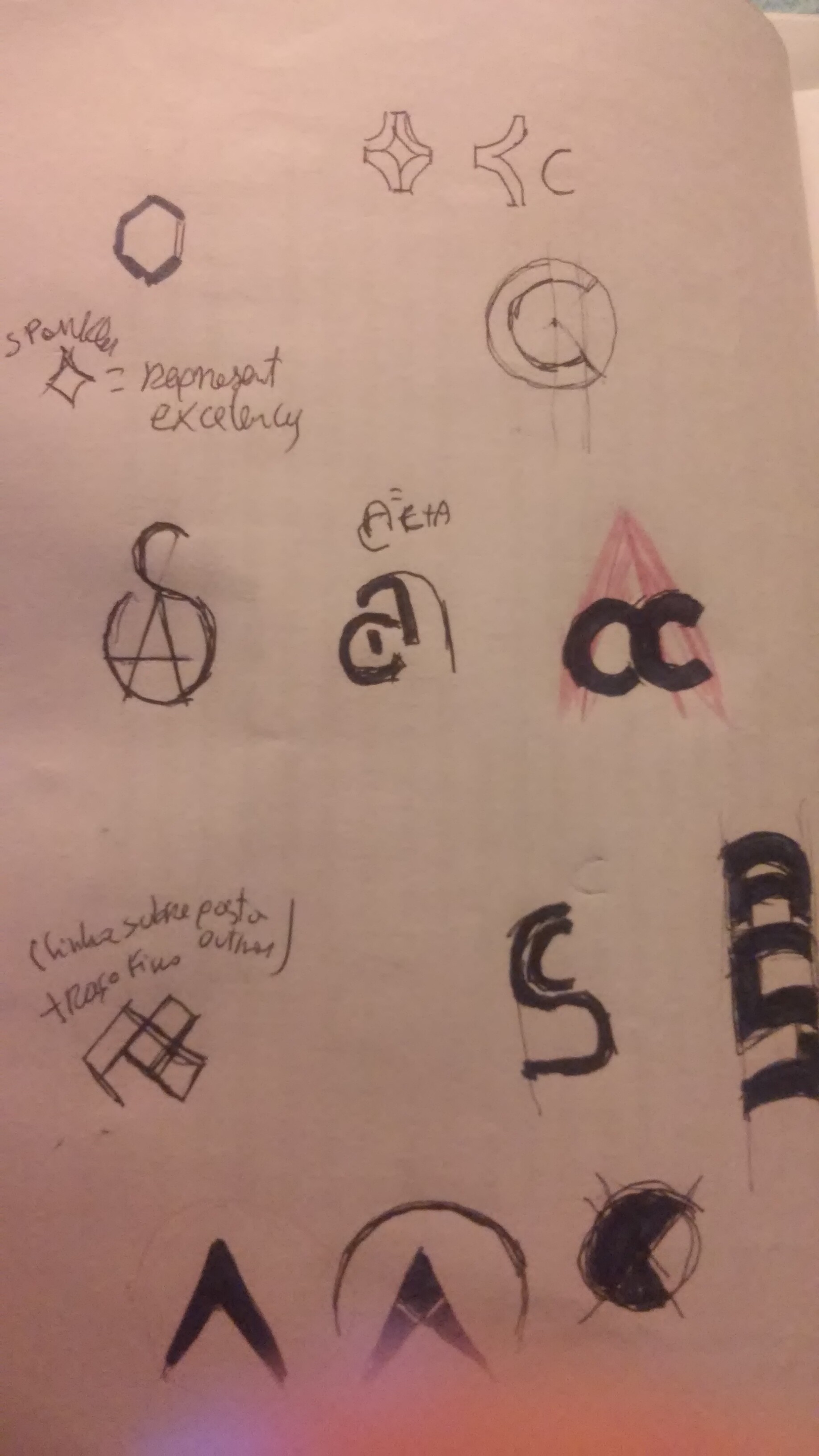
Such detailed analysis its very usefull.
But yes now all kinda makes alot more sence to me was so focused on making look pretty than actually efficient.
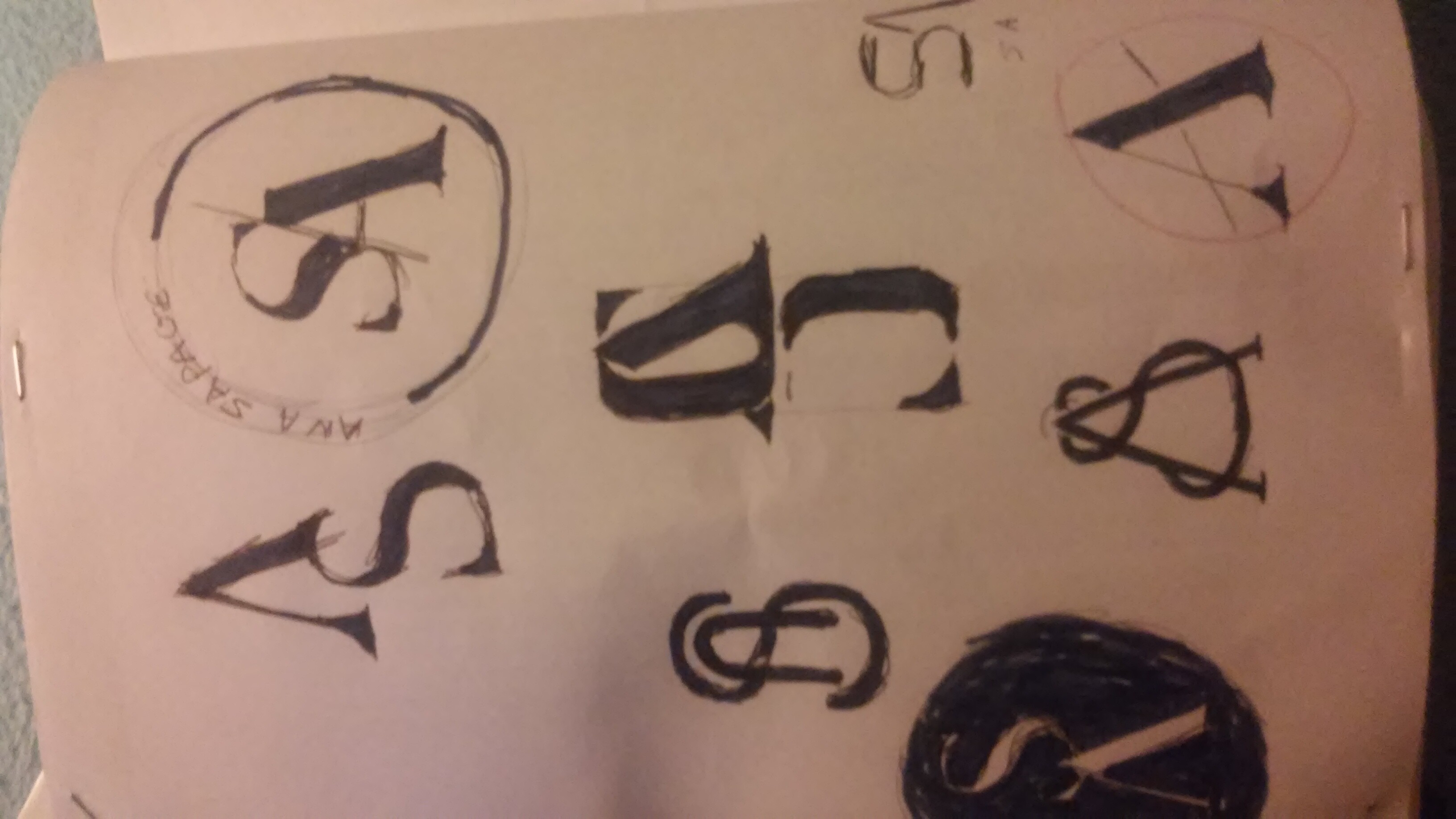
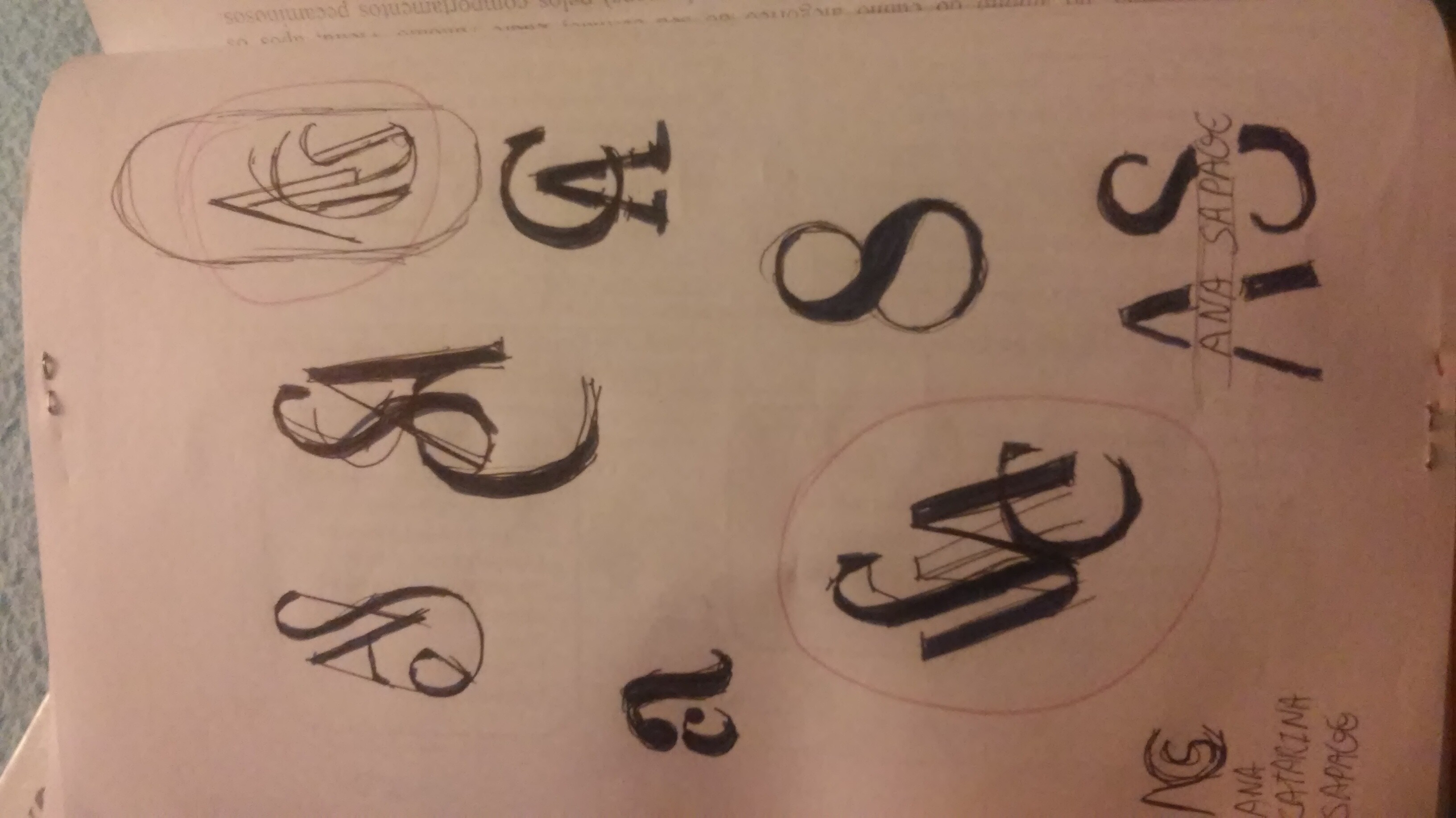
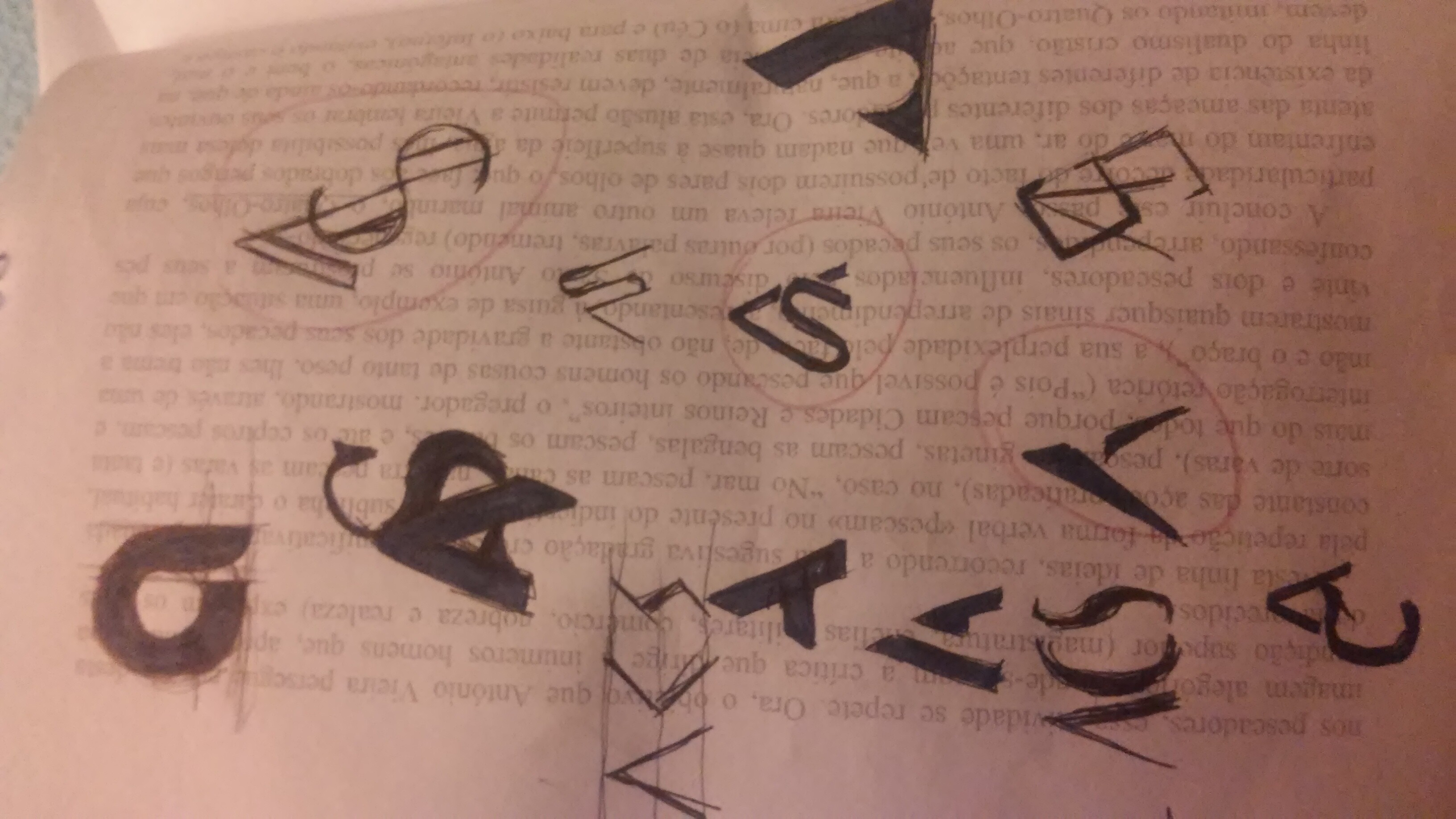
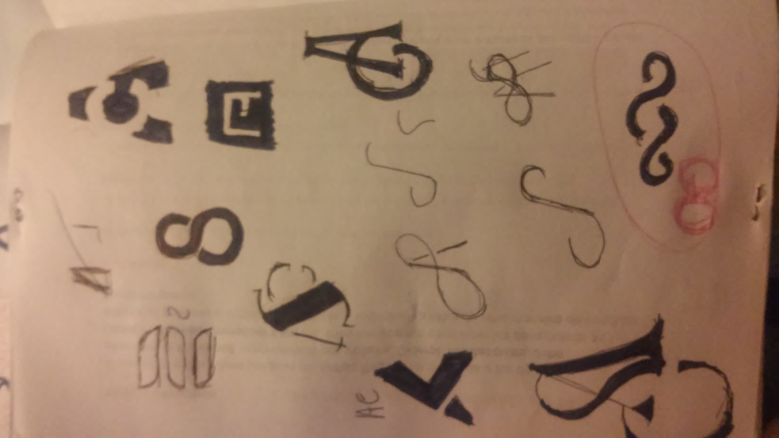
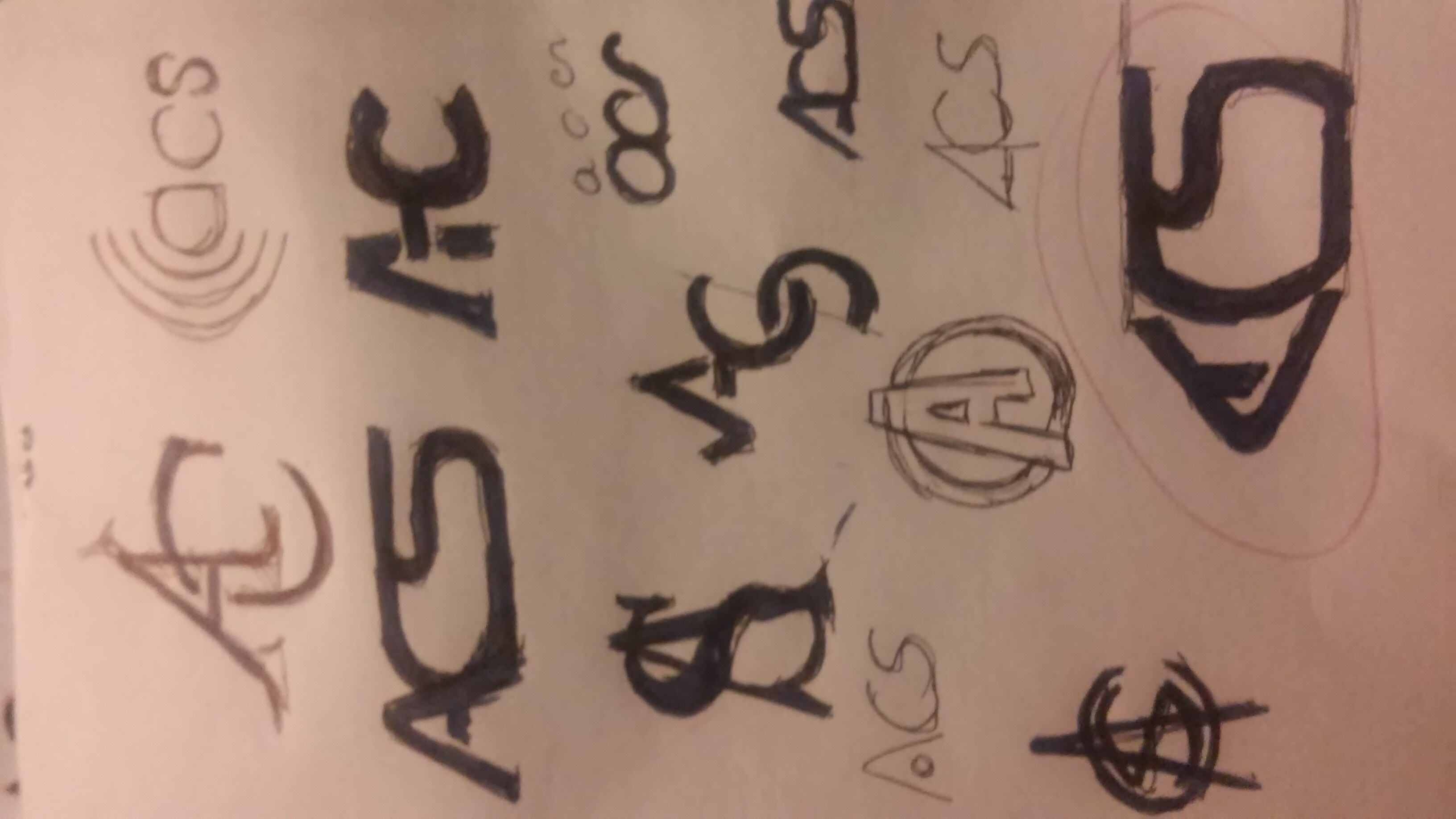
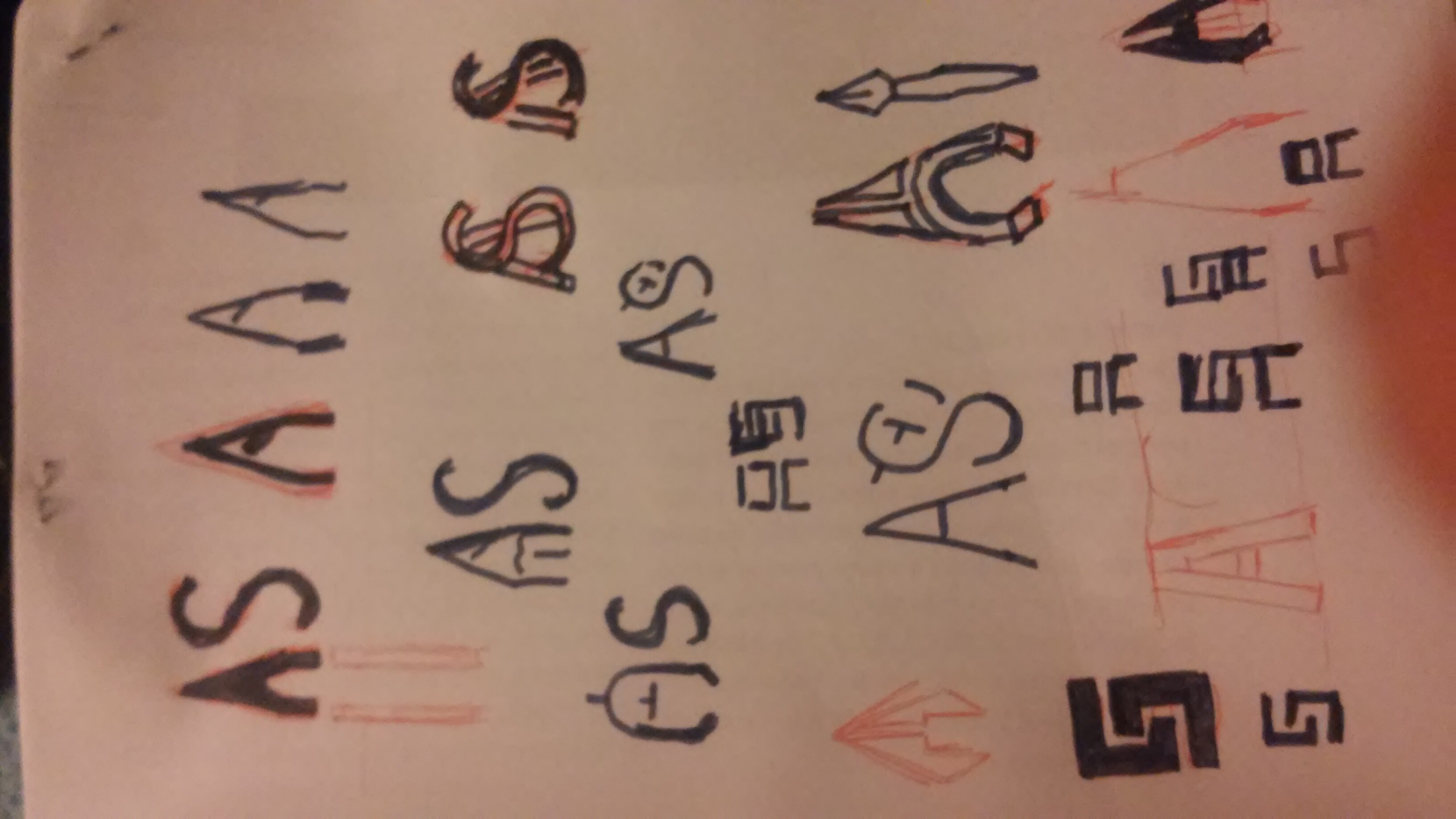
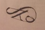
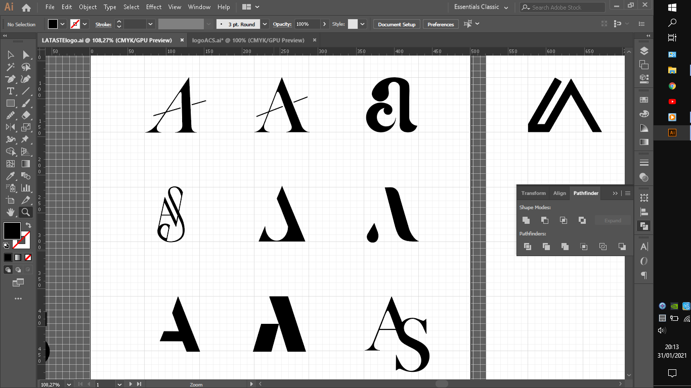
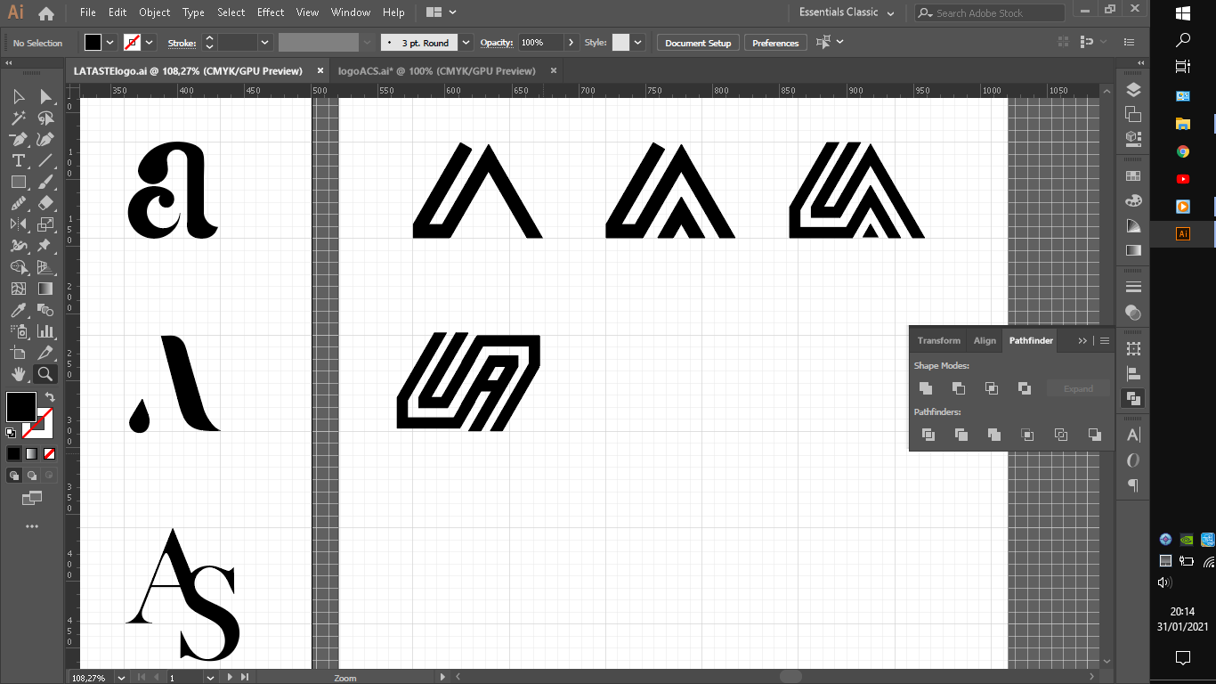
I made some variantions on some logos to test them like that A in normal and italic.
I am not sure why but that elegant smooth thin lines logo with A S c kinda seems strange i am not sure where it went out of track or if its my eyes who are unexperient.
I do enjoy that layed S and A and theirs variations with all same stroke and white space for some reason. Specially last one.
What you guys think?
Any sugestions?
Whats need to be fix?
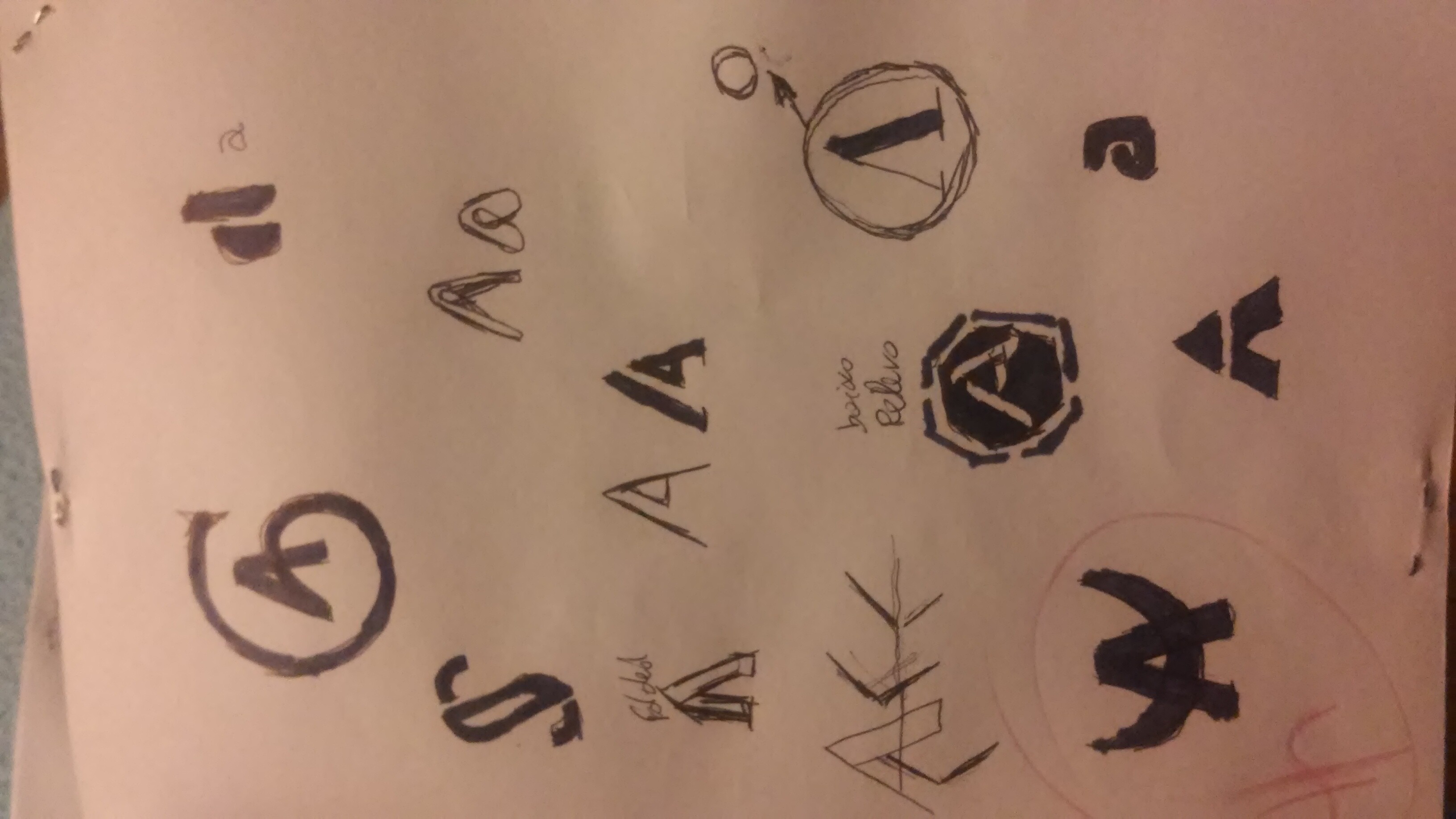
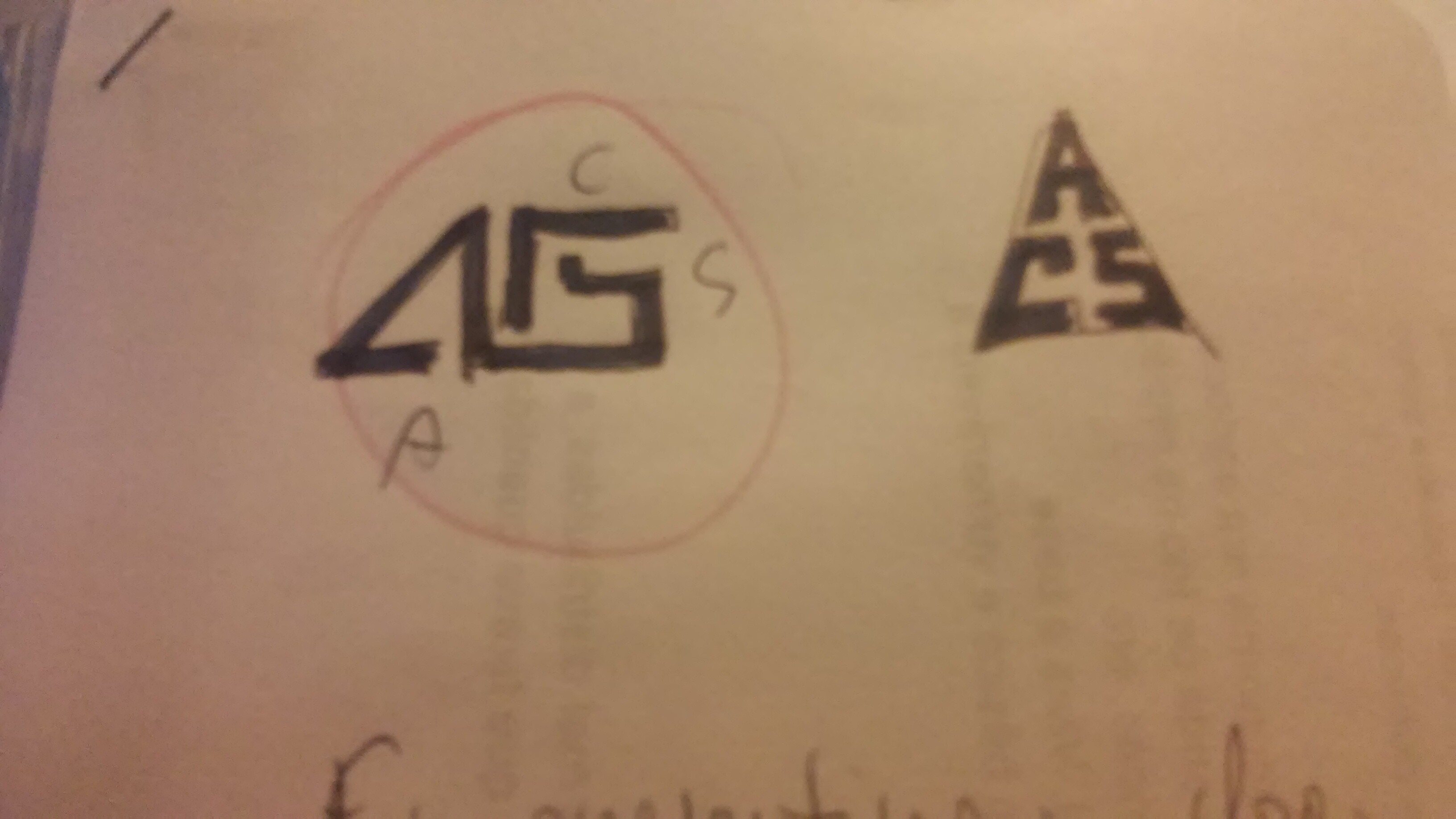
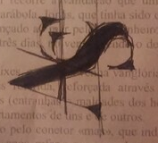
I feel you need to practice more how you vectorize your letterforms. Your sketches have much better linework than the vector versions. Let’s take the two I said where my favourites for example. The vector versions of those two look so clumsy in comparison. The “a with incorporated c” now looks like the c has some awkward umbrella handle dangling over it’s head, and the “triangle with drop” is now so roughly cut that it’s completely loosing it’s hinting of a capital A with the “S” cut out. Can you give it another shot and let the lines flow as good as on your sketches?
It took me a while, and only after re-reading your post again, to actually get that’s supposed to be an SA. It looks much more like an LA to me. Which is cool, if you aim for Hollywood.
Like @OVOAO mentioned - I think the “a” idea needs a bit of polishing. The way I would execute it (and I am super lazy ) - I would pick a beautiful typeface like Playfair Display, Bodoni, or Pirogi Roman - type ‘a’ and maybe 'c" and then tweak them to do what you want and make them look correct in terms of weight
That’s a great question, I see it too. It feels like the vertical lines aren’t parallel, however I’ve checked and they are ! What if you removed the bar on the “c” just to make it “AS”?
Specially last one.
What you guys think?
It’s nice, you have some really solid ideas there , now I think you need to pick which one you feel best represents you and will speak to the clients you intend to work with, then refine and polish it from there.
You said before to choose specialization.
I also seen that video and i found it usefull sence i must admite i had the idea to generalize like that student guy but now that i see the importance of it kinda sparkes some lights.
Like he said is better generally not only make it seem everything and all areas are superficial studied and experienced and known but clients with more knowledge see if crap your general work basecly and expect the rest to be just the same.
But the point is i am not even sure how to specilize in a certain audiance i want to achieve.
Or maybe even have, because like i said i was generalizing things. I want the audiance to feel like its a modern logo and is more geometrical in a way if i go for that series of words tecnology improvision and simplicity.
I do want to prioritize simplicity rather than the classic elegant charm look. Sence simple look always more pleasant to the eye, and modern in a way.
I mean i think i would go more for that last one who i liked more that looks more like L A like he mention. somehow now i cant unsee the L A anymore cux it actually does look like it.
There One thing i been coming across sence the start is that rotating letters from their original positions and laying them or reflect them kinda makes them more dificult to recognise. Isnt that correct to say?
I am guessing that for logos if its monograms especially its better leave the letters in their suposed vertical position and try blend it with the other letters from there.
But i also know there is alot of logos now a days aplying this typical theme.
And maybe thats where the influence came from.
I am not sure if that mind be a disadvantage in the competition. I mean from wut ik if the competition makes all the same type of logo the best is to go for the difrent right?
Whats your opinion on that?
Maybe i am wrong and those themes of logo arent so commun as i think they are cux i am not looking at the whole picture but i honestly come across them queit often in behance or drible or pinterest.
If you want simplicity, why do you keep on adding things and make them more complicated?
Yes, that’s the case. On top of my head I can’t think of any appealing monogram with letters in mixed directions. The exception might prove the rule, but I don’t know any.
Never seek a trend if you want to create something that lasts longer than a season.
It’s useful right? He got the idea of being a specialist from Marty Neumeier who is a famous brand strategist. Back in the 90’s Marty carved out a niche designing packaging for computer accounting (I think!) software when it used to come in boxes. He made a fortune doing it and beat out much larger competitors because people knew him in silicone valley as the go-to-guy for that particular service.
I would use the work you would like to be doing as a starting point for this. If you like geometric designs and making those types of marks, maybe you could start thinking construction companies, corporate or tech related businesses
You don’t have to decide today, it’s something you want to be considering though when deciding on a mark.
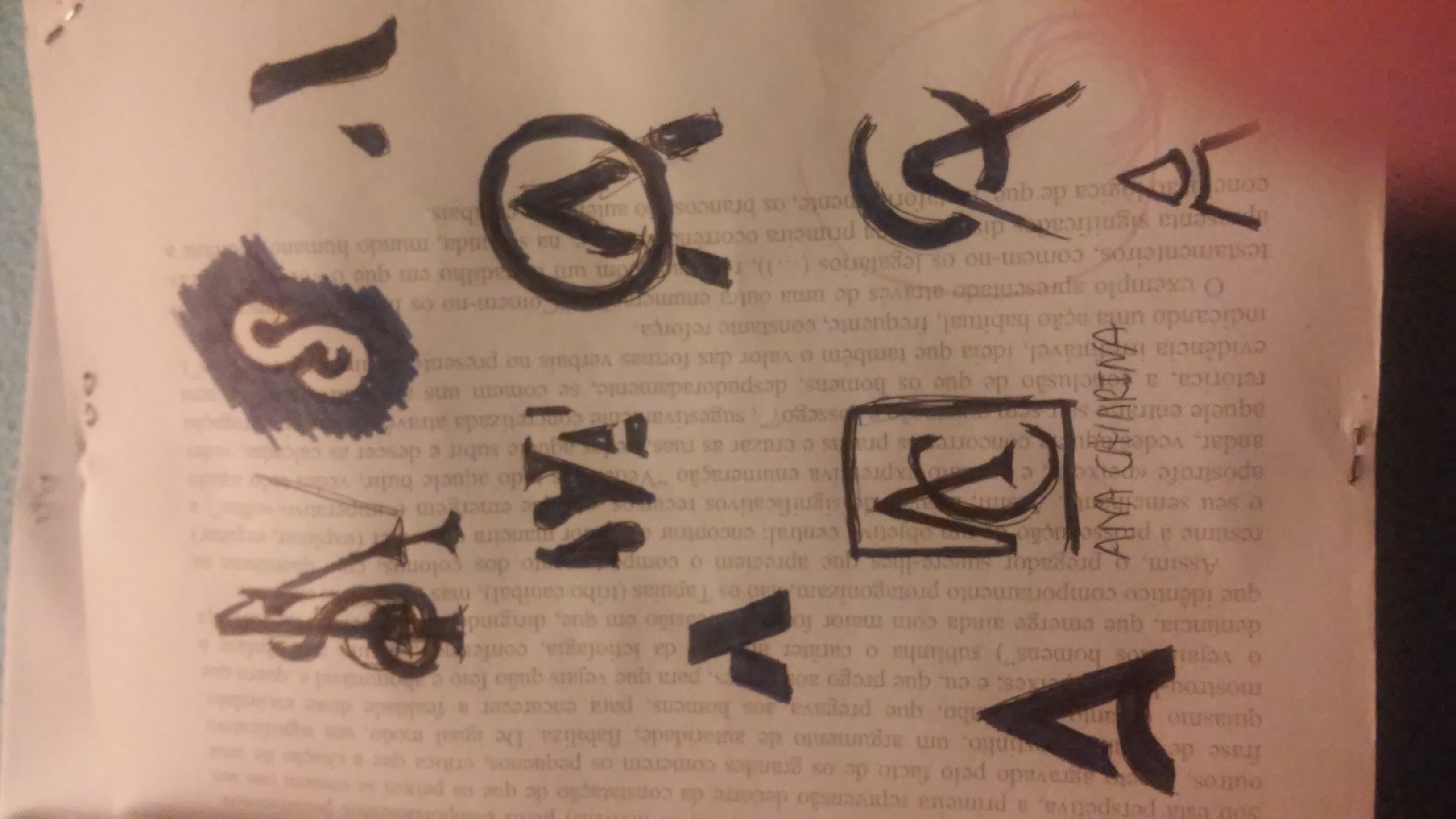
As @OVOAO mentioned it’s looking too complex and the letters are becoming unrecognizable.
I would agree, when you rotate them it affects the legibility and starts to look messy. If you want simplicity, drop the “S” and just stick with your “A”.
They do it because it works and looks good - and that’s what clients want.
When he says specialize, he means specialize in particular industry or for particular auidence or a particular style and do that thing or serve that audience really well.
Do not try and do things totally different to everyone else, you will appear super risky and no one will hire you.
This video explains that a bit more (you only need to watch 5 mins):
If you’re worried about it looking too similar to someone elses design, try giving it a twist or simplifying it further in different style.