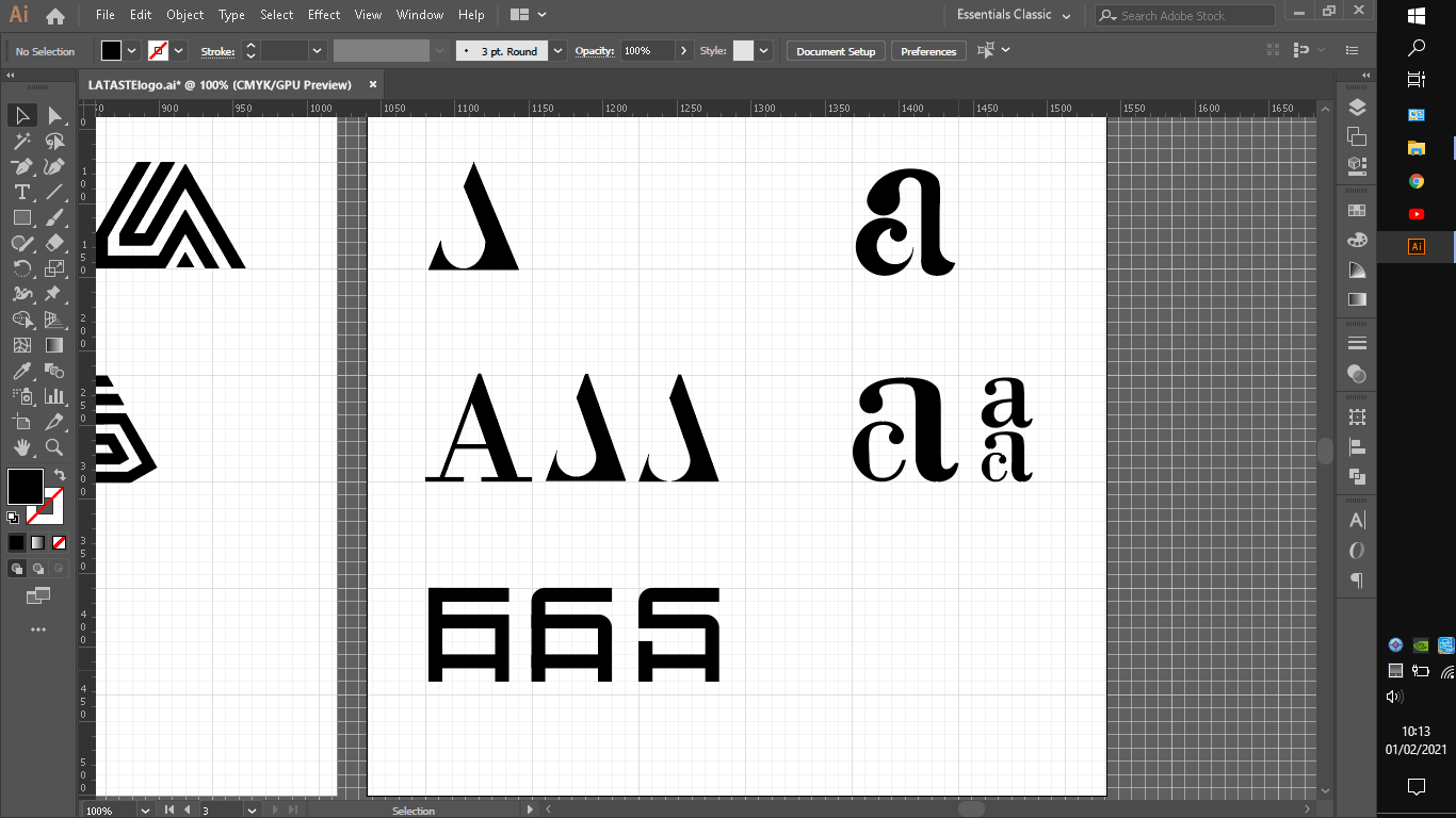
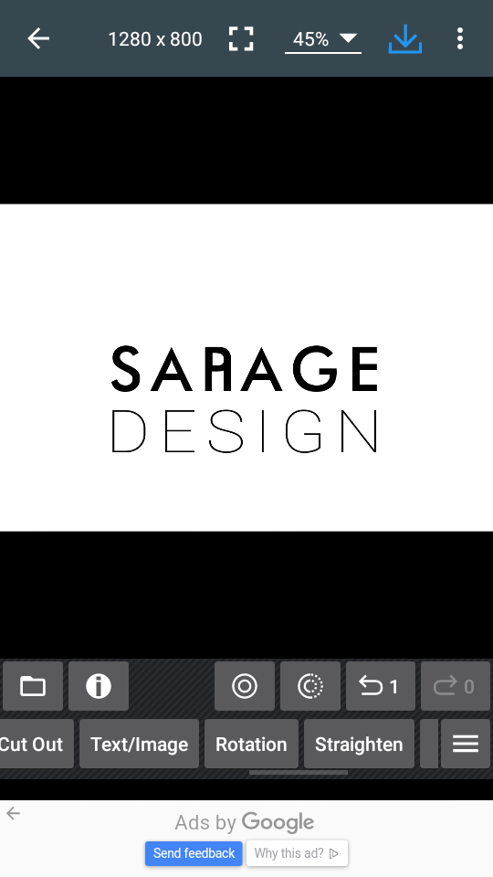
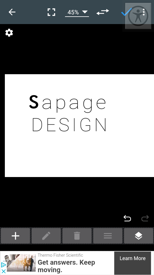
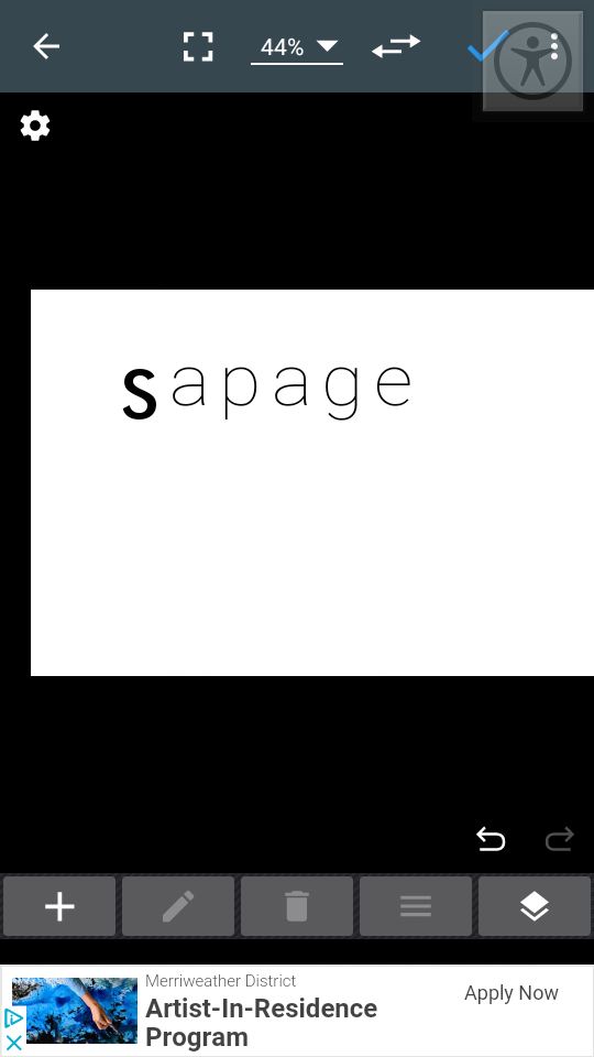
I used bodoni on both A’s it looks alot better from the before specially that lowcase a.
Before i was trying to build the shapes witouth a font as a base guide not only was alot more troubling to construct with rectangles circles shapes tool that even in the result was quiet difrent in a positive way.
What you guys think?
Is it decent?
What about that same stroke AS ?
In that A caps logo am not sure which one works better maybe the one with small cut on base makes it more seem like A.
What is your thoughts?
Good question…
I am not sure how to answer that.
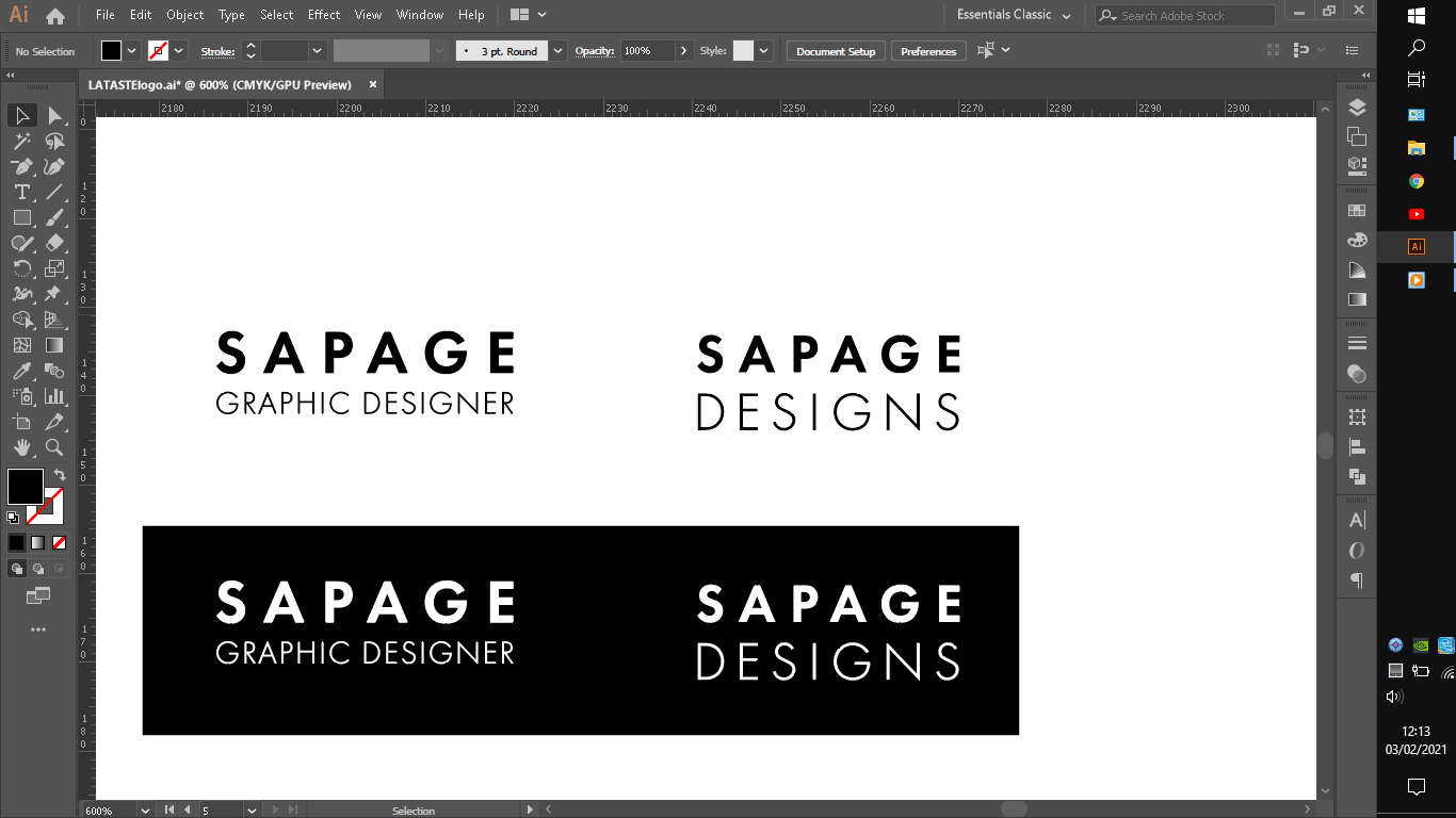
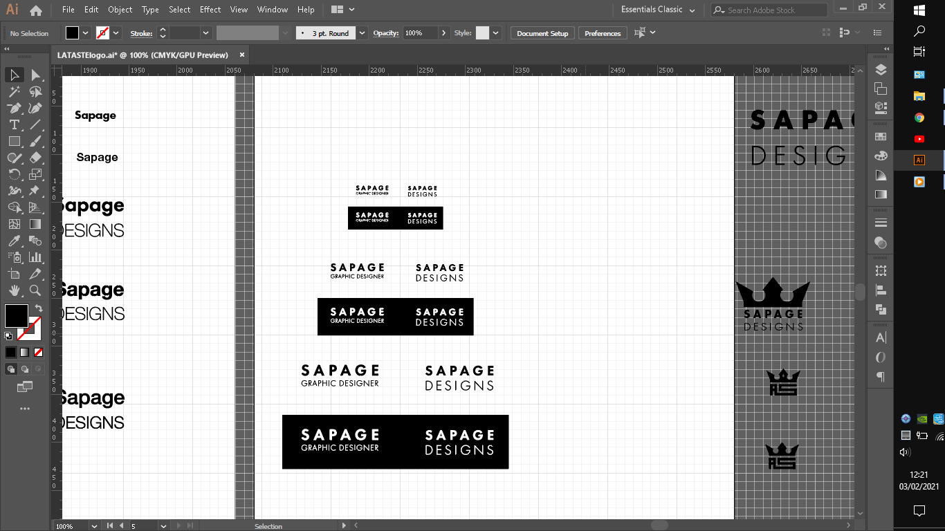
I read that wordmark could be a good way to go to sence my last name sapage is quiet unusual.
And i read its pretty good for starters freelancers.
Iam kinda jumping here and there see wut results of the many possibilities and experiments.
But if i go with word mark i have raised more questions like where or how i am gona make thw focal point or if will have one.
Am i gona put just sapage can i put like sapage designs or something?
What font represents best with the name of sapage or myself. I think i would go with some light font. Sans serifs. Maybe futura or gillsans i am not sure. Some timeless classic font. Then include a detail that mind focus the viewer eye like maybe color but if go with color maybe grey or blue cux most related to me psycologicly. Or maybe a shape. Maybe circle cux is also realated to feminine. Or some smooth line.
I think you could totally get away with shortening your business name to just your surname.
You can put the design or branding or studio on it and I think it will work. I would suggest you look on behance at what other people are calling themselves. A lot of smaller firms seem to include “designs” in their name, while the bigger firms get away without it, am not sure how it work for someone starting out.
If you go with a wordmark like “Sapage” or “Ana Sapage” I don’t think you really need to make a focal point. There’s something classy about being simple and understated. .
Because when you think about in the functional sense, what do you want it to do?
I think you want it to be first and foremost easy to read, simple, a little stylish and unique (which you probably get already with your name).
I did some reasearch and some of them do put “designs” or even put their line of work " graphic design" or even their job " graphic designer" some of them even go into more specific like " web designer or illustrator", but i am guessing they specify cux are not freelancers anymore and know what they aiming for already and know what is their passion.
So i think is better for now just go with designs ot maybe or maybe the job name.
Do you agree?
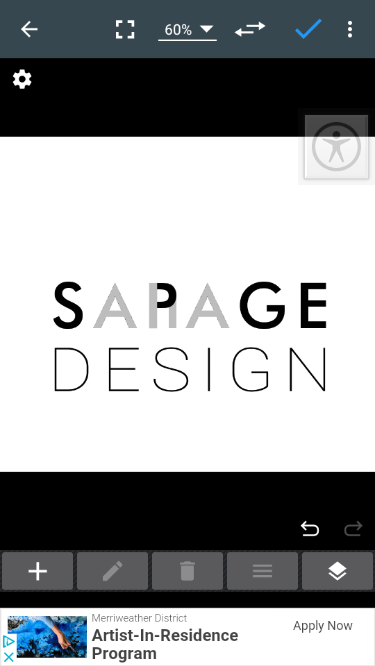
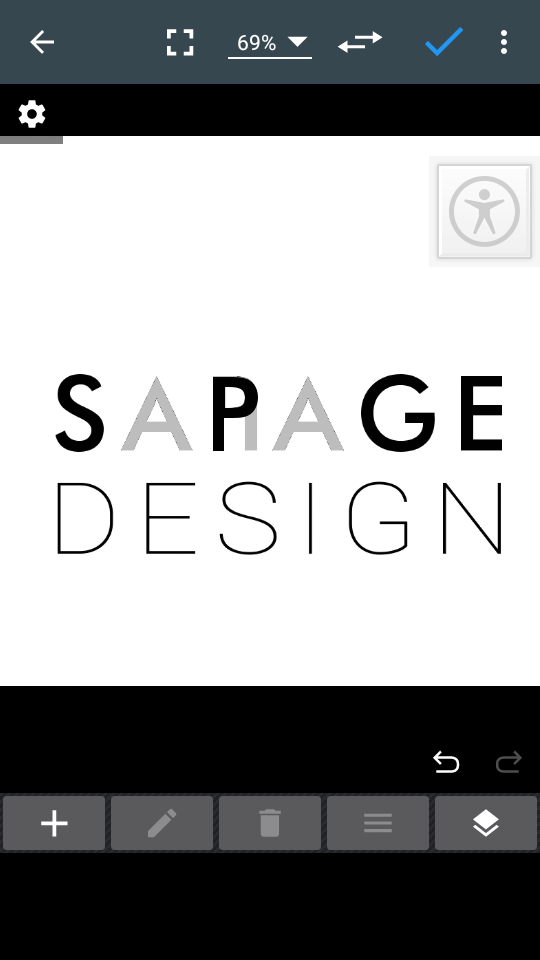
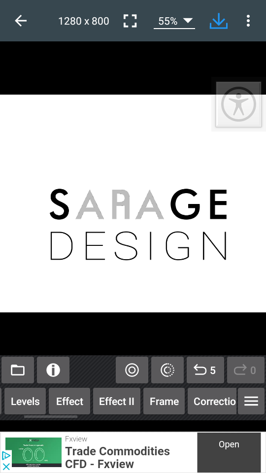
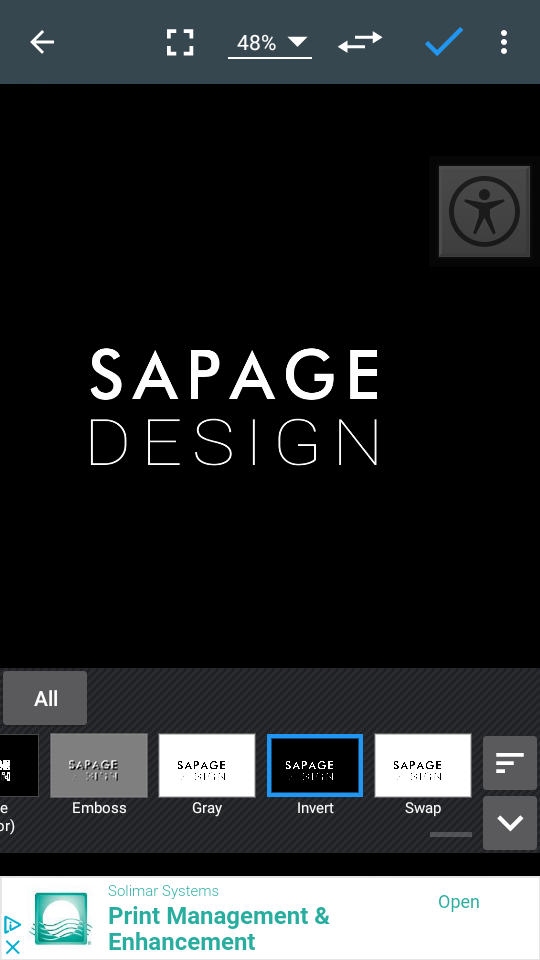
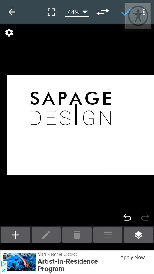
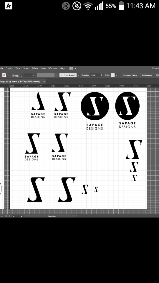
I also made some studies in my phone and i realise something that SAPAGE kinda as AnA inside of it is just put a leg on the P to make it like a low cap n.
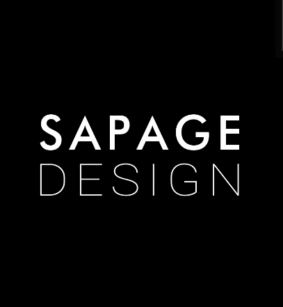
Most of them again are trying far too hard. The best, for me, is the white on black version – even though, personally, I am not a fan of mixing two similar sans serif fonts together like this. Better to use a good, solid sans that says what you want it to say and use different weights.
Here’s a hint that my Graphic Design professor taught me (the hard way) in College.
If you don’t come up with a design decision with a reason behind it, and can’t argue your point in critique, then you will keep doing it over until you do.
IOW, if you keep asking for opinions, you will get them. If however, you have a solid reasoning behind everything you do, and defend it adequately, you get to stop the “do over.”
In a way, it should lead to self-critique. Every time you make a design decision, you must force yourself, honestly, to question, then defend it. When the defense outweighs the question, you adopt the decision for as long as your defense holds up. As strongly as you prepare the defense, you should also prepare to recognize when it loses, and abandon.
This is where the value of peer review comes in at a later stage. Inevitably, someone will pose a question you didn’t. If your defense still holds up, progress is made.
You guys have a strong point there.
I got to work on that or else i am gona stay in loop for a century.
But what kinda questions should i ask?
If the brand is appropriate?
Like if have all principles of logo design.
Or what kinda audience i wanna atract?
Things like that?
No, more fundamental questions about your surface-level decisions.
Why does that spacing work better than a tighter track would?
Does it need to be that heavy?
Why is all uppercase better?
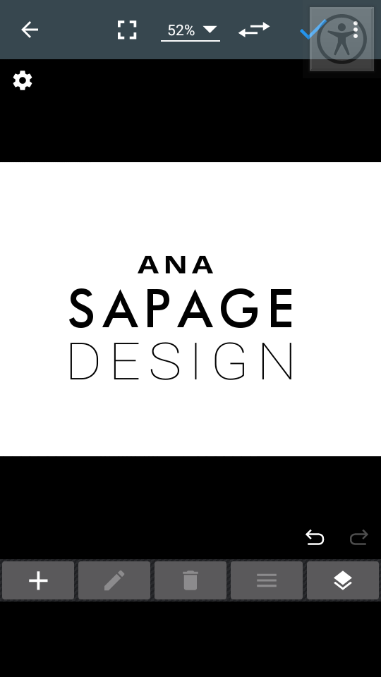
What’s the case for keeping my first name in it?
Since this is in the Crit Pit, I’m gonna assume this isn’t a student project, but one for your own business.
A lot of times a business logo starts by writing out a coherent business plan. That business plan is something that stands on its own two feet and can be used to apply for an LLC, business insurance, and/or a business loan at a bank. If you haven’t done one yet, find your state’s office of small business (they go by different names in each state) and see if they have a form or booklet that’ll step you through that process. That usually provides the focus you’ll need to identify what you need to convey in your logo.
And just my view as an output/signage provider, think in terms of how it will look beyond your computer monitor or printed on your letterhead. How else will that logo be used?
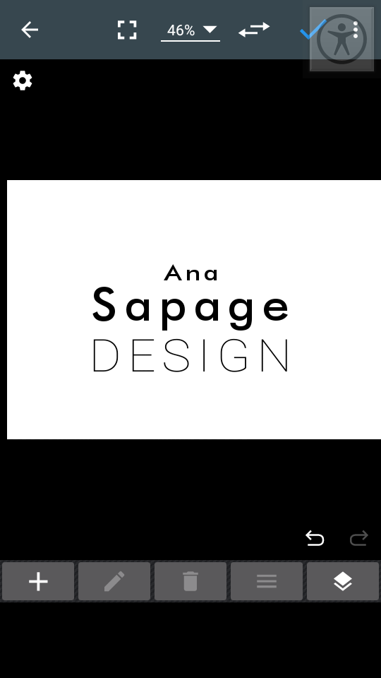
For uppercase reads better have some extra spacing in between.
Because gives a sence of strenght and power that can be considered confidence.
While if i use lower case it mind become more readable but gives a sence of compassion.
For that there is no point in it i supose i wil remove it.
Heaviness does give a sence of stability and trust on its own.
I wil use it in many plataforms as possible.
I want to include it in an icon wisch somehow ik maybe sapage designs is not much apropriedated for that.
So i will see so far wut i did and try to adapt one of them to the cause.
I feel that it’s got something to it that is really memorable and something to explore a bit more. So, if you’re keen @anasapage, I’d encourage you to play around with it some more.
How would it look like paired with the SAPAGE wordmark?
How would it look like as an avatar on social media pages?
How would it look like as a signature on a drawing of yours?
How would an “ANA” look in that style (with an equally styled N)?
Maybe it’s just me but the first thing I saw was pac-man with a mask on. I thought it was a Covid joke. I didn’t see the pencil- I had to look for it. I think it’s too gimmicky. Keep it simple-you’re trying too hard.
I played around with it a bit more.
I manage to turn into a S with a subliminal masagged A i dont feel like ana is that much important sence there is thousands anas in portugal and other countries such comun trivial name but i include it as an extra, neither adds a S for sapage and also keep the style of the A.
But then again i have my doubts and i wondered if is realy readable.
I mean it kinda look like Z but reflected…
I thought then maybe add a circle could itencify the S curves but i am not sure it helped.