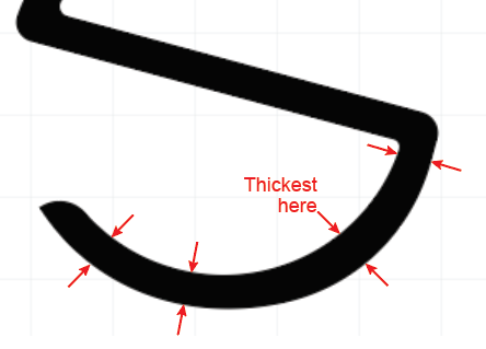
I think Sprout is referring to the (non)uniformity in thickness. If you measured at each of these points, you’d get 4 different measurements.
Thanks for doing what I was too swamped to do this morning.
![]() i apreciate your opinion but my mind is set to it.
i apreciate your opinion but my mind is set to it.
There is no turning back.
I realise if i wanna make it simple i must put only sapage name.
I fixed the S strokes and i realise i forgot to align properly![]() maybe.
maybe.
But is all good now i fix the rotation as well and i decided to go with hradient color.
Sence i have intention to use holographic foil into the logo make it more unique sence not many people use it maybe due to the expenciveness.. And maybe not all print houses have the holographic foil technique in use.
So i decided go with gradient of cmyk wiotuth the black.
I think it relates to my identaty sence magent is related to feminin, charm gentle, tranquil, and yelow sence relates to youth energy creative spirited cheerfull and blue that relates to trust peacefull calm honest competent inteligent eficient.
Ik that colors have also some negative points to it like blue also related to masculine wisch as nothing to do with me but sence the circle and curved lines convey feminine it doesnt worry me sence feminine becomes predominant.
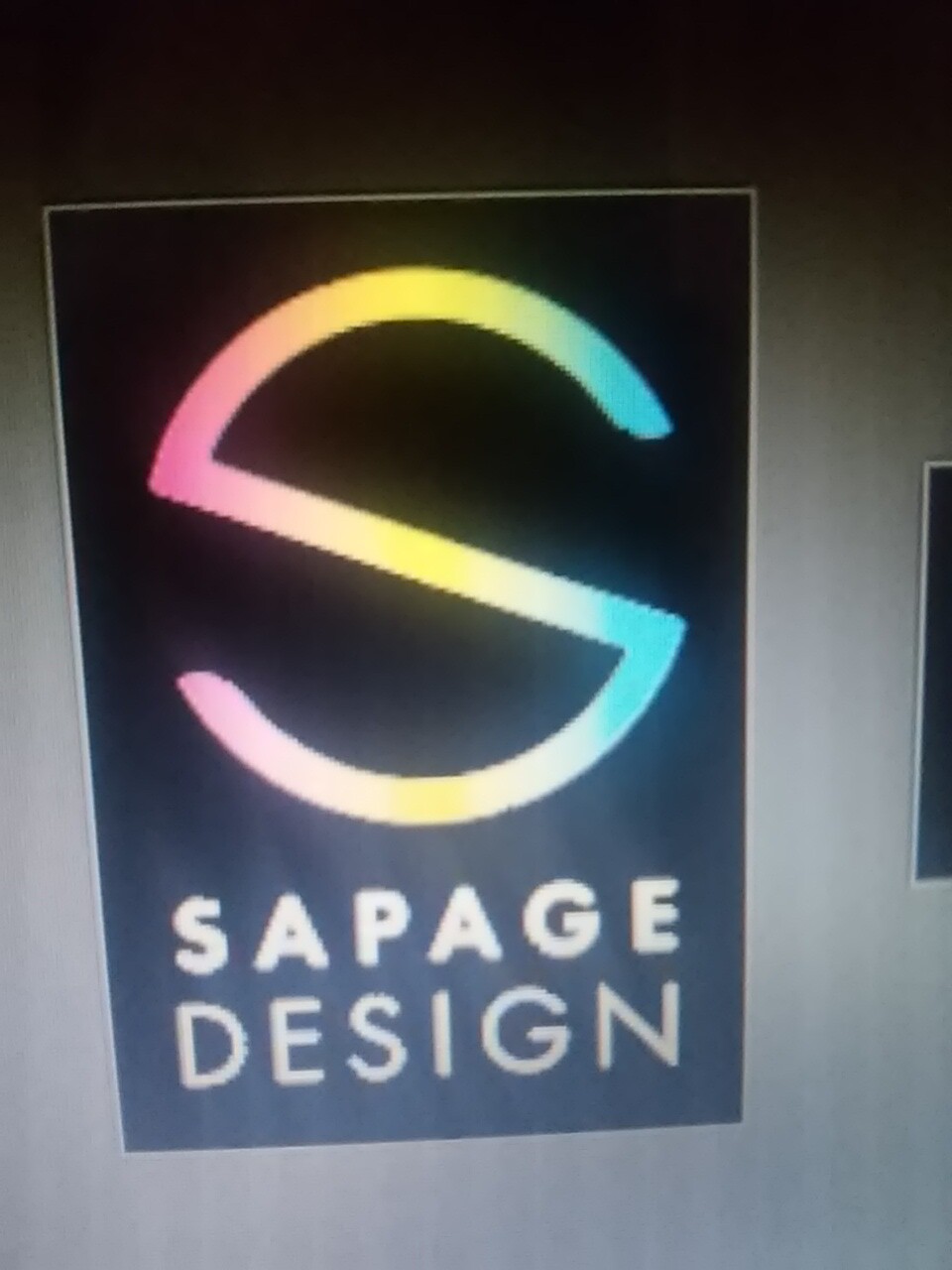
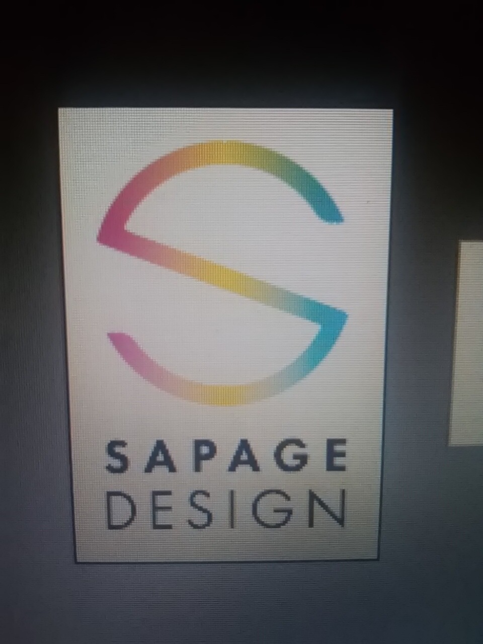
I have tested the gradient in both backgrouds to see if is visible.
1 Like
No offense but I think you still need a lot more experience as a designer before you put yourself out there as a designer/design firm.
Your original logo is just too futuristic and techy. This can give the wrong idea to potential clients and customers and simply is just unnecessary. I’m glad you decided to go less eccentric and more clean.
Your latest design looks good but here’s a BIG THING you should change: Make the S thicker. When your scaling logos you have to imagine what they will look like scaled small or big. The gradient is really unnecessary as when its printed on white it won’t look that good because there’s no crisp dark edges as parts are very light colors. It will also look too colorful on a black bg.
The only one that looks feasible from a designers perspective is this one: