What you mean dont beat the dead horse?
It’s an old British saying - an idiom.
Not just British. We use it here in teh Colonies as well.
No matter how hard you beat that dead horse it ain’t goin nowhere.
Or alternately, once something has reached a stage where do-over doesn’t result in something better, stop and re-evaluate.
If something is not working, no matter how you nurse it or dress it up, it is still dead. It’s time to change direction.
:0? Is there any of the logos and sketches i been doing so far aleast 1 that is decent?
I like this one. It’s obviously an A, it flows nicely, and it’s simple. Of course, it won’t work with just SAPAGE DESIGN. You’d need to spell out ANA SAPAGE DESIGN.
1 Like
Yep - there have been plenty of options so far which I think will work. I don’t think you need to keep generating more ideas (unless you don’t feel satisfied with what you’ve got), but instead I think you need to make a decision about what you’ll select.
What do you think are your best 2-3 ideas so far?
You’ve started going like a design by committee here - you know the saying, a horse designed by a committee is a camel, right?
We’re not here to hand pick your logo - we’re here for you to throw ideas at us and we tell you what works best.
You’ve gone in so many directions - I feel like you’ve made it unclear to yourself what you want in your logo.
It’s your logo at the end of the day - as someone else said earlier - it’s up to you to justify the design decisions and if you’re happy with that then stand by your design making process and show us that you know one works for you.
At the end of the day - this is how you will have to approach design decisions for clients.
You won’t be sitting there throwing up 5 or 10 different variations and saying - hey which one do you like! Because that will end in tears for both you and the client.
Revisit all you have done.
Pick 2 that you really like.
Work on them.
Once you have 2 you really like and have worked on them to the point you can justify the design decision.
Do 1 more - unrelated - to the other 2 - and work on that.
Produce 3 final versions of what you think works best for you.
Ok.
I have decided after another who knows how many tries i have done to go with this one and get it over with.
I tried work on others but idk at some point i didnt like the result.
Its simple mordern sence is geometric, as this feminine side to it from the curved lines.
I want to go with something geometricly strict sence i am gona go in my portfolio and maybe my future work with infography wisch requires some geometrical alignments and percisions.
Making the combination of work mark and logo now is more amplafied to the versality of uses i can give it neither now or in future.
I also want to make it seem a bit futuristic tecnology related sence i have intention to make hologram in business card wisch relates to feminine cux of rainbow but also futuristic and related youth.
I tested the minimum thin printable.as well the minimum size of it.
I make sure the lines dont go under the 0.75.
Ik that minimum thin for print is 0.50 but from my notes of colege it say if i wanna somehow anyway put it above image i must make it 0.75 so also in case the printer is kinda crapy to and cant print lower 0.75 is perfect.
Lines are thin then again intencify feminism.
The S is in the same thin of sapage to relate to it better instead of word design.
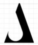
The large s looks unfinished.
It also looks visually tilted anti-clockwise.
^this
Well it must right?
Must look unfinish to have the spaces to be the S form for sapage. If put circle close then loses the main purpose. i dont see that as major problem with that.
1 Like
Anti clockwise?
But S 's nature start by beeing anticlock wise isnt that.
What you mean by that exctly?
That follows theclock movement right to left?
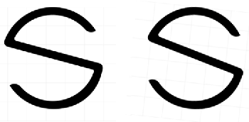
I think @Eriskay means the whole thing needs to be rotated a little in a clockwise direction. As it is, it looks like it’s tipping over backward.
For example, your original is on the left. I’ve rotated the one on the right a little.
Ah your correct.
I will fix that.
And
I think my journey ends here.
I must say i learn alot with you guys. ![]()
Even beeing super strict but i realy apreciated sence i was looking exactly for that.
I will continue my journey to make that portfolio.
I did write all all i needed to make sure no do same mistakes again.
I will come again when in need of feedbacks sence you guys super resourcefull and usefull.
And i am extremely sorry for handle my stuborn indecisive nature.
But realy thank you.
I am honestly apreciated.
Your efford wont be in vain.
1 Like
As a designer, I find myself the hardest to design for.. so can totally relate to your indecission.
Am glad you finally found a mark you feel is a good fit for your business! ![]()
![]()
One more nitpick. The weight of the curve on the bottom is unbalanced. Actually, and the top too, to a lesser extent.
You mean I should softly thin up the top and bottom curve?
Sort of. It is difficult to explain exactly where – as it comes off the straight, the inner curve is wrong and makes that first part look too thick. However, if you want my opinion – and you probably don’t – I think you were closer with the A triangle one. I think this is much less elegant. You were fairly close at one point. I’m not helping am I?!!