If Sherlock Holmes had a Youtube channel

Brand and Artistic Approach Explanation

The project is my YouTube consulting brand.

It clicked for me, and I realized what my true archetype was, and it explains much better how I approach this work and all the expert professions I have practiced. It is the Detective/Secret Agent archetype. It belongs to the Sage category.

I haven’t defined the manifesto yet. The message revolves around the importance of knowledge. For now, the slogan is “Knowledge = Growth”. The goal is to provide the best insights into the YouTube platform to enable the growth of YouTube channels for content creators like documentary makers and passion-based channels. This archetype appeals less to entrepreneurs and not at all to influencers.

The brand will be present on the YouTube channel, LinkedIn, Twitter, TikTok, and the website. It will therefore be found in the banner, the wordmark and logotype, the About section (for the values), the entire website interface, the YouTube thumbnails, and in video editing.

Here are the concepts I would like to integrate:

:black_medium_square:︎ The search for information and its analysis (detective’s work applied to decrypting YouTube)
YouTube is all about attention, the algorithm, the audience, virality, discerning the signal from data noise.

Blue is the color of the Sage. Red is the color of the YouTube logotype. AI suggested graphic palettes to me; I chose one with turquoise/cyan which I found again on the posters for the series Liaison. For the music, I want to reuse the soundtrack from the series The Bureau and the video games Metal Gear Solid.

:black_medium_square:︎ The villain in the story is the algorithm that prevents creators from succeeding and/or those who spread false information on how the algorithm works, how to succeed on YouTube.

For the algorithm, I can draw inspiration from the character Jobe in The Lawnmower Man.

:black_medium_square:︎ Modern high tech which is a machine/human symbiosis at the molecular level. In short, it’s an organic aspect.

I could draw inspiration from Refik Anadol and Neri Oxman. The animated dot grid (like polka dots) is supposed to be an organic representation of data, of the audience. The paper (dark wave in the wordmark background) recalls the Sage and the information medium.

The assets I have created:

:black_medium_square:︎ The name SageSignal doubly refers to the archetype; I could have just kept ‘Signal’ but the two words together arouse curiosity and visually pair perfectly by creating repetitions.

:black_medium_square:︎ The SageSignal wordmark: It’s Futura Bold font with a cyan and red offset effect to recall noise/signal and video. TikTok does the same without the notion of signal. I thought of including an eye in one of the letters, but then this part would become the logotype (the symbol). I chose Futura instinctively because of its name, and it’s really well designed; I haven’t found better. I paired it (a popular choice) with Caslon Pro.

:black_medium_square:︎ The logotype (the symbol): I had no other idea than to make an eye to recall attention. Yesterday, I had the realization: the white areas on the left and right of the eye are both the arrow of the YouTube logotype (which is a play or previous/next button), and also (if well done) two other eyes seen from the side that also look at the user/audience reflected in the iris-pupil. I think the whole thing in monochrome works really well.

:black_medium_square:︎ The sound signature: I assigned tones to each letter of the brand name, and played consecutively, they create a kind of melody. The harmony isn’t great. Combined with the dot pattern, it recalls the Apple ad for the HomePod.

:black_medium_square:︎ The banner: Not yet done; it will present the unique value proposition and will reuse the wordmark’s visual codes.

:black_medium_square:︎ The thumbnails: There’s more room to mess up there; a thumbnail must be much more flashy and must adapt to key elements that are always changing.

:black_medium_square:︎ The website: I’ve only redone one page while waiting for feedback. The latest version only has 3 colors: very dark background, medium turquoise for surfaces, and white for text.

Here are the problems I am encountering:

:black_medium_square:︎ I don’t know how to use colors. Well, apart from training myself, there’s no real solution. Concretely, even with a palette, I don’t know which color goes where and in what proportion. Should the darkest color be a turquoise or a true blue? Cyan and red are actually used in very small quantities in Liaison; should I do the same?

:black_medium_square:︎ The logotype must be contained within a circle. That’s the standard for platforms. I don’t know if I should round the shape of the eye (which would make it look more childish) to optimize the usable area within the round frame.

:black_medium_square:︎ The music I want to use translates the archetype perfectly, but it’s often oppressive or sad. I don’t know if that’s compatible with selling products and services. Maybe I could compensate for that with synthwave (Kavinsky) or Brazilian drift phonk.

:black_medium_square:︎ I don’t know what graphic style to use.

:black_medium_square:︎ Did you spot any particular issues especially regarding coherence ?

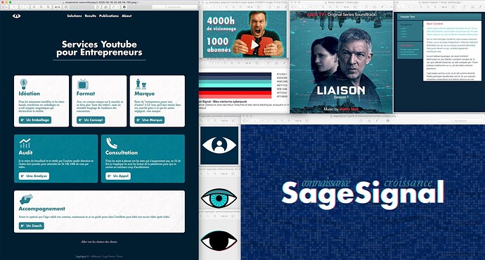
As I can’t post links I gathered the key assets into one image.
Despite reading your entire post twice, I still don’t understand what you are writing about other than it somehow relates to content creators and YouTube.

1 Like

I wrote about the branding of that project, branding for which I request a critique.

OK, I know where I was getting confused. You used the terms archetypes, secret agents, sages, manifestos, blue being the color of sage, sound signatures, and that sort of thing.

You’re using the trendy formula that suggests brands can be built around 12 different personality types or archetypes and using the jargon that accompanies the formula.

Over the years, I’ve worked on many branding projects, but I’ve yet to encounter one built around categorized personality archetypes.

As you’ve probably guessed, I’m not a big fan of this formularized approach. I think branding is far too nuanced to break down into a dozen categories with corresponding colors. I’m not saying it couldn’t be used as the framework for building a brand. But if it worked well, one could also use similar categories as frameworks for writing music, designing a building, painting a painting, or almost any creative pursuit. It strikes me as a paint-by-numbers approach to ensure passable work rather than something better.

By the way, I’ve increased your user permissions to enable you to post links to the rest of the project if you would like to do so.

I have to admit I was a bit lost too, the detailed explanation sets a certain expectation of sophistication and a unique vision, and then the visuals presented don’t quite seem to deliver on that promise. There’s a disconnect between the complexity of the conceptual framework and the apparent simplicity (or perhaps even genericness) of the initial visual execution.

It’s like reading a compelling synopsis of a complex thriller and then seeing a movie trailer that looks like a standard, low-budget production. The anticipation doesn’t match the reveal.

Branding is supposed to simplify a message. Strip it back to something people get straight away. But too often, what should be clear gets twisted into something so complex and self-referential, it loses the plot entirely.

It’s like me saying “It’s like watching Ballyturk.” If you’ve never seen it, that means nothing. And if you have well, you know exactly what I mean. Even then, most people left the theatre baffled, wondering what they’d just witnessed. It’s not that complexity is bad, or that abstract art has no place. But abstract branding? Come on. Branding isn’t theatre. It’s not a David Lynch film where the confusion is the point. When brands vanish into meta concepts and layered structures, overcomplicating a process that’s supposed to be going the other way towards clarity.

Of course, there’s a balance. Go too far the other way and you end up with soulless minimalism. Slogans so stripped back, they’re meaningless. Both extremes miss the mark. Over-minimalism makes a brand forgettable. Over-complexity makes it incomprehensible. Somewhere in between is the sweet spot.

Here’s a way to picture it a fish can swim up, down, left, right it moves freely in three dimensions. That makes perfect sense to a fish. But take the fish out of water, and none of that applies. It flounders because it’s no longer in an environment it understands. The same thing happens when brands get too clever for their own good. They stop swimming where their audience is. Instead, they’re flapping about in some abstract meta-space, where their audience can’t follow them.

Sure, archetypes and creative frameworks detectives, guides, sages, all that is useful. But it’s scaffolding, not the building itself. The whole point is to take the scaffolding down and reveal the building to the client. If your process leaves people staring at the scaffolding with no idea what’s underneath, you’ve failed.

At the end of the day, branding should be simple but never stupid. It should invite people in, not leave them outside, or walking out of a theatre muttering “what the heck was that?” If people need a study guide to ‘get’ your brand, you’ve missed the point.


Real world is harsh - it’s a harsh harsh harsh place. So I’m going to dig deep into my harshest critique I can come up with. And I hope it helps.

So, lets strip it all away. Let’s take off the gloves for a moment and call it what it is.

All the blurb is basically lipstick on a pig.

You’ve dressed it up with buzzwords and fancy talk, but it’s a dead simple webpage with stock icons, a flat hex colour palette, and a TV show screenshot slapped on for moodboard filler.

Nothing wrong with clean and simple, but when you’re selling it like it’s some visionary branding work and this is all you’re showing, it’s underwhelming. The lack of print colour references screams web-only mindset, which is fine if you’re upfront about it. But calling this a “brand ecosystem” or “identity strategy” would be stretching the truth.

And that “SageSignal” logo? If you have to squint to read part of your own brand name, you’ve already lost. Legibility first, clever second. It should never be the other way around.

This isn’t bad design. It’s just painfully generic. I’ve seen it a thousand times because it’s the safe, templated path. No risk, no soul.

Here’s the thing when you build it up with words like strategy, identity, ecosystem, you set an expectation. You’re telling me this is thoughtful, crafted, layered. But when the curtain lifts and it’s just the same cookie-cutter visuals with no real insight or differentiation, it’s not just disappointing it’s forgettable. In branding, forgettable is fatal.

If you’re going to talk the big talk, you’ve got to show the work. Otherwise, it’s just a ribbon on a cardboard box.

This isn’t me being harsh for the sake of it. This is me telling you that next time, dig deeper. Show the thinking, the why, the personality. Because right now? You’re selling a “brand ecosystem” that feels more like a starter template with a moodboard taped to the side. The language is promising a gourmet meal, but what’s on the plate is reheated leftovers.


Now that’s over with

Instead of just listing concepts, try to visualise how those concepts translate visually.

The Detective/Secret Agent
How can you subtly hint at investigation and insight visually? Think about visual metaphors beyond just an eye. Could it be abstract representations of data analysis, a feeling of uncovering something hidden, or a sophisticated, intelligent aesthetic?

The Algorithm as a Villain
This is interesting! How can you visually represent this antagonist? Jobe from Lawnmower Man offers a starting point, but how can you make it relevant to the YouTube algorithm? Could it be abstract patterns that feel complex and perhaps a bit chaotic, or a more stylised, almost digital ‘entity’?

Organic High-Tech
The Refik Anadol and Neri Oxman references are intriguing. How can you blend organic textures or flows with a sense of digital precision in your visuals? The animated dot grid is a start, but how can you make it feel more “organic” and less like standard animation?

What I see as your challenges

Colour
Instead of just picking from a palette, think about the feeling you want to evoke. Blue for Sage makes sense. How can turquoise/cyan and red play a role in supporting that feeling? Could turquoise represent the digital space of YouTube, and red the energy of attention?

Experiment with applying these colors to different elements (backgrounds, text, accents) in your mockups to see what feels right. Don’t be afraid to have one dominant color and use the others sparingly for impact.

Logotype in a Circle
Instead of just rounding the eye, explore how the essence of the eye and the play buttons can fit elegantly within a circle. Maybe negative space becomes more crucial, or you find a way to abstract the shapes while retaining their meaning.

Music
If the music feels oppressive, perhaps explore instrumental versions or find tracks with a similar sophisticated/investigative feel but a slightly more upbeat or neutral tone. Synthwave or Brazilian drift phonk could work if you can connect their energy to the growth aspect of your message. How does that sound tie into the detective uncovering secrets vibe?


Ultimately, the goal is to make the why behind your choices clearer through the visuals themselves, not just the description. Show, don’t just tell.


2 Likes

Brand archetypes bring the why to companies/people for what they do.
They were identified by Carl Jung and 12 of them were codified for brand usage.
There are more of them, at least 72.
If you pick up all the music genres, I’m willing to bet that each with fit meaningfully in one of the 12 archetypes.

I guess I would be offended if I was an artist. But I’m not. This is why I desperately need the framework of an archetype and I most likely won’t be able to push the implementation much further. I’ll have to hire an actual designer to do it.

Do you have a handful of brands that do it well and into which I look ? or better, some course or breakdown that explains the designer’s process ?

Thanks for your long answer.

You’re right about Jung laying the foundation with archetypes his work on universal patterns of human behaviour is timeless. But the 12-brand archetype model most people know was really popularised by Margaret Mark and Carol Pearson in The Hero and the Outlaw. That framework stuck because it gave brands a simple, relatable way to tell their story. The jump from 12 to “72 archetypes” is just slicing categories thinner and thinner, but if the core message isn’t clear, more labels won’t fix that. Archetypes work because they tap into shared human instincts. When it gets too granular, you risk turning a powerful narrative tool into a branding word salad.

I get the point about Jung and archetypes, genuinely. They can be a solid foundation for building out a brand’s voice, values, and emotional resonance. But let’s not pretend that simply referencing them adds instant depth or strategy to the work.

Right now, what’s being shown is a very surface-level execution a clean webpage with standard visuals and some buzzwords sprinkled on top. That’s not “archetypal branding”, that’s window dressing.

Archetypes should guide the storytelling, the messaging, the emotional hooks. They should influence how a brand feels to its audience, not just be used as a label after the fact. Otherwise, it’s a bit like quoting Carl Jung to explain why you picked teal and sans-serif. Feels clever, but it’s not doing the work. Substance first, then the theory can support it.

Well I said I’d be harsh - and it wasn’t meant to be offensive, so fair play for taking the critique on the chin. Respect. You’re right not everyone’s an artist (ME INCLUDED).

But design isn’t about being some tortured creative genius. It’s about solving problems visually and knowing how to communicate an idea without drowning it in jargon. If you’re serious about levelling up, start by looking at brands that don’t shout, but are unmistakably themselves.

Aesop
Patagonia
Mailchimp (pre-Intuit buyout)
Monocle Magazine
Studio Dunbar
Futur (Chris Do)

Marty Neumeier’s books
The Brand Gap, Zag, Scramble.

Pentagram case studies

Core Branding Framework (Jose Caballer)


And yes - work with a designer, yes. But don’t just hand it off and hope for magic. Good clients get good work because they stay involved and ask the right questions. You’re already curious, so you’re on the right track.

1 Like

I found 16 works by Pentagram that have to do with investigation or data analysis, but I got neither wow effects nor ah ha moments. So I guess I just don’t get it :man_shrugging:t2:

TradingView
Tractable
High Yield, Future Tense
Bulletin of the Atomic Scientists
Watch This Space
Closed Worlds
Uptake
Deloitte Insights
WGSN
TheStreet
A Spy Among Friends
Urbint
The Report
Exposed: Voyeurism, Surveillance, & the Camera Since 1870
Birds of Prey
A Wilderness of Error: The Trials of Jeffrey MacDonald

So many words….
In my 50-year design career all of my work came down to six seconds. That’s how long I had to get the attention of a consumer. It’s the Hemingway challenge—write me a story and tell it in six words
“Baby shoes for sale. Never worn.”

2 Likes

I don’t see why you’re saying this :slight_smile:

Perhaps, but that would be a post-hoc analysis, not a framework or formula for creation.

1 Like

<<<<sorry it’s so long again>>>>

I’m back with more thoughts on this - you can tell I’m interested because I’m getting involved, and this sort of thing fascinates me for some reason.

I haven’t been fascinated by design or a forum post in a long long long long time.

The Good

Ambition
The concept behind SageSignal is clever. Tying in a “detective/Sage” archetype to analyse YouTube data with style? That’s a niche, and niche is good.

Theming
Using a coherent metaphor (detective work, the villain being the algorithm, the colour story) shows thinking.

Creative elements
The idea of matching tones to letters, the Futura/Caslon combo, the symbolic logotype with the eye-as-YouTube arrows all imaginative.

The Bad

Language and jargon
Terms like “archetype”, “Sage”, “Secret Agent”, “data symbiosis”, “organic representation of data” it’s like watching a Christopher Nolan film explained with IKEA instructions. Interesting, but a bit up its own complexity.

Lack of visual backup
Describing a rich visual world without showing it is like a restaurant menu (I keep going back to food?) with nothing but poetic descriptions. If people can’t see it, they won’t get it.

These guys have it down

Just-B nails it with a lot less words than I do, fair and honest. You can tell he’s seen many branding projects and is allergic to frameworks that feel formulaic. I don’t think it’s being dismissive, but skeptical is acceptable - as I am - and rightly so. Branding isn’t a checklist, it’s a gut (hmmm food again) feeling, a reaction. If you have to explain the brand, it’s not hitting home.

Just B analogy of branding being “far too nuanced” for archetypes is spot-on. Archetypes are a starting point, not a structure to lean on too heavily.

And PopsD really says it all without saying much - simplify the brand message to make it more accessible to the target audience. Needs coherence between the concept framwork and the visual elements, this ensures that the branding aligns with the narrative.
And the key thing from popsds is focusing on how the brand communicates with the audience.

Finaly thoughts

Here’s my final take on it - cos I was very harsh and overly intrigued which is rare for me.

The idea behind SageSignal is good. The execution ----> not so much.

You’ve got:
A strong archetype
A memorable name
A decent instinct with type - even though there are flaws in legibility
Inspiration is clear

Issues
Over-explaining instead of showing
Cramming in too much symbolism
Forgetting that branding is emotional, not intellectual

Final suggestions
Simplify the language. Be poetic, not pedantic. People connect with stories, not structure.
Show more, talk less. Let the assets speak. Revisit coherence. Does the look match the talk? If not, either adjust the look or tone down the theory. Use archetypes lightly. Treat them like a compass, not a map.

Don’t force style. If your gut says synthwave + Metal Gear Solid + Refik Anadol, go with it — but commit with taste but also with restraint.

By the way - I’d never think like it has to be synthwave + Metal Gear Solid + Refik Anadol - this sort of thinking is alien to me - collages - doing what others have already done. If a client asks for this I’ll keep it on the map but find another route around it but keep it in view - if you get me. I might look up buzzwords to get sense of that they’re talking about - but I couldn’t in good conscience build an archetype out of it and call it my own. I’d stick to the brief and the gut instincts and deliver - it’s worked 99% of the time for the last 25 years.

Don’t fall into traps of what others have done - be you. You’re not designing for yourself, you’re designing for your client. Even if the client is you, you’re not designing for you, it’s the the client, the audience, the message, the tone.

By all means get inspiration from things, but don’t let that be a driving force to destinations. They’re shortcuts. You might get there faster, but you’ll miss all the turns where something original and beautiful could have happened. Real work comes from wrestling with the unknown, not following the GPS someone else left on.


In short, it’s a good idea teetering on the edge of over-intellectualisation. Pull back slightly, let your instincts breathe, and you’ll have something genuinely special.

2 Likes

Home alone, toilet seat was warm.

2 Likes

The butler did it, quite slyly.

Your being an amateur at this has probably been a little lost in the conversation. For someone with little to no training, what you’ve designed and how you did it is better than most could have done.

You’ve been getting replies from people who have been in the business for decades. For me, it’s been over 40 years. If one works at something long enough, a good deal of one’s expertise becomes second nature. Training wheels and formulae are no longer needed.

I try to look at the project from the target audience’s viewpoint and then design something that will resonate with them, be memorable, and accomplish the client’s objectives. Of course, there’s the research to more precisely. define the problem better than the client can. At that point, it’s often a matter of convincing clients that they’re not the target audience and that what appeals to them might not yield the best results. I suppose all designers have their processes, but designing according to a formula based on archetypes and their supposed colors and villains is never part of that process.

2 Likes

Well said, that man. I couldn’t agree more.

The original post – with no disrespect intended to the OP – comes across as over- (or possibly, pseudo-) intellectualising in a very formulaic way that only serves to limit the outcome and potentially ends up completely missing the point.

Anyway, once again, you’ve hit the nail on the head. I don’t know any professional (and effective) designer who would work in that way. I know, I wouldn’t.

Part of the reason I don’t and won’t read any books on design. I studied in college over 20 years ago. Haven’t picked up a design book of any kind.

Design isnt a science problem.

I think the whole archetype thing is drivel. And it sold. And people still buy into it.

Might as well be the 12 types of cars people buy. Or the best 12 chords in music.

A leaf can represent nature. But you can’t represent nature in its entirety by using a leaf.

1 Like

The archetype formula reminds me of the Myers & Briggs Personality Tests, where people can find which one of the 16 personality types people supposedly have.

Out of curiosity, I took the test a while back, and I’m apparently an INTJ-T — The Architect.

1 Like

ISTJ (Logistician) - that’s what I got

Ridiculous questions though. A lot of the answers would depend on the circumstances of the situation, which would either put it to strongly agree or strongly disagree or somwhere else in the middle.

Reminds me of the scene Donnie Darko when the teacher was trying to get him to put a marker on an emotional scale.

(sorry for going off topic - but it’s kinda relevant to archetypes and pigeon-holing them to design theories)